Thanks to everyone who submitted photographs for this critique. 26 people uploaded images to Flickr, and there are some outstanding images in the collection. I had to pass over a lot of interesting choices, but I’m keeping several in mind for future critiques.
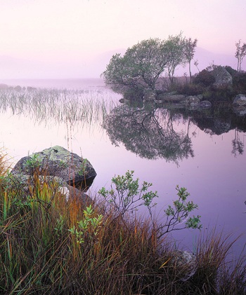
I chose this image mostly for aesthetic and instructive reasons, but also because the international flavor appealed to me. The photographer, Tim Parkin, lives in Leeds, UK, and the photograph was made at Lochan Na h’Achlaise (which Tim says roughly translates as ‘Loch of the armpit’) in Rannoch Moor, Scotland. Also, I like the title Tim used on Flickr—“That Damed Loch”—although his official title isPinks, Lochan Na h’Achlaise, Rannoch Moor.
I love the soft, subtle, color palette of this photograph, with pinks, golds, and hints of green. Many photographers would be tempted to pump up the saturation, but I think that would make this image look garish and fake, and lose some of its attractive, quiet feeling.
The composition is well seen and thought out. The main focal point is the shrub on the island just right of center, and my eye moves from that down to the smaller shrub, grasses, and rocks in the foreground. Tim was careful to keep separation between everything in the foreground and the reflections in the water, with the exception of the unavoidable merger between the three tall grasses just left of center and the reeds behind them.
The small foreground shrub echoes the shape of the larger one in the background, adding some repetition and tying the foreground and background together. I often see random foregrounds that seem stuck on, included only because the photographer felt that a foreground was obligatory. If you’re going to include a foreground it has add something to the image and tie in with the background somehow, either with similar lines and shapes, or by leading the viewer’s eye into the distance. Here the foreground definitely adds interest, and echoes shapes in the background.
The only minor problem I see with the composition is the bush on the island at the right edge of the frame. I find it mildly distracting, and it could easily be cropped out. In fact Tim cropped it in adifferent version of this photograph on his web site. I’ve used the version he posted on Flickr, which isn’t cropped, and is also a bit lighter, with more saturation. I like this (Flickr) version better except for the shrub on the right edge.
The light adds a wonderful quality to this image, silhouetting branches and making the mist glow. All the elements—color, composition, light, and weather—come together to create a beautiful, quiet, tranquil mood, and that’s really the main reason I picked this image. Photographs can be pretty, or interesting, or grab your attention, but to me the best ones capture a mood or feeling, or at least evoke some reaction in the viewer. To me this image conveys the calm serenity of this moor on a foggy morning.
Of course being in the right place at the right time is a big part of landscape photography. While luck is obviously a factor, luck favors effort, persistence, anticipation, and a willingness to fail. You have to drag your camera out when the chances of success are small. Most of the time you’ll be disappointed, but eventually you’ll get lucky. The ability to anticipate good light and weather conditions comes from experience, local knowledge, and a little intuition. Most photographers have more success making repeated trips to a local park, getting to know the place intimately, then traveling to some exotic, unfamiliar location.
If you do manage to find great light and weather, you need to possess enough photographic skill to take advantage of the conditions. This means making good decisions about composition, and having the technical skill to get the right exposure and make a sharp image.
According to Tim this photograph was made with an Ebony 45SU (4×5 view camera) using a Schneider 110mm Super Symmar XL lens. That’s a moderate wide-angle lens with this format. The exposure was 15 seconds at f/22 on Fuji Velvia with a soft-edged two-stop graduated filter. This was only his 10th large-format capture! Quick learner. He says that he made about 15 spot meter readings (!), putting the mist/sky at +1 2/3 to +2. An explanation of the metering would require a discussion of the Zone System, which maybe should be the subject of another post, but the upshot is that the exposure looks perfect. The graduated filter was clearly a good idea, helping to balance the light between foreground and background. With digital cameras I no longer carry graduated filters, preferring to achieve the same effect, with more control, in Lightroom or Photoshop. (Click here to see my tutorial on this subject.)
Using some rear tilt on the view camera allowed Tim to get great depth of field and keep everything in focus except the tips of those three tall grasses in the foreground (click here to see a larger view). To me those out-of-focus grasses are a minor flaw and don’t detract from the overall beauty of the image. A perfectionist might be tempted to clone them out in Photoshop, but this presents both ethical and practical problems. The ethical issues related to Photoshop retouching have been debated endlessly elsewhere, so I don’t need to add to the discussion here. The practical problem is that this would be a difficult cloning job—not impossible, but requiring a lot of skill, as you’d have to remove all of those grasses, right down to the ground, otherwise they’d look hacked off.
To sum up, this photographs has beautiful color, great light, good composition, and is technically well-executed. Nice work Tim! Thanks for sharing your photograph.
You can view more of Tim’s work on his web site, or click here to read his blog.
Of course, my thoughts about this image represent one person’s point of view. I welcome your comments and ideas as well.
If you’d like your photographs considered for future critiques, just upload them to the Flickr group I created for this purpose. If you’re not a Flickr member yet, joining is free and easy. You’ll have to read and accept the rules for the group before adding images, and please, no more than five photos per person per week. I’ll post the next critique on February 2nd or 3rd. Thanks for participating!


Trackbacks/Pingbacks