Note: I’ve decided to do these critiques every other week from now on, instead of every week. I enjoy doing them, and they’ve been popular and well-received, but I’d like to devote more time to discussing other things that I think will interest you, the readers. Stay tuned!
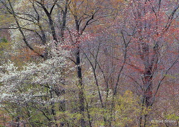
This week’s photograph was made by Brad Bireley in Potter County, Pennsylvania. By having his image chosen for this critique Brad will receive a free 16×20 matted print from Aspen Creek Photo. If you’d like your images considered for future critiques you can upload them to the Flickr group I created for this purpose.
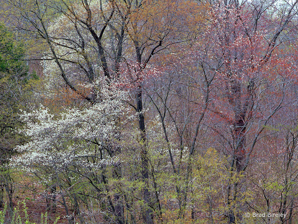
The soft light of an overcast day was perfect for this photograph. The even illumination helped simplify this complex scene, while sunlight would have created confusing splotches of light and dark. Soft light also helped bring out the beautiful, subtle colors. The varying shades of green, gold, red, and white create a pleasing and varied palette, with a nice warm-cool, red-green color contrast.
Overall the composition is well seen. Brad focused on the area with the most interesting color and texture. He put design before subject and didn’t feel compelled to include the tops or bottoms of the trees out of some misguided attempt to show the whole subject.
The lines of the tree trunks provide structure and prevent the image from becoming a random mish-mash of leaves. The thousands of tiny spots created by the leaves and blossoms add texture and another subtle, repeating pattern, almost like a pointillist painting.
Two small things, however, bother me about the composition. First, the branches in the lower-left corner are slightly out of focus, and their shapes don’t mesh with everything else. Luckily it’s easy to crop a little off the bottom of the photo to eliminate those branches.
The other problem is the bright patch of sky in the upper-right corner. Bright areas draw the eye, and this one pulls viewer’s attention away from all those interesting colors and textures and right out of the frame. Unfortunately, this patch of sky isn’t easily cropped, as trimming the top would also cut off some interesting forks in the upper branches of the left-hand tree.
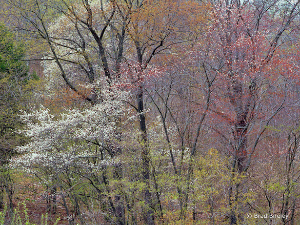
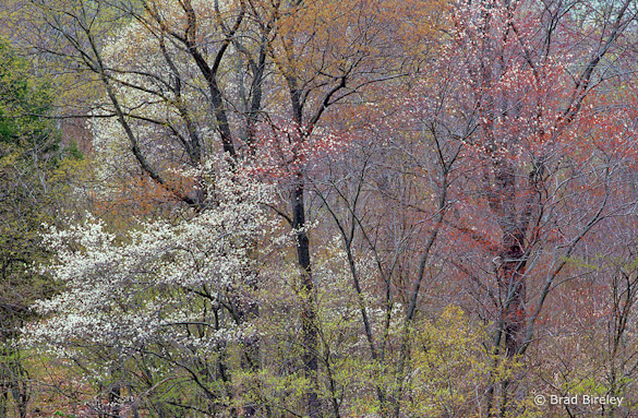
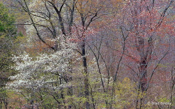
In search of a solution, I tried darkening the upper-right corner, and several different crops. At the end of this post you’ll find four alternate versions of this image. In version A I darkened the upper-right corner as much I could without making the image look fake and unnatural, but didn’t crop anything. In version B I trimmed a little from the bottom and just enough off the top to eliminate the brightest part of the sky. With C I lopped off all of the sky, and in D also cropped the left and right edges to fill the frame with texture.
I like tight compositions, so I’m partial to Version D, but honestly it’s a tough choice. Let me know what you think!
Technically this is well-executed: the exposure is perfect, and everything is in focus except the small vertical green branches in the lower-left corner I mentioned earlier. The overall contrast looks just right, with small areas of pure black and pure white, just enough to give the image some punch, but not enough to make it look harsh.
Brad said that he didn’t do much to the scan, perhaps adding a bit of saturation. I think a color balance adjustment would also help, as the image has slight blue/purple tint, visible in the branches on the right side of the frame. (I adjusted the white balance slightly in the versions below.)
Despite my nitpicking this is a beautiful photograph, with great colors and textures. Thanks Brad for sharing your image! You can see more his work on Flickr.
As part of being chosen for this week’s critique Brad will receive a free 16×20 matted print courtesy of the folks at Aspen Creek Photo. If you’d like your images considered for future critiques, just upload them to the Flickr group I created for this purpose. If you’re not a Flickr member yet, joining is free and easy. You’ll have to read and accept the rules for the group before adding images, and please, no more than five photos per person per week. I’ll be posting the next critique in two weeks. Thanks for participating!
—Michael Frye

