Two weeks ago I wrote about workflow. Today I’m going to talk about composition. But vision, technique, and the digital darkroom are all vital aspects of landscape photography, and I want to explore every relevant topic in this blog. I hope I can make the concepts, whether technical or creative, clear and easy to understand.
As a beginning photographer I almost always held the camera horizontally. Not only is the camera designed this way, it’s also the most natural way to see, since our eyes are lined up side-by-side on our heads. But the camera only has one lens—one eye—and “sees” just as well in an upright position. I missed a lot of good compositions in those early days because I didn’t think to turn the camera sideways.
As I graduated to using a tripod, and started to get work published, I forced myself to think about vertical compositions—after all, most magazine and book pages are oriented to the vertical format. But it was a struggle.
Over time though, the vertical or “portrait” orientation of the camera became more natural to me, to the point where now almost half my photographs stand upright. In fact my wife calls me “Mister Vertical.” Maybe my view of the world is just skewed 90 degrees.
In workshops I often see students stubbornly keeping the camera in “landscape” mode when a vertical orientation would fit the subject better. Like the old me, they rarely turn the camera sideways.
I don’t know any quick cure for this. Breaking the horizontal habit requires a conscious effort to think vertically, over and over again. But it’s worth the trouble, as there are many, many scenes that work better with the camera upright.
Once you turn the camera sideways you’ll discover a different world. The whole balance of the photograph changes. While the rule of thirds often works with horizontal framing, it seldom does with a vertical orientation.
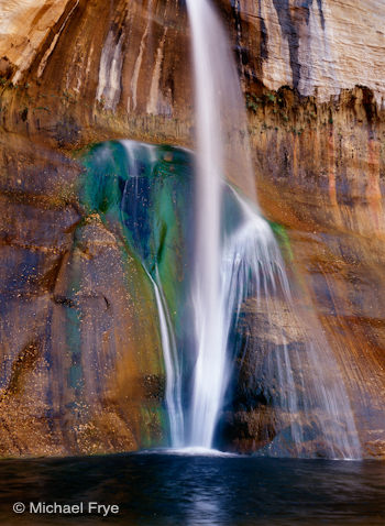
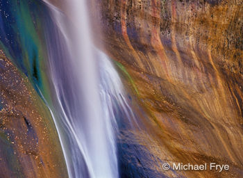
Consider these two compositions of Calf Creek Falls in Utah. The image at the top of this post shows the waterfall centered from left to right. This seems logical and natural; if the waterfall was placed left or right of center the image would seem off balance. In the horizontal composition the waterfall is about a third of the way from the left edge. This also seems logical and natural, as the fall is balanced by the striped rock to the right.
In a horizontal frame you can balance an off-center subject with something on the other side of the photograph. With a vertical frame there’s not enough room to do that.
I find this over and over again—when framing a scene in portrait mode, the main focal point almost demands to be centered from left to right. It might be above or below the middle, but rarely off to one side. But in landscape mode a centered subject often looks static.
Of course there are exceptions. In the photograph of Yosemite Falls below, for example, the waterfall faces left, so it seems logical and balanced to put the waterfall slightly right of center. Bridalveil Fall is squeezed over near the left edge of the frame, but balanced by the rainbow on the right. But more often than not, vertical compositions need centered subjects.
Don’t be afraid to defy convention, leave the flat, horizontal world, and turn the camera sideways. You’ll find a lot of great compositions you would otherwise miss.
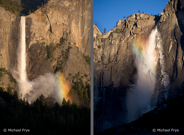 Two examples of off-center vertical compositions: Bridalveil Fall on the left is balanced by the rainbow on the right; Upper Yosemite Fall “faces” left, so it seems natural to place it slightly right of center





Trackbacks/Pingbacks