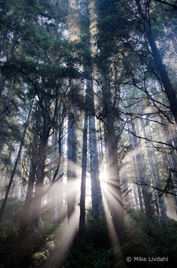
“Forest Sunrise #1 – Olympic National Park” by Mike Livdahl
This week’s photograph was made by Mike Livdahl in Olympic National Park, Washington. By having his image chosen for this critique Mike will receive a free 16×20 matted print from Aspen Creek Photo. If you’d like your images considered for future critiques you can upload them to the Flickr group I created for this purpose.
The most striking thing about this photograph is the fantastic light, with sunbeams radiating through the mist from behind tall trees. Light is the essence of photography. When we press the shutter we’re not recording objects, we’re capturing light. Often great light is enough to make a great photograph, even if the subject isn’t that interesting. These trees are nice, but without those sunbeams this would be a rather ordinary scene.
The exposure for such strong backlight can be tricky, but Mike handled it well. We see detail in all but the darkest parts of the tree trunks, yet the only the very brightest highlights are blown out. This is one of those rare instances where it’s okay to have some small washed-out areas in the photo, because this is something we would see in real life: looking at this scene the sun and adjacent sky would be blinding, and we wouldn’t expect to see detail in those areas in a photograph.
Mike said that he “exposed hoping to keep some life in the shadows.” As a result, he had to (in Lightroom) “damp the highlights pretty heavily, Recovery pushed to +81 and Brightness dropped to +29.” I guess that’s testimony to how much hidden detail can reside in seemingly overexposed highlights in Raw files. But if I were photographing this scene I’d keep my options open by bracketing exposures, allowing me to blend two or more images together later if necessary.
While the light in this photograph is exceptional, even great light could be ruined by a poor composition. Fortunately it wasn’t. The composition is clean and simple, with a strong focal point, the sunbeams, and some nice repetition created by the lines of the tree trunks. Mike chose a vertical orientation to emphasize the height of the trees. The sunbeams are centered from left to right, a configuration that works well in most vertical compositions (see my post about Sideways Photography).
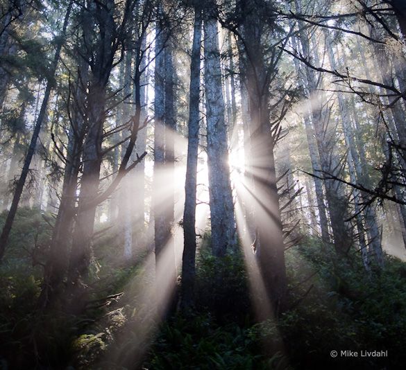
That vertical orientation, however, with the sunbeams near the bottom of the frame, leaves a lot of space in the top half of the photo. The bottom part of the image is clearly the most eye-catching area, and I always think it’s best to fill the frame with the most interesting stuff. There seems to be a natural horizontal composition here, including only the areas around the sunbeams:
I think this tighter, horizontal framing has more impact, but it doesn’t convey the trees’ height, and loses some sense of place as well. So it’s a tradeoff. Which version do you prefer? Post a comment to share your thoughts on this.
Mike said that he handheld this photograph, leaning against a tree, at 1/15th sec. and 5.6 with an ISO of 400. Since this shutter speed resulted in a slightly soft photo, he added extra sharpening in Lightroom. In a larger view some of the closest branches are a bit soft, indicating that the wide f/5.6 aperture wasn’t enough to keep everything in focus. Obviously a tripod would have been a good idea here—it would have prevented camera movement while allowing a smaller aperture with more depth of field.
The post-processing looks well done; the white balance looks right, and the heavy use of the Recovery tool created a perfect range of contrast—small areas of black, small areas of white, with a full range of tones in between.
Overall this is well done—beautiful light composed well.
Thanks Mike for sharing your image! You can see more his work on Flickr.
If you like these critiques, share them with a friend! Email this article, or click on one of the buttons below to post it on Facebook or Twitter.
As part of being chosen for this week’s critique Mike will receive a free 16×20 matted print courtesy of the folks at Aspen Creek Photo. If you’d like your images considered for future critiques, just upload them to the Flickr group I created for this purpose. If you’re not a Flickr member yet, joining is free and easy. You’ll have to read and accept the rules for the group before adding images, and please, no more than five photos per person per week. I’ll be posting the next critique in two weeks. Thanks for participating!


Trackbacks/Pingbacks