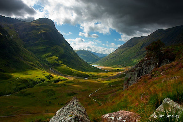
This week’s photograph was made by Tim Smalley near Kinlochleven, Scotland. By having his image chosen for this critique Tim will receive a free 16×20 matted print from Aspen Creek Photo. If you’d like your images considered for future critiques you can upload them to the Flickr group I created for this purpose.
The first thing that grabbed me about this photograph is the wonderful light. The dappled sunshine, rich colors, and strong contrast create a powerful mood. It looks like a scene from Lord of the Rings; I could imagine winged Nazgûl swooping down over the valley.
Tim said that “There was a certain emotion that I wanted to express” about Glen Coe. “The weather is often quite mixed . . . and there can be some phenomenal light, even during the day as the sun breaks through parting clouds.”
I think he succeeded quite well in capturing that emotion, and when your image communicates any kind of feeling you’ve done your job as a photographer.
The composition has a nice overall design. I especially like the broad V of created by the ridgelines, and the snaking line of the road or path through the valley. But those foreground rocks bother me. The distant scene is wonderful, yet the rocks pull my attention away from that, and, in the case of the left-hand rock, even block part of the view. I probably would have stepped forward, or even stood on top of the rocks, to get a clearer view of the background.
Tim, however, liked these rocks. He said, “I chose this particular composition because of the rocks in the foreground—in actual fact, they were what drew me into it despite the stunning scenery in the background. I think they mimic the scene behind them quite well and create a sense of harmony.”
Two weeks ago I talked about foregrounds in another context. I won’t repeat all that here, but will reiterate that I think a foreground needs to add something to the photograph, and mesh with the background, to justify including it. From his words, it seems that Tim was thinking about those things when he composed this image, but this is where photography gets subjective; what seems harmonious to one person can be distracting to another.
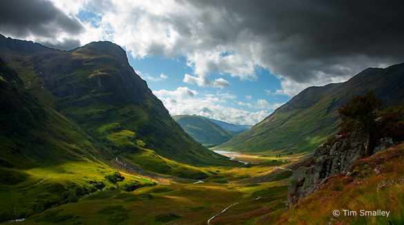
Version A, eliminating the rocks and trimming the right edge
I can’t show you what this scene would have looked like had the camera been moved forward, but here are a couple of crops showing alternatives. In Version A, above, I eliminated the rocks entirely, and also cropped a little off the right edge, as there seems to be a bit of extra space there. This edition is simpler, but is missing part of that path near the bottom of the frame, which obviously could have been included if the camera were moved forward. The second crop, Version B, includes two of the rocks, but in a square frame. It seems like the most interesting parts of the background are in the center of the photograph, suggesting a vertical orientation, but I can only hint at what this might have looked like here, as I would like to have included more space at the top and, especially, the bottom.
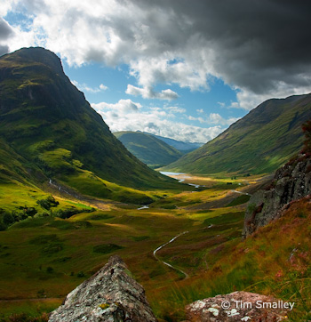
Version B, with a vertical/square format
Which brings up another issue about the rocks: they’re half-in, half-out of the frame. Placing prominent objects along the edge of the frame can often be problematic. Viewers are often left wishing, even subconsciously, that they could see the rest of those things. Sometimes you can get away with cutting objects in half if they’re balanced by other things that are cut in half too; in other words if the half-a-rock at the bottom of the frame were balanced with half-a-mountain at the top. Of course in this instance cutting off the tops of the mountains would eliminate those great clouds, so I’m not recommending that, but pointing out the problems associated with placing prominent objects along the edge of the frame. In this instance I think we need to see all of those rocks or none of them. At least that’s the way it feels to me; you never know until you actually see it.
Another issue with these foreground rocks is that they don’t line up well with the background, and they’re not balanced. The right-hand stone is stuck in the corner, while there’s plenty of space between the left edge of the frame and the left-hand rock. By taking a step to the right Tim could have balanced their placement and lined them up with the background: left-hand rock with that peak, middle rock with the valley, and right-hand rock with, vaguely, the right-hand ridge.
I wanted to show you what that might have looked like, so I took the image into Photoshop and, well, just moved the rocks to the left! Some quick and dirty cloning cleaned things up. The result, Version C below, is a bit crude, but shows what might have happened with a slightly different camera position. To me the whole balance and rhythm of the composition now feels much better.
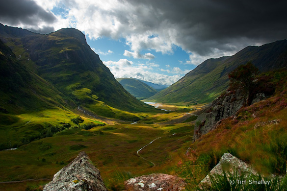
Version C, crudely Photoshopped to line the rocks up with the background
As always, I’d love to hear your thoughts about these rocks and the variations presented here.
Tim used two graduated neutral-density filters (one-stop and two-stop) to balance the bright clouds with the shaded foreground. He said he “wasn’t particularly impressed” by his first effort to process the image, but tried again eight months later, this time adjusting the single original Raw file several different ways for the sky, foreground, middle ground, and background, then blending the resulting images together manually in Photoshop.
Tim said that, “In hindsight, I might have decided to make a number of exposures and manually blend them.” That probably would have been simpler, but while the path he took was convoluted, the end result works. The photograph has just the right amount of contrast to convey the drama of the scene, with small amounts of pure black and pure white, and a rich range of tones in between. The final result looks natural, which can be difficult to do when juggling graduated filters and blending images.
One small issue is that, when viewed larger, there’s a noticeable halo along the ridge lines. This was probably the result of oversharpening when creating the JPEG image for the web. Otherwise the technique looks solid. A small aperture, f/16, kept everything in focus. I might quibble with the fuzzy grasses in the foreground, but Tim said he deliberately let those blur to capture the motion. In any case it would have been difficult to freeze that motion on a windy day yet use a small aperture to keep everything in focus.
Despite my issues with those foreground rocks, I love the mood of this image, and think Tim did a great job in taking a high-contrast scene and processing it into a realistic photograph with a well-balanced tonal range.
Thanks Tim for sharing your image! You can see more his work on Flickr.
If you like these critiques, share them with a friend! Email this article, or click on one of the buttons below to post it on Facebook or Twitter.
As part of being chosen for this week’s critique Tim will receive a free 16×20 matted print courtesy of the folks at Aspen Creek Photo. If you’d like your images considered for future critiques, just upload them to the Flickr group I created for this purpose. If you’re not a Flickr member yet, joining is free and easy. You’ll have to read and accept the rules for the group before adding images, and please, no more than five photos per person per week. I’ll be posting the next critique in two weeks. Thanks for participating!



What a fantastic photo,I’ve been there 3 times on holydays, I wish I could have this as wallpaper in my house! I’m simply in love with Scotland,hope to go there next year again! Greetings from the Netherlands, Jean.
Glad you like this one Jean.