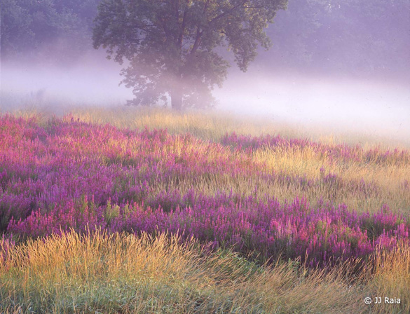
This week’s photograph was made by J.J. Raia at Troy Meadows, Green Acres, New Jersey. By having his image chosen for this critique J.J. will receive a free 16×20 matted print from Aspen Creek Photo. If you’d like your images considered for future critiques you can upload them to the Flickr group I created for this purpose.
Before I get to the critique, I’d like to once again thank all of you who have submitted photographs for this series. There are many outstanding images in the collection, and I wish I could write about all of them!
For these critiques I usually pick photographs that are good, but could be improved in some way. Discussing those potential changes often provides valuable lessons, or good points for discussion. But I chose this image not for its imperfections—it has only very minor ones—but just because I like it. Sometimes it can be helpful to figure out why a good photograph works.
Before we go further, take a moment to look at this image and define some of the elements that make it work in your mind. Or, if you think something doesn’t work, see if you can figure out why.
To me, there are several key ingredients that make this photograph successful. First, the purple flowers, gold grasses, and subtle green hues create a pleasing overall color palette. Next, the low-angle light, raking across the meadow from behind and to the right, highlights the textures and patterns of the meadow. And then there’s that fog. The combination of color, light, and weather create a sunny, optimistic mood. It’s morning in America! Or at least in New Jersey.
Of course it’s no secret that great color, light, and weather can produce wonderful landscape photographs. But if you’re lucky enough to find those elements, you still have to frame them well. This composition is simple and clean; we see meadow and tree, and not much else. The tree provides a nice focal point, something for the eyes to latch onto before exploring the colors and textures. The layers of gold and purple, along with the band of the fog, add repetition (our brains love repeating patterns), and a certain visual coherence that helps hold everything together.
J.J told me that he deliberately cut off the top of the tree to avoid including bright, distracting patches of sky above. I agree with this choice. Including the sky would have drawn attention away from more interesting things below. And I don’t miss the top of the tree; we see enough of it to get a sense of its shape, and for it to serve its purpose as a focal point.
It can be tricky to cut off parts of important objects like this. If you do, make sure it looks deliberate. If you trim just the tip of a tree, or a person’s feet, or the corner of a building, it looks accidental—like you weren’t paying attention when you composed the picture (which you probably weren’t!). If you’re going to chop something, chop enough to make it look intentional.
A couple more notes about the composition; J.J. used a telephoto lens—210mm on medium-format film (Velvia 50 with a Mamiya 645). The long lens helped to narrow the field of view and frame only the most essential elements, and also compressed the space, creating the layered patterns in the meadow, and emphasizing the juxtaposition between the flowers and tree.
Also, J.J. told me that he tilted the camera to make the layers of grass and flowers slant diagonally across the frame. I would never have guessed; the tree looks straight, and it appears as if the meadow just slopes slightly from left to right. This is a small thing, but the diagonal lines help give the photograph more energy.
The photograph is technically well executed. The exposure looks perfect. Everything appears to be in focus, which can be difficult to do with a long lens raking across a field like this; the grasses at the bottom of the frame are much closer to the camera than the trees in the distance. J.J. said that he used a small aperture, f/22, and focused carefully using the depth-of-field scale on his lens.
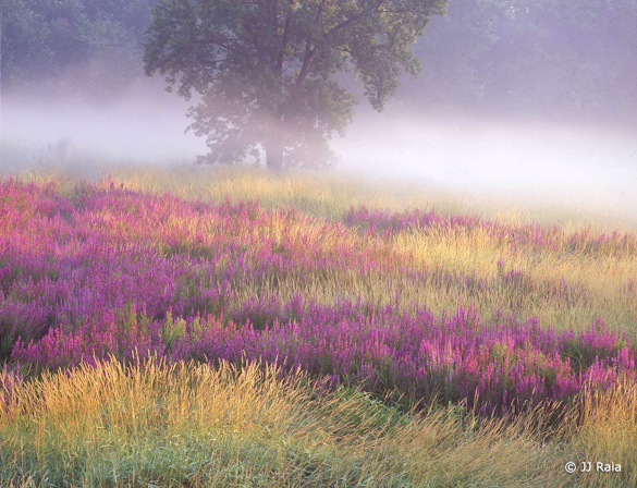
This was captured on film, so the image was obviously scanned (with an Epson 2450 scanner). JJ then took the scan into Photoshop and made some minor adjustments. The overall contrast looks good.Viewed larger, I can see some dust spots in the mist—an easy, if tedious, thing to fix in Photoshop or Lightroom. The only other problem I see is that the color balance looks a bit too magenta. While that magenta tint might help boost the color of the flowers, it makes the trees look somewhat purple. In this next version I took the image into Lightroom and pushed the Tint slider to left (-23) to remove the color cast, then restored the saturation and hue of the flowers with the HSL panel (Magenta Hue -27; Magenta Saturation +17). The same thing could be done in Photoshop by using a Color Balance or Curves adjustment layer to correct the overall magenta cast, then adding a Hue/Saturation adjustment layer to tweak the color of the flowers.
There’s one more story about this photograph that you might find interesting. J.J. told me that he spotted this field of flowers while driving his daughter to camp one year. He thought the sun would rise at a good angle to sidelight the scene, so he came back a day or two later and made a vertical composition. He returned again the following year, found more flowers and more mist, and made this horizontal composition.
This illustrates how important anticipation and planning are to landscape photography. It’s rare to stumble upon a great subject when the light and weather are perfect. You need imagination to visualize how a scene might look with different light, and knowledge of sun movements and weather patterns to figure out when to come back. Of course some luck helps, but so does persistence. J.J. made a very nice photograph one year, came back again a year later and made, I think, an even better one.
So back to my original question: What are the elements that make this work in your mind? (Did I miss anything?) Or is there something you think doesn’t work about this photograph? Please let me know in the comments!
Thanks J.J. for sharing your image! Be sure to check out more of his outstanding work on Flickr.
If you like these critiques, share them with a friend! Email this article, or click on one of the buttons below to post it on Facebook or Twitter.
As part of being chosen for this week’s critique J.J. will receive a free 16×20 matted print courtesy of the folks at Aspen Creek Photo. If you’d like your images considered for future critiques, just upload them to the Flickr group I created for this purpose. If you’re not a Flickr member yet, joining is free and easy. You’ll have to read and accept the rules for the group before adding images, and please, no more than five photos per person per week. I’ll be posting the next critique in two weeks. Thanks for participating!


Trackbacks/Pingbacks