On Wednesday morning Claudia and I woke early and headed up to Yosemite Valley. The sky was overcast, although the sun threatened to break through at times. After recording footage for a video I’m working on (more about that later), we decided to drive up the Wawona Road to look at dogwoods. As we ascended, we drove into the clouds, and into a patch of fog clinging to an area of burned trees.
As I photographed this area, the fog thickened, and I thought a group of dogwoods lower down might have become enveloped in the mist. Sure enough, they had, which made me happy. What could be better than dogwoods in mist? I spent a couple of hours composing photographs.
Although conditions were great, this area has thick undergrowth, and many potential images were ruined by intervening branches. The best views were often from the road, but the lack of shoulders and heavy RV and bus traffic made this hazardous duty. Nevertheless I was able to find several compositions I liked.
New images are difficult to edit. It’s usually easier to recognize the winners after some time has passed. But this blog gives me an extra tool—I can ask for help! So let me know which of these photographs is your favorite.

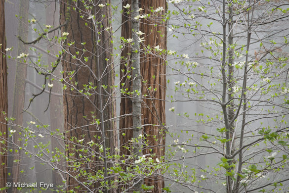
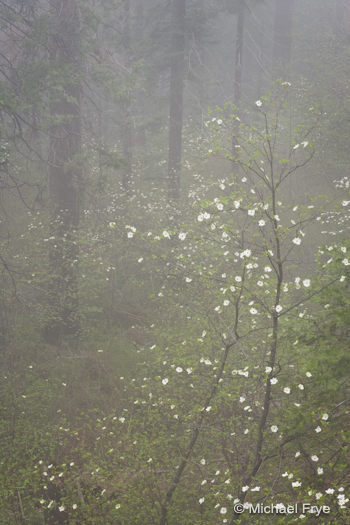
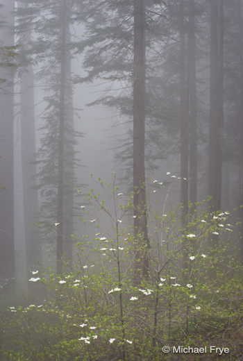


I prefer C (Dogwood and Firs). It’s a clean composition with mostly vertical lines. Being able to see into the foggy distance between the trees presents the setting well. A (Dogwood, Pine and Cedar) is my least favorite due to too many distracting and overlapping elements.
I like C. I would add a few leaves to the tips of the center branch to make it more flowing. if you follow the leaves, it has a nice flow to the center then it is a dead area. My .02
I like A. Love the contrast in textures and how the larger trees in back almost feel like sentinels.
I am voting for B although I agree with Kieth about C which is almost my choice.
I like C,,,I am not a photographer,,but it looks pretty,withe the mist and trees,,mysterious.
A is the one that caught my eye right off. I really like how this shot is up close, and the trees in the background add a bit of texture to the shot as a whole. The mist in the background gives the shot an even light and makes the greens and whites stand out. Over all I feel this is your best shot out of the three.
I prefer version A. What appeals to me is the texture on the bark on the 2 trees, the bold parallel lines created by the trees and finally the fact the flowers stand out the most.
I’d go with C. A seems too busy and I have a hard time figuring out where to look in B.
My vote goes for C as well, beautiful and simple.
C is the one I’m drawn to. I like how it is balanced.
I’d have to go with B. I like the feeling the depth here and the abundance of dogwood blossoms. The photo has a very lyrical quality to it. I would crop out a little of the right edge though to remove distracting blossoms.
C) the fog is more apparent. Our eyes start at the dogwood and then are forced back to the firs and then from the firs we can drift back to infinity with the fog. C is definitely my choice.
B I like the depth of the rich tapestry of dogwood blossoms and the diagonal line of the trees disappearing into the mysterious unknown.
A for me. The dogwoods are more central to the composition. I’d crop a little off the left to get rid of the edge of the tree poking in.
C is my pick. I am drawn to the levels and the repetition of the vertical tree trunks. My eye starts low and is drawn upward into the mist.
I like all of them. In picture, A I like the texture and how the pine and cedar mirror the smaller trees in front of them. Photo B has great composition with the curves of the dogwood, yet the dogwood seems to recede into the background. C seems to have the right balance of lighting, but I find myself jumping back and forth from the dogwood to the tall trees. Hard to choose!
Wow, kinda tough, but I choose B. The more you look at it, the more you see. At first I just saw the tall dogwoods in the foreground, but upon second look (like seeing through the mist) I noticed all the dogwoods in the background dispersed among the pines! Lovely!
They all look great but I like C the best by quite a large margin! I love the vertical crop and it creates the best, for lack of a better word, “spooky” mood, that fog gives, and the long lines of the Fir trees give such great leading lines to the comp…
I got excited when I saw the first shot as the email came up. Then my eyes started fighting with the Cedar in front of the Redwood vs. the gap of nearly the same color between the two redwoods. “Is that a gap and a tree or is it two trees?” It took a quick second to resolve, but by then I became distracted enough to move on to the next shot.
Shot #2 is also nice but in this one I was fighting with the different directions created by the Dogwoods main trunks and the limbs coming in from the left against the redwoods in the background. They all seem to be fighting for my attention.
Shot #3 Now here we have something very nice. The redwoods in the back ground, standing majestic there in the back, seem to be observing the young Dogwoods playing in the foreground. The contrast between age (redwoods) and youth (dogwoods) as well as dark (redwoods) and light (dogwoods) giving an interesting study that kept me in the shot. This all leads to wisdom (redwoods) and the untamed (dogwoods). Very nice. A description of life in all forms.
Have fun with it. And thanks for the opportunity, that was actually quite fun.
Wow – thanks for all your comments and votes! Seems like C is the most popular choice so far, but we have some strong advocates for A and B as well.
I like C the best. I could get lost in any of them, though.
Definitely C !!!! Very Nice!
I have to agree that C is the most pleasing to the eye. It is very well balanced between the firs and the dogwood. The eye can take in the entire scene at once without studying the image!
I liked C the best.
By comparison, A looked a bit too conventional and B a bit too indistinct.
C has a nice ethereal look to it, with strong lines and a balanced composition.
I vote for the right two-thirds of image A. Can I do that? I look forward to seeing you again at the Hidden Yosemite workshop.
I like (B) becuase it has lots more flowers in the background like it’s leaving a trail in the woods…
Definitely C Michael… I really like your POV, composition and depth.. It just shows more of the environment, which I like. The other two are a little more creative, showing more of the dogwoods than the overall environment, which is nice, but for me, I like C the best. 🙂 Thanks for sharing.
A gets my vote, it moved me the most and is a powerful visual statement.
WOW it’s a hard decision – A would be my choice if the tiny bit of tree wasn’t there in the LH margin – it says quintessential dogwoods in the undisturbed forest. C is very simple yet shows softness of the dogwoods against the stong vertical lines of the mysterious trees in the distant mist. Well always they are great!
Always tough to choose, Michael. I’m fond of the concept of A and the depth created by the contrast between the closer and more defined flowers and trees and the detail fading into the fog beyond. That said, all three have potential.
I love fog – wish I had been there!
Dan
Michael: I liked all of the pics, but the top one (A) is best for me. I like the delicate blooms and the low-key quality of the image. I’m a big fan of textures, and the closer shot really reveals that. (P.S. I go by my middle name “Dale,” so I’ll be signing future replies as Dale. Hope I haven’t confused you.
I prefer A – I like the contrasts. I kind of get lost in B and C, although I wish I were talented enough to have captured any of the three shots.
I hate to jump on the bandwagon but I like C as well. I wonder what A would have looked like with a wider aperture or if the center dogwood brancn was between the pine trees. It is a bit busy as it stands.
First let me say it is hard to evaluate small jpegs on an LCD display (even a color calibrated one); especially since all three images have lots of fine detail that only a print would highlight.
For me C is a “classical” dogwoods in a foggy forest scene. Perhaps the image would have been stronger with more blooms. The undergrowth in the lower right is distracting and there seems to be a lot of empty space between the dogwoods and firs.
A is a wonderful image! Compositionally very nice with lots of different interesting textures. I like the way the two large firs or pines have different bark textures but tonally similar and the two small saplings in front (with their horizontal branching as a nice contrast to the vertical nature of the overall image). My only visual distraction is the large vertical trunk just poking in on the left side of the image. I would probably crop it out (but not so much as to remove the tilted fir behind it just to the right).
B also has a great deal of interest. I like the two foreground dogwoods bent trunks contrast nicely with the fir branches in the upper left of the image. It is as if the dogwoods are “calling in” the branches of the forest canopy. And overall the image has great depth from foreground highlights to deep shadows into the forest with the dogwoods seeming to be “fairy like” throughout the forest. This is perhaps my favorite of the three.
I’d like to see prints of all three to really decide!
Thanks for sharing!
I like “C” because it highlights the dogwoods while being presented on an interesting pallette. I thought both of the other photos had a busier backgrounf that took away the dramatic effect that dogwoods have in the woods.
“A” grabbed my attention the most and I especially like the way it seems to pull you in to a mid-point in the frame before going to mist/fog. The contrast between the spidery dogwood and the bold redwood and cedar was also something that kept drawing me back to it over the others.
I like all of them. Depends on what you as the artist wants the viewer to see. My eye goes to bright tree in background in A, the dogwood in B, and the foggy trees in background in C. Nice shots as always; thanks for sharing them.
I like (A). Closer shot of the Dogwood and the Firs right behind. My attention stay with the subject and does not get lost into the shot unless I want to get lost . If you know what I mean.
Hmm, Michael, you’ve posed a hard question here! Bearing in mind that I’ve never actually seen Dogwoods, their photographic appeal is obvious. I, for one, would be very happy if I’d taken all or any of the above images.
My first choice is A. I am especially drawn to this image because I feel as if I am right there, a part of the scene. I am struck by the contrast between the texture, strength, ‘disciplined’ and powerfully compact verticals of the background trees against the slender elegance and slightly abandoned simplicity of the Dogwoods. The light is beautifully subtle. We see clarity in the foreground, mystery in the mist of the background. The tonal range, to my eye, is exquisite. All are beautifully exposed and framed, but I especially like the landscape composition of A, the feeling that I can almost reach out and touch what I see.
My second choice, along with many others, is C, a more detached and contemplative view, one that I could gaze at for a long time; one that (rather than feeling that I am there) invites me to the edges of another, faraway place.
B is my third choice. I think the Dogwoods need something to separate them just a little more from the background, perhaps a touch more contrast, or a smidgeon of light-shaping? I think B suffers a little by comparison with A and C; might it not stand better on its own, in its own right?
Warmest wishes to you and Claudia, as always 🙂
Thank you for sharing, for enriching our lives and taking us deeper photographically.
I prefer A. I like the contrast between the newly leafed out dogwoods and the bark of the fir trees.
I’m pushing for C, though it should be an easy edit since it’s nearly perfect now.
‘A’ is my choice. I agree with Rich Miller, the textures make the shot for me. The delicate dogwood blossoms and new leaves contrasted with the sturdy, mature, rough “pine and cedar” trunks is really cool. The mist gives a great background, eliminating any distractions from background brush, like it is painted on a canvas.
Thanks very much everyone! It’s great to hear your thoughts about these. C continues to be the most popular, but it’s not universal.
I love the third photo. I love photos that have mist in them. They have a mysterious feel to them. Robert Frost said it best: “The woods are lovely darki and deep, but I have promises to keep. Thanks for sharing the beauty of the forest. Debbie Sladen
I appreciate reading all the insightful comments here. It is hard to judge which is the better image, not only because, as Michael T said, the size is small, but it is also so subjective.
When I look at Michael’s work so many factors go into which image stands out for me. Not only am I comparing the day’s take to what he has produced before, on this particular day, I was there with him peering into the beautiful tangle of trees and foliage also trying to figure out where the perfect image was. Hard for me not to love all of them equally because I know how hard he worked to find the right composition.
When I first looked at the images after returning home, B stood out for me. I had the same take on the image that Ida, Charlotte, Bentchick, and Michael T did.
As I read through all of these great comments, I find myself going back and forth finding new reasons to look deeper into each image. While C is easy to love, A makes me work a little harder. I was put off by the two awkward branches on the left. Now they seem to balance the branches on the right. I don’t mind the tree on the left and find the bold contrast of heaviness and light appealing.
Interesting how first impressions change with time, and input!
All are nice images, but my instinctive favorite is C. I love the feeling of the fog/mist in the trees with the dogwood highlights in the foreground–creates a feeling of mystery and a nice contrast. My least favorite is B. A is nice and reminds me in some ways of your dogwoods along the Merced.
Lovely stuff Michael – it’s a close call between A and C for me. As an alien to these landscapes I’m most drawn to the shapes and textures in these two because they tell me so much about the feel of the forest. I like B too but the composition dominated by dogwoods and the lower contrast make it less appealing in comparison.
Michael,
I’m going counter to all thus posted and say I don’t like any of these. Yes, if I had to pick from just these, C would get my vote. The fog and the trees are powerful but the introduction of a small tree in the foreground not in full bloom serves as a detraction rather than compliment power and mystery of the image you captured behind it. I was in YNP early May and truly enjoyed your images in the Ansel Adams Gallery. They constitute a very nice set and are beautifully arranged. I found them very inspirational for my work in the park that week.
I like c the best
At first C was my first choice. After going back and back and back again, B really draws me into the scene and “speaks” to me. So my final answer is B – “Misty Forest with Dogwoods”
Wow, well I am easy, I like them all! A is good with the big trees right in it, but the mist becomes more progressive with each one, B is good, I think C is the best as its got more mist. They are all different in their own rights. From my very unProfessional eye I think I would choose C since it show mist more, its so soft and ethereal, but looking again I also like A. I think this would make a great grouping of all three….the different faces of dogwood in mist….. and thats my definate choice!!!! A, C, then B.
I’ve enjoyed reading all the comments here Michael but it has made me realize how little I consider before pressing the shutter and made me think that I’d be very reluctant to ask for feedback like this as the list of things that I never considered before pressing the shutter would be a mile long. As a very young boy at school the teacher filled the blackboard with my spelling mistakes, I guess to make an example of me in front of the rest of the class. I’d be in the same position with any of my photos!
My choice would be C for very simple reasons, the dogwood stands out nicely and the fog is more evident than in the others which makes the trees fade, thus not competing for the eyes attention. A is my second choice above B which I feel doesn’t have anything that immediately grabs the attention. But what do I know!
I like “B”: curvy shapes of dogwoods in the forground that dissipate into the background where they are embraced by moody furs…
Make it work perfectly together…
By far, I prefer image C. Dogwood in front is visually separated from the background firs and the firs. The firs seem to march in progression to the background with several receding planes of ever more deeply shrouded in fog trees. Heavy fog in the background really helps keep the image simple by obscuring what might otherwise be a busy background and this, in turn, helps that separation of the foreground dogwood.
For me it’s a toss-up between “A” and “C”. What I like about “A” is the clarity of the trees in the foreground, with the misty fog in the background. OTOH, “C” has an overall foggy look, almost mystical. However I’d prefer to crop “C” to remove the branch tips sticking in from the left.
“A” over “C”. Dogwood photos tend to feel like there’s too much going on to begin with and finding a clean composition is difficult, even impossible. That being said, I enjoy the layers in “A”. First, there’s the clarity of the dogwoods and bark with the center dogwoods centered on the tree bark. Then there’s the two variations of bark pattern of the center trees. Next, the tree just barely on the left provide a virtual frame for the left of the picture. My eyes then follow into the background fog and the trees in the distance. Sometimes there’s too much fog in a picture and it mutes everything to the point I feel like I’m squinting at a photograph. That’s the feeling I have with “C”.
I might even go as far as to say “C” would make an excellent photo without the dogwoods. This goes back to my original thoughts that dogwoods are usually “messy” and tend to clutter up an image.
I like C best. I would also like A if the dogwood trees weren’t directly in front of the redwood. B is my second choice.
Michael,
Glad you and your blog are back. We missed you while you were in Utah. I try to go into the park every week (I live in Oakhurst). Each week, season, day is different. Always something
“on” – snow, clearing storms, high water, dogwoods, big waterfalls, reflections. I enjoy reading
your blog beforehand just to know what you are noticing.
Then I get to see your photographs, made the same day I was there. I marvel at the beauty of what you found and captured. Always an inspiration to me.
Welcome back!
Kent
A. I think B might be interesting in parts but there’s no real “center” there. If you crop towards the “negative” space in lower left or upper center (hard to describe this) it gets more interesting, I think. In C I think the dogwoods distract/conflict with the really nice misty forest, and something about the leaves at the bottom and lower right seems distracting. It might be stronger to knock a little off the bottom and right. A at first glance seems to busy, but I like it. And I know you can/will tweak it a little to make it better 🙂
Just my .02
-eric
I can’t really decide either. 🙂 I like them all, but I think I prefer B because it reminds me of a Klimt painting.
I think A hands down. The colour contrast between fog and foreground is striking, you get texture in the trees, and then the splash of white (with detail) on the dogwood. The lines of the tree trunks are strong and draw you in, and then you wander around the fame.
C
While C feels most representative of how Dogwoods appear in the forest I think I would like this better if there were more flowers on the tree.
B feels a little off balance to me.
And A is my choice. I like the frame of the cedars in the background, along with another frame of the fog.
I’m new to your blog, and I am currently enrolled in a distance photography course, so I think I’m going to learn a lot from you. Thank you for posting.
I’ve always found that taking photos of dogwoods is challenging. While very often pleasing to the eye something seems to get lost when you takes shots from a distance. That’s why, out of these three, I would choose #1, it’s the most up close. #3 is also very good but the tall trees tend to draw your eyes upwards.
One way to get a little more ‘dogwood’ in the picture is to get to a higher elevation and shoot downward. From this angle you can see the round shape of the blooms better and that helps them standout more. I prefer to shoot dogwoods in focus in the foreground and blur out the background. Also, here in the northeast we have many more blooms than these. It’s easier to make the blooms the dominant feature in the photo.
I had trouble deciding between B and C, and finally narrow it down to B.
I didn’t like A as much, as it seemed to busy, and lacked a focal point. C was much better, but the Dogwood in the foreground looks cut off; thus leading my final choice to be photo B.
With that said, my preference would be to have a little more contrast in both photos B and C. It’s a tough call, as more contrast would make the trees in the background stand out too much, but I’d like to have more contrast, or pop (just a little), with the Dogwood in the front.
Oh drat. I’m a little late to this party. 🙂
I like C for the overall sense of a foggy morning. The pine tree trunks in the background make for some nice solid vertical lines, which I think help ground the shot.
I also like A for the nice vertical lines the pines make in back of the dogwood. The fog seems more subtle in this one.
Well thanks again everyone! I really appreciate your comments. Unfortunately with this kind of volume I can’t reply to every one, but I’ve certainly read them all. It’s great to get the “votes,” and especially the more detailed analysis of why you like or don’t like something. I think that’s helpful in your own photography as well – in other words, if you can articulate what you like or don’t like about someone else’s images, you’ll be better able to do that with your own, which helps with editing, and gives you clues about how to improve.
I love the effect of the misty background in this photo!
Thanks Shirley!