The critiques are back! With my trip to Utah, and then having to restore the blog, it’s been awhile, but I’m happy to be able to present another photo critique this week, and I hope it won’t be so long until the next one. Thanks for your patience!
Light
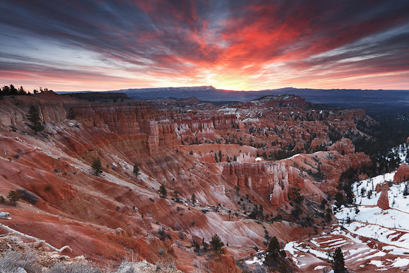
This week’s photograph was made by Raymond in Bryce Canyon National Park, Utah. Perhaps the most striking feature of this image is the colorful sky, with clouds appearing to radiate out from the sun just before it clears the horizon. The warm hues of the red-orange clouds, along with the rusty rocks, form a nice color contrast with the cool blues of the sky and distant mountains.
Composition
What I like most about this composition is how the foreground and background complement each other. Those radiating lines in the clouds are subtly echoed by the folds in the landscape below.
Raymond said, “I found the scene to have many things going on—the snow, the hoodoos, the colored bands across the canyon sides, the ridges running down the sides, etc. In circumstances like that I find it difficult to feel “sure” of how the elements are arranged. I basically placed the horizon at the one-third point and placed the sun at the left/right midpoint. With my fingers crossed, I was hoping the colored bands would help lead the eye into the distance and the canyon’s bowl-like shape to cradle the elements of the scene.”
While there are “many things going on” here, the overall design is simple, and holds everything together. The colored bands do indeed lead the eye into the distance, and the canyon’s shape does “cradle” the elements of the scene, and better yet, echoes the shape of the clouds. Centering the sun was the perfect choice, as this emphasizes that radiating pattern in the sky.
But those colorful clouds are the most interesting part of the photograph, and I think they deserve more space. Plus the lines in the sky would be stronger, and echo the foreground more, if they were longer. I don’t think you’d want to split the photograph in half—centering the horizon rarely works unless you’re photographing a reflection—but I think a 60/40 division (60 percent land, 40 percent sky) would have been better.
Simply pointing the camera upward with the same focal length lens wouldn’t have worked, as that would have cut off important V-shaped lines near the bottom of the frame. But Raymond’s 10-22mm lens wasn’t quite zoomed out all the way—it was at 12mm—so he could have pulled back to 10mm, kept the bottom edge of the photo the same, and let the wider lens encompass more sky.
Technical Considerations
Raymond used a Canon Rebel XSi, 10-22mm lens, and an exposure of 5 seconds at f/16, 100 ISO. He used a 3-stop reverse graduated-neutral density filter to to darken the sun and sky.
The overall exposure looks good. The graduated filter did a decent job of balancing the contrast between the sky and foreground, and the result looks fairly natural, although an experienced viewer would know that something was done, because normally the sky would be much brighter than the landscape in a situation like this. But the contrast here was extreme, and it would be difficult to make this look completely natural no matter what you did.
I think, though, that the graduated filter darkened the top edge of the sky too much—that part of the photo does seem a bit unnatural. It would help to lighten that edge and the top corners.
Raymond said, “In processing, I removed some sensor noise and dust spots, then did the usual color, saturation, and contrast adjustment, as well as sharpening and spot removal. The 3-stop filter didn’t hold back the sun enough, so a bit of effort was spent on toning that area down with the burn tool. Finally, I darkened the image by a tad to my liking.”
Overall, the processing looks good. There’s enough contrast and saturation to give the image life, but it doesn’t look overdone. One small problem is that, when viewed larger, there’s a distinct halo along the distant ridge, probably the result of oversharpening. Also, the snow in the lower-right corner is too light—it pulls the eye out of the frame. Darkening this area would make it less distracting.
Conclusions
Raymond pulled off something all too rare in landscape photography—he used lines to tie a foreground and background together visually. The result is a coherent, dramatic image of an often-photographed national park. Technically this is well-executed, although a little less sharpening and some dodging and burning would improve the image.
Your Comments
I’d love to hear your thoughts about this photograph. Do you think the composition works overall? Would you also like to see a little more sky? When you first looked at the image, did it strike you as unnatural-looking, or did the blend between bright sky and darker landscape look fairly seamless?
Thanks Raymond for sharing your photograph! You can see more of his work on Flickr.
If you like these critiques, share them with a friend! Email this article, or click on one of the buttons below to post it on Facebook or Twitter.
As part of being chosen for this critique Raymond will receive a free 16×20 matted print courtesy of the folks at Aspen Creek Photo. If you’d like your images considered for future critiques, just upload them to the Flickr group I created for this purpose. If you’re not a Flickr member yet, joining is free and easy. You’ll have to read and accept the rules for the group before adding images, and please, no more than five photos per person per week. Thanks for participating!
—Michael Frye


It seems to me that struggling with filters, and then not quite getting the ideal balance, can be avoided by shooting multiple exposures and combining them in Photoshop to get exactly what you want.
I liked this photo because it immediately drew me in to the scene with its great color and compostition. I also would have liked more sky to be included in the shot. I understand that photo journalists would not approve, but I would use some content aware fill to add some sky.
Thanks Eric. I agree with you about the first point – I no longer use graduated filters, because I can do the same thing, with more control, in software, and without messing with those rather-tricky-to-use filters in the field. But the filter worked pretty well here.
As for the content-aware fill – sure, I have no problem with that, although I don’t think it would be a simple fix. Glad you also liked the color and composition!
Michael, I want to thank you very much for your extremely helpful critique. I completely agree with you (and Eric) regarding getting more of the sky in the frame. I can’t remember why I used 12mm instead of completely zooming back to 10mm. Maybe there was something I didn’t want in the frame, or maybe I was rushing and forgot to double check. That 60/40 split is a good suggestion – will definite try.
Thanks for mentioning the sharpening halo. It’s something I’ll have to pay more attention to.
Regarding the GND filters, I’m not quite ready to give them up yet. I don’t have enough confidence in my photo editing skills, but I’m learning and practicing.
I disagree with Eric’s second point but agree with his first.
The balance of land and sky is ideal, any more sky would not work for me.
Combining multiple exposures to control the white out of the sun would be the best way to fix this excellent image. This is a technique I use although I was considering investing in some high quality grad filters in order to cut down on this type of post processing work.
However if using grad’s still means I have to combine multiple exposures in Photoshop then I’ll probably save my money.
Great job, Raymond…especially with such a spectacular sky. Michael, thanks for another great critique. The suggestion of the 60/40 is a good one. There is a little bit of foreground element (the brush) in the lower left hand corner, that while not distracting, could easily be eliminated and not missed. Some of the bowl effect of the valley might be eliminated that way, though.
Sometimes I still need to blend a couple of exposures even when using grads, but I think it still cuts down on post processing work for me.
Hello,
Personally I would like to say two things:
1. I’m living in Brussels, Belgium in Europe and a couple of years ago I attended a ‘Photo Summit’ in Bryce. So, I know how the place looks like and I also know how beautiful, original an special those hoodoos are.
Why do I say this? Well, someone who has never been there cannot enjoy the beauty of those sculptures. They fade away in the landscape. All you see is ‘red rocks’. So, I definitely would have taken the same picture with the converging lines, with 1/3 sky BUT I would have used another lens; one where you can really see the hoodoos.
2. Michael is asking if the picure is unnatural-looking. When I saw the picture, the first thing that came up was ‘vignetting’ because of the dark upper corners. But then I looked at the two bottom corners and those looked ‘normal’. So, it had to be something else and indeed you used a filter.
I really wonder how this picture would look like in B&W ….
Great picture Raymond and fantastic analysis Michael.
Johan
Raymond, you’re welcome – glad you like the critique, and I appreciate your willingness to share the image and expose yourself to the slings and arrows… 🙂
Gavin, the idea of including more sky is mine, which Eric agreed with. Of course it’s all subjective! As for grad filters, there seems to be a division about this these days – not quite Canon vs. Nikon, but there are two camps. You can put me in the “prefer to do it in software” camp, as this gives me the most control, but I know there are many people who would rather use filters in the field to avoid the processing work later. Using grad filters would certainly cut down on this type of work later for you, but not eliminate it, as there are situations where the filters won’t work, or work as well. Plus you wouldn’t get the degree of control you get with doing it in software.
Vivienne, good point about the lower-left corner. I didn’t mention cropping that out because I felt that would cut off important lines down there. But perhaps darkening that corner would help.
Johan, thanks for your comments. Certainly a tighter composition, highlighting the hoodoos more, could work here too, although I like the lines here, as I mentioned. That tighter framing might work better with a vertical orientation. You have to be careful, though, when coming at a situation with a pre-conceived idea, like “I want to show the hoodoos.” This might work very well – or that pre-conception might prevent you from seeing the strongest composition. To me, the best compositions arise from thinking about lines and shapes – in other words, about the abstract design – than from thinking about the subject. Something to keep in mind… 🙂
I know this is a bit off-topic but what I’d love to see is a Grad VS ‘Photoshop Fake Grad’ article with comparison images. If I ever buy some grad filters I might do this, take an image with a well placed grad and then compare that to the same image with no grad filter but with the multiple exposure blending of photoshop.
Sometimes I find blending multiple exposures in Photoshop can look a bit unnatural, but then I guess using a grad could also look unnatural.
The main goal is recreate what your eyes witnessed on the scene.
Another thing to keep in mind is using the Graduated Filter Tool in Lightroom to bring down the exposure in the sky. Then use the HSL panel to adjust the Saturation and Lightness. Although this will not work for blown out skies, it can work wonders on many overexposed skies.
Gavin, this would be a great idea, and I might do it if I still owned any grad filters! So if you buy some, maybe this would be your baby. And yes, a grad can look unnatural too. One of the biggest difficulties in using grads is choosing the strength of the filter. You don’t want a filter that’s so strong that it makes, for example, a reflection lighter than the object being reflected – something you’d never see in real life. This can be hard to judge in the field.
Eric, good point about the Graduated Filter tool in Lightroom, although, as you point out, it has limits, and probably wouldn’t have worked in this photo because of the extreme contrast. But it’s a very useful too.
I agree Michael,
There are also other instances where I think a grad might be useless, for example shooting a horizon that has a large pointy rock coming from the bottom of the image right up into the sky.
I’m guessing this would give us a pointy rock which is dark at the top and normal at the bottom. Unless of course there are some magic properties of using a grad that still allow the light from the rock to somehow bypass the dark half of the grad, now that would be cool.
If I do finally bite the bullet and splurge on a grad or two I’ll put together an article and send you a link. Would love to see a similar article from a bunch of different photographers to compare notes.
Gavin, unfortunately there are no so magic properties of grad filters! And you point out another obvious limitation of these filters – they only work when the transition from light to dark in the scene has a fairly straight line.
I like the composition overall. I was immediately drawn to the snow in the lower right corner, which then took me out of the scene, so I agree with Michael to darken that area. And…learning from my own mistakes about making the foreground lighter than the sky, I would recommend slightly, and I mean just a little bit, darkening the cliffs in the foreground. I think it would help my eyes believe the scene more. Love the color in the sky!
To add to my response, maybe lightening the sky, as Michael suggested, would work equally as well as a slight darkening of the foreground…would have to see both ways to know for sure…
Kirk, it might indeed make the photo look more natural to lighten the rocks, or darken the sky (or just the top edge and corners), or both. But having tried this in Lightroom with this photo (we’re thinking along the same lines here), I have to say that it loses a little vitality when you darken those rocks. More natural, but less appealing. This is a common dilemma I think.
My only comment is that it appears to not be level, seems to need a very slight clockwise rotation. Might just be me though. Otherwise a very nice composition, especially the sun centered, which I wouldn’t have thought of but see that it works nicely here.
Andy, you may be right – hard to tell here where there’s no distinct horizon.
I agree with everything you said Michael about this photo your critic is spot on. What I like the best about this image is both the foreground and background color similarity that makes a unified whole. This may have been the best composition for this shot as only Raymond knows what the sky was like above where he chose to crop it. I am hoping Raymond took some other compositions as well, I would have tried making the sky the dominate feature in another composition. I have been to this location as well and have used both grad filters and multiple exposures. What worked for me in my “Sunrise at Sunrise Point” image was a combination of both. In this shot I used a 3-stop grad in combination with a -2, 0, +2 exposure and used HRD to blend them together into what I hope looks natural. What the grad filter got me in this case was the complete dynamic range with 3 frames verses have to take 5 or 7 to accomplish the same thing. And since my camera will only do a 3 frame auto-bracket I avoided having to manually adjust exposure and introduce the possibility of camera movement in the process.
Here the the link to the image I mentioned in my comment, http://www.gregclurephotography.com/utah/h29f8f89#h29f8f89
Thanks for your comments Greg. I agree that making a different composition, with the sky the dominant feature, would have been a good idea – certainly something I would have tried here. I face the same limitation of a 3-frame auto-bracket, but I found a workaround: bracket by two-stop intervals, then quickly change the base exposure by one stop, and do it again. This gives you six frames, each a stop apart, with a minimum amount of cloud movement between frames. You do have to use a solid tripod and be careful and not moving the camera when changing the exposure.