A Tale of Two Photographs
Reading David duChemin’s eBook A Deeper Frame got me thinking about how we perceive depth and space in photographs, and how lens choice affects that perception.
David says that because photography turns “a world of three dimensions into two,” that “if we aim to create photographs that create within the reader a deeper, fuller, longer experience, it falls to us to recreate that depth.”
There’s no question that wide-angle lenses are better tools for creating a sense of depth in a photograph than telephoto lenses. Telephotos make objects appear closer together than they really are, compressing space and flattening the perspective. Wide-angle lenses make objects appear farther apart than they really are, expanding the sense of space, and, if used correctly, creating an illusion of depth.
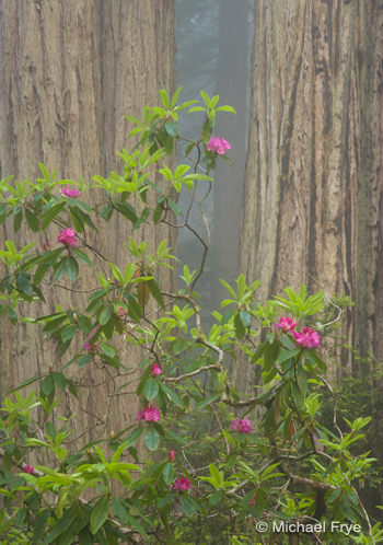
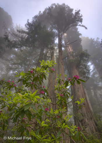
These two photographs from my recent trip to the redwoods illustrate the difference. Both images include the same rhododendrons and redwoods.
In the top image I stepped back with a telephoto lens (130mm) and isolated part of the bush against two redwood trunks. It looks like the rhododendrons are only a few feet in front of the trees, but they’re not. They’re at least 20 feet away—illustrating the compression effect of the telephoto lens. The sense of depth is minimal.
In the next photograph (left) I moved underneath the rhododendron bush and looked up. The focal length was 22mm, and here there’s a considerable sense of depth. What creates this illusion? First, there’s the size difference between the foreground and background. Even if you’ve never been to a redwood grove before, everyone knows that trees are bigger than flowers and leaves. Yet in the photograph the flowers and foreground leaves look relatively large compared to the trees. This gives us a visual cue that the rhododendron bush must be much closer to the camera than the redwoods. Second, the long, converging lines of the trunks, leading to an invisible vanishing point in the sky, create perspective, enhancing the illusion of depth, distance, and, in this case, height.
Which image is better? That’s hard to say. The wide-angle version certainly shows the height and size of the redwoods better. But the telephoto image is simpler, cleaner, and communicates the essential ideas—redwoods, rhododendrons, and fog—more directly. It even conveys some sense of place, although probably not as much as the wide-angle photograph.
Inclusion or Isolation?
David calls wider lenses “inclusive,” and telephotos “isolation lenses.” I think that sums things up pretty well, and points out the benefits and drawbacks to each.
Wider lenses automatically tend to include more, and if used well, invite the viewer into the photograph. On the other hand, the single most common photographic mistake is including too much in the frame—cluttering up the image with extraneous junk. And that’s all too easy to do with short focal lengths. It takes skill to use wide-angle lenses well because it’s so hard to keep the compositions simple.
Of course it takes skill to use telephoto lenses also, but longer focal lengths encourage you to simplify, and include only the most essential elements of a scene. The word “isolation” usually has a negative connotation. But in photography our task is to take an infinite and chaotic world, put a frame around a little piece of it, and make that rectangle communicate a mood, or a feeling—or at least be interesting. Isolating the most essential elements of an idea, the ones that tell the story most vividly, can be a good thing.
Other Ways to Create Depth
Of course David rightly points out several ways to create a sense of depth that aren’t lens-specific, such as through focus, color, light, and the emotional power of the subject.
I’ll point out another: atmosphere. My favorite photograph from my recent trip to the redwoods was made with a moderately-wide focal length (33mm), and while I think it has a considerable sense of depth, it doesn’t use optics, or perspective, to create that. The fog does that almost automatically, making the trees fade and recede into the distance. Haze can do the same thing in expansive landscapes.
When “Flat” is a Good Thing
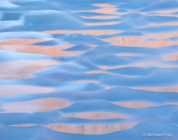
But flat images, without much sense of depth, can also be effective. Think of M.C. Escher’s “Symmetry” drawings (click the link and go to “Picture Gallery,” and then “Symmetry”). Here’s an example from my own portfolio, where I used a 200mm lens to compress the space, flatten the perspective, and create a pattern out of ice and water. Such images tend to be more abstract, and less about mood than about creating a visual surprise, but I like them on that level.
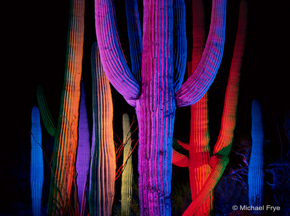
And here’s another example—a very different one—of how compressing space can work to your advantage. These light-painted cacti are actually much farther apart than they look. The red one just right of center, for example, is at least thirty feet from the central cactus. A short telephoto lens (150mm on 6×4.5 cm film) compressed the space and brought these cacti into closer visual proximity with each other, creating a cohesive composition out of widely-scattered elements.
A sense of depth can certainly add another dimension to a photograph (pardon the pun). But the simplicity and flatter perspectives created by telephoto lenses can also be effective arrows in the photographer’s quiver. One isn’t better than the other—it’s more a matter of choosing the right tool for the job at hand, the perspective that conveys your idea best. Learn to use both these tools well—to create a sense of depth with wide-angle lenses, and compress space with telephotos—and you’ll become a more effective communicator with your camera.
I tend to use long focal lengths more often than short ones (I wrote about that last August), but reading David’s book may make me rethink that, and try to incorporate more depth into my images. What about you? Do you find yourself gravitating to one perspective or another, or do you make “inclusive” and “isolating” photographs with equal frequency? Do you think about depth in your images—about creating the illusion of depth, or deliberately flattening the perspective? Post a comment and let us know.
—Michael Frye
Related Posts: Capturing a Mood, Does Size Matter?
Michael Frye is a professional photographer specializing in landscapes and nature. He is the author and photographer of The Photographer’s Guide to Yosemite, Yosemite Meditations, and Digital Landscape Photography: In the Footsteps of Ansel Adams and the Great Masters, plus the eBook Light & Land: Landscapes in the Digital Darkroom. He has written numerous magazine articles on the art and technique of photography, and his images have been published in over thirty countries around the world. Michael has lived either in or near Yosemite National Park since 1983, currently residing just outside the park in Mariposa, California.



Nice read. There is so much I should learn about photo, starting with ordering ‘A Deeper Frame’ now! I was at the Grand Canyon for the first time last weekend and the weather didn’t allow much light (cloudy, misty). Most of my pics look flat, there’s no sense of depth or immensity the place should convey… I’m going back in September, hopefully can do better!
Nice post, and thanks for recommending David duChemin’s eBook. It’s making me think how to use each of my lenses for a particular effect. I tend to “think” in mid-focal lengths, and a little while ago challenged myself to use my 17-40mm lens at the widest lengths.
I like your various illustrations here…I think there is still a sense of depth in your first. The fog helps convey that with the trees in the background. I like the simplicity of the composition in the first and the drama in the second.
A very nice post, Michael, thank you. I think I slightly prefer the telephoto composition above, but
it is also very remarkable how different the moods of the two photographs are.
Thanks Claire. While it’s possible to convey depth on photographs, size is another story – that’s really difficult. So I’m not surprised that your Grand Canyon photos didn’t convey the immensity of the place. Do anyone’s? Better, perhaps, to not worry about size in those situations and try to make a good composition, capture good light, and convey a mood.
Vivienne, thanks, and I’m glad David’s book and this post are helping you think outside of the mid focal lengths. The wide and long perspectives are almost always more interesting! I agree that the first photo here has some sense of depth – just not as much as the second. Personally I probably like the first one a little better overall, but it’s never an apples to apples comparison with photographs – there are so many other differences between those two photos besides choice of lens.
Lenya, thanks. I probably agree with you – I like the telephoto version better too, but only slightly. And you’re right, they do have different moods. But as I just stated above, the difference isn’t just due to the lens – there are a lot of other differences between the two images as well.
Thanks for another very interesting post, Michael. The question of isolating or including is much in my considerations of late. This recurring choice requires us to really consider the subject and conditions, especially if a little in love with sweeping vistas and a wide angle lens! (I sometimes daydream about cameras with rotating lenses, especially when shooting beside the ocean. I don’t like changing lenses in the salt-laden atmosphere, so usually choose one lens ahead of time and stick with it.)
Of your images above, I prefer the second for it’s uplifting dynamic, the soaring, ‘reaching for the sky’ feeling that reminds me that plants always strive towards the light, the sun. The humble rhododendrons have their rightful place amongst the towering, massive redwoods. There’s a metaphor in there, somewhere… 🙂
Your review of David duChemin’s ‘A Deeper Frame’ prompted me to add it to my Craft&Vision collection. Would be good if your ‘Digital Landscape Photography’ was also available as an iPad-loving eBook. Is possible?
Thanks for your post. Perhaps I prefer the first one (with a little mistery around it)
but as you said it is difficult to choose between the 2 as they seem so different.
Vivien, thanks very much – glad you like the post. Since you seem to have a predilection for wide-angle lenses, I’m not surprised that you like the second redwood image!
As for Digital Landscape Photography, I’d love to have it available as an eBook, but that’s up to the publisher. Maybe I’ll mention your comment to them. 🙂
Maria, thanks for chiming in! It is indeed hard to choose – and we don’t really have to, as we also have the choice of just enjoying both.
An educational post as always. Your forest photographs are quite fine, but that one of the melting ice is extraordinary in my opinion.
Hi Michael,
I realize this was a post from last July, but it is my first time seeing it.
Great photos, and information!
I am always experimenting with flexible spot meter focus when using telephoto lenses.
This isolates my subject, adding depth, rather than having the telephoto compress the distance between my subject and background
I learned this technique from a book that I purchased last year titled:
Digital Landscape Photography: In the Footsteps of Ansel Adams and the Great Masters
By Michael Frye 🙂
Nice Paolo, thanks!
Hi Michael, I was trying to find the information about which wide angle lens you use, Is it the 17-4o. I currently have a 10-22, but if I am aspiring to get a full frame camera, that lens wont work. I use canon lenses and currently have a 7d. thank you for all of your blogs and information, Victoria
Hi Vicki,
I have the 17-40 f/4L, but my needs might be different than yours, so you should get lenses that suit your needs. I will say that I like the 17-40; it’s a sharp lens, though not cheap.