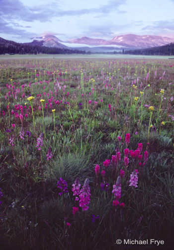
It’s wildflower season in the Yosemite high country, which made me think about this image that I made 25 years ago, in August of 1986, in Tuolumne Meadows.
In the 1980s large swaths of Lemmon’s paintbrush and shooting stars were common in Tuolumne Meadows in the summer. But 1986 brought the best bloom I’ve ever seen there, with this great mix of paintbrush, little elephant’s heads, lupine, shooting stars, penstemons, and… that yellow flower (arrowhead butterweed?). For some reason though wildflowers have diminished in Tuolumne Meadows in recent years, and those great blooms seem to be a thing of the past.
In the summer of 1986 I was working at The Ansel Adams Gallery in Yosemite Valley. On the day I made this photograph I drove up to the high country after work. A thunderstorm had rolled through, leaving the meadows wet and the skies overcast. But just before sunset the sun crawled underneath the clouds and lit up the peaks in the distance.
I actually think I did a pretty good job with the composition here. I needed to find some kind of structure or design to hold the foreground together and lead the viewer’s eyes into the distance. The little V- shaped group of flowers at the bottom of the frame accomplished both those things, giving the foreground some structure and leading viewer’s eyes toward the background. As a bonus, that V-shape mirrors the upside down Vs of the peaks.
The horizon line is high, but I think that’s appropriate here: the foreground is much more interesting than the sky. I’m glad I wasn’t overly concerned about putting the horizon a third of the way from the top.
This photograph was made with an Olympus OM-1, 28mm lens, and Kodachrome 64 film. I don’t remember the shutter speed, but I do remember that I stopped the aperture all the way down to f/22. Although you may not be able to tell at this size, the background is not perfectly sharp. The depth of field was pretty extreme (the closest flowers were only three feet from the camera), so it was hard to get everything in focus, but I wish I’d focused slightly further back and kept the peaks sharp—although if I had to pick one or the other, I’d rather have a soft background than a fuzzy foreground.
What else would I do differently? Well, I wish I had had better equipment and materials! Kodachrome film didn’t render greens very well, and despite my efforts in Photoshop to coax some life into the greens of this drum-scanned transparency, they still have a dull, bluish cast to them. A warming filter would also have helped, but I had only started taking photography seriously about a year earlier, and didn’t know about warming filters yet. Nowadays of course, with a digital camera, I could just adjust the white balance.
That cyan sky is also a Kodachrome artifact that’s difficult to correct. A graduated neutral-density filter would have helped to darken the sky, though I was able to bring it down in Photoshop a bit. Again, I would do it differently with a digital camera these days, and either simply darken that sky in Lightroom or Photoshop, or blend two different exposures together.
Despite the flaws though, I’m happy with the composition, and I’m glad I have this photograph to remind me of that spectacular wildflower display.
So go ahead—this is your chance to critique one of my photos! What do you think of the composition? What would you have done differently?
—Michael Frye
Related Posts: August Flowers, High Country Wildflowers in Yosemite, Summer Wildflowers, Late Bloomers in the High Country
Michael Frye is a professional photographer specializing in landscapes and nature. He is the author and photographer of The Photographer’s Guide to Yosemite, Yosemite Meditations, and Digital Landscape Photography: In the Footsteps of Ansel Adams and the Great Masters, plus the eBook Light & Land: Landscapes in the Digital Darkroom. He has written numerous magazine articles on the art and technique of photography, and his images have been published in over thirty countries around the world. Michael has lived either in or near Yosemite National Park since 1983, currently residing just outside the park in Mariposa, California.


Michael,
I like the anchor you have on the lower right hand corner of the photo; it grabs my attention right away. However, once there my eye doesn’t automatically wonder to the top of the photo, where the mountains are. I attribute this to a dead center above the anchor, and the lack of leading lines.
Perhaps more emphasis on the anchor, with a lower tripod height might have helped. I can’t really pull anything more out of the photo that would give me alternative ideas to help the composition.
Thanks for sharing, and thanks for giving us something to think about.
I think the photo is fine and would make a nice magazine cover, but I’d like to see some other compositions. I’d like to see one with less shadow in the bottom of the frame, another without a V shape (and corresponding lack of flowers inside the V), and one where you are much closer to a single group of the flowers and at an even lower angle.
I can relate to being able to remember being there despite it being so long ago.
When I first saw the photo my thought was, “I’m heading up there tomorrow!” Only missed it by 25 years. Bummer. 😉
I would like to see it cropped tighter. From the left bringing it in to the edge of the three yellow flowers and the right to the first yellow flower behind the paintbrush. Also bringing the sky down closer to the mountains and up a tad from the bottom. Brave of you to put up on the chopping block Michael for all to dissect!
Roteague, thanks for your comments, and your thoughts about the composition. I’ve always thought the eye traveled pretty well from foreground to background here, but of course it’s all subjective! As I remember, I didn’t try a lower camera angle because I couldn’t get closer to the flowers and have any hope of getting it all in focus. These flowers are quite small, and my lens was only perhaps 2 1/2 feet from the closest blossom. As it is the background is soft. These days I would focus bracket and, if necessary, blend those exposures together to make sure everything was sharp – so I could have tried that lower angle. Though when you lower the camera in situations like this you lose some of the middle ground, and whatever leading lines there are. But certainly a good suggestion, and worth trying.
John, thanks for your thoughtful comments as well. The shadows at the bottom were unavoidable with that film and without a graduated filter – no matter where I put the camera, as long as it was pointed down there would be dark shadows underneath clumps of grass or flowers in the foreground. A graduated filter would have allowed me to lighten the whole foreground in relation to the sky, and kept those shadows from being so murky. Live and learn, as they say…
As I said in my comments to roteague above, I didn’t try the lower angle because I knew I couldn’t get everything in focus if I were any closer to the flowers. We are so lucky these days, when thorny problems like extreme contrast or extreme depth of field can be overcome by blending exposures. Of course a view camera could have dealt with the depth-of-field issue in those days, but that was way beyond me at the time.
Sorry you were a little late for this bloom! I sure wish this would happen again, as it would be fun to see what I could do with better equipment and more experience, and what you and other photographers would come up with also.
Michael,
Thanks for sharing this early image of yours! My eyes are immediately drawn to those wonderful wildflowers up front, and I definitely noticed the “v” shape that subtly draws your eye out to the mountains. I say “subtly” because I think the color of those foreground blooms are so catchy that my gaze wants to linger there. I do like how the distant evergreens center the shot, and I like all the layers. I think the vertical works well to keep the focus on those distant peaks, but it would be interesting to see how a horizontal comp would have worked.
my first reaction was appreciating the color of the distant mountains complementing the lavender of the flowers. i also agree with Mary’s comment of a slightly tighter crop, the lack of detail in the bottom bothered me a little. Mainly what I see apart from a beautiful photo is the advantages we now have with digital processing in the tweaks we can do to perfect an already great shot. I envy your time in Yosemite. Thanks for putting this up.
Michael, there’s an odd color shift here that reminds me of faded Ektachrome (on my mind because a bunch of my old transparencies have faded the same way), but I think Kodachrome is supposed to be more stable.
I like the shot a lot — it’s the kind of composition that really draws me in, which was your intent, I’m sure. In a perfect world I might wish that there was more of a “mid-ground” to the shot. There’s a long leap from the foreground flowers to Lembert Dome and the trees. I don’t know, would a slightly longer lens have compressed the flowers back against the middle a little?
I’d love to see what this becomes when you get done tweaking it. The contrast from the midpoint back seems a bit flat. Maybe run it through a “Velvia” plug-in? 🙂
-eric
Thanks for chiming in Mary! I think a tighter crop could work. Some things might be lost in the process, like the red flowers near the left edge, and the clouds near the top, but the tradeoff might be worth it, so I’ll play with that. It wasn’t really that brave, as the image is 25 years old, and I have lots of excuses for its imperfections!
Nora, thanks for your comments. A second vote for the crop… And yes, we have many more options now!
Eric, there could be fading here. Kodachrome is very stable in the dark, but more prone to fading than Ektachrome when exposed to light (when projected or viewed on a light table for example).
I like your suggestion about a slightly longer lens, as that would have lessened the “empty” space above the closest flowers. It couldn’t be too much longer though, because then I would have lost the sides of the distant peaks. Depth of field might have also been an issue.
So, actually, I am done tweaking it! In fact I’ve worked hard to get as much out of this as I can. If you click on the image itself above you’ll see a comment by Tim Parkin, and a link to an image that he adjusted further. This version does solve some of the color issues, but at the expense of some of the pinks. Maybe I’ll work on it further and see if I can get the best of both worlds.
Firstly I think you’ve done a pretty good job… I wasn’t taken photos this good after a year… In fact I’m still not 🙂
Perhaps I would have tried a lower viewpoint to emphasise the foreground flower a little more… But that’s being picky.
Thanks Chris – I didn’t say I’d only been photographing for a year, but I’d only been photographing seriously for a year! A couple of others suggested that lower angle too, so there must be something to that…
I have not noticed the mountains at first- the almost overhead angle on flowers made me focus on them. I do not particularly like this angle on the flowers, and wish you shot it from somewhat lower position. I don’t mind slight blue cast, I think it makes violets more vivid, but I would add a bit of light at the bottom- today an easy fix in Lightroom.
I’m inclined to disagree with those suggesting a crop off the sides. For me, doing so (with my browser) doesn’t seem to improve the composition……which overall, is pretty impressive especially for someone in their first year of ‘sight’.
IMO, if any cropping is to be done, it should be off the bottom. I would crop it to just above that first, small reddish flower just left of center. With the exception of that one small flower, everything from there down is pretty much dead space and doesn’t add to the composition. And if it don’t add to it, it should be removed……again, IMO.
The one thing I do find a little puzzling about the image is the evenness of the light across the meadow area. Obviously, it’s not something you could control, but given the ‘partly cloudy’ nature of the sky area that is visible, if that same condition existed over the meadow, I would normally expect some patches of more brightly lit areas in the meadow. IF that had occurred, there’s no telling at this point how it would have affected the composition. It could have helped or hurt depending on where such patches might have fallen. Do you happen to recall….was it (likely) just more consistently cloudy over the meadow.(??)
Very impressive image overall!
I love this image & hope to be fortunate enough to see a bloom in Yosemite like it some day!! The only thing that I might play with would be the highlights in the sky. I might try to darken them a little to bring out some of the detail in the clouds. But, it is still a gorgeous image, as is!
not relevant but i stuck at the stupid bus station the only website i can logon to is this one regardless it was a good read