In the comments for my last critique, Michael Glover asked a question about cropping and aspect ratios. I get this question a lot, as many people feel that they must crop their images to a certain size—4×6, 8×10—for printing. So I thought I would expand on my answer to Michael and address this issue in more depth here.
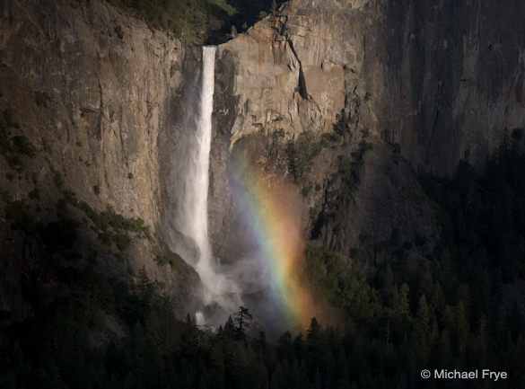
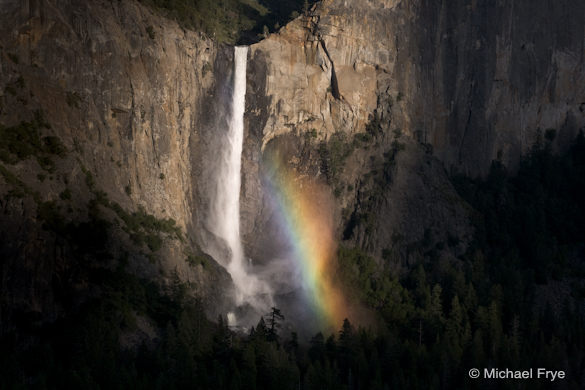
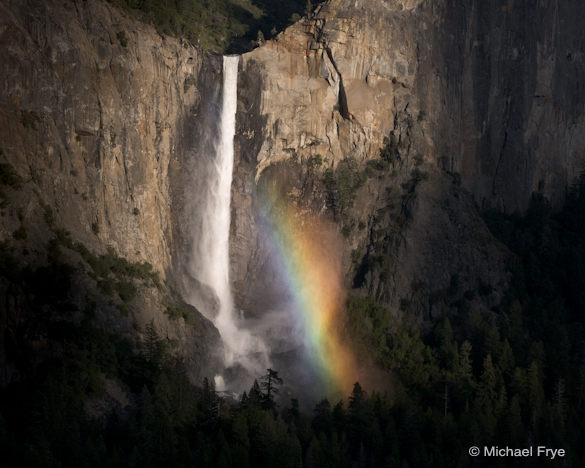
The problem with cropping to fit a particular aspect ratio for printing is that you can compromise the photograph’s esthetics. The accompanying images of Bridalveil Fall show what I mean. Below you’ll find the uncropped version, with its original 2:3 (or 4×6 or 8×12) aspect ratio, and a version cropped to a 4:5 (or 8×10) ratio.
To me, the uncropped version leaves too much empty space on the right and left sides, while the 4:5 ratio is too square, and a bit static. I prefer the crop at the top of this post, which lies somewhere in between.
For online viewing, which is the most common way people see my images these days, aspect ratio doesn’t matter, so I crop for esthetics, and if that means the photograph becomes more panoramic, or square, so be it.
For prints, I cut my own mats, so it’s easy for me to accommodate any dimensions. But I realize that most people don’t own their own mat cutter, so aspect ratio then becomes more of a concern. Here are some suggestions for dealing with that.
Copies and Virtual Copies
If you use Lightroom, you can create a virtual copy of your image (Photo > Create Virtual Copy), and crop one version for online viewing, and the other to fit a certain aspect ratio for printing. Then just choose the appropriate copy when you’re ready to export a TIFF for printing or a JPEG for the web.
I think you can make virtual copies in Aperture as well. (I don’t use Aperture, but I’m sure someone out there can confirm this.)
If you use Lightroom and Photoshop, don’t crop the photograph in Lightroom before taking it into Photoshop, and don’t crop it in Photoshop either. Make all of your other adjustments in Photoshop, then after you save your file it will appear in Lightroom, where you can then make two virtual copies: one cropped for esthetics, one for printing that fits a convenient aspect ratio (I’d suggest keeping the original Photoshop master file uncropped).
If you use Photoshop and Bridge, don’t crop your Photoshop master file, but when you’re ready to print, make a copy of that master file, select the Crop tool, then enter the dimensions and resolution you need in the Tool Options bar at the top.
Stretching or Squeezing the Image
Here’s another idea: open a copy of your master file in Photoshop, then go to Image > Image Size, and uncheck “Constrain Proportions.” This will allow you to stretch or squeeze the image to fit a certain size without cropping. Unfortunately this often distorts the image too much, but sometimes a little distortion combined with a little cropping can give you the dimensions you need without eliminating important elements.
One more trick: open a copy of your master file in Photoshop, choose Select > All, then go to Edit > Content-Aware Scale. Drag the edges of the bounding box to change the proportions of the image. With Content-Aware Scaling, Photoshop tries to keep prominent objects intact, while shrinking the space in between them. This works better with some images than others, and again, a little bit of Content-Aware Scaling combined with a little bit of cropping might do the trick without distorting the image too much.
Custom Mats
Finally, you don’t necessarily have to make the print fit a certain aspect ratio, even if you don’t own your own mat cutter. You can simply leave a white border on the paper and frame it to show that border. Or, have Documounts make a custom mat for you. (I’m sure there are other companies that do this too.)
That’s all I can think of right now, but I bet some of you have discovered other creative solutions to this problem, so please tell us about them in the comments!
—Michael Frye
P.S. Sometimes it’s hard to keep track of virtual copies in Lightroom, so here’s a little tip: In the Library Module, near the bottom of the right-hand panel under Metadata, there’s a field called “Copy Name.” (If you use the default Metadata viewing mode, it’ll be the third field down.) When you create a Virtual Copy, Lightroom will automatically name it “Copy 1.” But you don’t have to keep this name. You can name your master file “Master,” another copy “Online Crop,” another copy “Printing Crop,” and so forth.
Related Posts: Photo Critique Series: An Intimate, Wide-Angle Composition From Scotland; Photo Critique Series: “Bonsai Waves” by Mat Malone
Michael Frye is a professional photographer specializing in landscapes and nature. He is the author and photographer of The Photographer’s Guide to Yosemite, Yosemite Meditations, and Digital Landscape Photography: In the Footsteps of Ansel Adams and the Great Masters, plus the eBook Light & Land: Landscapes in the Digital Darkroom. He has written numerous magazine articles on the art and technique of photography, and his images have been published in over thirty countries around the world. Michael has lived either in or near Yosemite National Park since 1983, currently residing just outside the park in Mariposa, California.



Hm. I wonder where I got the idea that I had to maintain the original aspect ratio? When I first started working with digital photos, I cropped to suit the aesthetics. Somewhere along the line, though, I suddenly started maintaining the original 2:3 aspect ratio and then trying to force that into 4:5.
I appreciate getting permission to crop as suits the images.
Especially with digital: while I find that my habits keep pulling me back to 2:3 or 3:4 (my background is in old standard-def video production), I have to remind myself that there is no “natural” aspect ratio for photographs, just standards that make selling products easier.
On the other hand, as a writer (my degree is in writing and editing), I know that the discipline of a specific genre (such as a sonnet form) can tap into unexpected creativity, there’s also value in working within the “organic” framing of the sensor in your camera with no cropping afterwards.
Kurt, permission granted!
Dave, you make a good point about the discipline of a certain format making you tap into “unexpected creativity.” Such constraints can be a great exercise. But I think many times people get stuck into such formats for more mundane reasons.
With Apple’s Aperture 3 it’s possible to create Virtual copies, no Problem at all. I use this quite heavily. If an adjustment is applied to the original image Aperture automatically creates a Virtual copy. I find this useful, though it can increase the total count a lot.
Bernd
Good points all. Also, Michael Gordon wrote an excellent post on this subject a little while back that incorporates composing outside the camera and cropping according to subject as part of the seeing process: http://michaelegordon.wordpress.com/2011/02/06/camera-less-seeing-and-the-art-of-cropping/ It is quite interesting how photography is evolving beyond the constrictions of the frame now that it is easy for it to do so.
Michael, a nice run-down of the range of possibilities – though not all of them seem that attractive! Two thoughts.
First, I like your last idea best – custom cut mat (which isn’t that big of a problem) or matting with the full image visible with space around it inside the mat. I am developing a preference for matting with the full print visible rather than over matting and losing stuff around the margins anyway.
Second, while sometimes there really is only one crop that works or one that is clearly way better than alternatives, sometimes there are alternate ways to crop the same image that can be different but perhaps not necessarily worse.
Dan
Bernd, thanks for the confirmation.
David, thanks for posting the link to Michael Gordon’s article – very nice. And good point about “photography evolving beyond the constrictions of the frame.” And other constrictions too.
Dan, I like the last idea best too 🙂 And yes, there can be more than one crop that works, and which works best is often highly subjective. Thanks for chiming in.
This is timely for me. I’ve got two 9×16’s I want to mat. Documounts seems the best option, but also rather expensive because of shipping and the $10 surcharge they put on any order under $50. I figure I’d end up spending about $44 for two 16×20 custom-cut windows with foam boards, which is less than local brick-and-mortar stores where I’ve asked, but still seems high to me. I’m a low-budget amateur who prints at Costco.
Ron, glad you found this helpful. $44 for two 16×20 custom cut windows with foam boards seems pretty reasonable to me, but it’s all relative I guess!
Thanks for the followup article to my question. This really opens up a lot of possibilities and will make me look at my images a little differently!
You’re welcome Michael – thanks for the idea!
I was a big believer in cropping to whatever dimensions a photo called for until I started buying frames. Now I try to keep to a half dozen or so sizes so that I can swap in and out of frames. Framing is frickin expensive! I am printing for shows, not the web.
John, thanks for your comments. I take it you don’t mat your images? That’s an easy way to make non-standard-size photos fit standard frames. And, as I describe in the post, you can always try stretching or squeezing your photos slightly.
Funny you should mention that. I am slowly realizing that I could change my mat borders as well. Pretty slow of me, I know. Thanks for pounding it home.
You’re welcome John! 🙂