I continue to get lots of great submissions for my photo critique series. Thanks to all of you who have submitted work!
When selecting images to critique I usually pick photos that are good, but could be improved in some way. That gives me something to talk about, and I think these good-but-not-perfect photos are usually very instructive.
But that means many great images don’t get picked, and lie in obscurity in the Flickr critique pool. So for this post I thought I’d do something different and showcase some beautiful photos that I haven’t critiqued because I can’t figure out how to improve them. There are many more, and I wish I could show them all, but for now here are eleven rejects from the critique pool—rejected because they’re just too good:
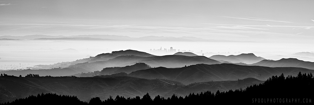
I love the layers of hills leading to the barely-visible but still recognizable San Francisco skyline. You can see more of Neal’s work on his web site and Flickr stream.
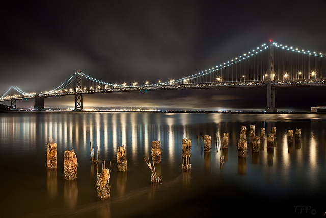
The silvery light and reflections here are wonderful. Click these links to Ellie’s Flickr page and web site. And you might remember that I critiqued one of Ellie’s photos last July.
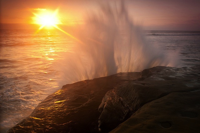
Great light and a beautiful wave-form, with just the right shutter speed to suggest motion without blurring the image too much. See more of Jeremy’s work on his web site and Flickr stream. And I critiqued one of Jeremy’s photos also, back in December 2010.
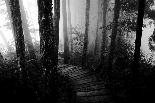
This image has a wonderful other-worldly feeling to it—just as the title (a reference to the game Myst) suggests. The tiny figure is a great touch. You can view more of Stephanie’s work on her web site and Flickr stream.
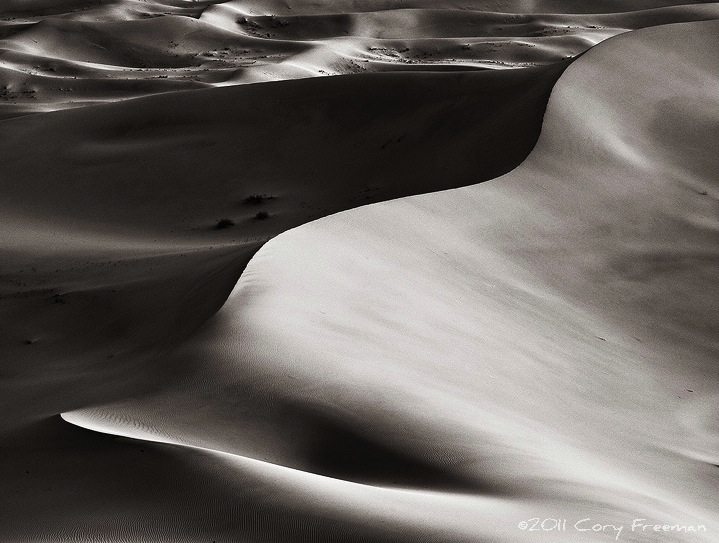
Great light and design, beautiful tones, and the smooth textures here are almost tangible. Here’s a link to Cory’s web site.
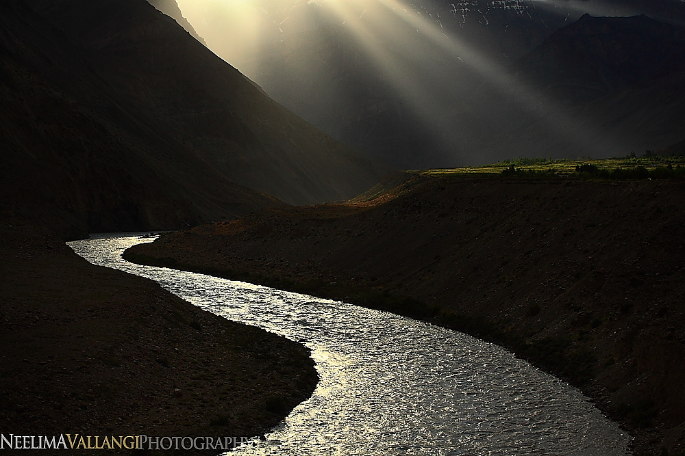
The strong, simple design of this photo from northern India is striking, plus there’s that unusual and captivating light. You can see more of Neelima’s photography on Flickr and on her web site.
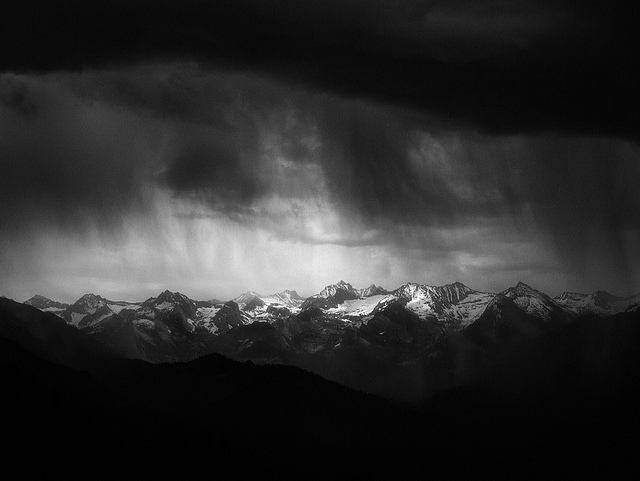
Wonderful drama here as we peer through a window of clouds and rain toward the mountains. JJ did a great job of processing the image to enhance that idea. You can see more of JJ’s work on Flickr, and I critiqued one of his photos last October.
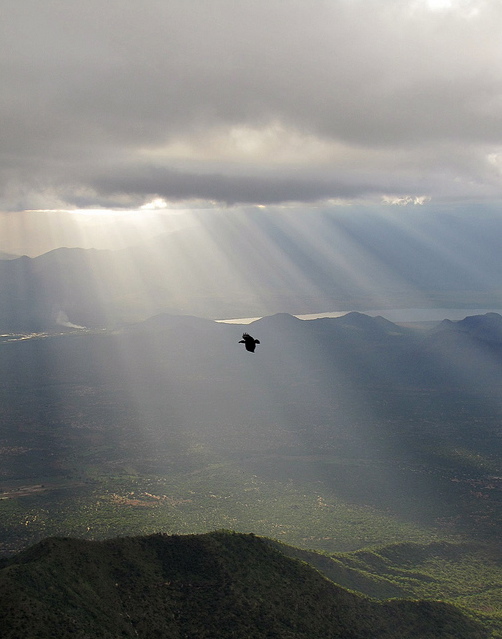
The god beams here are spectacular, plus there’s the raven, and the unusual, high vantage point. Altogether a captivating image. You can find more of David’s work on his Flickr stream.
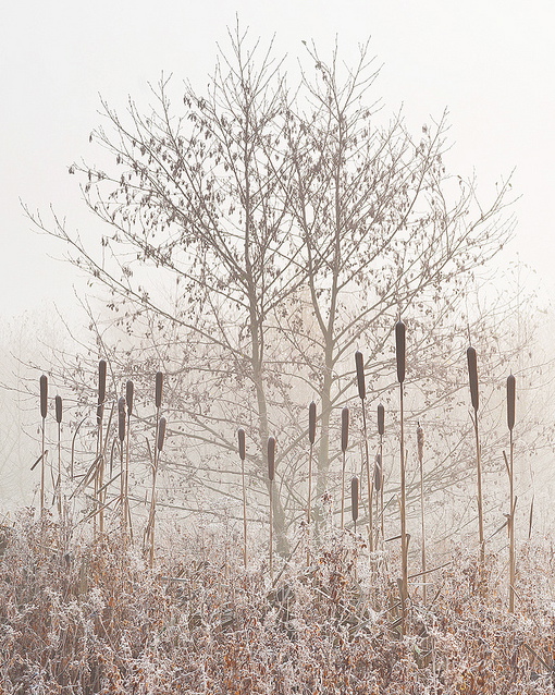
I love the beautiful, graphic (yet delicate), high-key look to this image, and the subtle color palette. Visit Dav’s web site or Flickr stream to see more of his work.
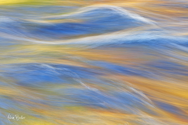
This image has beautiful colors, textures, and overall design. You can find more of Adam’s work on Flickr.
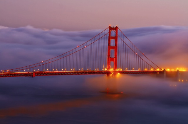
More wonderful light and colors, with a simple, clean design. I like the reflection of the bridge in the water. Here are links to Allen’s web site and Flickr stream.
Hope you enjoyed looking at these images as much as I did. Please tell me about your favorites in the comments!
—Michael Frye
Related Posts: Photo Critique Series: “Red Sky at Night” by Ellie Stone; Photo Critique Series: “Juniper and Monolith” by Jeremy Long; Photo Critique Series: “Meadow of Loosestrife” by J.J. Raia
Michael Frye is a professional photographer specializing in landscapes and nature. He is the author and photographer of The Photographer’s Guide to Yosemite, Yosemite Meditations, and Digital Landscape Photography: In the Footsteps of Ansel Adams and the Great Masters, plus the eBook Light & Land: Landscapes in the Digital Darkroom. He has written numerous magazine articles on the art and technique of photography, and his images have been published in over thirty countries around the world. Michael has lived either in or near Yosemite National Park since 1983, currently residing just outside the park in Mariposa, California.



All very nice wish I had taken them.
This is great, Michael! Really good to gain some insight into what you regard as not needing any improvement, what you like about these photographs as they are…which raises a question, re Jeremy Long’s dynamic ‘Sunset Wave’.
Have I been wrong in believing that it is unacceptable if the sun’s centre is over-exposed? I’ve rejected numerous shots of mine on that basis, yet am observing that accomplished professionals don’t seem bothered by it. Is it a question of degree, the overall effect on the image as a whole…or what? Would really appreciate your thoughts on this.
Faves (a hard call!) in display order: ‘Misty Bay Bridge’, ‘Sierra Crest’, ‘Golden Gate’. Thanks for sharing and big congratulations to all 🙂
Nice idea, Michael, and what a wonderful group of photographs. It is great to just look and _not_ have to critique, isn’t it?
Dan
(who will soon be chasing aspens…)
I have to say, these are the best “rejects” I’ve ever seen!
Thanks for your comments Frank, Vivien, Dan, and Vivienne – I appreciate your chiming in.
Frank, I wish I had taken them too!
Vivien, I’m not bothered by the center of the sun being overexposed. In fact I think it’s okay to have areas near the sun overexposed as well. Usually overexposed, washed-out spots in photographs look unnatural, because in real life we don’t see things that are washed out. But the sun itself is an exception. You can’t look at the sun and see detail – it’s too bright. So it seems natural to look at the sun in a photograph and see it overexposed. In fact it would look odd if we could see detail in it, because we almost never see that with our eyes. The exception is when the sun is right on the horizon, and most of its light is blocked by atmosphere – that’s the only time we can usually look at the sun without being blinded, and can actually see some detail in it.
Dan, thanks, and yes, sometimes it’s nice to just enjoy photographs without a critical eye!
Vivienne, I agree!
Many thanks, Michael. Big help. Makes perfect sense to me.
wonderful series of captures shown here … I am very thankful to have one of mine included as well …
All very beautiful photographs indeed. I can understand you rejected them for the reason you did 🙂 They all have their own compelling elements I think, but if I should choose a favorite right now it would probably be the one on top. Very beautiful detail with the fog which makes you able to really distinguish the rows of hills, and a very fine juxtaposition of elements from nature to city.
Looking forward to your next post in the Photo Critique Series.
This was a great idea Michael and thanks for including me with the rest of these spectacular images! I’m honored to be included.
You’re welcome Vivien – glad that helped.
Neal, you’re very welcome – thanks for letting me include your beautiful image.
Martin, thanks, I’m glad you like this selection. It is indeed difficult to choose, and there’s no obligation to do so – you can just enjoy them!
Cory, you’re welcome, and thanks very much for sharing your wonderful photograph.
Great idea for a post! Enjoyed looking at these more closely.
Wow! These are all amazing! I bet there are still a LOT of these in your collection. All I can really is that all these photos are breathtaking — just perfect!
These are all stunning, I’ll have to join the group on Flickr.
These are magnificent. Great idea to post the “too-good-to-have-instructional-critiques”!
Ellen, Halley, Miles, Clay – glad you like the selection!