I’ve finally had a chance to really dive into Lightroom 4, and I’m very happy with the results I’ve been getting. While I haven’t found a big difference in processing low-contrast images, with high-contrast scenes the improvements are significant.
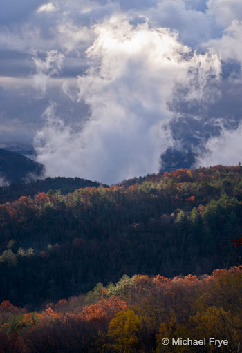
The accompanying image was made during my trip to South Carolina last November. It was a fast-changing situation—the sun suddenly broke through, and I missed the exposure slightly, so the brightest highlights at the top of the clouds were blown out. By the time I adjusted the exposure the scene had changed.
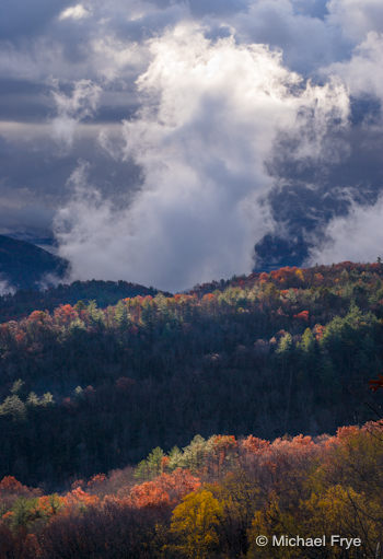
I struggled to process this image with Lightroom 3. While I was able to recover detail in most of the highlights, they still looked a bit hot, and the darker bottom half of the image seemed flat, despite extensive efforts to bring out the detail and contrast in this area. You can see this Lightroom 3 version at the bottom of this post.
The version on the right was processed in Lightroom 4. I was able to get better texture and detail in the brightest parts of the cloud, while the bottom half of the photograph has more local contrast, and seems livelier. Overall I’m much happier with this version.
Along with this improved ability to handle high-contrast images, Adobe has made big changes to the Develop Module. I’ve been testing Lightroom 4 extensively, and though I’m still learning, I’ve found out many things about how the new tools really work—things that I haven’t seen or read elsewhere. I’m looking forward to sharing all this with you, but it’s easier to show you than write about it, so I’m working on a video (or maybe two videos), that do just that. I’ll show you how the new tools differ from the old ones, how they really behave, how that might influence the way you work, and some suggested working methods for getting the most out of Lightroom 4. I’ll be posting this next week—stay tuned!
About That Point Curve Bug…
Adobe has finally provided a fix for the point curve bug in Lightroom 4 that I mentioned in an earlier post. They’ve released Lightroom 4.1 RC (release candidate), which seems to solve the problem. You can download this update here. Adobe says “a ‘release candidate’ label indicates that this update is well tested, but would benefit from additional community testing before it is distributed automatically to all of our customers.” Which is basically their way of saying don’t blame them if it doesn’t work perfectly. But this does seem to solve the point curve problem for most people. You can read more about this issue in one of the Adobe forums.
There is a lot of confusion about this bug, and what it is. The appearance of the point curve will change when you update an image from the 2010 (Lightroom 3) process to the 2012 (Lightroom 4) process, but that’s not a bug—it’s by design. The point curve in the 2012 process has a different baseline starting point than it did in the 2010 process, so the shape of the curve necessarily has to change to reflect this. (I’ll talk more about this baseline change in the video.)
The bug is different. It occurs when you update a Lightroom 3 catalog to Lightroom 4, and look at an image in the Develop Module in Lightroom 4. Before updating the process version—in other words, while the image is still in the 2010 process—point curve settings disappear, and the curve resets to it’s default.
So a change in the appearance of the point curve when updating from the 2010 to the 2012 process is normal. Having point curve settings disappear while an image is still in the 2010 process is not.
I expect Adobe will officially release this 4.1 update soon. In addition to this point curve problem I’ve heard about a few issues, especially some plugins that no longer work, but these should all be fixed with the update.
Happy Easter! I hope you all have a great holiday weekend.
—Michael Frye
Related Posts: Lightroom 4 Goes on Sale; Should You Wait, or Dive In?; A Trip to South Carolina

The same image processed in Lightroom 3. There's less texture and detail in the top of the cloud, and the bottom half of the photo looks duller and flatter.
Michael Frye is a professional photographer specializing in landscapes and nature. He is the author and photographer of The Photographer’s Guide to Yosemite, Yosemite Meditations, and Digital Landscape Photography: In the Footsteps of Ansel Adams and the Great Masters, plus the eBooks Light & Land: Landscapes in the Digital Darkroom, and Exposure for Outdoor Photography. He has written numerous magazine articles on the art and technique of photography, and his images have been published in over thirty countries around the world. Michael has lived either in or near Yosemite National Park since 1983, currently residing just outside the park in Mariposa, California.


I’ve noticed the same thing, Michael. The RAW converter (or something) in LR4 does a much better job on the blown highlights than LR3 did. I am happy to pay the upgrade fee just for that! Everything else is just gravy and pretty good gravy at that.
Best,
Rick
Glad you like Lightroom 4 Rick. I think the actual difference in highlight recovery ability between Lightroom 3 and Lightroom 4 is small. In other words Lightroom 4 may be able to recover highlights that are a bit more overexposed than Lightroom 3 can – maybe about 1/2 a stop more overexposed. But the way those overexposed highlights are rendered is better in Lightroom 4 – more depth and texture. I’m actually equally impressed with the new Shadow tool, and it’s ability to lighten shadows in a realistic way, without halos, and with lots of local contrast.
That’s really quite a difference! I’d never have guessed it would be. So far I’m still using ACR for much of my processing and it does have limitations. Seeing the difference between Lr versions I’m wondering if I would benefit from upgrading to Lr 4 sooner than later. Any thoughts? Looking forward to the video(s). Thank you Michael!
Joolz, ACR 7.0 has all the new controls that Lightroom 4 has. ACR 7.0 is included with the beta version of Photoshop CS6 that’s available now. As for moving to Lightroom 4, I like the simplicity, convenience, and speed of using Lightroom vs. the Bridge and ACR combo, but Bridge and ACR (if we include the beta ACR 7.0) have most of the same functionality of Lightroom 4 – just in a clunkier package.
Thank you for the update Michael. I am really looking forward to the videos. Your “Light & Land” eBook is my goto resource for LR workflow and LR4 is clearly a different beast. The LR4 version of your photograph is definitely livelier than the old one!
Thanks Kyle. Yes, Lightroom 4 is a different beast. Most of what I wrote in Light & Land still applies to Lightroom 4, but some things are definitely different. So I’ll try to explain those differences in the videos!
This is an excellent example showing the vast improvement of Lightroom 4 over LR3.
I am still shooting with my Nikon d200. I am extremely impressed with the LR4 rendering of my photos–I think I’ll skip buying a new camera. I have been reprocessing old shoots on a daily basis, and I am very happy with the improvements I am getting with LR4. I am finding that very little processing is needed. I often use the exposure slider to get very crisp, detailed results with only occasional need for Clarity. Most of my photos are landscapes which I shoot on a tripod with mirror lockup and remote shutter release. LR4 seems to make all that effort pay off with sharp, clear, detailed renderings. I am also getting excellent result with impromptu photos of people.
I can’t wait to see your videos!
Eric, thanks, and I’m glad that you’re happy with the results you’re getting with Lightroom 4!
Thanks for the tips Michael. I hope to upgrade soon.
You’re welcome John. When you do upgrade, don’t automatically update all your old images to the new process, as they can often look quite different. If you’re happy with the way they look in the old (Lightroom 3) process, there’s no need to change, and you might end up making a lot of work for yourself if you update them all. I’ll say more about this in my next post about Lightroom.
I’m liking v4 but it seems to run slower than v3. I downloaded 4.1rc and it doesn’t seem much faster. I really like the new develop module though and you can really do some nice things with landscapes. Overall I’m pretty happy with v4.
Jeff, I’ve had some performance issues with Lightroom 4 too, though they seem to be intermittent. v4.1 is supposed to fix this, and I’ve heard some positive reports about that, but don’t have any personal experience, as I haven’t installed the 4.1 RC (I used an experimental script that Adobe sent to some people to fix the curve bug).
It is really a good example. I’m also looking forward for your new videos because I usually followed your workflow sugested in Light and Land or in your last book. And about the older presets? I’m waiting for the Lr4.1 upgrade. Thanks Michael.
Thanks Maria. About the presets, if you’re asking whether Lightroom 3 presets work with Lightroom 4, the answer is sometimes. They won’t work if they involve anything in the Basic or Tone Curve panels, but anything else should be fine.
Looking forward to the videos Michael. LR4 definitely made a big difference in this image. I installed the 4.1 RC and I have been having issues with lagging in adjustments that I didn’t have in LR3.6. When I move a slider it takes a few moments to show the result. I was wondering if this is an issue for everyone or just me.
Hope you have a Happy Easter!
Hmm… another report of slow performance despite the 4.1 update. That’s a bit worrisome. No, you’re not the only one having this problem. I’ve seen it too with 4.0, as have a lot of other people. Here’s a forum thread about this issue:
http://feedback.photoshop.com/photoshop_family/topics/lr4_0_reacts_extremely_slow
I’ve heard through the grapevine that the biggest challenge in making the new highlight and shadow adjustments work so well was making them work fast enough. Maybe they didn’t completely solve this??
Thanks for the link! I guess we’ll just have to wait and see what happens. I’m sure Adobe will get it working right.
I’m pleased that Adobe at least fixed your curves issue but judging by the above comments and my experience there is still a lot of work to be done but I’m sure they will come good in the end.
I am looking forward to your videos and learning about the new LR4 develop tools.
David, it does seem like there’s work to be done. As you say, I’m sure they’ll fix the issues.
Thanks for the LR4 review and 4.1 update, Michael.
I just downloaded and installed LR 4.0 last night, driven by the need to deal with the files from our new D800 just received last Thursday.
Adobe still has not released a camera update ieluding the D800 for CS5.
Stoney Edwards
Stoney, you might want to upgrade to the Lightroom 4.1 RC. Also, I’m not sure if support for the D800 is included in ACR 7.0, which is part of the CS6 beta, but you might want to look into that.
LR 4.1 still has performance problems. When using brushes, gradients etc., combined with slider moves in the basic panel, I am experiencing stalling, catch ups and slowdowns. Besides that, lots of improvement over 3.
Michael, you were a fan of using ACR 4.4 as a profile in LR3. Will that continue in 4? I have a new Sony Nex 7 whose raw files bring up Adobe Standard as the only choice. Not sure why? Someone said that its because Adobe supplies only that one for the Nex 7. Is there any way to gain access to others, like ACR4.4 to use with the 7?
Jonathan, sorry to hear that you’re still experiencing performance problems. It seems that Adobe still has some work to do. I wonder what’s going on.
As for the ACR profile (4.4 or different versions all look the same as far as I can tell), that’s my default profile for my camera, but Adobe stopped making ACR profiles a few years ago I think, so newer cameras don’t have that profile as an option, and so the default is Adobe Standard. Adobe Standard used to be terrible, because it created cyan skies. But with more recent cameras it seems like they’ve corrected this, and the sky color is great, so I hope that’s the case with your Nex 7.
With Nikon and Canon cameras you usually have a variety of profiles to choose from, but with all the Sony cameras I’ve looked at there’s only one – Adobe Standard. If you want more choices, you could make your own profiles. The easiest way to do this is with the X-Rite ColorChecker Passport, which is about $100. The profiles I’ve made with this for my camera are close to the ACR profiles.
Ok, that’s good to know. I had been using the ACR 4.4 with a Canon 1ds III. As you pointed out, the 4.4 did render the sky much better than the Standard with that camera; and I was just wondering if I would be missing something by not be able to use it with the Sony.
Thanks.
Michael,
Thank you for the two free videos on LR 4. They were so good. I would welcome your republishing your ebook using LR 4. Please keep up the great work.
Walter
Thanks very much Walter!