I meant to post this earlier, but if you haven’t heard, Lightroom 4.1 was officially released about two weeks ago. So if you’ve been waiting to upgrade to Lightroom 4 until Adobe fixed the bugs, I think your wait is over, as the major problems should have been addressed. I know the point curve bug was fixed with the 4.1 RC (“release candidate”), so that shouldn’t be an issue any more.
Lightroom 4 is a big step forward in Raw image processing, but the advancements require a lot of horsepower to work properly. So check the system requirements before you take the plunge. Many people have had to upgrade their operating system to run Lightroom 4, and upgrading your OS can be a big undertaking, requiring that you update other applications as well.
Earlier I posted two videos about Lightroom 4, so if you haven’t watched those yet they can help you get up to speed in the new process. Here are links to Part 1 and Part 2.
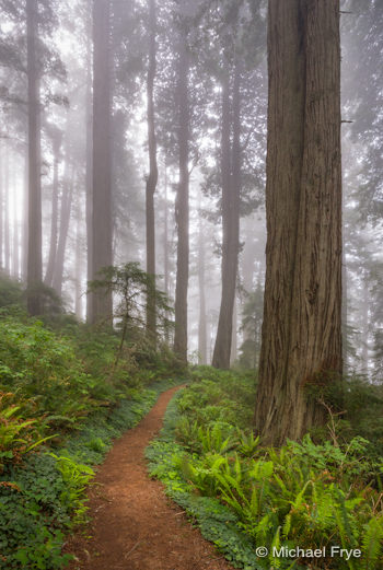
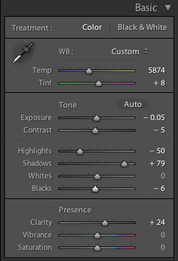
The first image here, as well as all of the images from Monday’s post—including some pretty high-contrast scenes—were processed exclusively in Lightroom 4. In the comments for that last post JayM asked if I could make a tutorial on how I processed the first image. That’s a great suggestion, but for now you’ll find a screen shot below that shows the Basic Panel settings for that photograph. (I didn’t use the Tone Curve, which is not unusual for me these days with high-contrast images in Lightroom 4.)
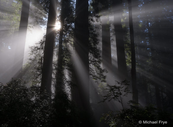
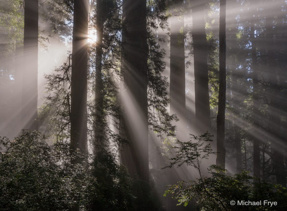
Also, the camera was pointed up, and the focal length was fairly short (32mm), so the trees converged—leaned in from the sides. Photoshop has many ways of correcting this, but since version 3 Lightroom has also had a leaning-tree tool: the “Vertical” transform slider in the Lens Corrections Panel, under the Manual Tab. You’ll find before and after versions of this redwood photo below showing the image with my default settings, including leaning trees, and the final version that I posted here on Monday.
—Michael Frye
Related Posts: Back to Jurassic Park; Lightroom 4: The New Tone Controls; Lightroom 4: Working With the New Process
Michael Frye is a professional photographer specializing in landscapes and nature. He is the author and photographer of The Photographer’s Guide to Yosemite, Yosemite Meditations, and Digital Landscape Photography: In the Footsteps of Ansel Adams and the Great Masters, plus the eBooks Light & Land: Landscapes in the Digital Darkroom, and Exposure for Outdoor Photography. He has written numerous magazine articles on the art and technique of photography, and his images have been published in over thirty countries around the world. Michael has lived either in or near Yosemite National Park since 1983, currently residing just outside the park in Mariposa, California.



In Lightroom 4, is the contrast slider suitable for everyday adjustments or should we continue to use only the tone curve? Thanks
Doug, pushing the contrast slider to the right is just like making an s-curve, so you can use either tool to create midtone contrast. If you watch the second video (Part 2) that I link to in this post I talk about this. The short version is that the Basic sliders in Lightroom 4 are much better than in Lightroom 3, so I think the Basic sliders are now a viable alternative to using curves. A curve gives you a little finer control, but in most instances I find that I can achieve the same results either way.
Personally, with high-contrast images – photos where I’m trying to reduce contrast, either by lightening shadows, darkening highlights, or both – I find myself using the Basic sliders exclusively. For these images I’m mainly using the Highlights and Shadows sliders, and the effects of these tools can’t be duplicated with the Tone Curve. What little I would do with the point curve – a little s-curve for midtone contrast (probably a lightening s-curve to brighten the image) and maybe moving the black point – can be done a little more easily with the Exposure, Contrast, and Blacks sliders.
For lower-contrast images – photos where I want to increase overall contrast, i.e., darken shadows and/or lighten highlights – I usually use the point curve. I’m making bigger moves here – sharper s-curves, moving the black and/or white points more – so the curve gives finer control over all these moves. But, as I said, I can usually do the same things with the sliders.
Again, I go into more detail about all this in the second video. Bottom line: whatever you’re comfortable with, and works for you, is fine.
Michael, thank you for the very helpful incormation. I bought both youe eBooks yesterday and will spend some happy hours today practicing your advice. Thanks for taking the time to help. Doug
Michael,
I’m really impressed with and like LR4. It is an excellent and user friendly post-processing program. However, I still find that I use CS5’s smart sharpen tool at the end of my processing as that seems superior to LR4’s tool.
Glad you like Lightroom 4 James – me too! 🙂 Actually Lightroom’s sharpening (in the Develop Module, not the “output” sharpening in the Print Module), is very similar to the Smart Sharpen tool in Photoshop. This changed with Lightroom 3 – in Lightroom 1 and 2 the sharpening was similar to Unsharp Mask. But the “output” sharpening in Lightroom’s Print Module sucks IMO – only a few choices, and none of them very good.
I found a long time ago that I could get sharper large prints, with more fine detail, by applying some sharpening (actually quite a bit) to the Raw file (in Lightroom or Adobe Camera Raw), and then applying just a bit more with Smart Sharpen in Photoshop at the end. So even though I may do everything else in Lightroom for many images, if I make a large print (16×20 and up) I always take the file into Photoshop for final output sharpening.
Michael,
I had never tried to use sharpening on my RAW files. Actually, I am pretty much a novice using RAW formats but am getting more into that. It will definitely be something I shall try and see how it works. Thanks for the tip!
Michael,
I’ve posted several times before on dealing with blown and almost-but-not-quite-blown highlights and how to not posterize them, but I’m blown away myself by how you managed to pull up detail in the beams and keep a smooth transition into the sun. *VERY* cool.
Thanks Eric. The credit goes mostly to the new process in Lightroom 4; it does a great job creating those smooth, natural-looking transitions.
Michael,
Just got around to watching the second part. Thank you for the starting points. I was going through some photos from a very recent trip to Yosemite, and I was using LR4 for the first time as a comparison to how these looked in LR3.
I really came away feeling they were flat and lifeless in LR4 and was having to really process them a lot to get them where I wanted them.
Then, Starting Points. -1 on the exposure and -33 on contrast, set the white clip, and my clouds clinging to the hills and waterfalls popped. What a big difference. Once you pointed out in the video that the exposure control is a lot more like the old brightness control, it makes perfect sense.
Thanks,
Doug
Doug, thanks for taking the time to write. I’m glad the videos helped! Highlight contrast and separation can really make a difference in a lot of photos.
True. the key was how to get them in LR 4…. I already knew how to do it using my existing tools (LR3 +), and your video definitely cleared that up.
Doug
So… Lightroom bent the trees straight without bending the light beams? Does that hold up well zoomed in more?
Lizbeta, everything in the image is straightened proportionally, light beams as well as trees, and yes it holds up quite well zoomed in.
Thanks a lot for all these works, I mean these videos about LR4, but also your books. I agree that I would love to buy a book like “Light & Land” but about LR4.
But thanks anyway
You’re welcome Miguel, and thank you!