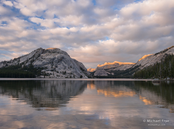
At Tenaya Lake last week my workshop student and I watched and photographed a spectacular, constantly-changing cloud display for over two hours. I made many images, including the one at the top of this post (you can see two more here and here). With the lake in the foreground every composition included a prominent horizon line, so I was often thinking about where to place the horizon in the frame.
It’s not always an easy decision. If you’ve ever read any books on composition you probably learned about the rule of thirds. And when applied to horizons this means you should place the horizon a third of the way from the top or bottom of the photograph. And you probably also read that you should, at all costs, avoid putting the horizon in the center of the frame.
As many of you already know, I’m not a big fan of the rule of thirds. It’s too restrictive, too limiting when applied to the infinite number of possible subjects and situations a photographer can encounter. It’s useful sometimes, but shouldn’t be taken as dogma.
I think this applies to horizons as well. Sometimes putting the horizon a third of the way from the top or bottom works. Sometimes it’s better to ignore the rule and put the horizon right in the middle, or near the top or bottom of the frame.
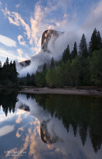
If you’re photographing a still, mirror-like reflection, a centered horizon can work quite well. The bottom half of the image mirrors the top, creating symmetry and repetition. This photograph of El Capitan, for example (B, at right), is all about symmetry. The way the bottom of the photograph mirrors the top creates the sense of lines radiating and swirling out from a central point—an effect that would be lost if I had moved the horizon off-center. (Okay, it’s slightly off-center, but only slightly.)
If you’re not dealing with a mirror reflection then centering the horizon often makes it look like you’ve stuck two different photographs together. In these non-symmetrical situations it’s usually better to point the camera up or down, even a little bit, and choose to emphasize either the sky or the foreground.
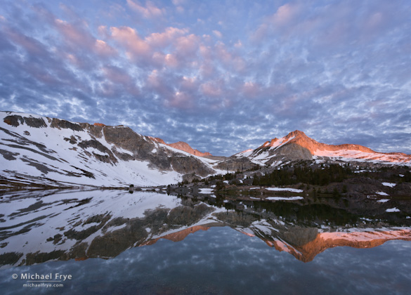
In the photograph below of Greenstone Lake (C) there was a mirror-like reflection, so I could have centered the horizon, but my lens wasn’t wide enough do that and still include enough of the clouds at the top. So I chose to point the camera up and emphasize the sky more than the reflection. The horizon happens to be about a third of the way from the bottom of the frame, but this was just where it seemed to fit, allowing me to include some breathing room above the most prominent clouds, as well as space below the reflection of the peak.
In the image of Tenaya Lake at the top of this post (A) the water wasn’t a perfect mirror, so I figured a centered horizon wouldn’t work. I liked the ripples in the water, but decided that the clouds were a little more interesting. But placing the horizon a third of the distance from the bottom of the frame wouldn’t have left much room for those beautiful reflections. In this case putting the horizon just below center seemed to strike the right balance.
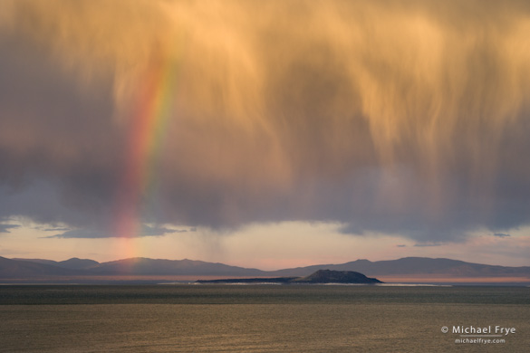
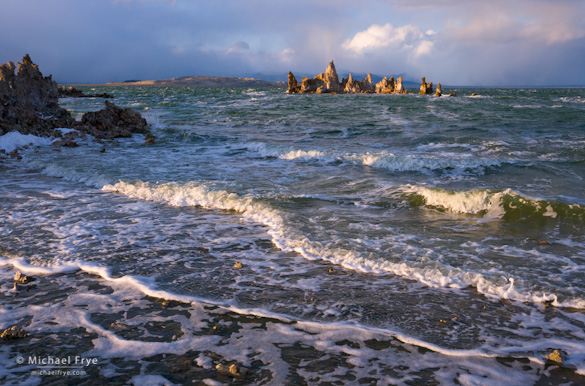
The next two photographs below (D and E) were made at the same location—Mono Lake. In the first one I put the horizon low in the frame, in the second one I put the horizon high in the frame—in both cases well beyond rule-of-thirds territory. In the first the sky was spectacular, while the ruffled water wasn’t that interesting. In the second photograph I felt the waves were the most compelling element in the scene so I pointed the camera down, filled most of the frame with water, and put the horizon near the top.
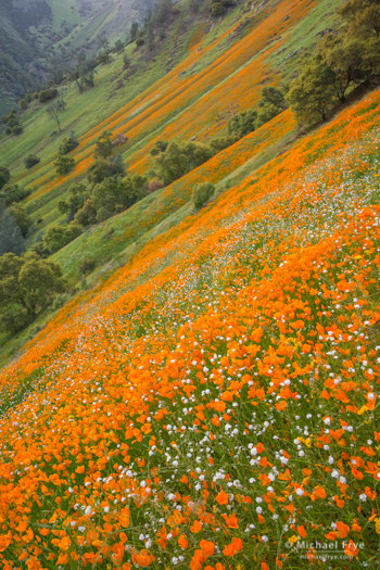
Finally there’s one more example, of poppies in the Merced River Canyon (F, below), with no horizon visible. Showing the horizon would have required including a bright, washed-out sky, and that bright area would have pulled viewer’s attention away from the spectacular display of flowers. There’s no law that says you have to include a horizon at all.
So where should you put the horizon in landscape photographs? It’s really pretty simple. If you have a mirror reflection, consider putting the horizon in the center. If not, ask yourself which is more interesting—the sky or the foreground. If it’s the sky, point the camera up. If it’s the foreground, point the camera down. Let the logic and esthetics of the scene, not arbitrary rules, guide your decision.
— Michael Frye
Related Posts: Photo Critique Series: Space and Separation in a Mt. Shasta Photograph; Redbud and Poppies
Michael Frye is a professional photographer specializing in landscapes and nature. He is the author and photographer of The Photographer’s Guide to Yosemite, Yosemite Meditations, and Digital Landscape Photography: In the Footsteps of Ansel Adams and the Great Masters, plus the eBooks Light & Land: Landscapes in the Digital Darkroom, and Exposure for Outdoor Photography. He has written numerous magazine articles on the art and technique of photography, and his images have been published in over thirty countries around the world. Michael has lived either in or near Yosemite National Park since 1983, currently residing just outside the park in Mariposa, California.



Good post, Michael. Agreed. I haven’t even really consciously thought about the rule of thirds since the first year I was shooting. Horizon placement should merely be the result of how the other elements of the scene play a role in the framing, or image usage intent such as covers, etc… rather than a default placement just because a guidebook said so.
That seems about exactly right Richard: The rule of thirds is helpful for getting beginners out of the habit of putting their subject right in the center, but once you’ve broken that habit the rule can be more restrictive than useful.
Getting out of the habit of centering subjects is the most helpful description I’ve heard on the rule of thirds. Helpful article.
Thanks Lyle – glad you found that helpful.
I don’t know if it’s a helpful observation, but I often think of the horizon line as an “anchor” for a composition, especially when there’s something like a spectacular cloudscape that’s the subject. Then I tend to put the horizon line very close to the bottom of the frame, and to me that feels like a “ground line” for the image to”grow” out. I don’t think I’ve shot very many shots where the horizon line is almost at the top of the frame, but I can visualize how that’d work too.
Eric, that’s definitely a helpful observation, at least when you have interesting clouds overhead. And you don’t have to visualize putting the horizon almost at the top of the frame – just look at E above, the second image of Mono Lake.
I really like that last one.
Thanks Tim. You can read more about that photo here:
https://www.michaelfrye.com/2012/04/10/redbud-and-poppies/
Michael, I absolutely love B! I’m curious about the clouds on the left edge of the picture directly out from the face of El Capitan. They look a lot different than the rest. It’s tough to tell in a small picture why they look that way. They almost look painted on.
I read about the rule of thirds several years ago in a book. I tried focusing on it while shooting for several pictures and then examined them. I didn’t like them. I took away exactly what you said about not centering the subject (horizon) and let my eye do the rest. I sometimes crop a little while processing to adjust things.
Thanks Brad! The clouds you refer to are higher and more distant than the rest. In fact they’re actually clouds, while the rest is mist rising from the valley and El Cap.
Thanks for sharing another set of stunning images, Michael, and a thoughtful examination of some of the implications of the ROT. I prefer to think of the ROT lines as quite broad zones (rather than narrow lines at exactly the one third positions.) Thought of in this way, the intent is to make sure that the novice doesn’t place the significant lines either too centrally, or right at the very edges of the picture (without good reason!). Another way of putting this would be to say “avoid symmetrical compositions unless the image components are themselves symmetrical.” Personally, I love symmetry. Some of the best pictures I have seen have been symmetrical!
Just in passing, I really like the tilted camera effect of the poppies shot – a clever idea that creates an intriguing image. I’m going to try that!
Geoff, thanks for your comments. Thinking of the rule of thirds lines as “broad zones” seems like a good idea to me. Maybe very broad! 🙂
Glad you like the poppy photo, but the camera wasn’t tilted. The hillside just slopes at a really steep angle.
I’ve been suspicious for some time that a good part of the hangup with the ‘Rule of Thirds’, and/or the broader ‘Rules of Composition’, is less about the concept than about the word ‘Rule’. Because ‘Rule’ at least implies there is a b&w (no pun intended 🙂 ) nature to the concept, people tend to interpret it that way…..as though it were a hard edged ND grad filter.
Truth be told, we’re probably much better served to think of things, and use the concept, in more of a soft edged nd grad filter sorta way. In a large majority of cases, but certainly not all, it probably is better to steer clear of centering the horizon. But how much above or below center the horizon should be placed might best be treated as a VERY fuzzy line. And the only ‘rule’ to which it should adhere is that it’s location is placed to best serve the overall composition.
Because I’ve seen similar discussions in numerous venues over the last several years, I have begun to wonder how & when that particular terminology came to be. Did it arise with the birth of photography? Or perhaps more likely, it’s been used by painters for a thousand years.
Fo, thanks for your comments here. I think the rule of thirds is actually a simplified version of esthetic principles related to the Fibonacci number and the golden ratio:
http://en.wikipedia.org/wiki/Fibonacci_number
http://en.wikipedia.org/wiki/Golden_ratio
So it’s actually quite an old idea, though the rule of thirds is a vague and gross over-simplification of it. But though the golden ratio has a long history and is associated with many great thinkers, to my mind any artistic principle based on mathematics is suspect. 🙂 Some people would like to believe that there’s a mathematical formula behind artistic beauty, but I think it’s way more complicated than that.
The word “Rule” should, perhaps, be replaced by the word “Guidelines”
Am familiar with Fibonacci. Does make sense that the ‘Rule of Thirds’ may be, however loosely, based on that. I don’t understand your skepticism about application of a mathematical concept often used to analyze/predict price movements in financial markets also having application in the photographic art world (he sez, tongue-in-cheek-mode on high. 🙂 ).
But hey, there are those who will argue that math is at the root of everything in some way, shape, or form.
Well I guess I’m a maverick for not wanting to apply a mathematical concept used for financial markets to photography. 🙂
Wonderful post w/ images that seem even more spectacular than usual. Thank you Michael!
Just saw the Fibonacci spiral comment. I’d heard that da Vinci based his work on it. Love hearing you dis da Vinci! 😀
LOL Joolz – that da Vinci, what a hack! 🙂 But in that article about the golden ratio I linked to it’s not clear that da Vinci really used it in his paintings. Certainly looking at the Mono Lisa it’s hard to see golden ratio proportions in way the figure is placed, though maybe in the background. And my god, she’s centered, left to right! Clearly this piece would be thrown out of many camera club competitions (aside from the obvious overuse of Photoshop’s Oil Painting filter, of course…).
http://en.wikipedia.org/wiki/Mona_Lisa
Great article Michael, It is easy to get caught in the rules, and choose the rules over one’s natural creativity. Thanks for encouraging us all to let that creativity flow.
Thanks John!
Great post Michael.
The last sentence is arguably the most important of all lesson I’ve passed onto other photographers. Don’t let some silly rule dictate the aesthetics, flow and balance of the image you’re making…
I haven’t been keeping up with your blog regularly, but it’s still packed full of great content. Thanks for taking the time to share your images and words.
Best wishes,
Tim
Thanks very much Tim – glad you liked this.
Excellent post and brilliant photos to accompany the point! This will go a long way in helping me with composition when the situation arises.
Thank you Micheal!
Thanks Don, and you’re welcome – glad you found this helpful!