Depth can be a powerful tool in photography. Our medium is two-dimensional, but a sense of depth, an illusion of space and distance, can make the viewer feel like part of the scene, and literally and figuratively add another dimension to a photograph.
A Common Formula
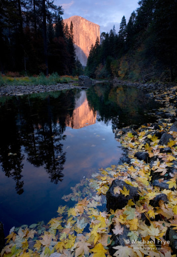
This image of El Capitan follows a common formula for creating a three-dimensional effect in landscape photographs: find an interesting foreground (preferably with some leading lines), get the camera low and close to that foreground, and use a wide-angle lens.
A wide-angle lens by itself can’t create a sense of depth. Wide-angle lenses make things look smaller, and therefore more distant, but if everything looks small and distant there’s no sense of depth. The 3-D effect only happens when you put the wide-angle lens close to something in the foreground. That proximity makes the foreground look big, but things in the background still look small. The optics create an exaggerated size difference between near and far objects, and our brains interpret that as depth and distance.
This wide-angle, near-far look is common today, but it wasn’t always so. Though he wasn’t the first to use this perspective, master landscape photographer David Muench popularized this technique through his many beautiful books, and a lot of people have followed his lead.
But this look has become so popular that I think landscape photographers have stopped looking for other ways to create a sense of depth, and by doing that we’ve limited our options. We owe it to ourselves and our viewers to explore other paths, and create images with depth and meaning that go beyond this one formula.
Other Ways of Creating Depth
In his eBook A Deeper Frame David duChemin suggests some alternatives. He talks about the obvious ones of course, like perspective and optics, but also discusses some less-obvious techniques like using color, light, and selective focus. I won’t elaborate here, as it’s better to hear it from David, and the eBook is only five dollars.
But after reading David’s book, and writing a post about the third dimension in photography, I couldn’t help thinking that there must be even more ways of creating depth that we landscape photographers haven’t taken advantage of.
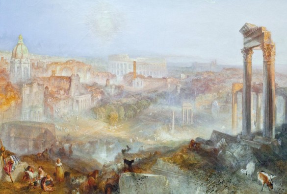
About a year ago, while visiting the Getty Museum, I encountered this JMW Turner painting of Rome. I was struck by its great sense of depth. (It helps to click on the image and see it larger, though viewing the original is much better.) It doesn’t use a wide-angle perspective, which was unknown before the advent of photography. The angle of view is similar to a “normal” lens — i.e., 50mm on a full-frame sensor.
Turner created depth with an older formula: he included a foreground, middle ground, and background. This arrangement helps produce a size comparison: we see that people and structures near the bottom of his canvas look larger than similar objects in the middle, implying that the smaller objects are more distant. You might also notice some subtle perspective lines that converge near the center of the painting. And Turner added smoke or haze; notice how the shadows are darker and the contrast stronger in the foreground, while the background colors and contrast are faded, an atmospheric effect that adds to the illusion of depth and distance.
This got me thinking, and I started looking for images from our own medium that had depth, but didn’t depend on a near-far, wide-angle perspective. It didn’t take long. My favorite Ansel Adams photograph, Clearing Winter Storm, has, I think, a great sense of depth, but it was made with a “normal” lens (12 ¼ inches on an 8 x 10 camera, roughly equivalent to a 45mm lens on a full-frame sensor), and the closest objects, the foreground trees, are at least a hundred feet away.
Like Turner’s painting, Clearing Winter Storm has atmospheric effects — the mist in the distance. It also has a foreground, middle ground, and background, setting up a size comparison between the relatively large trees near the bottom of the frame and the smaller ones in the middle.
Ansel again used a normal lens (the same 12 ¼ inch model) for Mt. Williamson, Sierra Nevada, from Manzanar. The foreground here is more prominent, but not pushed into the viewer’s face. Beyond, there’s a middle ground and background, plus, once again, atmospheric effects. But one of the strongest three-dimensional cues here is the repeating shapes of the foreground rocks that gradually diminish in size in the distance.
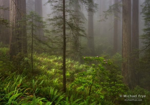
I don’t want to compare myself to Turner and Adams, but I’ll show this example to demonstrate that we mortals can do this too. This photograph of redwoods and rhododendrons from my own files has all of the elements we just discussed. The atmospheric effect — fog — is obvious. There’s a foreground, middle ground, and background (though not a distant background), and a repeating element that diminishes in size with distance: the ferns. The focal length was 32mm on a full-frame sensor, only slightly wider than a normal lens.
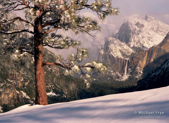
A near-far juxtaposition can create a feeling of depth even with a telephoto lens, as in this image of Bridalveil Fall and a Jeffrey pine. I used a 150mm lens on 645 film, equivalent to about a 90mm lens with a full-frame sensor. There’s really no middle ground here, but the nearby tree looks much larger than the cliffs and waterfall, so our brains assume there must be a great distance between the foreground and background.
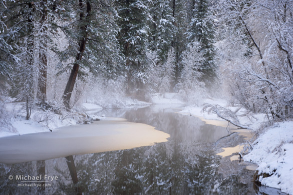
Leading lines, converging lines, and s-curves — those visual cues about perspective and distance — can also work with telephoto lenses. This winter scene along the Merced River uses those elements to create a subtle but palpable sense of depth. Of course it also has a little mist for atmospheric effect. You might say that there’s a foreground, middle ground, and background here, though I think that’s stretching it a bit. The focal length was 91mm on a full-frame sensor.
A Question
There’s another element, a tool for creating a sense of depth, that I haven’t mentioned yet, but most of the images I’ve shown or linked to so far have it. It’s related to the artist’s vantage point. Can you guess what it is before reading further?
What I’m alluding to is that most of these images were made from an elevated position. The photographer or painter was on a hill, or a rise of some kind. This height helps visually separate the foreground, middle ground, and background, and makes perspective lines and size comparisons more apparent.
It doesn’t have to be a big hill; a slight rise is enough. For the last image of the Merced River I was standing on Swinging Bridge, about 15 feet above the water, high enough to show the converging lines of the river’s banks and the s-curve — a perspective you wouldn’t see if the camera had been placed at water level.
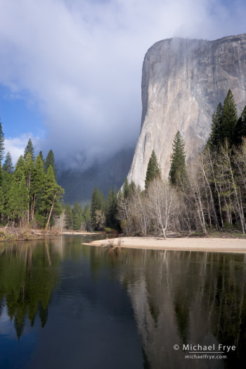
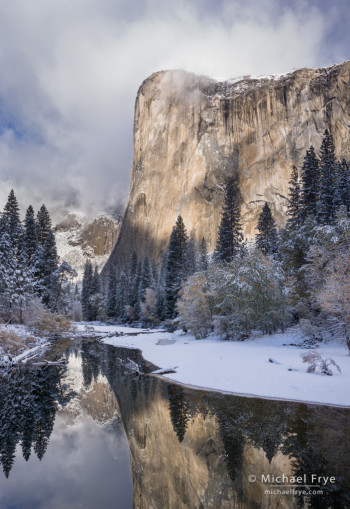
Following this paragraph you’ll find two images of El Capitan. The first was made near the edge of the Merced River. The second was captured nearby, but on top of an embankment which provided an elevated vantage point. I think the second image has a greater sense of depth. Notice how the banks of the river in this second photograph converge, and the trees on the right diminish in size as they recede into the distance. Interestingly, I think this 3-D effect also makes El Capitan look taller.
For the image of redwoods and rhododendrons above I was also standing on a rise, with the tripod as high as possible, looking over a small swale. It might not be apparent when viewing the photograph, but the ground sloped steeply down from my feet to a point just beyond the rhododendron bush, where the terrain rose again toward the most distant redwoods. This elevated position helps the viewer see over the foreground ferns and into the swale, and sets up the visual size comparison, where the ferns in the lower-left corner look relatively large, then diminish in stature toward the middle of the frame.
For the wide-angle, near-far look I talked about at the beginning, you actually take the opposite approach — you put the camera low to the ground to make the foreground appear larger and more prominent. But that low position often hides or diminishes the middle ground. If you’re trying to create a sense of depth with a normal or telephoto lens, or even with a less-exaggerated wide-angle perspective, gaining elevation helps by visually separating the foreground, middle ground, and background, which makes perspective lines and size comparisons more apparent.
Also, wide-angle lenses often make mountains look small and insignificant. Combining a longer focal length with a sense of depth can make mountains look larger and more imposing.
Beyond Depth
The last thing I want to do is replace one formula with another. Not every landscape needs a foreground, middle ground, and background. Elevated viewpoints, atmospheric haze, near-far juxtapositions, and perspective lines are entirely optional. These are just a few ideas, ones that I hope will get you thinking about different ways to create depth. I’m sure we’ll find many other depth-enhancing techniques once we start looking for them. If you have any ideas please let me know.
And while depth can add power to a photograph, it shouldn’t be a goal in itself. The goal is to make expressive images, and a sense of depth isn’t a requirement for this. Some of the world’s greatest landscape photographs have no foreground or middle ground, no atmospheric haze, and little sense of depth. Think of Ansel’s Moon and Half Dome, or Galen Rowell’s Last Light on Horsetail Fall.
As Ansel and Galen understood, sometimes it’s better to embrace photography’s true nature and let the image be graphic and two-dimensional. These classic images don’t need an illusion of physical depth because they have something more vital: emotional depth. Make images with great depth of feeling and no one will care what lens you used.
— Michael Frye
Related Posts: The Third Dimension in Photography; New eBook: A Deeper Frame by David duChemin
Michael Frye is a professional photographer specializing in landscapes and nature. He is the author and photographer of The Photographer’s Guide to Yosemite, Yosemite Meditations, and Digital Landscape Photography: In the Footsteps of Ansel Adams and the Great Masters, plus the eBooks Light & Land: Landscapes in the Digital Darkroom, and Exposure for Outdoor Photography. He has written numerous magazine articles on the art and technique of photography, and his images have been published in over thirty countries around the world. Michael has lived either in or near Yosemite National Park since 1983, currently residing just outside the park in Mariposa, California.



An absolutely excellent article, one of the best for many a long time! I was taken aback by ‘William’, in the UK he is more usually known by JMW and even though I know Joseph Mallord William, it seemed odd. Looked at a lot of his work in the Tate a few weeks ago, it really is ephemeral.
Thaks again for this superb article.
Thanks Graham! I don’t really know what the convention is here, as I’ve seen the name both ways, though it does seem odd to call someone by his initials.
Excellent article, Michael!
Thanks Dan!
Great summary, Michael – and cool that you included the work of a painter in your examples, as there is much that we don’t quite have to reinvent when we look to what has worked for them for centuries.
I did guess your the answer to your “elevated perspective” question, perhaps because I have a photo from this past week that made use of just that factor (along with a few others you mentioned). It should show up at my blog and elsewhere tomorrow.
Dan
Thanks Dan — I look forward to seeing your elevated-perspective photo.
Very thoughtful and informative article Michael. It will make a fun study to review some of my own images and compare these perspectives. Your examples are excellent and really help visualize your points. Well done as always!
Thank you Marc!
Really really good read Michael. I’ll definitely be thinking beyond the wide-angle formula in future.
Great Simon — thanks!
Very well-written article Michael! I really like how you thoroughly explain the concept you’re discussing and provide an example for your readers to study. You are an excellent teacher and I appreciate you taking the time to share your knowledge with the world.
Thank you Bryan! Glad you like the article.
Thanks so much for posting this thoughtful and thought-provoking message. I am in the process of studying some of the great masters (although this process never ends!) and your post was very timely and relevant for me.
Thanks Kayla — and let me know is you learn more about creating depth in your studies. 🙂
Good post! I am wondering if you would include the Blur Effect to creat depth, by bluring a foreground or background or both, would you say creates depth by providing visual cues that the out of focus areas are either to close or to far away to be seen clearly. You see this alot with telephoto and tilt-shift shots or it can even be done in software.
Thanks Jon! Yes, selective focus can definitely help suggest depth. David duChemin discusses this in his eBook that I mentioned, but I didn’t discuss that in more detail here so I could devote space to other things.
At the risk of using up my allotment of replies – and then some – it occurred to me that there might be one other element illustrated in your redwood forest shot, and maybe some others. It is related to the atmospheric recession element but not quite the same thing. The inclusion of elements that are in different sorts of lighting also strengthens the effect of depth. The redwood forest photograph would not have nearly the effect is has if it were not for the foreground light. Something a bit like this can even be seen in the Turner painting, where there is a patch of shadow at the lower right that enhances the effect of open light beyond and even on the figures at the left. The snowy Merced River photograph also exhibits this with the small area of warmer light on the ice.
I think we all know this, as well, from photographing on the wonderful days when broken clouds move across the landscape, creating alternating patterns of shadow and light.
Dan
Good observation about light. Since David duChemin discusses light and depth in his eBook I didn’t elaborate on the topic here, but he makes some interesting points about how light can delineate the form and texture of objects, which helps suggest the third dimension.
I think that’s part of what’s going on in the redwood photograph, where light accentuates the round form of the trunk on the left, and the texture of the ferns. Just the fact that there’s sunlight in one part of the scene, and not in others, suggests that there’s some depth and distance involved because we assume that if the scale of the scene were small then the light would be even everywhere.
David doesn’t talk about the chiaroscuro effect that you point out, and I hadn’t thought about that in relation to depth either. Maybe the dappled light created by broken clouds subtly suggests depth and distance to our brains because it can’t occur over short distances. In other words, clouds have a minimum size, and subconsciously we know that, because we’ve all seen lots of cloud shadows in our lives and they’re never less than about 100 feet across, and usually much larger.
About that redwood tree on the left and the light that hits it from out of the frame… this creates another sort of “depth” that I’ve thought about recently, namely the suggestion of space beyond the edge of the frame. I’ve seen this created in several ways. In your redwood photograph it creates a certainty that there is something important to the left of the area we can see, since that is where this light obviously comes from – and at some level our minds engage this area outside of the frame and consider it as part of what we do see in the image you present.
This can work vertically as well – no surprise! I remember some years ago finally figuring out – duh! – that if I wanted to “show” the tremendous height of, say, redwood trees it was not necessarily best to use a tall, vertical frame that showed the whole tree. Thinking about my own awareness of the massive size of redwoods and how I look at them when I visit them, I realized that what I can’t see is perhaps more important to creating this effect than what I can – so I simply used a landscape orientation and shot the bottoms of the trees, leaving their mass to imply the thing above that can’t be seen. Obviously, this can work with lots of other subjects. Eliot Erwitt does it beautifully with subjects like small dogs and people, and it works well for certain urban landscapes, too.
Dan
Nice points again Dan about what’s suggested and not seen in a photograph. More stuff to think about… 🙂
Michael, that was the best written description of the visual elements one sees in viewing pictures of landscapes with depth that I have ever read. I think that many of your followers will benefit from that and will strive to incorporate those factors in their images. I know I shall try.
In regards to other ways to create depth, I will sometimes use a fill-flash for the foreground if it contains a shaded element that would enhance the photograph. This sort of ties in with G. Dan’s comment above.
Jim
Thanks very much James! The fill flash is an interesting idea. If you lighten up a dark foreground with flash it could actually decrease the sense of depth by making the lighting too even. But if you use the flash to create a little sidelight that would enhance the 3-D feeling of the foreground objects.
One of the best photography posts I’ve ever read. Period. Thank you for taking the time and effort.
Thank you Ben!
I’ll second Ben’s comments… one of the best posts I’ve ever read. Thank you!
Thanks Brad!
I agree a marvelous post.
I really appreciate that you use more intimate views (Merced River in winter, Redwoods, ferns) as illustrations too. I also appreciate your providing for shooting data for those of us that are still learning.
Drawing on a variety of photographers adds to your message as well. I’m struck by how each photographer produces something quite different even in virtually the same location. It’s a wonderful testament to human creativity and the natural world.
Thanks Phyllis, and you’re right about the smaller scenes — great distances don’t have to be involved to create a sense of depth.
Excellent, thanks and well done!
Thank you Thomas!
Very good article. I very much agree that we need some new options; David Muench’s “look” works best if you are not confronted with image after image with that same effect. I am increasingly looking for ways to have strong light contrasts, preferable shadowed forms in the foreground or mid-scene with light/fog/brightness in the distance. I had not thought much about the elevated position though now hearing it I can certainly think of times where I have looked for ways to stand on the log or boulder to get that effect, which mimics some the effects of a tilt-shift lens. Good thoughts here!
Thanks Ed — I like your ideas about darker foreground and lighter background. That seems like it would suggest depth and create some drama.
Michael,
An excellent article on creating depth in photography. I’ve quickly become a fan of yours after buying your Photographers’ Guide to Yosemite and subscribing to your blog. Although you shoot in digital format and I shoot in large format with b&w film, all of your comments would apply to my work as well. Thanks so much.
Ken
Thanks very much Ken — glad you liked this article. When it comes to composition, light, seeing — all the most important aspects of photography — it’s all the same regardless of what camera you’re using.
Your blog is quite timely. I was trying to work out the depth with a telephoto solution and hadn’t yet arrived at elevation. It was an “Of course!” moment. Thank you! Can’t wait to put it in my bag of tricks – though looking back at some of my own images, it was already there…
Thanks Tom — that was an “Of course!” moment for me too when I realized that. And I wasn’t thinking about depth when I chose the high vantage points for the images shown here — that was analysis after the fact. But now that I’m aware of it I’ll be seeking about those elevated viewpoints. I think it works better if they’re not too elevated, otherwise you lose the middle ground.
Excellent, excellent, article! Certainly among the best, if not the very best, I’ve ever read also. Every word (and illustration) contributed to a magnificent whole. I can’t wait to put these thoughts into practice. Thank you so much!
Thanks very much David! I hope you do get to put these ideas into practice.
Thank you, Michael, for another thought provoking article. I was at one of the local forest preserves this morning and considering a composition I had made before, but it looked flat. Now that I’ve read your article, I realize why it had worked on another morning – a dense fog had created a sense of depth between the rows of trees in my background.
Thanks Vivienne. Fog can add a lot to a scene — depth, yes, but also mood and mystery. Certainly it would be a very different scene without it.
I thoroughly enjoyed this post Michael. I can think of some my own images that have always had that extra feel of depth to them and fall in line with what you mention. I believe your post points out important facts that we may otherwise overlook. Thanks for the great info.
Thank you Brad — glad you found this helpful!
Outstanding article; well grounded and beautifully illustrated. If I were still teaching I’d insist that everyone of my students read it daily for a month. Thanks for sharing.
Thanks very much Eric! Apparently you liked to torture your students. 🙂
I have not seen such an amazing photography in a long time, completely in love with the pictures, excellent photography skills, Thanks for sharing the pictures and the post.
Thanks very much!
Excellent article.
One of the effects you briefly discuss regarding the Turner painting is called aerial perspective.
“Aerial perspective or atmospheric perspective refers to the effect the atmosphere has on the appearance of an object as it is viewed from a distance. As the distance between an object and a viewer increases, the contrast between the object and its background decreases, and the contrast of any markings or details within the object also decreases. The colours of the object also become less saturated and shift towards the background color, which is usually blue, but under some conditions may be some other color (for example, at sunrise or sunset distant colors may shift towards red).”
http://en.wikipedia.org/wiki/Aerial_perspective
It is often used in landscape painting to show depth and distance.
Thanks Foosion — didn’t know what that was called.
I’ve heard photographers use the term “atmospheric recession” for this.
Do you think capturing depth was one of the reasons Adams built a platform on top of his vehicle?
George, he certainly wanted the ability to have a higher vantage point, but whether he was thinking about depth I don’t know. It’s always possible to make the camera position lower, but it’s difficult to go higher than your eye level, so any way you can create that opportunity is helpful.
Michael —
Thank you for speaking up and sharing this post. The insights are valuable and the images you’ve included really quite striking. You could do a post around any one of them. I especially liked the Jeffrey Pine and Merced River in Winter images.
The wide-angle, near-far approach truly worked well for David Muench and he deserves the considerable credit he’s been given for pioneering it. But, it has become way, way over-used. Look down thru any landscape “photo stream” today (Flickr, photo.net, 500px) and you would believe the only approach to landscape is a 10-24mm lens supported by the saturation slider.
I would encourage you to further develop this topic — perhaps collaborating with David duChemin — and build it into an eBook such as those offered through Craft & Vision.
In my own experience, living on the North Coast of California, fog is a great atmospheric effect that does indeed impart depth. I have found that fog-laden compositions, while nearly monochromatic, do tend to “work” better as color images rather than monochrome. Fog tends to de-saturate colors progressively as one moves deeper into the fog. Even a subtle, natural saturation gradient adds noticeable depth.
Best,
Frank
Thanks for the kind words Frank. You’re right that many people seem to think that landscape = wide-angle lens — an attitude that I find puzzling, given the abundant evidence to the contrary. I’ll look into exploring the depth topic further in one way or another. And fog is wonderful stuff for photography, not just because it can create a feeling of depth, but because it can add mood and simplify a composition.
Thank you, for the tips on creating depth. While I am not a photographer, I am a textile artist and found it very helpful in what I am trying to achieve with my art work.
Thanks Marci — glad you found this helpful.
Great article, love your photos all very atmospheric in this article.
Thanks Dan!
Thanks Michael! Great advice to keep in mind as always!
Thank you Brent!
Well, your readers have all said it already, but great article with much to consider in broadening my techniques as I learn landscape photography. Thank-you!!
Thanks Hillel — glad you found this helpful!
This is an *excellent* piece of writing on the larger issues around composition in photography. Thank you for taking the time to write such an extensive, well-articulated piece. I sorely wish I was able to do more landscape photography – but, many of the things that you talk about apply to other kinds of subjects as well. It’s also good to realize that even if all you have is a 50mm prime, you can still achieve depth in your photographs by thinking about your elevation in relation to your subject.
Thanks Chip — glad you liked the article. Yes, a lot of what I talk about here applies to other subjects, not just landscapes. Photography is photography, and there are more similarities than differences between different genres.
Michael,
I’m with you all the way on this point. Garish sunsets and super wide angle shots bore me to death. I’m glad you wrote this article, it’s very interesting and the photo examples are fantastic!
Thanks.
Thanks very much Dirk. I wouldn’t say I’m bored with super wide-angle shots — if they’re done well they can be great — but would just like to see some different ideas. There is more than one way to take a landscape photograph.
My original point came off the wrong way. I can appreciate the u-w angle view, you just plainly illustrated there are many techniques to be used. By not sticking to one formula, a photographer can get great photos at any time of day, with various focal lengths and vantage points. I was just trying to say it’s refreshing to see you mixing it up.
BTW, I like your blog, and your books a lot.
Dirk
No worries Dirk! And I’m glad you like the blog and books.
Your article was excellent. Thank you for taking the time and making the effort to pull all those interesting elements together in order to illustrate your point. I found it very interesting and thought-provoking.
Regards,
Monica
Thanks Monica! Glad you liked the article.
Great read Michael. I do appreciate being reminded of the “rules” along with examples to express them, but you have gone far beyond just giving a formula.
Thanks Paul! I hope you’re able to put this information to practical use out there.
Great article and spectacular images. Thanks for sharing.
It makes me want to go to some of those spectacular places even more.
Thank you Mark! Glad you enjoyed the article.
I really enjoyed this article. I have seen a number of times articles on this subject and pretty much most of them circle around the large foreground taken with super wide angle lenses, but you went a lot farther, and even though we might use all the other elements unintentionally, it was enlightening reading and bringing it up to a conscious level, so it would come up to mind in future work.
Thanks much for an article so well done.
Thanks very much Oscar. I hoped to take this subject further, and hope that others may be able to take these ideas and go further still. And I can also thank David duChemin (I mention his ebook above) for inspiring me to think more about this subject.
Very well written and easily understood. As an novice-to-middle-of-the-road amateur I appreciate the applicability of all your ideas. I’ll look into that ebook as well as your photo guide to Yosemite. Ironically I stayed in Mariposa a couple nights over Christmas and lucked out on the snowfall this past Holidays. Would love to get back to Yosemite more often! Thanks again.
Thanks Bob — glad you found this helpful. And I’m happy you got to see and photograph a snowfall in Yosemite!
An inspiring article,and a common theme among these photos is the dramatic light and shadows created not only by the position of the sun, but the landscape structures as well,blocking sunlight in certain areas.Depending on what is in front of your camera you might have to change the way you shoot,think for youself,forget about what is written in a Photographer Magazine.So i think it is great to read little tips and advice like this article,it is kind of a relief,i don’t have to use a wide angle lens with a very close foreground subject.
Yours Sincerely, Noel Buttler
Thanks very much Noel! You’re right about the light helping to create a sense of depth. David duChemin talks about light and depth in the ebook I mentioned, but not in the same way. I think you and G Dan Mitchell (see his comments above) are talking about similar things, and you’re on to something.
Thanks a lot for this very interesting lesson of photography. After reading, all of that seems evident, but why don’t we think earlier about it?
You’re welcome Henri. I think many people have talked about these ideas before, but perhaps we photographers have forgotten about them.
Thanks Michael,
Can’t wait to get to Yosemite this Summer. I’m planning a trip with my wife and now I just know how I’m going to structure my shots. I’m also a big fan of JMW so the use of your work and his wonderful art is a really nice touch.
Thanks, Bob.
You’re welcome Bob, and thank you. I hope you have a great trip this summer.
Excellent article Michael.
I enjoyed it very much. I’ve tried to incorporate many of the examples you’ve given in my own landscape photography. There’s an ebook I found fascinating and helpful on this subject called “Learn landscape photography from the old masters of painting.” It is published by another photographer I admire by the name of Patrick Smith. In it, he points out some of these same techniques that the old masters employed to establish a sense of depth in their paintings.
Thanks again for a wonderful article,
David
Thanks for the kind words David, and thanks for the tip about that ebook. I’ll have to check that out.
Thanks for the suggestions Michael. I was recently in CA, what a beautiful state. I was in San Fran and spent a little time looking around and shooting.
Fantastic images you have posted!
Best,
Ray
It just occurred to me that one technique I use is with sharpness (and clarity) and luminosity.
If the foreground is very sharp, and with contrast, and the distant sky, or valley, etc., is softer, there is the sense of depth.
R
You’re welcome Ray, and thanks for the kind words. Are you saying that you add more sharpening or clarity to foreground objects than background ones? If so, that’s an interesting idea.
Yes, that’s the idea. Clouds can be left soft in a lot of cases, and even smoothed some with noise reduction (there might be a better way), which would be a visual contrast with the sharp foreground. Or a distant object, which you might not expect to be detailed.
Like I said Ray, and interesting idea. I’ll have to try it. Thanks!
Thanks for all the wonderful information Michael. As I was reading this I remembered reading something similar in one of my photography books that I had totally forgotten about. Now I’ll be looking for a slightly higher vantage point to shoot from.
You’re welcome Dana, and thank you!
A thought provoking discussion accompanied by beautiful photographs. Thoroughly enjoyable. When you mentioned shooting from an elevated vantage point, I couldn’t help but think of the work of George Steinmetz, the photographer who has made a career of just that. Indeed, where you shoot from can make all the difference.
Thanks Randall! And thanks for bringing up George Steinmetz. He has indeed made a career out of photographing form an elevated vantage point. Despite the elevation, most aerial photographs actually don’t have much sense of depth. If you point the camera straight down you get lots of interesting flat patterns, but not depth. But George get a great sense of depth in many of his images; he gets relatively low, and looks toward the horizon, and uses perspective lines or repetitive elements that recede in size to create that sense of depth.
If your perch is too high, whether you’re in an aircraft or on top of a mountain or cliff, you don’t get depth because everything is far away. I think a cherry picker would be very useful. 🙂
Michael – this really is a wonderfully written article about the art of composition and developing an “eye” for creating beautiful landscapes.
I do have a couple questions that are a bit technical about the settings & focus point, but often ignored in these articles/books: I’m assuming you’re generally using an aperture of F8 or greater (e.g. F11-22), unless intentionally trying to blur background elements. Is that correct?
Also, I’ve read many that say you should understand the hyperfocal distance to figure out where to focus and others talk about focusing on something 1/3 into the scene. Do you have any other guidance or practical examples on where best to position your focus point? Or can you pick a picture above please and tell me where the focus point was?
Thanks in advance!
I know that Michael will have a much better answer for you but I’ll tell you what I’ve learned. I have difficulty figuring out distances. So using hyper focal distance didn’t work for me. So I started using my LCD screen with the grid enabled. This allowed me to use the bottom line of the grid as the 1/3 from the bottom of my frame to set my focus. All you need to do is find something on that line to focus on then without taking your finger off the shutter re compose your shot and your photo should be sharp from top to bottom. When using the LCD screen you will need to move the focus square that is usually in the middle to the center of the bottom line. Otherwise your focus will stay in the center of your frame. Keep in mind that what you see on the screen or in your view finder will not look sharp but the finished result will be. Hope this helps.
cdubman — Thanks very much, I’m glad you like the article.
Your question brings up a lot of complex issues. To start with, you want to focus closer to the foreground than the background, as there’s more depth of field behind the spot you focus on than in front of it. But that’s just a vague starting place.
As Dana points out, using some chart for finding the hyperfocal distance is difficult, since you have to estimate distances — unless you want to carry and use a long tape measure! On the other hand, focusing a third of the way from the bottom of the frame is not very precise. That sorta, kinda works sometimes, but only with the right lenses, and with the right terrain. It would not work, for example, in the redwoods photo above, where the closest object to the camera is the fern in the very lower-left corner, and the right focus point is at about the ferns at the very bottom of the frame in the center.
There’s actually a very simple way to figure out where to focus in any situation where you want maximum depth of field — where you want to get everything in focus. You have to use manual focus for this. First, focus on the closest thing to the camera (usually at the bottom of the frame), look at the distance scale on your lens, and note the mark (let’s say it’s the 3-foot mark on your lens’s distance scale). Then focus manually on the farthest thing, and note where that falls on your lens’s distance scale (let’s say that’s at infinity). Then turn the focusing ring so that you’re focused halfway between those two marks (in this case it would be halfway between the 3-foot mark and the infinity mark on the lens).
I explain this procedure in detail, with illustrations, in both my Digital Landscape Photography book and my Photographer’s Guide to Yosemite book and app. This method works regardless of what lens you’re using, and whether you’re photographing a sweeping, wide-angle landscape or a closeup of a flower.
Focusing is actually the easy part. The next step is harder — figuring out how small an aperture you need to get everything in focus, now that you’ve found the optimum focusing point. The best way is to take a photo a certain aperture — let’s say f/8 — and then zoom in on the image on the back or your camera and check the foreground and background. If they don’t look sharp at f/8, go to f/11, then f/16, and so on. This is accurate, but slow.
Hope that helps.
Thanks for your insightful and comprehensive response! I’m looking forward giving this a try.
One question though: why do you have to focus manually on the closest and farthest thing? Wouldn’t using auto focus on those two spots and looking at the focusing ring distance do the same thing? Sorry if that’s a silly question.
Also, are you referring to your “Digital Landscape: In the Footsteps of Ansel Adams and the Great Masters” book? Not you ebooks, which I’ve already purchased :-).
Thanks again!
You’re welcome cdubman. You could use autofocus to focus on the closest and farthest thing in the frame and look at the focusing distances, as you say, but I don’t know any cameras that will let you pick an autofocus point at the very edge of the frame, which is almost always necessary for this technique. So you would have to move the camera to autofocus on the closest spot, then autofocus on the farthest spot, then re-compose, then take the camera out of autofocus so that it doesn’t re-focus when you press the shutter, then turn the focusing ring to a spot halfway between your closest and farthest marks on the lens. To me it seems easier to just use manual focus. If you have trouble focusing manually through the viewfinder try zoomed-in focusing with live view.
Yes, I’m referring to Digital Landscape Photography: In the Footsteps of Ansel Adams and the Great Masters, not my eBooks. Thanks for your purchases. 🙂
Thanks again Michael.
I use the AF-ON button decoupled from my shutter, so I should be able to follow your approach without having to use Manual focus – essentially press AF-ON to focus on something close (noting distance) then on something far (noting distance) and then move focus ring to middle, and then hit shutter to take photo. Since the shutter doesn’t focus, it just snaps away whenever I press it (assuming I don’t have it set to Focus priority). I’ve tried it a little bit and it seems to work but I need to keep experimenting!!
Cdubman, you’re welcome. I also have autofocus decoupled from my shutter, but I still use manual focus for the technique I outlined above, because no camera will let you move the autofocus right to the edge of the frame, which is essential to focus on the very closest and farthest things from the camera.
I knew that you would have a wonderful reply Michael : – ) Now I need to learn to focus in a new way *Sigh* I do use manual focus most of the time which makes this a little easier. Thanks for being kind enough to share your knowledge.
This is timely for me too – I’m an amateur and have been contemplating “the formula.” So this is refreshing, challenging and inspiring. One (hopefully not too basic) question: do you use GND filters? Is this a must-have for landscape photography? p.s. I’m not a Photoshop junkie….
Thanks Pam — I’m glad that you found this helpful. No, I don’t use graduated neutral-density filters, as I find that I can do the equivalent, with more control, in software. Photoshop proficiency is not necessarily required for this. I mostly use Lightroom, including the Highlights, Shadows, Graduated Filter, and Adjustment Brush tools. I also use an exposure-blending plugin called LR/Enfuse. Yes, I do sometimes blend exposures by hand in Photoshop, but that’s not so common for me these days.
Thanks Michael. Great info.
Interesting article, Michael. I like how you used the painting as an example intertwined with the photographs. One thing I have been experimenting with lately to create depth, although it may be a little off topic is to use my 45 mm tilt shift lens to create panoramic images by using the shift function. It gives the finished image a wide-angle feel with a normal lens perspective.
Happy shooting –
Fred Weymouth
Thanks Fred, and interesting idea.
Fantastic article, Michael (you can tell that without even reading, by the number and depth of the responses it stimulates!
One of my favourite photographers from my hemisphere, Peter Dombrovskis, was a absolute master at the wide angle technique’: e.g. http://nla.gov.au/nla.pic-an24365392 and many more.
Thanks Geoff for the kind words, and also for the link. I wasn’t familiar with Peter’s work, but I enjoyed looking at it. Maybe I’ll get to Tasmania sometime!
Great Article! I think these different perspectives really help and inspire to think outside the box. Thanks!
Thanks Adam — glad you found this helpful!
It’s beautiful pictures, like a paradise. I really love it. Hope to go there some time
Thank you Rumah!
Great article.
Thanks Terri!
after reading your (as usual) excellent and informative article, i have a deep sense of peace almost as though having been deeply meditating. your images affect me with a deep sense having captured the essence of the scene. nice one mike….
Thank you very much Michael — well said, and greatly appreciated.
appologies, didn’t spell check and left a wayward “Y” in the yahoo address
Michael, I have Adams’ book The Camera circa 1980 and the Mount Williamson photo is shown, but the caption states, “I made this photograph from a platform on top of my car, using a 19-inch lens on 8×10 film.” This would translate to roughly an 80 mm lens on 35 mm I think. It may be a typo, but if not he sure excluded a lot and gave us the essence of what he wanted to show us.
Stephen, I probably read that Ansel used a 12 1/4″ lens in Examples, but I’ll check that when I get home. It would not surprise me if Ansel wrote that he used a certain lens in one book, and then contradicted himself in another book. I’m sure I would have difficulty remembering what lens I used for a photograph I made 40 years earlier!
hi michael.. thank you very much .. for me wooooooh reaallyyy informative..
Thanks Branz — glad you found this helpful.
what a click sir
Thank you Hassan!
I’m fairly new at photography. I listened to your interview with Jim Harmer (Improved Photography) and really enjoyed your insights. I was fascinated by the part of the conversation about not using a wide-angle lens and how surprised Mr. Harmer was. I’m participating in a landscape workshop near Jacksonville on the ocean on Saturday. I’m thrilled to have read your suggestions on focal lengths. I’ve not been to our location previously but am so excited to have these ideas in mind as I approach compositions. MANY thanks for sharing this with delightful examples.
Thanks Brian, and I’m glad the interview was helpful to you. I find it mildly amusing that some people think that using telephoto lenses for landscapes is some kind of new-fangled, radical idea. On the contrary — people have been using telephotos for landscapes for a long time. What’s new is this weird idea that wide-angle lenses are the only ones suitable for landscapes. But why wouldn’t any photographer use any tool at his or her disposal? Why miss a lot of potentially wonderful photographs because you didn’t bring your 70-200mm zoom? I’m certainly glad Ansel had a long lens in his case when he photographed Moon and Half Dome, and that Galen Rowell had a 200mm lens with him when he raced around Yosemite Valley to photograph Last Light on Horsetail Fall.
Love the reflections in the article on creating depth! I came across a pretty ancient example of atmospheric perspective the other day, in a class given by Yale art history professor Diana Kleiner: The dining room of Livia, who was married to Roman emperor Augustus. Here is a small clip form her lecture: https://www.youtube.com/watch?v=JIResRsvDc4 (the whole course on roman architecture is available on coursera.org)
Karsten, glad you liked the article, and thanks for sharing the video!
Michael
This was a great article, with the accompanying photos from Adams and Rowell it really showed how depth in photo’s can be applied utilising different lens lengths.
Thanks Tim, glad you liked the article!
Love your Blog Michael, we will be arriving in the park on April 1st. Your book and blog make our short visit a thousand times more valuable, thank you, Jan
Thanks Jan, and I’m glad you like the book!
Oh my goodness. I am so impressed (by the way you respond to people). SO much to learn. I am so glad that I found your blog. Wish I knew sooner. Let me read and learn. Thank you, Michael.
Thanks Bailing – glad you found me. 🙂