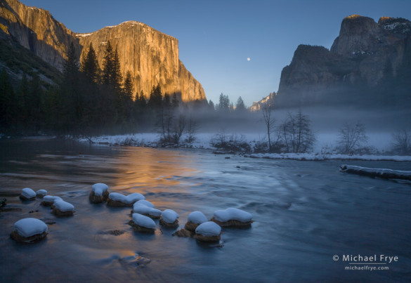
Moon rising between El Capitan and Cathedral Rocks from Valley View. What’s the least interesting part of this image?
The best compositions are simple; they present only the essentials, and leave out extraneous clutter. The most common mistake in photography – by far – is including too much in the frame. Anything that’s not adding to the photograph’s message is detracting from it.
To help simplify your compositions, ask yourself, before you press the shutter, “What’s the least interesting part of this photograph?” Try to identify the weakest area of your composition, and find a way to get rid of it. Then, once you’ve done that, ask the same question again: “Now, what’s the least interesting part of this image?” And get rid of that. And keep doing that until there’s nothing left that you could possibly cut out without losing something vital.
To give you some practice, look at the photograph above. What’s the least interesting part of that image? And if you got rid of that, what would be next – what’s the next least interesting part of the photograph?
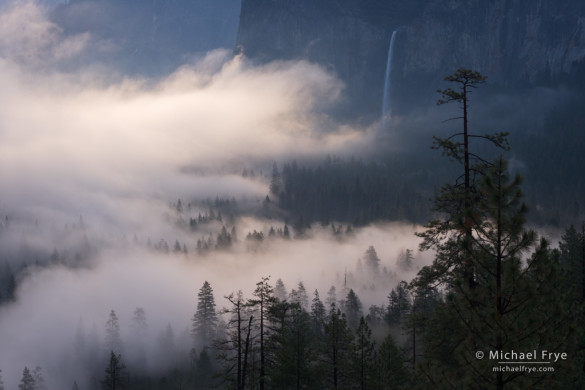
I’ll give you a minute to think about it. When you’re ready, take a look at this next photograph, and answer the same question: what’s the least interesting part of this image?
Okay, let’s go back to the first image. To me, the least interesting parts of that photograph are the dark trees on the left side, the dark cliffs on the right side, the slightly-distracting log near the right edge, and the featureless water in the lower-right corner. Since these areas are all on the left or right sides, and the most interesting things – the snow-covered rocks in the foreground, the gold reflection, sunlit El Capitan, and the moon – are all in the middle, this seems like a natural candidate for a vertical orientation, something like this:
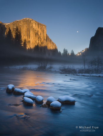
Moon rising between El Capitan and Cathedral Rocks from Valley View; this vertical version cuts out the excess – the least interesting parts on the left and right sides.
I think this is cleaner, simpler, and stronger than the horizontal version. There’s no extraneous clutter, and the most compelling objects dominate the frame.
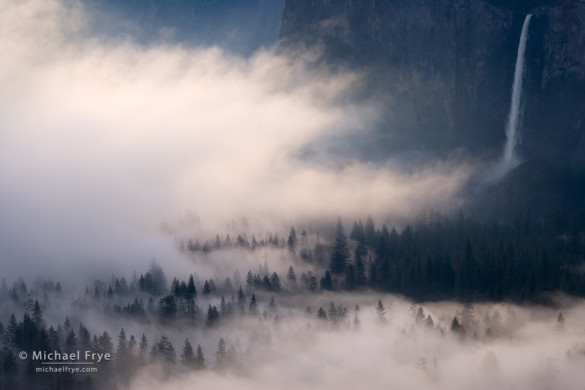
In the second photograph, I’d say the least interesting parts are the dark trees and cliffs in the lower-right and upper-right corners. The tall, prominent tree on the right side is fairly interesting, but not as compelling as the mist, the more distant trees poking up through the mist, and the waterfall. So I took a couple of steps to the left, zoomed in, and made this version:
Again, I think this is cleaner, simpler, and stronger than the wider view.
So the next time you compose a photograph, ask yourself what’s the least interesting part of the frame, and get rid of it. Then look at the new composition, and ask yourself again what’s the least interesting part of the frame, and get rid of that. Keep going until there’s nothing left but the essentials.
I show more examples of simplifying compositions in some of my photo critiques, including this one with a fall color scene from Florida (believe it or not), and this sunset scene from a California Lake.
— Michael Frye
Related Posts: When Separation is a Good Thing; Simplicity vs. Complexity in Photography; Weekly Photo Critique: “Odgen Lake II” by Joe Hablas; Photo Critique Series: “Red Sky at Night” by Ellie Stone
Did you like this article? Click here to subscribe to this blog and get every new post delivered right to your inbox!
Michael Frye is a professional photographer specializing in landscapes and nature. He is the author or principal photographer of The Photographer’s Guide to Yosemite, Yosemite Meditations, Yosemite Meditations for Women, and Digital Landscape Photography: In the Footsteps of Ansel Adams and the Great Masters. He has also written three eBooks: Light & Land: Landscapes in the Digital Darkroom, Exposure for Outdoor Photography, and Landscapes in Lightroom 5: The Essential Step-by-Step Guide. Michael written numerous magazine articles on the art and technique of photography, and his images have been published in over thirty countries around the world. Michael has lived either in or near Yosemite National Park since 1983, currently residing just outside the park in Mariposa, California.




Right you are. However, my first question is usually: Is there anything that draws my eye away from the subject? Get rid of it (by cropping, cloning, etc.). Then, I ask your question about whatever is left over, and take the necessary action(s). I repeat the cycle until I can answer both questions in the negative. The result is almost always a much stronger image. If it isn’t, I move on. No sense in polishing a turd. 8^)
Marty, yes, it’s as important to look for distractions as to cut out the least interesting parts. As a teacher I often find it’s better to hammer one point rather than try to make two and dilute them both, so that’s why I didn’t emphasize that here. Maybe I’ll concentrate on distractions in another post.
Great post Michael. Digital cameras make photography seem too easy as there is no longer a cash penalty for wasted frames.
Thank you Kevin! Funny you should say that about wasted frames… For the second, vertical version of the image with El Cap and the moon, I set the camera on my tripod with auto-bracketing on, and set my interval timer to take a bracketed set every minute, then left it while I went off to help my workshop students. Don’t think I would have done that with film!
For me, wasted frames means not slowing down and studying the composition through the view finder before I click the shutter. Also I tend to not recompose and keep shooting even though the light isn’t changing quickly. Too many frames of the same thing!
I “got it right”, but in real life I probably would have choked. I probably would have shot the first one and didn’t “see” the second one as composition until I got home!
Great post Michael and timely too. I hope to get up there (same location) on Friday.
Ah, Mike, but that’s the key — to be able to see it when you’re in the field, not later! This post was meant to give you a little practice, but try to ask yourself that same question the next time you’re behind the camera.
Michael, all are good images in their own right. I agree with the top image somewhat, but I also like the four snow covered rocks that were cropped out in the vertical. What I see is a crop up from the bottom and the right to the log. This makes a horizontal (calendar crop) as opposed to a vertical (magazine crop).
On the second, I love the tight shot. I am also drawn to the original with those great pines lending great contrast to the image. I also see this as a vertical cropping on the left.
As you know, put five good landscape photographs in front of the same great landscape and you will no doubt get 5 equally good landscape images…no two alike. I love this process.
Thanks for your comments Michael. While the four rocks on the left side of the foreground are nice, they tend to draw your eye to the corner, and out of the frame. Keeping them also means that you have to keep the less-than-interesting parts above them.
With the second image, to me it’s not even close – the second version is much stronger. But it’s all subjective! The vertical is an interesting idea. I did try some tighter views, without Bridalveil Fall, but horizontals, not verticals, and ended up liked the (second) version shown here better.
Hi Michael,
Interestingly, I found the moon in the first one a distracting element. It became less so after your crop.
Doug
Well Doug that is interesting! Maybe for you the moon became just one too many elements in a rather complex scene, but not so in the vertical image. BTW that vertical is not a crop, it’s a re-composition. I tried the horizontal shown at the top, and realized it didn’t work as well as I would like, so I switched to the vertical. Note that the mist and the light on El Cap are different in the two photographs.
Michael,
Sorry about confusing it as a crop. Good point about the mist being the clue. I went back and looked at the pictures again, and the first thing my eye is drawn to in the first picture is the moon, and it just doesn’t seem right. In the second, this is not the case.
You said you realized it didn’t work for you, but how did you come to that conclusion? Were you just judging it from the LCD? Or did you have something bigger to work with? Or was it just visualizing it?
Thanks,
Doug
Doug, I don’t really remember, but I think I realized it wouldn’t work just looking through the viewfinder, but decided to take it anyway, then switched to a vertical to see if that worked better.
Great post. I really enjoy these insight into the ‘psychology’ of photography. I actually did predict correctly which parts you would later remove, but my age old problem is panicking once the light is right and capturing the photo with a less than ideal composition. I then only see the issues when I view the image in lightroom later. I’m getting better as I shoot more and more, but this is something I’ll have ask myself each time I frame a landscape photo.
Thanks for sharing!
Thanks Francis, and I hope this little exercise does help you the next time you’re in the field.
This is a fun interactive post, thanks! I didn’t realize till I read through the comments that you were talking about recomposing in field and not simply cropping later. That’s a good challenge and goes along w/ your other post about moving yourself/composition. Again, is this your 17-40?
Thanks Lynette, and yes, it’s always better to crop in the camera rather than later, otherwise you’re throwing away too much resolution. Yes, it’s the 17-40mm lens for the images from Valley View, but my 70-200mm lens for the images of the mist and Bridalveil Fall.
Your blog is amazing. The photography tips are really great.
Thank you Charlie!
Michael,
As I scrolled down I mentally made crops and then I came to your crops and it was what had visualized.
I agree, work with a scene. Don’t think you got the shot and move on. Be aware of all elements
in the scene. In fact, look around you and you may see something you did not see at first.
“Situational Awareness”.
Thanks John. There are no right or wrong answers here, but it’s nice that we saw this the same way. Again, for the record, these are not crops, they’re re-compositions. I stress this because sometimes people assume that I’ve just created compositions by cropping, and think if Michael Frye does then it must be okay for them too. Well sure, do whatever you want, but it’s always better to get the composition right in the camera rather than cropping later and throwing away a lot of resolution.
I was definitely in synch with on the first photo. The second one i was tempted to leave a little more of the foreground but with same side cropping. Another great blog post…I really love it when folks like yourself share their thought processes on image making. : )
Thanks John, I’m glad you enjoyed this post. As I said, there are no right or wrong answers here. With the image of the mist and Bridalveil Fall, leaving more of the those foreground trees in the middle-left is a reasonable option, but I’m guessing the mist had changed enough so that area wasn’t as interesting, so that might be why I left that out. Also, leaving those closer trees out in my second version here focuses more attention on the repeating little tree pyramids poking out of the mist in the bottom half, which to me is the most interesting part of the photograph.
Thanks very much for this lesson, Michael. It is a very compelling and revealing exercise.
I had to chuckle to myself, though, because my first reaction was that it was the moon itself that was the biggest distraction. I wasn’t going to say so, though, until I read Doug’s post above and saw that I wasn’t the only one!
I very much like your alternative compositions , but I’m sorry to lose the shadow and strata lines in the cliffs on the left.
You’re welcome Geoff, and thank you. It’s hard for me to see the moon as a distraction, but everyone is different, and it’s all highly subjective! But remember that the point was not to find the biggest distraction, but to find the least interesting part of the photograph. Finding and removing distractions is important, but I was trying to get everyone to look at their compositions a little differently, and notice parts of the photograph that aren’t necessarily distracting, but aren’t carrying their weight.
I’d say I came close, maybe not as much as a crop from the left side, but now I see what you were describing about the left most rocks. I like this evaluative process – more practice, even despite it is happening afterwards, always seems to help to see this stuff while composing in the field. Too often I find I think I know what I am seeing in the field, and later on it just isn’t as hot as I thought it would be.
Mark, everyone, including me, makes photographs that we think are better at the time we make them then they turn out to be later. I hope this exercise helps you to recognize the “dead” parts of your composition better while you’re in the field, so your compositions are stronger, and maybe there will be a fewer disappointments in the future.