Not long ago, photographers were divided into two camps: color photographers, and black-and-white photographers. Sure, there were some people who did both, and even some who did both well, but they were rare. Most photographers specialized in one medium or the other – and I use that word deliberately, because it almost seemed like they were different mediums, not just different palettes.
Part of this was the materials. You had to decide, before you put in a roll of film, whether you wanted to photograph in color or black and white, and then you were committed to that choice for the next 36 frames. This encouraged you to stick with what you liked and knew best.
Also, color and black and white required different skill sets. Apart from the ability to “see” in color or black and white, processing and printing color film was (and is) difficult, and most color photographers, even serious ones, avoided it by using transparency film and outsourcing the processing and printing to labs. You could do that with black and white too, but getting the most out of black-and-white film required (and still requires) doing it yourself, with access to a darkroom, and possession of considerable printing skills.
That divide has largely disappeared. With digital cameras, you don’t have to make a 36-image advance commitment to one palette or another – you can switch back and forth from one frame to the next. In fact you don’t even have to decide in the field: you can capture in color, then try both palettes later in software. And the processing skills are virtually identical for both color and black and white.
With film, I photographed almost exclusively in color. That’s the way I saw things – I looked for color and built compositions around it.
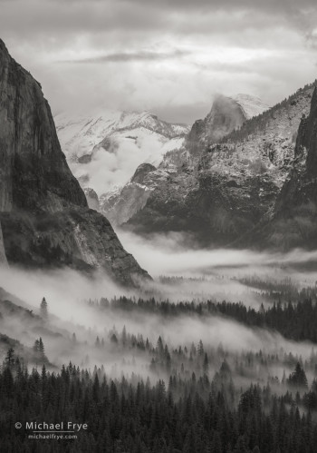
I still look for color most of the time, but I’ve been using digital cameras exclusively for nine years, and over that time I’ve gradually learned to see better in black and white. Sometimes there isn’t much color to work with, and sometimes color is just a distraction, and stripping out the color helps focus attention on more important aspects of the composition.
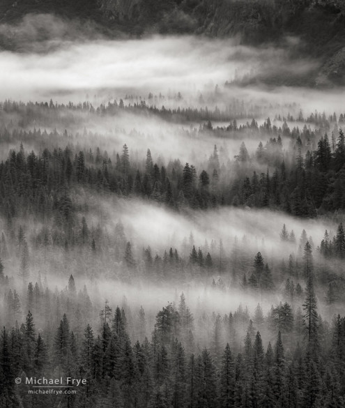
Last Thursday I rose early and drove up to Yosemite Valley, hoping for mist, and light, and clearing storm conditions. I found some great mist over the valley from Tunnel View, but skies were overcast, so there was no sunlight, and no color. That was no problem, however, as I knew these scenes would work beautifully in black and white.
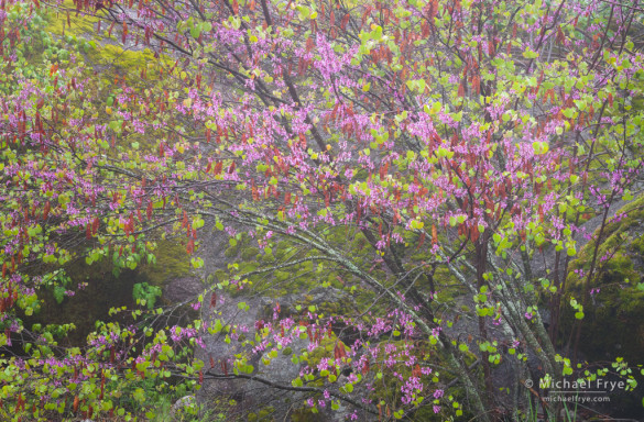
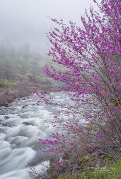
I spent 30 minutes happily photographing the shifting mist, then decided to head back down to the Merced River Canyon near El Portal. I had seen fog there while driving to Yosemite Valley, and the redbuds were blooming, which seemed like an intriguing combination.
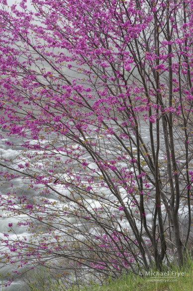
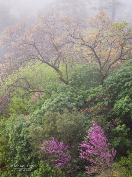
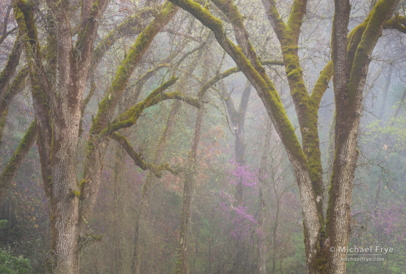
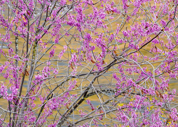
Unfortunately the fog had lifted by the time I got back to the canyon, but I still found some interesting redbud compositions. The next morning I drove back to the canyon, hoping for fog again, and found it. Luckily this time the fog lasted longer, and I was able to spend several hours looking for redbud-and-fog photographs.
In the redbud photographs, color was obviously a primary, essential ingredient. The whole point was to show the magenta blossoms set against the gray fog. These images wouldn’t make sense in black and white.
To me, and I think for many photographers, this ability to fluidly switch between color and black and white has been liberating. I can choose the palette that suits the situation, or that helps clarify an idea, without having to use different materials or techniques, or even change film.
I’ve been gratified to see more and more photographers doing great work in both black and white and color. Maybe they aren’t different mediums after all, but just two different and equally beautiful palettes. Perhaps we’ve finally reached the stage where we don’t have to label someone as either a color photographer or a black-and-white photographer. We can be known for our work rather than defined by our materials.
How about you? Do you prefer photographing in color or black and white? Has that changed since you started using a digital camera? Please post a comment and let me know.
Flower Report
For those of you (like me) who are attracted to the color of poppies and redbuds, here’s a quick report.
As of Friday, the poppies in the Merced River Canyon seemed to have survived Wednesday’s storm quite well. In fact they’ve spread further up the hillsides in some places. We’ll have to wait and see what happens after last night’s storm, as well as the next storm due tomorrow night.
The redbuds, on the other hand, have already peaked, and many are starting to leaf out. It was a surprise to see this, as the bloom usually lasts a couple of weeks. This year’s display peaked quickly, and we never saw many redbuds with really vibrant colors. But there should still be some beautiful, photogenic redbuds around for the next week or so.
Storms
As I write this on Saturday night, the second in a series of three storms is moving into the area. This is predicted to be a fairly warm storm, with no snow expected for Yosemite Valley. And it’s also a quick one, as it’s supposed to clear out Sunday morning.
The next storm is due to arrive Monday night and linger through Tuesday. This one is predicted to be colder, with the snow level reaching down to perhaps 3,500 feet on Tuesday, which would mean snow in Yosemite Valley (4,000 feet). We haven’t seen much snow on the valley floor this winter, but it’s been such a strange year, heck, why not, let’s have snow on the first day of April!
– Michael Frye
Related Posts: Wildflower Update; Yosemite Storms
Did you like this article? Click here to subscribe to this blog and get every new post delivered right to your inbox!
Michael Frye is a professional photographer specializing in landscapes and nature. He is the author or principal photographer of The Photographer’s Guide to Yosemite, Yosemite Meditations, Yosemite Meditations for Women, and Digital Landscape Photography: In the Footsteps of Ansel Adams and the Great Masters. He has also written three eBooks: Light & Land: Landscapes in the Digital Darkroom, Exposure for Outdoor Photography, and Landscapes in Lightroom 5: The Essential Step-by-Step Guide. Michael written numerous magazine articles on the art and technique of photography, and his images have been published in over thirty countries around the world. Michael has lived either in or near Yosemite National Park since 1983, currently residing just outside the park in Mariposa, California.



“I spent 30 minutes happily photographing” I love this your phrase it is true even for me with a much lower level of photographic skill. I just get lost in the moment of photographing – “happily photographing.”
Also like the realistic way you see photography. Thanks for sharing your thoughts, your love of photography and love of Yosemite and area.
George, that’s what it’s all about isn’t it? If photography isn’t enjoyable, why bother? Thanks for chiming in here.
I totally agree with you Michael that in this new digital age of photography we longer have to be divided in one camp or the other regarding Color or Black & White. I was more a Black & White photographer in the film days because I loved the control I had doing my own developing and printing. Heck, I even lugged an 8X10 view camera around Yosemite more then once in hopes of capturing the most detail in my Black & White pursuit for excellence.
Today, like you, I happily shoot in the digital format world, always in RAW to capture ever bit of information from the scene before me. Many times I do know at the time I click the shutter (still can’t get away from those old analog terms) that the image will be a Black & White, but not always.
Thank you for your constant support to the photography community, we are all learning and seeing better thanks to your blogs, books and teaching.
Thanks for your comments Richard. It’s nice to be able to go from color to monochrome so easily isn’t it?
I’ve found composing in B&W to be invaluable. When I’m having trouble finding a composition I like, if I switch to B&W on the LCD, the elements of the frame become so much clearer & finding the composition becomes much simpler. Thanks to David duChemin for making that an exercise in the seminar I attended! And to you for recommending David!
Nice tip, thanks Monika.
Michael, You got more great shots in a day than I get in a year. Dang. Those redbud shots are wonderful and I especially like the one with the black oaks. I have mostly converted to black and white, but I’m slowly learning color. Your Lightroom ebook has been invaluable. Thanks.
Thanks Kevin, and I’m glad you’re learning to see in a different palette, as that can only expand the possibilities for you.
I started to seriously take up photography during the digital timeframe, so I never had to make a choice one way or the other. So I happily bounce back and forth between monochrome and color.
I usually have a very clear visualization as to which it is going to be during composition. As you say, sometimes the subject matter just demands to be in color.
I will say this though, the images that I am generally most proud of tend to be in black and white. I think that is mostly because I can really push the image to its utmost in processing to get to something that feels more satisfying as a final artistic product.
Looking forward to visiting Yosemite next month, hopefully the interesting weather patterns will keep rolling along for the next several weeks.
Thanks for your comments David. I agree with you about being able to push black and white images more in processing. Since the lack of color makes them one step further removed from reality, I think we don’t notice tonal manipulations as much. You can do more heavy-handed dodging and burning, for example, and get away with it in black and white when it would be obvious in color.
Lovely series Michael. In the film days I almost exclusively shot colour transparencies – Kodachrome 64 and 25. That taught me to be selective in my composition and attention to the exposure. After waiting weeks to get the slides back there was nothing worse then seeing black underexposed images. It’s easier in the digital age, but the lessons learnt with Kodachrome are still with me.
Thanks Peter. Even if someone uses digital cameras exclusively today, I think a film background does help in many ways.
Like Peter Knott above, I shot a lot of Kodachrome 25 and 64 along with some Ektachrome. I then would place the film in those yellow Kodak mailers and send them off to Dallas, my nearest Kodak processing lab. There are still many of those slides in a big Rubbermaid tub and I occasionally will scan some into digital format. Although I dabbled with black and white film I was never very good at it despite the rainbow of colored filters that I tried with my “state of the art” Minolta SRT 100 camera! Perhaps if I had had my own darkroom – and knew how to use it – the B&W’s wold have been better. Today, using digital technology, I have vastly improved my monochrome attempts. However, color is still my medium of choice.
James, sounds like we’ve followed a similar evolution in many ways. It is a lot easier to do black and white these days.
As one of the newer generation photographers, most of my work has been in digital form, but I will say, after working through more than a few black and white courses in college, there really is nothing like the darkroom.
Yes, you can get very comparable results in the digital darkroom now, but the process from shooting, developing, viewing, selecting, printing, and hand toning a real silver print is something that just can’t be duplicated.
Being able to shoot both, like you mention, even on the same shoot, really is a gift though. Some scenes just beg for black and white while everything else around it demands color. There just isn’t a way to easily accomplish that without digital technology.
Katy, many people share your love of the darkroom process, maybe the whole experience as much as the end result.
I set Picture Styles on my D3200 to Monochrome and shoot RAW. I use the histogram to check exposure and the image to check composition. Viewing in mono lets me “focus” on shape and line, et. al. without being seduced by color.
Thanks Jerry – that’s never a bad idea if you plan to make the final image black and white.
It has pretty much become my default mode. If you shoot RAW you still have the color info. You only see the image on the camera’s monitor in B&W. It may be a peculiarity of my camera, but the JPEG image’s color always looks “odd” (yes, that’s a technical term) to me… I am more interested in shapes at that stage. But then, we don’t have a lot of color in the Sonoran desert either… We do have lots of interesting shapes though.
Hi Michael,
You are a good writer. I especially like your thoughts on your recent experience.
When I am drawn into a good black and white, it is mostly by the power of its mood and atmosphere (often literally), e.g., Ansel Adams’ Lone Pine and Michael Frye’s lone egret.
For me, color photos attractions are more diverted, in comparison.
Thanks Sharon. I like color and black and white photography equally. As I said, they’re both beautiful. Color can also be a powerful tool for creating a mood.
Agree.
Hi Michael,
You are absolutely right, when there is enough contrast but hardly any color, I tend to convert into a B&W photograph. I am always amazed what I can bring out from a rather dull picture once I convert it to B&W.
Always love reading your blog. By the way, when I was in Yosemite last fall, they closed the park on me, the day after I got there, due to the government shutdown. Good thing I booked a motel over in Lee Vining. So I spent four days on the Eastern side around Mono Lake and the Eastern Sierra. And thanks again for all your help and good advice. Hope to go back to Yosemite someday again.
With regards
Günther from Austria
Thanks very much Günther for sharing your thoughts, and the kind words. I’m glad I’ve been able to be a small help to you!
I too love your phrase “happily photographing.” I do that every so often before I head in for my job-that-keeps-me-in-photography-gear (and other stuff…I don’t seem to have very cheap hobbies), and I arrive at work feeling refreshed. At least until I turn on the computer and see all the emails. 🙂 I love that digital photography allows such flexibility! I will never forget hearing about someone who’d gone to see the lighting of the Fresnel Lens at Pigeon Point Lighthouse with B&W film only to see one of THE most amazing sunsets develop.
Love all that mist!
Thanks Vivienne, and I’m glad you also like that phrase. 🙂 Your story about the lighthouse reminds me of a friend who was at Gates of the Valley for an amazing sunset on El Capitan. The scene was captured by James Randklev, who made a poster from his image, along with a ton of stock sales, and Jeff Nicholas, who did a very cool diptych, but the friend I’m referring to only had black-and-white film. 🙁