Does every landscape photograph need a foreground? Not always. Some of the world’s most memorable landscape photographs lack any foreground – like Moon and Half Dome by Ansel Adams, or Galen Rowell’s Last Light on Horsetail Fall (go to page 2).
On the other hand, many classic landscape images do have foregrounds – prominent ones – like another Ansel Adams photograph, Mount Williamson from Manzanar, or many images by landscape master David Muench.
So how do you know when to include a foreground in your own landscapes? Ask yourself these questions:
Is the foreground compelling?
This might seem like an obvious question, but some photographers think that a foreground is an absolute requirement, and include one whether it’s interesting or not. A boring foreground just takes up valuable image space and distracts from other, more interesting parts of the photograph.
In fact I think the foreground has to be more interesting than the background – otherwise the foreground won’t hold its weight, and viewers will wish (perhaps unconsciously) that the background was a bigger part of the photograph.
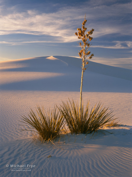
On the other hand, finding a truly eye-catching foreground can add greatly to a scene, especially if the background is not that compelling. While I liked the shapes of the dunes in New Mexico’s White Sands National Monument, I thought this lone yucca was even more interesting. This image is all about the foreground, while the background takes a secondary role:
How interesting is the background?
Is the background compelling enough to stand on its own? If so, you probably don’t need a foreground, and including one will just draw attention away from that interesting background.
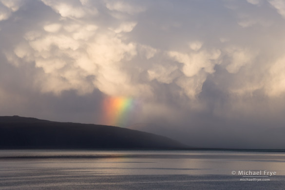
This scene at California’s Mono Lake, with a rainbow and spectacular storm clouds, doesn’t need a foreground. Bushes or trees at the bottom of of the frame would only be a distraction. I didn’t think for a second about trying to find a foreground here, and used a telephoto lens to fill the frame with all that drama on the other side of the lake:
Does the foreground complement the background?
You can have a great foreground, and a wonderful background, but if the two don’t mesh the final photograph will look like two different images stuck together. For the foreground and background to complement each other they have to have similar lines, shapes, or colors, or the foreground has to lead the viewer’s eye to the background.
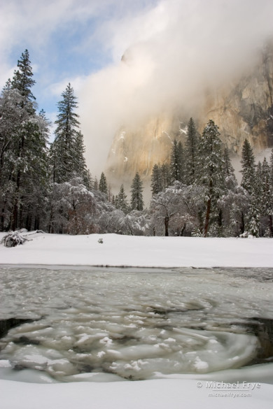
This photograph from Yosemite has beautiful swirling ice patterns in the foreground, and mist-shrouded El Capitan in the background. But it doesn’t work—the two halves of the image don’t fit together because the lines in the bottom are mostly horizontal, while the lines in the top are mostly vertical. It looks disjointed:
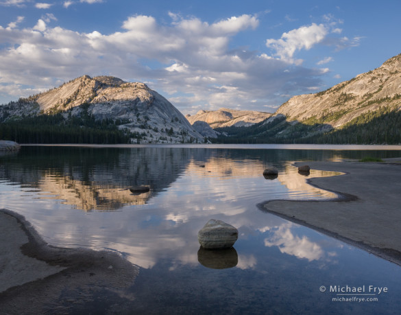
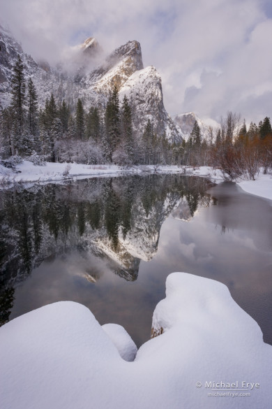
In this next photograph of Three Brothers, made only about 100 feet from the previous example, the foreground and background complement each other because they have similar shapes. The triangular shapes of the snow mounds echo the triangular shapes of the peaks, and those foreground triangles actually form arrows that point to the background, leading the viewer’s eye into the frame:
So any time you’re deciding whether to include a foreground, ask yourself whether the foreground is compelling – at least as compelling as the background. Then ask whether the foreground’s lines and shapes mesh with the background. If the foreground doesn’t meet both those criteria, then either look for a better one, or leave it out.
— Michael Frye
Related Posts: Creating Depth: Beyond the Wide-Angle Formula; Where Should You Place the Horizon in Landscape Photographs?
Did you like this article? Click here to subscribe to this blog and get every new post delivered right to your inbox!
Michael Frye is a professional photographer specializing in landscapes and nature. He is the author or principal photographer of The Photographer’s Guide to Yosemite, Yosemite Meditations, Yosemite Meditations for Women, Yosemite Meditations for Adventurers, and Digital Landscape Photography: In the Footsteps of Ansel Adams and the Great Masters. He has also written three eBooks: Light & Land: Landscapes in the Digital Darkroom, Exposure for Outdoor Photography, and Landscapes in Lightroom 5: The Essential Step-by-Step Guide. Michael has written numerous magazine articles on the art and technique of photography, and his images have been published in over thirty countries around the world. Michael has lived either in or near Yosemite National Park since 1983, currently residing just outside the park in Mariposa, California.



That’s some great food for thought Michael. Thank you.
Thanks John, glad you found this helpful.
Nicely explained, and well chosen images to illustrate your points!
Thank you Glenn!
Great examples. Good teaching points. That is why I use wide angle lens now to capture a different perspective of the foreground relative to the background. Thanks Michael.
Thanks Karl!
Good points. The example about the foreground and the background not meshing is a great illustration of a problem I’ve had several times and I never really understood what the problem was exactly. But you just made it clear so thank you.
Thanks Ivy – glad this helped!
Michael,
This is a great post that puts this topic in perspective. You are spot-on that a forground should complement the background landscape or be the primary focal point. I have found that whenever I place a foreground “anchor” in a landscape it actually becomes the main object in the photograph, as did your soap tree yucca and the sand dune. I think that such emphasis on a foreground tends to give the scene a sense of space to the viewer.
Your examples fit very well with your text. That is the mark of an excellent teacher. Thanks, Professor Frye!
Thanks very much James for the kind words, and for sharing your perspective on the subject (pardon the pun). 🙂
Michael-
Your post was very timely. I’ve often struggled with having a foreground, do I use leading lines, is there a distraction in the image. Do I use a wide angle or telephoto lens?
Thanks for your thought process. It was highly informative, thanks for posting.
Bill
Glad you found this helpful Bill!
Gracias. Una lección muy instructiva.
Thank you Manolo!
Great post Michael and I agree with all your good points about when or not to include a foreground subject.
Some of my most satisfying and favorite images of mine(and others) when I have searched and found a good foreground to include into the image and thus make the image stronger and capture more of what I was seeing and sensing at the time.
Thanks again for all your beautiful examples and thought provoking post!
Thanks Wayne!
Very good article Michael! Thx!
Thank you Rick!
Loved the blog–excellent information. I have noted foregrounds that didn’t work at all, before, much like your horizontal lines example. Maybe it’s time for another critique session. Wouldn’t it be fun to have people post topic specific photos and pick through them to critique which ones work, which ones don’t? I have a few myself that I think work well, but they’re a bit outside the box, you might say. We could do something like that here or go back to flickr. Have you ever thought of using your group there to have specific topic threads in discussion? Or have you quit using the group?
Charlene, thanks for the suggestion, and I’ll give that some thought. I still use the Flickr group for selecting images to critique. It’s been awhile since I’ve done a critique, but I’m sure I’ll do more at some point.
I’ve noticed it’s been awhile. I miss them, although I know you’re probably not doing them because you are busy. Busy is generally good when you are an outdoor photographer, right? 🙂
Some very good points. Thanks Michael.
Thanks Alan!