When doing critiques I often encounter otherwise-wonderful images, with simple, strong compositions, great light, and nice color, but lacking an essential ingredient: a focal point. Viewers need something to latch onto, and if they don’t find it right away they feel lost. You have to take them by the hand and say, “Here, look at this.”
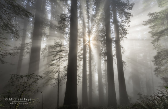
The photograph above has an obvious focal point — the sun. From there your eyes can travel along the radiating light beams out to the rest of the frame.
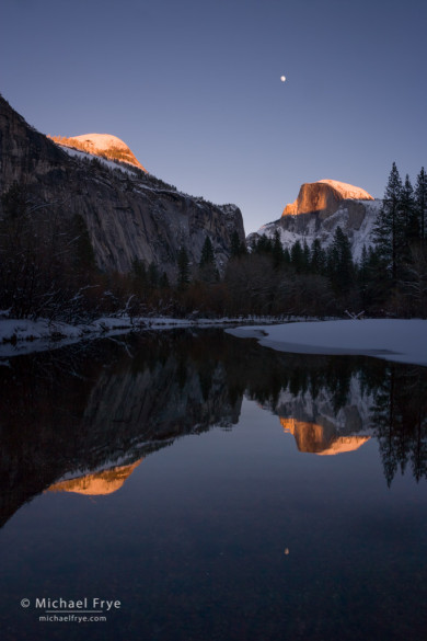
Of course a photograph can have more than one focal point. In fact, it’s often better to have two or three centers of interest. But it still usually works best to have one predominant focal point, a spot that viewers notice first before looking at the rest of the image. In the photograph below, for example, there are actually six focal points: Half Dome, the moon, North Dome, and the reflections of all three. But I would say that Half Dome (actual Half Dome, rather than its reflection) is slightly more eye-catching than the rest. You tend to notice Half Dome first, and keep coming back to it after your eyes jump around to the other elements in the frame.
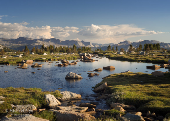
The next photograph, on the other hand, could really use a stronger focal point. I made this during my recent Hidden Yosemite workshop, and it has nice clouds, low-angle sidelight, interesting textures, and even some repeating patterns. But it’s missing something: a strong focal point. The most eye-catching things in the frame are that triangular rock just below and left of center, and maybe the pointed cloud just above center. But neither of those things stand out enough to provide a true focal point, and the photograph suffers for that. (I wanted to move down to the shore of the lake, and closer to that triangular rock, but the sun went behind a ridge before I had the chance.)
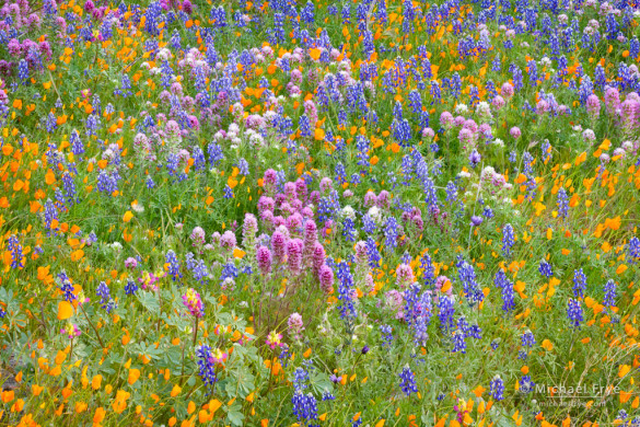
The next two photographs both include multi-colored patterns of flowers. In the first image, a clump of owl’s clover just below and left of center provides a subtle but important focal point. It’s the color that draws attention to this spot, and from there your eyes can roam around the rest of the frame. In fact the flowers seem to form faint concentric rings around that focal point.
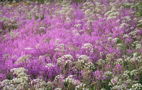
The second image, on the other hand, lacks a clear focal point. Those magenta flowers grab your attention, but there isn’t one spot within that swath of pink that stands out. The white flower just right of center is perhaps the most eye-catching single spot, but that’s pretty subtle, and hardly a focal point. There’s still a strong enough overall pattern here to make this photograph work, but a clear focal point would make it better.
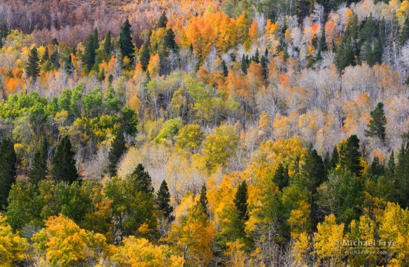
The next photograph, of an aspen-covered hillside, also has some nice patterns, but again lacks a clear focal point. It still works – to a degree. But it would work better if there was one particularly eye-catching tree in the frame.
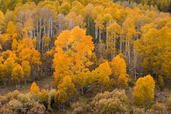
In contrast, the next image does have a clear focal point, and I think that makes it a stronger photograph. The aspen left of center stands out because of its color and shape, giving the viewer something to latch onto. From there your eyes can travel around the rest of the picture and find interesting colors, patterns, and textures.
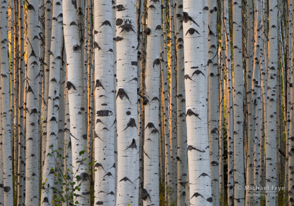
Finally, however, I’ll leave you with an example that breaks the rule. There’s no clear focal point in the photograph below. If pressed, I’d say the two largest aspen trunks near the center of the frame are the biggest eye-catchers, but it would be stretching things to say that they’re focal points. Nevertheless, I think this works better than the other focal-point-lacking examples I’ve shown so far because the overall pattern is so strong, with the repeating vertical lines of the tree trunks, and all those Dalmatian-like spots. (The golden light helps too.)
So when do you need a focal point? Almost always. Don’t leave viewers guessing; make it clear what you want them to look at first. The only consistent exception is when the image has a very strong repeating pattern, where the pattern itself might be enough to grab people’s attention.
— Michael Frye
Related Posts: Cloud Patterns; When Should You Include a Foreground in a Landscape Photograph?
Did you like this article? Click here to subscribe to this blog and get every new post delivered right to your inbox!
Michael Frye is a professional photographer specializing in landscapes and nature. He is the author or principal photographer of The Photographer’s Guide to Yosemite, Yosemite Meditations, Yosemite Meditations for Women, Yosemite Meditations for Adventurers, and Digital Landscape Photography: In the Footsteps of Ansel Adams and the Great Masters. He has also written three eBooks: Light & Land: Landscapes in the Digital Darkroom, Exposure for Outdoor Photography, and Landscapes in Lightroom 5: The Essential Step-by-Step Guide. Michael has written numerous magazine articles on the art and technique of photography, and his images have been published in over thirty countries around the world. Michael has lived either in or near Yosemite National Park since 1983, currently residing just outside the park in Mariposa, California.



Hi Michael,
Your latest blog on focus points was very good and to the point, thank you. I am looking forward to the day I can participate in one of your workshops, maybe next year. I’m sure you will get some replies from a few readers about the Aspen trees with “Dalmation spots”. Correct spelling is Dalmatian, no “o”, more like martian. Again, thank you for sharing your vision and beautiful photographs.
Glad you liked the post Dave, and thanks for catching the typo – it’s fixed now.
Hi Michael,
Good post and strong examples to make your case. I’m just wondering if there could be more exceptions to having a strong focal point than just patterns. Perhaps contrast or texture or light in a composition that is less representational and more abstract?
Thanks Tom, and a good question. In looking through my own images, I can’t find a successful one that doesn’t have either a focal point or a strong pattern. That doesn’t mean that a photograph couldn’t succeed without either, but I haven’t been able to find an example of that in my own work. Maybe that’s my own limitation – something about the way I see things. But I look at a lot of other people’s work too, and can’t think of any examples from anyone else either. I think that patterns and focal points work together. The stronger the pattern, the less important a focal point becomes, while a photograph with no patterns or weak patterns needs a distinct focal point. And in an image with a really strong edge-to-edge pattern, a strong focal point might disrupt the repetition and actually be a detriment.
Hi Michael,
Wonderful teaching post – I like how you show examples of the good and not so good, and when to break the rules! It also made me think why sometimes having the human element adds to a scene – a strong focal point.
Thanks Vivienne, and a figure in the landscape can indeed be a great focal point. Even if it’s a small figure, if it stands out clearly people’s eyes will go right to it.
I did not realize the depths of taking photos was necessary, but when reading your critiques I could see clearly the explanation of same. The high-mountain tarn was my favourite, as I felt like a cowboy on a horse riding into the next adventure. A Dale Evans moment.
Thanks Michelle!
Michael–I echo the comments of several of your other readers. I really appreciate your examples of strong photos with clear focal points and examples of photos which can be strengthened with a definite focal point. I also like your example of when breaking the “focal point” rule works.
Thanks very much Hadley – I’m glad you found this article helpful.
Thank you for writing this up, Michael. This is one of the best and most helpful articles I’ve read on composition.
Thank you Blake!
Just a lady taking pictures, mostly of my horses and other animals I may see in my yard. Don’t know anything about photography.
Just happened to land on this and found that it was very interesting and taught me a lot in a short time. I also REALLY like the way you write! Great, great pictures. Thank you!
Thanks so much Cristy, and I’m glad you found me. 🙂
Hi Michael!
I had sent you a photo from the SJR Nat Wildlife Reserve in November. Although the picture is impressive for the number of birds, it just does not have that “wow- that is a good photo” effect. Now I know why- no obvious focal point. Please feel free to use it as an example of a photo that almost worked
Warm Regards
Jack
PS- I tried pasting it into this email, but could not do so- sorry- not sure how I managed to send it to you before?
Well Jack, as I said here, an image with a strong pattern can work even without a clear focal point. You can’t post images in the comments here, but you can include a link. Previously you sent me an email rather than posting a comment.