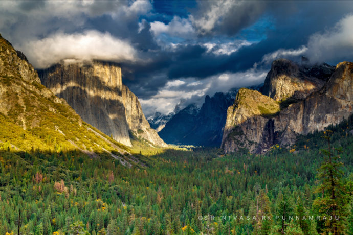
The Photo Critique Series is not dead! It just took a long vacation. 🙂 This time we’ll look at a photograph by Srinivasa Punnamraju from Tunnel View in Yosemite.
Light and Weather
Srinivasa was lucky to catch some dramatic weather at Yosemite’s most iconic location, Tunnel View. There were plenty of interesting clouds overhead, and some nice mottled patterns of light and dark on the cliffs – especially the striped bands on El Capitan to the left.
It would have been great to have some sunlight hitting Bridalveil Fall also (even though there wasn’t much water in it), and maybe even some spots of light on the valley floor in the foreground. But this photo was taken late on a November afternoon, and by that time of day at that time of year the light had already left Bridalveil and the foreground. In other words, even on a sunny, cloudless day those areas would have already been in the shade.
But most photographers would be very happy to find these conditions at Tunnel View. It’s a dramatic vista, and with the help of those clouds this photograph conveys some of that drama – which is not an easy thing to do.
Composition
This is basically the classic composition from Tunnel View, with El Capitan on the left and Cathedral Rocks on the right. So there’s nothing new or surprising about this framing, but similar compositions have worked for many photographers at many moments from this spot, and it worked here – for the most part. I have two quibbles with the framing: the tree in the lower-right, and the expanse of not-very-interesting trees occupying the bottom third of the photograph.
First, that tree in the lower-right stands out because there are no other prominent trees in the foreground, but it’s right near the edge. I’d prefer to have it in or out – either get it out of the frame entirely, or bring it into the frame more so it becomes part of the composition rather than a distraction along the edge.
With the camera position chosen for this photograph, cropping off the entire tree creates another problem, because it also brings the bright triangle of light on Middle Cathedral Rock right to the edge of the frame, like this:
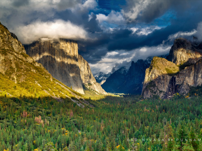
Cropping from the right to get rid of the tree brings the bright triangle of light on Middle Cathedral Rock right to the edge of the frame
I’d prefer to have a little breathing room between that bright spot and the right edge. You can do that here by cropping off most of the tree, but not all of it, leaving only some not-very-noticeable branches:
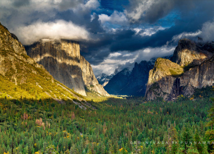
There’s a sweet spot where you can crop off most of the tree, but not all of it, and leave a little breathing room between the triangle of light on the rocks and the right edge of the frame
But an even better option would have been picking up the camera and moving to the left, which would have created more space between the tree and the bright spot of light on Cathedral Rocks.
The other possibility I mentioned – bringing the tree into the frame – would have required either zooming out more, or moving the camera position to the right. I know it’s often crowded at Tunnel View, making it difficult to move around. But if you’ve ever seen me photographing from this spot on a not-so-crowded day you would have noticed that I don’t stay glued to one spot. I move left and right, my position depending on the light and clouds, all in an attempt to deal with that tree. If the light dictates using a wide-angle lens I’ll move right to bring the tree into the frame and incorporate it into the composition, because with a wide lens it’s difficult to keep it out. If I’m using a longer lens I’ll often move left and try to push that tree out the frame entirely.
That tree has vexed many photographers at Tunnel View, but I have a soft spot in my heart for it because it’s in Ansel Adams’s Clearing Winter Storm, a wonderful, famous photograph that was made some 80 years ago. And I’ve included that tree to good effect in some of my own images.
Aside from that one prominent tree, a bigger issue with this composition, in my mind, is the expanse of trees occupying the bottom part of the frame. If you were to ask “What’s the least interesting part of this photograph?” I bet most people would say the bottom third. The middle and top thirds of this image have a lot of interest – dappled light, swirling clouds, and so on. The bottom third is not nearly as interesting by comparison, and any space devoted to less-compelling stuff like that dilutes the impact of the more-compelling stuff.
There’s an easy solution: just crop something off the bottom. Here I’ve also cropped a little extra space off the left side as well, which helps bring the composition into better balance:
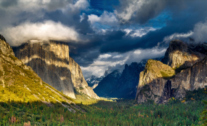
Here’s I’ve cropped most of the expanse of trees on the bottom, plus a little off the left side. To me this is the best crop for this photograph, though I’d prefer to see even more clouds above.
While I think this crop is an improvement, it might have been better still to point the camera up more to begin with. In other words: fewer trees, more sky. While the trees aren’t that interesting, the sky sure is, and I’d like to see more of it. A vertical composition might have even worked if the clouds extended high overhead.
Technical Considerations
Srinivasa sent me the original Raw file for this image, and it looks perfectly exposed, with no pixels touching either edge of the histogram (at the default settings in Lightroom). The photograph looks fairly sharp, but it was taken at f/22, which caused some diffraction and softening of the image. There’s not enough depth here to require f/22, so the image could have been sharper with a more moderate aperture like f/8 or f/11.
Processing
There’s some dramatic light in this scene, and Srinivasa tried to bring this out by increasing the contrast and saturation. Maybe too much? It’s sometimes tempting to use digital-darkroom tools to make a scene look the way we wanted it to be, rather than the way it actually was. And in doing so it’s easy take the photograph to a point where it doesn’t look natural, making viewers think about the process behind making the photograph rather than its content. When people wonder whether it really looked like that, or whether the colors are real, they’re not thinking about the beauty of the scene or the unique moment captured.
Srinivasa also used the Graduated Filter tool in Lightroom to lighten the foreground trees. I understand not wanting to have a big dark area occupying the bottom third of the photograph, but think cropping off part of that area is a better solution. Lightening the trees only draws attention to a not-so-interesting part of the image.
Since Srinivasa was kind enough to send me the original Raw file for this image I re-processed it with a bit more natural color and contrast, cropping as I did above. I also added a bit of dodging and burning to darken the sky and the sunlit triangle to the left of El Cap, and lighten Bridalveil Fall slightly:
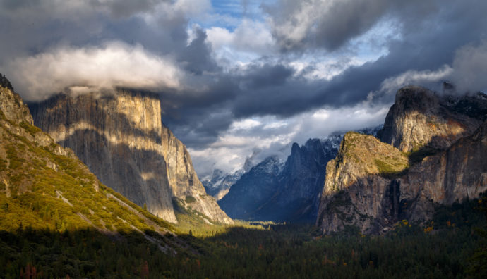
Reprocessed in Lightroom from the original Raw file with less contrast and saturation, and cropped as in the previous version above
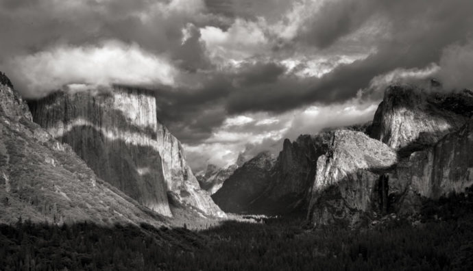
But what about black and white? While there are some nice warm-cool color contrasts in this image, to me this photograph is more about patterns of light and dark than about color. Here’s a black-and-white version for comparison:
I don’t know about you, but I like this image in black and white. To me it conveys the drama of this scene better. Color might be just a distraction in this photograph.
Conclusions
This image is technically well-executed, and Srinivasa succeeded in capturing the dramatic mood of this scene. The composition is good overall, but I think it could have been improved by pointing the camera up a bit to include more sky and less foreground, and by finding a way to remove the prominent tree in the lower-right corner, or incorporate that tree into the composition better. I also think that re-processing the image would help, with a black-and-white interpretation being perhaps the best way of conveying the drama of this scene.
Your Comments
I’d love to hear your thoughts about this photograph. Do you like the mood? Do you think the composition works overall? What do you think of the way I cropped it? And how do you feel about the black-and-white version?
Thank you Srinivasa for sharing your photograph! You can see more of his work on his website and on Flickr.
— Michael Frye
P.S. As part of being chosen for this critique Srinivasa will receive a $25 gift card to Metal&Paper which he can use to create a beautiful, custom, fine-art print. If you’d like your images considered for future critiques, just upload them to the Flickr group I created for this purpose. If you’re not a Flickr member yet, joining is free and easy. You’ll have to read and accept the rules for the group before adding images. Please, no more than five photos per person per week, and make sure your Flickr profile has an email address where I can contact you. Thanks for participating!
Michael Frye is a professional photographer specializing in landscapes and nature. He is the author or principal photographer of The Photographer’s Guide to Yosemite, Yosemite Meditations, Yosemite Meditations for Women, Yosemite Meditations for Adventurers, and Digital Landscape Photography: In the Footsteps of Ansel Adams and the Great Masters. He has also written three eBooks: Light & Land: Landscapes in the Digital Darkroom, Exposure for Outdoor Photography, and Landscapes in Lightroom: The Essential Step-by-Step Guide. Michael has written numerous magazine articles on the art and technique of photography, and his images have been published in over thirty countries around the world. Michael has lived either in or near Yosemite National Park since 1983, currently residing just outside the park in Mariposa, California.



Hi Michael, I agree with all your suggestions and I do like the B&W. On the B&W I would like to see the sky a little darker to balance the dark area at the bottom. I also would have liked more sky, that really is the most dramatic part of the image. Good job by the photographer and your critique.
Thanks for your comments Donald!
Thanks for bringing back the critique series Michael! We missed it. I agree with all recommended adjustments, but especially with your comment on over-processing. The original photo looked fake, though not ridiculous fake, like some hdr images on the internet nowadays. After reducing contrast and saturation I like the color image as much as the b&w version.
Thanks for chiming in Bart!
Michael,
I also prefer the B&W but your final color edit is quite impressive. I think that I may have brought out a little more shadow detail in the bottom of the color one to give it more interest.
Thanks James! In evaluating slight differences in shadow detail we need to bear in mind differences in monitors and calibration. With that said, on my calibrated Apple Cinema Display I wouldn’t want to see the shadows at the bottom any lighter, as that would draw a little more attention to one of the least interesting parts of the photograph.
I love the final color version – just lovely. And so glad you are bringing back the critique series – they are always so interesting and helpful.
Thank you Chloe!
The scene is beautiful. Too much saturation was my immediate response to seeing the top image. Your crop and processing, Michael, creates a very pleasing and natural result. I do, however, agree with James Hamilton about lifting the foreground shadows a wee bit more. The B&W version does highlight the light and shadow patterns in both the mountains and the clouds very nicely, but if I was forced to choose, I think I’d still opt for the color version.
Thanks for your comments Bev! See my reply to James about the foreground shadows.
I too prefer the black and white version. But in converting it, it seems to have lost some detail in the bottom dark area the new foreground after the crop. I am a glutton for details and miss them in that area at the bottom. Ditto for the dark area near the falls. I like the composition but would like to see it not QUITE as tight as you cropped it. As you said, some breathing room would be good I think. And agreeing with Bee’s comment, I do think the saturation in the color version is a bit overdone. I prefer more natural, realistic color but that’s just me.
Thanks for chiming in Carol! As I said in my reply to James, it’s hard to know whether differences in opinion about shadow detail are really differences in the way monitors are rendering that detail. That said, I guess I’m not in the same camp regarding shadow detail. In this HDR age it’s the style to open up the shadows and show lots of detail there, but that often leads to making the image look too flat for my taste. If there are no dark areas then there’s no contrast, and the image loses some of its vigor. And again, lightening shadows often draws attention to the least interesting parts of the photograph.
Of course it’s all subjective, which is what makes photography – and discussions like this – so interesting!
I do like the black and white version the best. I don’t know if it is the way my monitor renders it but the sky, in color, looks a little unnatural. My only other comment is not liking the straight shadow line on the middle left side.
Thanks for chiming in Alan. I know what you mean about that shadow, but it’s rare that we get perfect light.
I agree with you that the B&W is the best primarily because the colors aren’t that arresting (and that probably why they were saturated). I also agree with some of the viewers that the final foreground shadow is too dark; the initial tonal values of this area was probably closer to what I think is right. I would also crop a bit from the left in the B&W image as I lake that frame a bit more than the current more panoramic presentation. It’s hard not to compare this to Adam’s image. The snow on all his foreground trees gave them more texture which contributed to the interest in those trees.
Thanks for sharing your thoughts here Igor!
Thank you so much for bringing back this series and for selecting this image. I have had my own issues w/ the foreground tree and other things you mentioned about this location, so it was very helpful to hear you talk about them and how you work w/ them. I liked your final color version best. 🙂 Thank you again!
Thank you Joolz!
As for the other comments I really appreciate your critique, but just to emphasise the subjectivity of our subject, I also liked the tree foreground in Srinivasa’s original (and even more so with your right hand crop) – while de-emphasising the spectacle of the clouds and mountains, which I appreciate is the look you were going for, I liked the way the bigger foreground draws you into the subject.
Thanks Lawry – and you’re right, it’s all subjective!
Hi Michael,
I like the way you originally cropped the image with less foreground and removal of the big tree on the right. I was happy with that image. I’m not so happy with the desaturated colors after processing. I think the yellow cast on the slope on the left and on El Cap emphasizes the sunset mood. The wide exposure latitude, I find pleasing as well. I think the green trees in the foreground gives the image more dimension and depth.
Thanks for your comments John!
This is an interesting post for many reasons, the foremost of it is, I never knew there was a critique series. I have not seen a critique since I have been following this site. Good to learn of it.
Some day, when I feel confident enough of my photography to be able to show it and ask for a critique, I’d take the challenge to send it to you. Would love to have someone tell me how to improve my particular image rather than receive generic tips.
As to this image and it’s critique. Quite honestly, I had not thought of either the tree or the colors or even the foreground, till I read through and reached the cropped version of it. That is when the composition struck me. That is when the difference was apparent to me. I know composition and details like foreground, background, drama and colors make a difference, but I would not have realized on my own that it can make this much of a difference.
Thank you for showing it Michael.
As for my choice… I’d go with the colored version. The contrast between the sunlit granite and dramatic sky… is enhanced by the colors imho.
Thank you for re-starting the series. Looking forward to learning from these critiques.
Since I broached the subject of submitting my own images for critiquing, I’d love to know the process to do so. How do I submit my image when I feel confident enough to do so. Are there any specific criteria as to what kind of images can be submitted or rules to do so?
Also, I would love to learn to do a ‘self-critique’ myself. To look at my own composition before or while clicking the shutter to think of what all I should consider. Is there a check-list I could follow? Even a very rudimentary check-list would be helpful.
Thank you once again Michael for this critique and the previous ones( I just perused through a few more). These critiques are a great way for newbies like me to learn cause I am seeing a mistake, even minor ones, and then immediately seeing the difference correcting those mistakes is making. The compare and contrast is really helpful.
Thank you so much. 🙂
Regards.
You can find information about how to submit images for the critiques in the P.S. at the end of this post.
I don’t have a composition checklist, but maybe I’ll come up with one at some point. I’m not sure that’s a great approach, however, as I don’t think composition can be reduced to a series of dos and don’ts. Every situation is different, and composition is an art, not a science. One tip that I think is universal is to run your eye along the edges of the frame. This will, first of all, make you aware of the edges, and what you’re framing. Also, you may notice objects along the edge that are distracting, or cut in half – things that should be either all the way in or all the way out, like the tree in the lower-right corner here.
Jyoti, it’s been awhile, but yes, there’s a critique series. 🙂 You can find all the previous ones by going to the Critique category; either hover your mouse over “Blog” on the top menu, where you’ll see a list of categories, including Critiques, or on any blog page look in the column on the right side for Categories, and then under that find Critiques.
Thanks for sharing your thoughts about this image!
Hi Michael,
How wonderful to have a critique post again! Lots of things to learn, and I do like that B&W version. I think it brings the drama in the clouds very well.
I had a giggle when you discussed the issues with that tree. My friends and I have a mantra for it – Tree on right, shoot it tight. 🙂
Thanks Vivienne, and I like your mantra!
Thanks Michael – I appreciate the work you did on this image and the time it took to write a cogent description of the post processing. Also, the contributors to comments are thoughtful and insightful. Your tweeks created a more pleasing image to my eye, including the BnW, although I find all the images too contrasty (maybe that’s a word.) Besides you, Charlotte Gibb is my favorite Yosemite photographer, and I would offer a similar view of hers as being much more pleasing. http://www.charlottegibb.com/page/about/#/gallery/yosemite-national-park/winter-in-the-valley2/
Thanks for all you do and I am looking forward to using your app on my next trip up to Yosemite from Bakersfield.
Thanks for sharing your thoughts here Mike. Charlotte is a friend. I think she’s a wonderful photographer, and I like the photograph you linked to. There are a lot of great photographs from Tunnel View, including Ansel’s, and I suppose it’s inevitable that we’ll compare Srinivasa’s photo to others, but I’d prefer to not go there, and assess Srinivasa’s image on its own merits. In re-processing his photo I tried to take Srinivasa’s vision into account. Clearly he wanted the image to have a lot of drama, and I tried to bring out that drama, but not overdo it.
In thinking about contrast, and how much to apply to a photograph, I actually think the image you linked to is quite contrasty. There’s no sunlight in that scene, and yet Bridalveil Fall is close to white, and there are areas in the clouds and along the lower edge that are close to black. Your perception that there’s less contrast in that photo may actually relate to Clarity, rather than overall contrast. I suspect that Charlotte reduced the Clarity in her photograph while increasing the contrast. In other words, the overall contrast – the difference between the lightest and darkest areas in the photo – is high, but Clarity, which affects local contrast, was reduced, which gives it a softer look. (I could be wrong about her methods, but that’s my guess!) In my judgement, reduced Clarity wouldn’t have been appropriate for Srinivasa’s photo. Since the image had patches of sun and shade, and higher overall contrast to begin with, there was some inherent drama, and a softer look wouldn’t have fit with that mood. But it’s all subjective, and reasonable people could disagree!
The color in the foliage seemed a little off to me, but I like Srinivasa’s original composition. I’m not bothered by the tree, and I like the foreground trees, especially since there are some whose leaves are turning. I have “Clearing Winter Storm” right in front of me at my work desk, and the big trees off to the right are either a distraction or a balancing element of the composition, depending on my mood!
Well I like the trees in Clearing Winter Storm. They’re placed well inside the photo, not near the edge of the frame, and they line up with the tops of Upper and Middle Cathedral Rocks. Ansel said that he “related the trees to the background mountains.” Clearly he gave careful thought to their placement.
My take on S.P.’s capture was that it was not just a rendering of an “iconic” scene but as a photo story about vegetative transformation in Yosemite Valley with bug & fire killed trees within a dense overstory. Bottom line, I found his foreground very interesting.
If S.P. couldn’t have included more tall trees in the lower right corner due to equipment limitations (i.e. wide angle, tilt/shift lens), he could have enhanced it in post. I like the way it anchors the photo & gives the scene depth. Also, cropping the tree out, reduces the expansiveness of the valley in the frame.
Basically, I liked his photo, how he framed it & glad he had the opportunity & interest to forward it to you for review. I like your style & how you toned down his color/contrast processing in post. While the original photo shouted B&W, your salvaged version saved the day. Too bad you didn’t have more storm clouds to work. That would have made your results moodier yet.
Thanks for your perspective. I’m not sure that most viewers would see the same story you did, especially if they haven’t been to Yosemite recently. They might wonder what’s going on with some of the trees in the foreground, but I don’t think it’s immediately clear from the photograph. If you did want to tell a story about vegetative transformation I think you’d have to make the trees a much more prominent part of the photo.
Michael,
I agree if the vegetative changes were the story then those changes should have been made more prominent. It could have been done relatively easy in post. But if the impending storm was the story then the clouds should have filled more of the frame.
Nevertheless, some viewers were picking up on the “discoloration” of the foreground but apparently didn’t know what they were seeing. The orange color bothered me at first until I went back & looked closer at the original. Also, it might have been more apparent if there was a larger example to view but then only if one knew what was being viewed.
Anyway, what I was seeing affected me more than the other choices except for the B&W which told a different story that fell somewhat short for me due to the limited treatment of the weather pattern captured in the original. Oh well, just a thought.
Incidentally, I’ve never been to Yosemite.
Thanks for reviving the Series.
Well it’s a good thought, and I appreciate you sharing your perspective. It goes to show how we all see things differently!
Hi Mike,
Thanks a lot for in-depth analysis of the photograph I took. I intended to capture the trees in the foreground but did not have the wide angle at that time. I agree that black and white version better showcases the drama in the sky. That was one of the reason I immediately posted the B&W of the same scene with more clouds on the top frame. I really appreciate the time you took from your busy schedule to review this and publish your perspective. Hope to hear more critiques 🙂
You’re welcome Srinivasa, and thanks again for letting me use your photo for this critique!
Comment from Alma:
I have taken many photos from Tunnel View as well and I like to keep the photos with less contrast like you have done with the final image of Srinivasa I do like the black and white processing as well. Now I need to go back to my photos and see where that proverbial tree is located in some of mine! I hope that I have also accomplished the job of either including it more fully into the image or not having it be dominant in the corner of a photo.
Nice to see and read your critique Michael!
Thanks for your comments Alma!
I don’t know if it’s because I look at landscapes with a photographer’s eye, but images with shadows lightened beyond a point don’t hold my interest for too long as a viewer. I have been guilty of that same temptation (of wanting to bring out maximum detail), when I was a novice but now shadows for me are an important part of the photograph (unless it is foggy, etc). Other that that, all the (interesting) action at that moment seemed to be happening on El Cap (the cloud cover on top & the bands as pointed by Michael). Perhaps, a slightly tighter composition on El cap with the foreground but without the 3 brothers and possibly with more restraint on post processing might have helped tell a better story?
Thanks for sharing your thoughts and experience Adarsh!
Great discussion, and very informative critique by you Michael. I agree with your assessment of the foreground forest – cropped and darker. I like in your version how the Sentinel Rock area detail is brought out and color temp warmed up compared to the original. That seems better balanced with lights and darks throughout the image. I would even consider warming that up a bit more based on personal preference. I also like how you improved the blue luminance in the sky, and created some distinction between the clouds (gray/white) and the blue sky bits while maintaining the dramatic look vs the original image with lots of intense blues overpowering the whole sky.
Keep ’em coming!
Thanks Ted – I’m glad you liked the discussion, and thanks for chiming in with your thoughts.
Amazingly beautiful clicks….all pictures depicts the beauty of nature…In simple words its mesmerizing…Just wanted to tell keep up the good work. 🙂
Hi Michael,
Thank you for restarting the critiques. I always pick a few tips from them. I’d like to give my two cents about the image. I do like the image overall, but I also get a bit of the “overprocessed” feel from it, like the saturation and contrast have been increased too much. However, my main point about the image is that there are two bright areas that beg for my attention, but there is no natural flow between them, so my eye doesn’t really know where to go and tends to go back and forth between the two bright areas. In contrast, the image by Charlotte that one viewer linked does not have any of that “ambiguity,” where the eye does not know where to go. I cannot fault the photographer for the two bright areas, as that was the light at the time. Perhaps waiting for a more unified composition would have helped.
Greg
Greg, you’re right about the lack of continuity between the two bright areas. The bright area on the left also extends to the edge of the frame, which tends to pull your eye out of the frame. Of course you can’t control the light in such situations, but can only hope for a better moment.