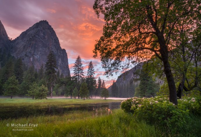
Sunset in El Capitan Meadow with oaks, pines, azaleas, and Lower Cathedral Rock, Yosemite NP, CA, USA
Last Sunday, after the double rainbow from Tunnel View faded, Claudia and I headed down to El Capitan Meadow. We had explored this meadow earlier in the afternoon and found azaleas still blooming (though most were past peak). I hoped to photograph the azaleas again in better light, maybe with a sunset above.
By the time we got to El Cap Meadow the sky was already starting to get interesting, so I had to hurry. My previous explorations gave me a head start, but I still had trouble finding a good composition that included azaleas, the sky, and, preferably, Lower Cathedral Rock. There was also some mist along the Merced River in the distance, and ponds reflecting the sunset, so I wanted to include those elements too, if possible.
But that was a lot. An awful lot. In talking about composition in my workshops and books I always stress simplicity, because I think the single most common mistake in photography is including too much in the frame. I tell people to ask themselves what caught their eye in the first place, and to include just that, and nothing else. And try to focus on just one or two things. If you attempt to include three or more main elements in your photograph you’re likely headed for trouble. All those different objects will probably compete with each other, rather than complement each other, and nothing will stand out.
I think that’s all good advice, and I follow it myself most of the time. But sometimes I try to push the boundaries. While I like simple, clean compositions, I’m even more partial to photographs that are rich and complex – as long as they don’t cross the line and become busy and confusing. As the great Sam Abell put it, “What we’re all trying to do is make a layered, deep, complex, complicated photograph that doesn’t look complex or complicated.”
So back in El Cap Meadow, I was definitely pushing things by trying to include azaleas, the sunset, Lower Cathedral Rock, mist, and reflections in one frame. I knew the odds of succeeding were small, but I still wanted to try. And if I couldn’t find the composition I was looking for I could always try something simpler.
It took a lot of searching – and some trial and error – to find the composition above. Initially I was on the other side of the clump of azaleas in the lower-right corner of that image. But even from the other side that clump of azaleas caught my eye, and I decided to navigate around the flowers to see if I could juxtapose them with the sky and Lower Cathedral Rock.
Initially I didn’t want to include the oak tree above the azaleas, as that would just add to the clutter. So I walked right up to the flowers underneath the oak, and tried to include the azaleas, the water and reflections beyond them, and Lower Cathedral Rock. But it just didn’t work. I would have needed a tripod that went two feet higher so I could look over the azaleas to see the water, yet still include the flowers in the foreground.
So I turned around, looking for some higher ground, and saw a slightly-elevated perch underneath another tree. I knew that I’d have to include the oak above the azaleas from that vantage point, but I thought it was worth a try. When I got to that spot I saw that the oak above the azaleas had a nice shape, so it might work. The azaleas would become a small part of the picture, but still visible, so that might be okay too. And I could clearly see Lower Cathedral Rock, as well as the mist in the distance, and a little bit of the sky reflected in the pond. Most importantly – and luckily – I could get separation between the left-most branches of the oak and the pines next to Lower Cathedral Rock.
I had to use my widest lens – 16mm – to fit everything in (and then just barely). The contrast was extreme, so I bracketed five frames, two stops apart (at f/16, 100 ISO), and blended them together with Lightroom’s HDR Merge.
The final image is certainly complex, with many different things competing for attention. Yet all the important elements stand out clearly, and I think (and hope) the photograph “reads” well, and hasn’t crossed that line into becoming too busy and confusing. It’s definitely near that edge though.
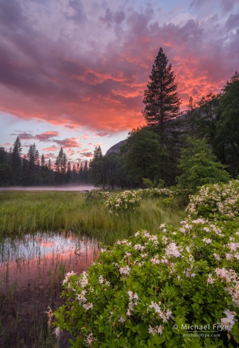
After capturing several bracketed sequences of that scene I hurried to another part of the meadow to see if I could find a different composition before the sunset faded. After a bit of searching I found the composition shown below. This includes many of the elements I was looking for: the azaleas, the sunset sky, the mist, and reflections in a pond. But I couldn’t fit Lower Cathedral Rock into the picture. It was just out of the frame to the left, and I was already at my widest focal length (16mm), so it was all I could do to fit the azaleas and the sunset sky into the photograph. And besides, there was a tree in front of Lower Cathedral Rock from this angle:
This second image is simpler than the first, and the azaleas are more prominent. And yet I still probably prefer the first image (at the top of the post). Having Lower Cathedral Rock in the frame helps give that first photograph a sense of place, but more importantly, I like it’s richness, complexity, and sense of depth. But it’s a close call for me. Which do you prefer?
In composition, simplicity and complexity actually go together. The more complex a photograph becomes, the more important it is to strive for simplicity – to eliminate all but the most essential elements, and make sure that all those potentially-competing items stand out clearly, and flow together. I think the best way to learn how to make a “layered, deep, complex, complicated photograph that doesn’t look complex or complicated” is to practice making clean, simple compositions. Once you can do that consistently, only then can you add more complexity while still keeping your message clear.
— Michael Frye
Related Posts: Double Rainbow; Simplicity vs. Complexity in Photography
Michael Frye is a professional photographer specializing in landscapes and nature. He is the author or principal photographer of The Photographer’s Guide to Yosemite, Yosemite Meditations, Yosemite Meditations for Women, Yosemite Meditations for Adventurers, and Digital Landscape Photography: In the Footsteps of Ansel Adams and the Great Masters. He has also written three eBooks: Light & Land: Landscapes in the Digital Darkroom, Exposure for Outdoor Photography, and Landscapes in Lightroom: The Essential Step-by-Step Guide. Michael has written numerous magazine articles on the art and technique of photography, and his images have been published in over thirty countries around the world. Michael has lived either in or near Yosemite National Park since 1983, currently residing just outside the park in Mariposa, California.


Both images are so outstanding and beautiful and tell two different stories. If you were to tell me I could have either one, but just one, which would I choose? Very difficult, but I believe I would choose the second, more simply composition only because of it shows more details of the dramatic clouds in the sky. I truly love both of them.
As always, thanks for sharing your wonderful photography and for the details as to how and why you chose and captured the images. I always walk about with a little golden nugget that helps me in my photography.
Thanks Gail!
The second image is a definite first choice for me. It brings out the beautiful reflections and the azaleas more than the first. Since I can’t travel and photograph as much as I use to, I thoroughly enjoy seeing and reading your posts. Thank you for sharing!
Thanks Mary!
Amazing pictures, both! While the second one has a much stronger ooh-flowers feeling, I like the first one better. The complexity of the image really draws me in, and gives me a very strong feeling of really being there. With the first one, though possibly more attractive still feels like I am looking at a (very beautiful) picture.
Thank you Sameer!
I think this is one of those cases where size matters. At the size of the photos in this blog, I find the second image much more compelling: it has prominent flowers in the foreground, and the reflections and background complete the photo. In the first image, all that jumps out at me is the cliff (Lower Cathedral Rock) and some nice sunset clouds that are significantly hidden by a tree.
If I click on the images to see the larger versions, things equalize. I still like the second image, but now the azaleas are catching my eye in the first image and I’m starting to like it better (although I still barely notice the mist).
If I were able to enlarge these images to full screen (I haven’t figured out how to do that from the web blog), then I think the first image would become my favorite: the details like the mist and reflection would start becoming big enough to make me appreciate the richness of this image.
I’ve seen similar issues with many of my images over the years, and it can go both ways: an image looks great to me small, but when I enlarge it little details start to clutter it up and I don’t like it as much. On the other hand, an image that I just love full screen losses its impact when I make it smaller (say to put on a 8.5×11″ calendar page) because some set of details drop below the threshold of significance for my eye.
So in this particular case I think the second image looks better in this blog or on something like Twitter, but the first one would likely be my choice if I were going to hang a good-sized print on the wall.
A very good point Jeff. Complex images often need to be seen large to be appreciated. On the other hand, truly great photographs, like Sam Abell’s image that I link to above, grab your attention even at a small size, and then hold your attention as you delve deeper and notice all the details.
You really nailed it on both of them! They are superb. I keep wavering between the two in trying to choose my favorite. I think the second one just barely edges out the first as of this moment. One thing I really like about it is the balance between the color in the clouds and the colorful reflection. As Jeff stated above, the first one would make a first-rate large print for the wall. Love them both!
Thank you Laurel!
Hi Michael, The balance in the first picture I like much better as the balance in the second image seems weighted to the right side with the shape of the mountain mimicking the shape of the top edge of the azaleas. I find that the mid-tones in the first image (that may not be the right term…?) but the darker items all seem balanced better to my eye than in the 2nd image.
There seems to be more mimicry of shapes in the 2nd image, which is fine, but since it doesn’t seem balanced, that makes it a second best to me.
I prefer the top/1st image much more and do not find it cluttered since many of the items are not in bright light, thus they recede and do not make the photo look busy or cluttered.
Thanks for sharing your thoughts Alma!
Hi Michael,
sometimes I download images from your site. I did so this time and opened them with LR.
I looked at them again and agein – full frame and comparison view. I did so before I read your “story” about the making of these images. This way I didn’t have any special expectations, just an idea, that there might be azaleas.
My favourite image is the first one. It’s a poem about the beauty of a landscape, including sunset, its reflections and the distant mist.
The second image is a completely different image. It’s beautiful, and the azaleas play the prominent role.
Thanks for sharing your thoughts about these images Marie – I appreciate that!
Michael,
Nice!
Cheers,
Alyn
Thanks Alyn!
Very tough to pick between these two. Both are very strong images, great color and composition, beautiful mist in the background, amazing sky. If the subject is meant to be the azaleas then I feel the second is the strongest, no question. Another strength of the second is that it could be any location because it doesn’t contain the iconic mountains. I can imagine it to be anyplace I like, perhaps someplace closer to home. I can make it mine, if you know what I mean.
But I keep going back to the first image. When I first viewed it at the small size the reflections in the water just to the left of the azaleas appeared to be two ghostly animals, maybe mountain lions or fox, one lighter colored, parallel to the viewer and facing left. The second, just to its right, brighter and angled as if it were walking from the distance towards the viewer, just beginning to turn towards the left with the first. I know I’m creating something that isn’t there, but that’s what I first imagined when I saw the photo, and that’s why I keep going back to that image, and why it’s my favorite of the two. How’s that for a bit of added complexity you may not have planned for? 🙂
Thanks for your thoughtful comments Todd. “If the subject is meant to be azaleas…” Well no, not necessarily. In most of my photos I couldn’t care less what the “subject” is, as long as the image works. Ideally the photograph conveys a mood or feeling, and if it manages to do that then it doesn’t matter to me what mood or feeling it is, nor what identifiable objects are in the frame. And you could say that the mood is the subject. But every object in a photograph has symbolic meaning, and that symbolism – combined with the light, colors, lines, shapes, and tones – helps to convey the image’s message and mood. So you can’t really separate the objects and their symbolism from the feeling the photograph conveys; it all works (or doesn’t work) together. In the first image, the azaleas may be a small part of the frame, but imagine, for a moment, that they weren’t there. The mood would be different, wouldn’t it? It’s one thing to have a pretty sunset over a steep-walled, lush valley. It’s another to have a pretty sunset over a steep-walled, lush valley with flowers booming in it. The latter suggests something a bit more idyllic.
Mood as subject, and symbolic meaning of each object in the frame. I hear what you’re saying. Every image ideally expresses something, and it’s the synthesis of everything in the image that should lead to that something. And that something can be completely different to each viewer (and to the photographer). You’ve given plenty to think over. Thanks much.
While both are wonderful images, I prefer the second. I find the oak tree in the first image a bit distracting and while LCR provides a better feel for the location, the part I find most intriguing is the mist on the water and the deep colors of the sky. And the evergreen on the right side really points me to the sky rather than hiding part of it as the oak does.
Thanks Roland!
Wow, that’s a hard one to answer, Michael. I do like the second for the cleaner lines and the subtle diagonals going through the scene. I also like how the color in the clouds is highlighting that tree. The first is wonderful for the sense of place. Yes, lots of elements, but I think each are strong enough to form a cohesive scene.
Thanks Vivienne!
Beautiful. Perfect blend of sky, water, flowers. Beautiful color.
Thanks Pearl!