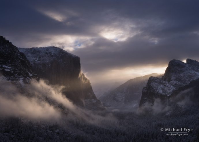
Sunbeams and morning mist from Tunnel View, Yosemite. While photographing this dramatic light from Tunnel View a few years ago, I zoomed out wide enough (to 40mm) to leave some dark areas between the bright clouds and the edges of the frame.
When you compose a photograph, you put a frame around a piece of the world, at a certain moment, and say, “Hey, look at this.” It’s the frame that creates the composition, and it’s the edges that define the frame. That’s why it’s so vital to pay attention to the edges of your photographs.
It’s always a good idea to run your eye around the edges of the viewfinder before pressing the shutter. Look for anything that might be distracting, and see if you can get rid of it. Look for objects that are cut in half along the edge, and decide whether you should include them or eliminate them.
And finally, look for bright areas along the borders, and see if you can get rid of them. When we look at photographs, our eyes naturally get drawn to bright spots. A bright spot along an edge (or even worse, in a corner) tends to pull your eye out of the picture.
It usually works better to draw the viewer into the frame, not lead them out of it. That means putting bright areas near the middle rather than the edges. (Of course there are exceptions to this, such as silhouettes, where a dark subject is surrounded by light areas. But most of the time it works best to have a brighter center and darker borders.)
This is one reason why you can’t separate light and composition. The light, in many ways, creates the composition – or at least determines what might work and what won’t at that moment.
It’s not always easy to eliminate those bright edges, but the more you practice, and the more you pay attention, the better you’ll get. Here are some examples, with extended captions, to get you started.
— Michael Frye
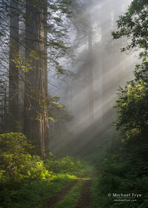
Sunbeams and an old road in a redwood forest, northern California coast. The bushes on the right side of this photograph play an important role here, adding a dark border and helping to keep the viewer’s eye in the frame. I tried some slightly tighter compositions, but liked this wider view better because of that dark right-hand border. There are still some minor bright spots along the edges, but most of the borders are dark, and your eye gets drawn where I want it to be drawn: to the sunbeams, the spot of light on the road and bushes, and the redwood trunks.
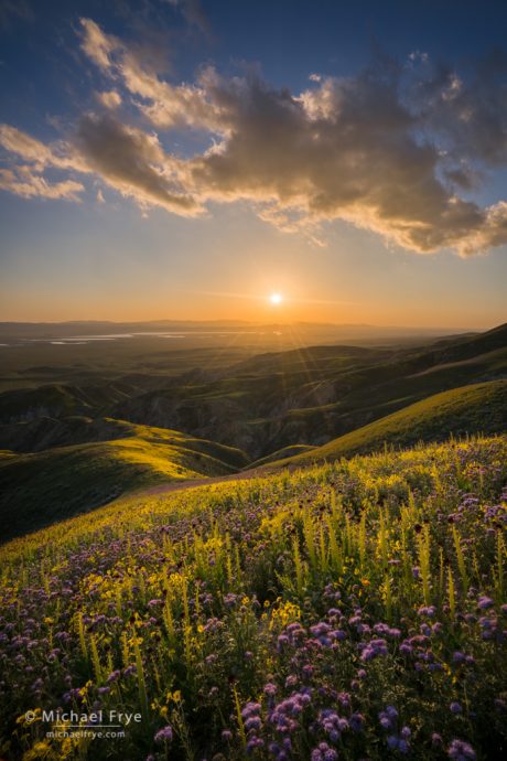
Setting sun from the Temblor Range, with desert candles, tansy phacelia, and hillside daisies in the foreground, Carrizo Plain NM, CA. You have to be especially careful with clouds, since they’re always moving. Here I zoomed out wide enough (16mm) to avoid cutting off that bright cloud finger reaching toward the upper-left corner. The clouds that meet the right and left edges aren’t as bright, and therefore not as distracting.
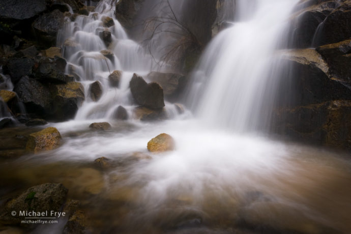
A small waterfall in Yosemite. With cascading creeks and rivers it’s often impossible to avoid including at least one bright edge, as the water has to enter and exit the frame somewhere. In this photograph I managed to keep three sides dark, but couldn’t avoid putting a bright edge along the top. I did darken the white water along the top, but you can only go so far with that before it becomes obvious. Nevertheless, I like the image. There’s no such thing as a perfect composition.
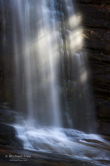
Sunbeams, Twin Falls, South Carolina. Another white-water example, and again I couldn’t avoid putting white water along the upper edge and in the lower-right corner. But those areas are relatively dark compared to the sunbeams, and to the water splashing onto the rocks at the base of the fall, so your eye gets drawn into the picture.
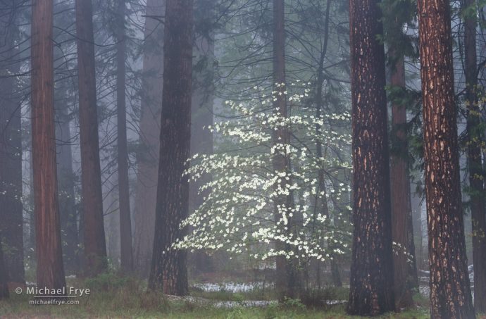
Dogwood, mist, and ponderosa pines, Yosemite. This scene had natural light-and-dark contrast, with the white dogwood blossoms standing out against the dark surrounding tree trunks. I picked my camera position and framing carefully in order to put dark trunks on the right and left edges, and also tried to keep bright spots from meeting the top edge. The bottom edge was medium green, so I darkened it slightly with Lightroom’s Adjustment Brush.
Related Posts: Lupines and Fog; Where Time Stopped; When Does a Photograph Need a Focal Point?
Michael Frye is a professional photographer specializing in landscapes and nature. He is the author or principal photographer of The Photographer’s Guide to Yosemite, Yosemite Meditations, Yosemite Meditations for Women, Yosemite Meditations for Adventurers, and Digital Landscape Photography: In the Footsteps of Ansel Adams and the Great Masters. He has also written three eBooks: Light & Land: Landscapes in the Digital Darkroom, Exposure for Outdoor Photography, and Landscapes in Lightroom: The Essential Step-by-Step Guide. Michael has written numerous magazine articles on the art and technique of photography, and his images have been published in over thirty countries around the world. Michael has lived either in or near Yosemite National Park since 1983, currently residing just outside the park in Mariposa, California.


Thanks Michael for sharing.
Your tips and techniques are always pretty well written along with stunning images.
Even though the ideas are not new but with your guide I always enjoy to read then review what I did to ensure mistakes are not repeatedly happen.
Still carry your book with me to Yosemite every time visiting the park 🙂
Anna
Thanks very much Anna.
Masterful scenes, masterfully seen!
Thanks Chuck!
Great set of pictures, Michael and a great advice.
Thank you Gabor!
A Very interesting post.
Thanks!
Thanks Doug!
As Usual, Fantastic Images, With Great Tips Michael.
Thank you John!
Very good discussion about composition and beautiful images. Just to continue the discussion, I have a question about the last image because I’ve run into this situation many times. On the far left, the tree trunk (not even close to the main subject) is cut off. Usually we say, like you did earlier in this post, to eliminate the object or include it. However, the trunk provides that dark edge that is also needed. I would like to hear your or anyones thoughts about this. I know for most people that’s getting real picky, but that’s what we photographers do, and that is a good thing.
Thanks Alan, and good question. In general I think it’s better to avoid cutting trunks in half. That usually applies to most other objects as well – rocks, buildings, etc. But there are no hard and fast rules about anything when it comes to composition, and you may have to compromise a principle in order to gain something that’s more important for the situation at hand (like cutting a trunk in half in order to create a darker border). You can often get away with cutting a trunk in half on one side of the frame if you do the same thing on the other side, so there’s balance. You can often get away with cutting a rock in half on one side if you cut a rock in half on the other side, as long as the two rocks have reasonably similar shapes and sizes. I sort of did that with the last image (the dogwood); the trunk on the left side is cut in half, and the bottom of the trunk on the right is cut in half, but since that right-hand trunk leans it was impossible to achieve perfect symmetry there. Basically I found the best compromise that I thought worked.
What an interesting topic. Although I watch the edges I don’t always look for bright spots. Now I will! Great tip.
Glad you found that helpful Nancy!
Thank you for the reminder Michael. And thank you for sharing some excellent examples of how to get it right.
You’re welcome John, and thanks!
Michael,
Very interesting topic and one to which I shall pay more attention. In the two waterfall images you appear to have almost created a vignette effect which is a tool that often is found in editing software programs. Once again that points to the value of excellent composition trumping the need for post manipulation.
Thanks James. I rarely use an overall vignette when processing my images. If overdone it becomes really obvious. And I’d rather not darken edges that don’t need it, which is what happens when you use an overall vignette and some of the edges are already dark. I do frequently darken edges in software (subtly), but 99% of the time I do it selectively to only the bright areas that need it. And of course, as you point out, it’s always better to make a composition where the edges are naturally dark, rather than trying to fix those edges later. There’s only so much you can do in software before the “fix” becomes obvious and weird-looking.
Hi Michael! I think one of the things that helps your first waterfall is the motion of the water. We know it flows downward, so our eyes follow the water down.
Good point Vivienne. Psychologically it’s probably better to have water flowing into the frame than out of it