I sometimes get asked to recommend a book about composition, and my first suggestion is always Ian Plant’s ebook Visual Flow. Ian understands composition well, presents his concepts clearly, and doesn’t have much use for rules.
The title of the book suggests an important concept, but one that’s often overlooked. I think the best landscape compositions have a natural visual flow. Your eye doesn’t get stuck, but travels freely through the frame, pausing briefly at the key areas.
Effective compositions usually need some kind of focal point – something bright, colorful, or contrasty that draws your eye and tells you where to look first. From there, the viewer’s eye can roam to other areas that grab its attention. How your eye moves determines the visual flow of the image. When a composition works the eye seems to moves smoothly, and the different parts of the composition fit together harmoniously. When a composition doesn’t work the parts fit awkwardly, while the eye gets stuck and moves haltingly.
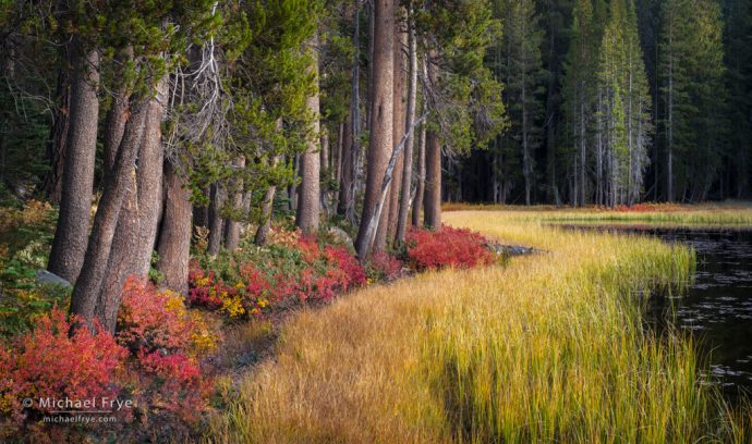
In the photograph above, made last month in the Yosemite high country, the first thing that probably catches your eye is a warm color – the row of red blueberry bushes extending from the lower-left corner into the middle of the frame. Next, you might notice something bright and warm: the zigzag line of reeds. Both the red bushes and zigzagging reeds lead your eye from the lower-left corner up to the upper-right corner, landing on another small spot of red below a group of trees. From there your eye can travel back down to the red bushes, the trunks above the red bushes, or the reeds. The curving diagonals and zigzags lead your eye freely through the frame, without interruption, giving the image its flow.
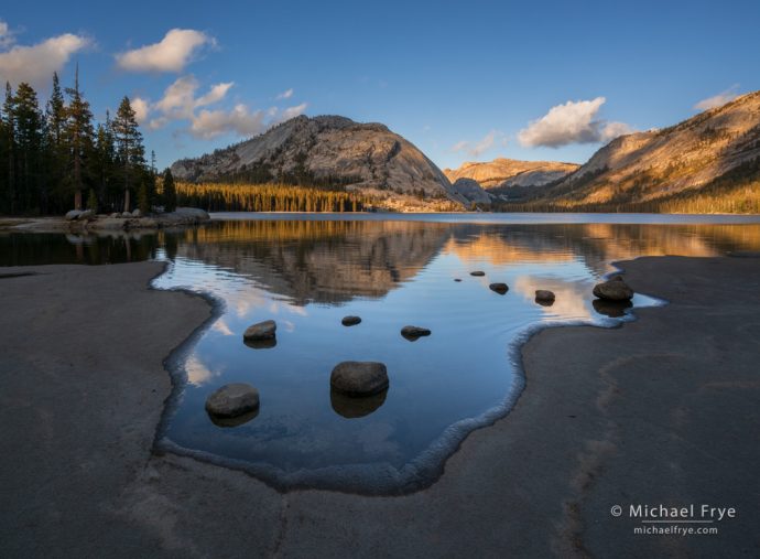
I made the next two images during our eastern Sierra workshop, when we decided to take a break from fall color and head to Tenaya Lake. In this first photograph, your eye might first get drawn to the U-shaped bay in the foreground. That isn’t the brightest spot in the image, nor does it have any warm colors, but the round rocks in the water and the shoreline both draw our attention because of they contrast sharply with their surroundings. From there my eye goes in a counter-clockwise circle: around the U-shaped bay, up to the domes and cloud in the upper-right, then over to the left and back down to the foreground. Other round shapes in the composition (the rocks, the left-center dome and its reflection) echo, and therefore strengthen, the overall design:
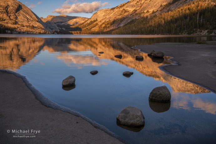
In the next image from Tenaya Lake, my eye again gets drawn to the rounded foreground rocks because they contrast strongly with their surroundings. From there, strong diagonal lines lead me directly to the domes and cloud in the upper-left. (In fact a bunch of diagonals point to that upper-left corner.) And then my eye goes back down to the lower-right, and again to the upper-left, bouncing back and forth. The diagonals are pretty straight, with no curves to slow down the eye movement, so the eye moves quickly. Diagonal lines create a sense of movement, and in this image there’s a certain amount of dynamic tension because the main focal points are in opposite corners of the frame:
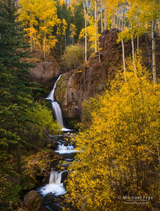
The following photograph, from Colorado, literally has flow – in the form of a cascading creek. That creek also creates a nice, slightly-curving, zigzagging line that lead your eye through the frame. My eye follows the creek down, then moves counter-clockwise to the upper-right corner, then circles back down to the top of the cascade:
Diagonals, curves, and zigzags can lead your eye through the frame. Circles take your eye around the frame. Either way there’s visual flow.
On the other hand, vertical lines and horizontal lines tend to stop the eye and interrupt the visual flow. Unless, that is, there are enough vertical or horizontal lines to create some repetition. Repetition creates rhythm, and rhythm can give an image a different kind of flow.
This photograph from the redwoods is one of my favorite images of the year. The repeating vertical lines give it repetition and rhythm, but there are other, subtle factors that keep the eye moving through the frame. Alternating areas of light and dark give the image depth, and a forward-back-forward-back sense of movement as your eye travels from left to right. There’s an up-and-down zigzag near the bottom of the frame (along the edge of some brighter areas), and another (very) subtle up-and-down zigzag near the top. Although the photograph is dominated by vertical lines, I think all the pieces fit together harmoniously, and the eye still flows through the frame:
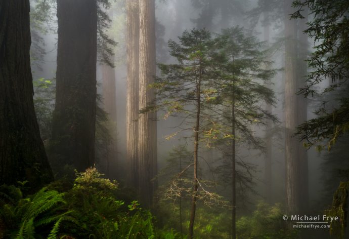
“Twins” – sun breaking through fog in a redwood forest, Northern California. 25mm, 1/8 sec. at f/16, ISO 200, polarizer.
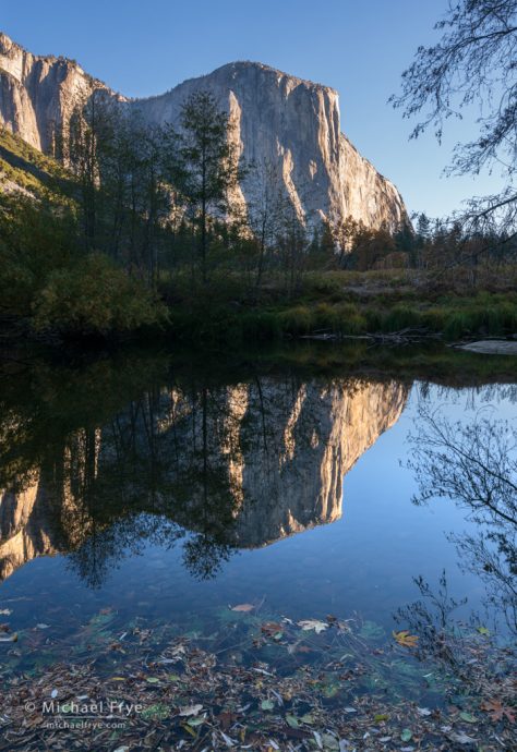
It might help to illustrate my point about visual flow by showing an example of an image that doesn’t flow very well – at least to my eye. The first photograph of El Capitan below is dominated by vertical and horizontal lines. There are a few diagonals, but they’re minor, and overridden by all those stodgy horizontals and verticals. The horizontal lines just above center block the visual flow from foreground to background:
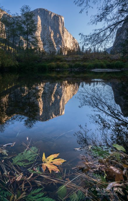
Realizing this, I changed camera positions and compositions to try to get a little more flow into the composition. This next version isn’t going to get nominated for one of my best photos of the year, but I think it works – and flows – better than the first version. The leaf adds a foreground focal point, allowing the eye to bounce from the leaf to El Capitan and back. There’s also a vague U-shape in the foreground, which helps create a subtle circular flow to the image. And although there are still some strong vertical and horizontal lines, there are more diagonals, which help create a more dynamic sense of movement:
I could show many more examples – both good and bad – but I hope you get the idea. The next time you compose a photograph, ask yourself, “Does it flow?” If not, look for a way to create better flow, rhythm, and eye movement through the frame.
— Michael Frye
Related Posts: Visual Echoes; Abstract Vision
Michael Frye is a professional photographer specializing in landscapes and nature. He is the author or principal photographer of The Photographer’s Guide to Yosemite, Yosemite Meditations, Yosemite Meditations for Women, Yosemite Meditations for Adventurers, and Digital Landscape Photography: In the Footsteps of Ansel Adams and the Great Masters. He has also written three eBooks: Light & Land: Landscapes in the Digital Darkroom, Exposure for Outdoor Photography, and Landscapes in Lightroom: The Essential Step-by-Step Guide. Michael has written numerous magazine articles on the art and technique of photography, and his images have been published in over thirty countries around the world. Michael has lived either in or near Yosemite National Park since 1983, currently residing just outside the park in Mariposa, California.



Michael, that may be, indeed, not the most beautiful photograph of the year but this may be the most beautifully written post of the year. Thank you,
Thanks Leonid!
Thank you for the tip for the book, been looking for one. I’ve been to that spot at Tenaya Lake, never really gotten that composition I was happy with, guess I didn’t pause to look at what lines there were!
You’re welcome Harri. It’s all about lines!
I absolutely love the first photo, Michael! Thanks ~
Thanks Adair!
Michael, excellent post…….examples were great “Show and Tell” examples. I think this is one of your more informative posts.
Thank You for sharing…….Well Done Sir.
Have a Great Day.
Thanks very much Dave – I’m glad you liked the post!
Thank you so much for this post. I have good compositions, but not great. This clarifies a lot. Thank you again.
Thanks Marilyn – I’m glad you found this helpful!
Excellent Article. Helps iIlustrate the point.
Thanks Krishna!
Such a helpful post–thank you.
Glad you liked it DJ!
Excellent Post Michael, And As Always Beautiful Images, As Usual.
Thank you John!
Very helpful! Thanks for posting a good example of what doesn’t work. That is often missing from posts like this.
Thanks Carl! I usually throw out images that don’t work – or I don’t take them in the first place. But sometimes I remember to take them or keep them for instructional purposes.
These images carry your signature in style and quality.. Just beautiful.
Thanks Mike!