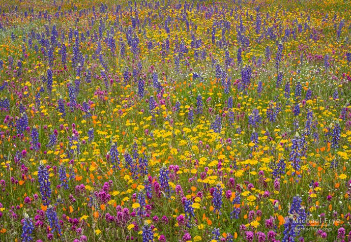
Spring colors, Mariposa County, California. 78mm; seven focus-stacked frames blended with Helicon Focus; each frame was 1/8 sec. at f/16, ISO 250.
I hope you’re all staying safe and not going too stir-crazy. I’m sure, like most of us, you’re anxious to be able to get out and photograph again. In the meantime, here are some thoughts about an often-overlooked aspect of composition that I hope will help you the next time you pick up your camera…
Balance doesn’t get talked about much, but it’s a vital aspect of composition. While looking for compositions I’m always thinking about balance – so much so that it’s become an unconscious act. I intuitively reject any composition that would feel unbalanced, and I’m often making subtle shifts in my camera position or framing to improve the balance of a photograph.
In the photograph above, for example, the whole frame is filled with flowers, and the various shapes and colors are distributed pretty evenly throughout the image. If one side or corner was empty – just green grass perhaps – the composition would feel out of balance.
There’s also a subtle-but-important focal point in this composition: the oval patch of yellow flowers just below center. When making this photograph I was aware of the need to include some kind of focal point among all the patterns – a spot for the viewer’s eye to land on and go back to – so I was happy to find this bright, eye-catching patch of yellow.
But I was also conscious of the the need to find balance. In this case that meant, first, centering the patch of yellow from left to right; putting that yellow oval left of center or right of center would throw the picture off balance. I put the patch of yellow below the middle of the frame mainly because the flowers above the yellow patch were more interesting, with a stronger pattern, than the flowers below it. But also – and again, this was an instinctive decision based on lots of experience – having the main focal point above the middle can make the image feel top-heavy. While that can work in some cases, here I wanted the composition to feel calm and grounded to counterbalance the visual chaos created by all that vibrant color.
From there, having figured out more-or-less where to place the patch of yellow, I had to arrange the top part of the picture in a way that created left-to-right balance. I noticed a subtle, bow-shaped arrangement of the blue lupines up there, along with another patch of yellow. So I walked back and forth, left and right, in order to line up the patch of yellow below center with the bow-shaped swath of lupines near the top.
As I said, that was all pretty instinctive. It took me less time to actually figure out that composition than it probably took you to read my description of the process.
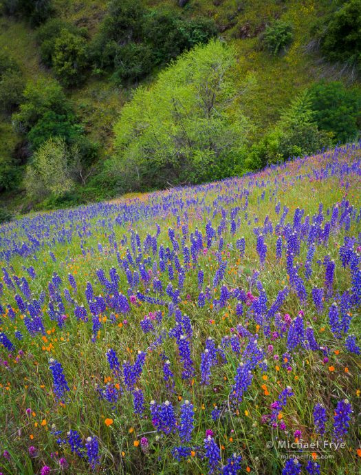
In the next example I was also – as always – highly conscious of the need to find balance, both left-to-right and top-to-bottom:
The top-to-bottom balance was fairly easy. To me, the most interesting part of this scene was the flowers, so it made sense to devote more space to the flowers than the trees. The central green tree merely provides a visual focal point for the top part of the image – something for the foreground to lead your eyes to.
The left-to-right balance was trickier. Again, I had to consider the balance for both the bottom and top parts of the frame. You might notice a vague V-shape to the lupines in the foreground. One of the reasons I was attracted to this scene was because I thought that V-shape would give the flowers some structure. There’s also a faint, snaking line of lupines leading through the middle of the frame. I positioned the camera so that the V-shape and the snaking line pointed toward the central tree. And in framing the scene I made sure to include the two small lighter-green trees flanking the larger, central tree; including only one of those smaller trees, (or worse, cutting one in half) would throw the top portion of the photograph out of balance.
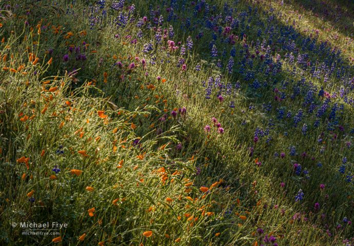
The previous two examples were made on an overcast day, so the light was consistent, which allowed me to take my time, look around, compose carefully, and then wait for the wind to settle down long enough to capture a focus-stacking sequence. In the next photograph, the sun had just crested a ridge in the morning, creating streaks of sun and shade as the light sifted through a line of trees. These bands of light moved constantly, so I had to compose and shoot quickly.
Viewer’s eyes will naturally get drawn to bright spots in a photograph, so I looked for a sunlit patch of flowers that could provide a visual focal point for a composition. A bright band of poppies and grasses caught my eye, and I saw that if I placed that band in the lower-left corner of the image I could juxtapose that band with other diagonal streaks of light and shadow cutting across the hillside. The diagonal lines would create a sense of energy and motion, and the repeating pattern would help unify the composition and imbue a sense of order and rhythm:

Sunlight, shadows, and wildflowers, Mariposa County, California. 98mm; eight focus-stacked frames blended with Helicon Focus; each frame was 1/15 sec. at f/16, ISO 100.
Is this composition balanced? The main focal point is stuck in the lower-left part of the picture, but the rest of the frame has enough visual weight to hold its own. The diagonal streaks are distributed fairly evenly across the photograph, so that helps make things feel balanced. There’s a dark triangle in the upper-right corner that balances the dark triangle in the lower-left corner.
So it feels balanced to me, but it’s a dynamic balance, not a calm, static balance. It’s balanced diagonally, and asymmetrically, with the upper-right corner balancing the lower-left corner. This photograph has tension because of that asymmetry, and because the steep diagonal lines of the hillside make it feel like everything could roll out of the frame if given a little nudge. It’s an unstable equilibrium, like this…
… while the photograph at the top of this post has a more stable equilibrium, like this:

(Illustrations by OrdinaryArtery)
You can use different kinds of balance to create different feelings in a photograph – whether calm and tranquil or dynamic and energetic.
But before you can use balance expressively, you have to gain a feeling for it. Start by assessing photographs you see in books, or magazines, or online. Identify the most eye-catching elements in a composition, and see how they balance each other – or not. If the image feels balanced, how was that balance achieved? If not, why not?
And when composing your own photographs, ask yourself the same questions. What are the most eye-catching elements in the frame? Does the photograph feel balanced, both left-to-right and top-to-bottom? If not, how could you improve the balance?
— Michael Frye
Related Posts: Photographs That Flow; Avoiding Bright Edges
Michael Frye is a professional photographer specializing in landscapes and nature. He is the author or principal photographer of The Photographer’s Guide to Yosemite, Yosemite Meditations, Yosemite Meditations for Women, Yosemite Meditations for Adventurers, and Digital Landscape Photography: In the Footsteps of Ansel Adams and the Great Masters. He has also written three eBooks: Light & Land: Landscapes in the Digital Darkroom, Exposure for Outdoor Photography, and Landscapes in Lightroom: The Essential Step-by-Step Guide. Michael has written numerous magazine articles on the art and technique of photography, and his images have been published in over thirty countries around the world. Michael has lived either in or near Yosemite National Park since 1983, currently residing just outside the park in Mariposa, California.


Michael, Thank you so much for this post. A Question: are you manually executing the initial images, or are you using a control tool?
I am repeatedly inspired by your photography.
Regards, Dale
You’re welcome Dale, and thanks. Sorry, I’m not sure what you mean by “using a control tool.”
Michael, sorry for being unclear. By control tool, I meant software (like Helicon Remote) or an app like Arsenal that you tether to your camera and it automatically advances the focus.
Dale
No worries. I don’t use anything like that.