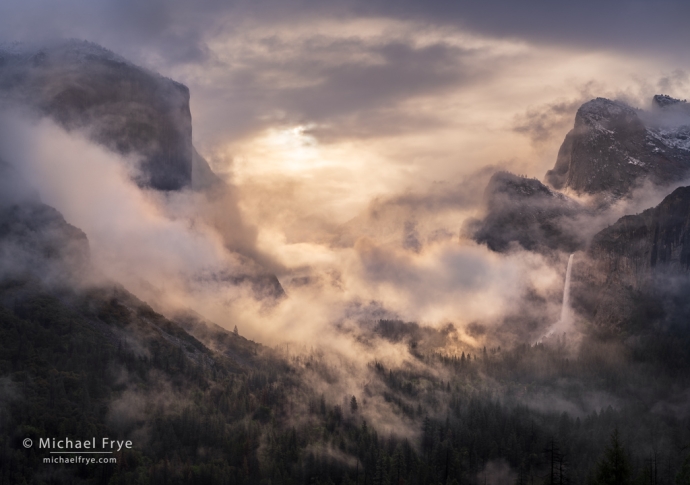
Misty sunrise from Tunnel View, Yosemite NP, California. Where does your eye go in this photograph? Here the brightest areas are in the middle of the image, while the edges are darker, helping to draw the eye into the picture, rather than out of the frame.
We launched our first online workshop about composition about 18 months ago, and then more recently added additional online workshops focused on light. I picked these topics because I think they are, hands down, the two most important aspects of photography.
In photography, nothing is more fundamental than light. When we press the shutter, we record the light falling on the film or sensor at that moment. Light is literally the medium we’re working with, and the quality of the light has everything to do with the mood and message of the photograph.
But when I say “quality of the light” I’m not talking about whether the light is “good” or “bad.” I’m talking about whether the light is hard or soft, the direction of the light, its color, and what the light accentuates. Those qualities can either complement or obscure your photograph’s message – depending on the scene or subject, and what you’re trying to say about it. There’s really no such thing as “bad” light – only light that doesn’t work for the story you’re trying to tell.
But even if you have the perfect light for the scene or subject at hand, you need to find a composition to go with that light. Unless you’re trying to convey chaos, the elements of the picture need to be arranged in a cohesive, pleasing, comprehensible way in order to tell your story.
And those elements need to be pared down to the essentials. Anything extra – anything that’s not pulling its weight, and adding something important to the story – dilutes the power of the image. It’s like pouring half a glass of beer or wine, and filling the rest with water. Full-flavored photographs can’t be diluted with unnecessary elements, or even worse, things that clash with and distract from the photograph’s message.
And of course you can’t make a successful composition without considering how the light will draw the viewer’s eye. Is the light drawing attention to the things you want people to look at – or is it pulling the eye elsewhere?
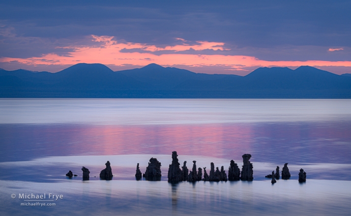
Look at this photograph from Mono Lake. Where does your eye go first? Second? Third?
Chances are the first thing that caught your attention was either the bright patch of sky above the mountains, or the silhouetted tufa towers near the bottom. Why is that? Because our eyes get drawn to bright areas, strong colors (especially warm colors like red, orange, and yellow), and contrast.
The orange patch of sky above the mountains is the brightest thing in the photo, with a fairly strong, warm hue. Both those qualities naturally draw the eye. The tufa formations, on the other hand, are the darkest things in the picture, but dark objects can jump out at you when they contrast with lighter surroundings – as they do here.
Of course I took the light into account when composing this image – something you have to do with every photograph. I try to make the light work for me, not against me. That means using the light to draw the viewer’s eye into the frame, toward the key elements that I want them to look at, and not out toward the edges, or to distracting objects.
In this case, I tried to place the most eye-catching areas – the bright sky, the reflection of the sky, and the tufa towers – away from the edges, in order to pull the eye into the photograph. And I tried to put darker, less-eye-catching things toward the borders of the image, to keep the eye from wandering out of the frame.
I also tried to keep things balanced. Balance is one of the most vital aspects of composition, but rarely gets talked about. Here the two most visually prominent things – the patch of orange sky, and the tufa towers – balance each other top to bottom. And they’re both pretty balanced left to right as well; the row of tufas are, overall, a little right of center, and the biggest patch of orange sky is a little left of center, so there’s a slightly diagonal, dynamic balance from upper-left to lower-right.
Nature rarely provides perfect compositions, so there’s a bit of that orange sky touching the right edge, perhaps tugging the eye out of the picture a bit, and the tufas are a little too close to the bottom of the photo for my taste. (I couldn’t include more space below the tufas without also including a distracting bit of shoreline.) But overall I think the photograph is pretty well balanced, and the viewer’s eye goes where I want it to.
I hope these ideas make sense to you, but this is just the beginning. Light and composition are rich, fascinating, complex subjects. While one could ever truly master these aspects of photography, we can all get better at understanding and using these essential tools – and doing that will improve your photography more quickly and more profoundly than anything else you could learn.
If you’d like to gain a truly deep understanding of light, or composition, or both, and make a fundamental improvement in your photography, we still have space in our two upcoming online workshops on these topics. Click these links to sign up or learn more:
Advanced Composition and Storytelling online workshop, October 26-27
Mastering Light online workshop, November 2-3
I hope to see some of you in one of these workshops, but in the meantime, I hope the concepts I’ve presented here will help you better understand some of the most important aspects of light and composition – and help you make photographs that communicate your vision more clearly.
— Michael Frye
P.S. Yes, I did photograph the aurora on Thursday night – in Glacier National Park. It’ll take me a little while to sort through the thousands of photographs I made, but I’ll post some of them soon. I hope some of you got to see and photograph it as well!
Related Posts: Photographing the Olympic Peninsula; The Light and Colors of Mono Lake
Michael Frye is a professional photographer specializing in landscapes and nature. He lives near Yosemite National Park in California, but travels extensively to photograph natural landscapes in the American West and throughout the world.
Michael uses light, weather, and design to make photographs that capture the mood of the landscape, and convey the beauty, power, and mystery of nature. His work has received numerous awards, including the North American Nature Photography Association’s 2023 award for Fine Art in Nature Photography. Michael’s photographs have appeared in publications around the world, and he’s the author and/or principal photographer of several books, including Digital Landscape Photography: In the Footsteps of Ansel Adams and the Great Masters, and The Photographer’s Guide to Yosemite.
Michael loves to share his knowledge of photography through articles, books, workshops, online courses, and his blog. He’s taught over 200 workshops focused on landscape photography, night photography, digital image processing, and printing.



Whenever I’m asked what my favorite subject to photograph is, I reply: Light.
With the right lighting, you can make a jar of Peanut Butter look good.
Absolutely! Or a patch of mud, or sticks, or… you name it.
Having said that, interesting light by itself won’t make a compelling photograph without a good composition to go with it.