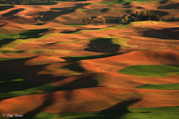
This week’s photograph, titled “Steptoe Beauty,” was made by Greg Speasl in the Palouse country of eastern Washington. The image is an interesting study of how a telephoto lens can compress space and create patterns.
Light
Sidelight is usually a great way to bring out textures, and here the low-angle, late-afternoon sun raking across the fields from right to left brings out the beautiful textures and forms of the landscape. The alternating patterns of green and amber also create a nice color contrast.
Composition
Recently I wrote about depth in photography, and how wide-angle lenses can help create an illusion of depth, while longer focal lengths can flatten the perspective and emphasize patterns. This is a great example of the latter—Greg used a telephoto lens (210mm on a full-frame sensor) to zoom in, compress the space, and pick out an intriguing pattern in the sculptured hills. In fact we see two overall patterns here, one formed by the interplay between light and dark, the other created by the color contrast between regions of green and amber.
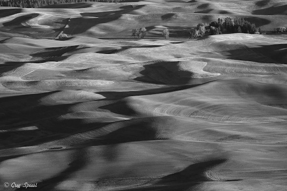
To highlight the difference, here’s a black-and-white version. I deliberately reduced the contrast between colors here—that is, I tried to make the greens translate to the same shade of gray as the amber tones—in order to emphasize the pattern of sunlight and shadow. This version works too, which is not surprising with such interesting textures and forms. Notice, however, that the lower-right quadrant seems a bit blank. In color, two arrows of green coming in from the right edge define shapes in this area that disappear in black and white.
I probably prefer the color version, although only by a slight margin. But I think it’s interesting to see which parts of the pattern were created by color, which parts by light and shadow.
Most photographs need a strong focal point; without one, viewers don’t know what to look at. This image lacks a clear center of interest—the closest thing might be the cluster of trees (and a building or two) in the upper-right corner. But I think this composition works anyway. If the photograph has a strong enough overall pattern you can sometimes get away without having a clear focal point, and I think this is one of those cases.
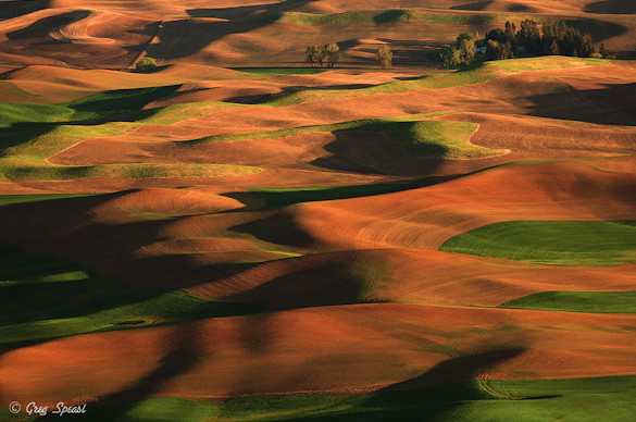
There are two minor details about the composition that bother me. While the trees in the upper-right around the buildings fit well into the overall design, the ones in upper-left are an anomaly, a break in the pattern. Cropping the top edge eliminates some nicely-shaped shadows in the upper-right corner, but simplifies the image, so I think the tradeoff is worth it. There’s also that tree in the upper-right that almost touches the edge of the frame—another minor distraction. In the version below I’ve trimmed a little off both the top and right sides.
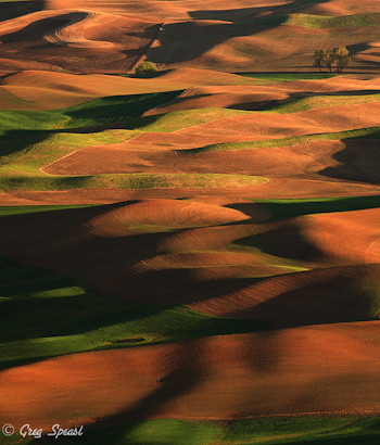
While I like Greg’s composition a lot (except for those minor complaints I just mentioned), I think there were other possibilities here as well. I tend to see photographs within photographs, and if Greg had stretched his 100-400mm zoom a bit more he might have found something like the vertical version below as well. This one is even more abstract, and not necessarily better (or worse), just different. As my friend Mike Osborne likes to say, when you find a great subject, work it—there’s always more than one photograph there.
One other small nitpick: I understand the need to put a copyright watermark on your images—I certainly do that with all of my photos that go on the web. But for this photograph the watermark should have been in the lower-right corner. Placed as it is here, in the lower-left, the watermark interrupts an important curving shadow line.
Technical Considerations
Greg used a Canon 5D Mark II, 100-400mm zoom at 210mm, with a shutter speed of 1/15th sec. at f/6.3, 100 ISO. The image appears to be sharp, the exposure is dead on, and the processing looks about right too, with enough contrast and saturation to give the photograph life, but not so much that it looks fake or garish.
Conclusions
Overall I think this is very well done. The low-angle sidelight is beautiful, and complements the scene perfectly. Best of all, Greg used the space-flattening qualities of a telephoto lens create a great pattern out of the curves and folds of this classic Palouse-country scene.
Your Comments
I’d love to hear your thoughts about this photograph. Do you think the composition works overall? Do you like the way I cropped the top and right sides, or do you prefer the original? What about converting this to black and white?
Thanks Greg for sharing your photograph! You can see more of his work on Flickr.
If you like these critiques, share them with a friend! Email this article, or click on one of the buttons below to post it on Facebook or Twitter.
As part of being chosen for this critique Greg will receive a free 16×20 matted print courtesy of the folks at Aspen Creek Photo. If you’d like your images considered for future critiques, just upload them to the Flickr group I created for this purpose. If you’re not a Flickr member yet, joining is free and easy. You’ll have to read and accept the rules for the group before adding images, and please, no more than five photos per person per week. Thanks for participating!
—Michael Frye
Related Posts: The Third Dimension in Photography; Does Size Matter?
Michael Frye is a professional photographer specializing in landscapes and nature. He is the author and photographer of The Photographer’s Guide to Yosemite, Yosemite Meditations, and Digital Landscape Photography: In the Footsteps of Ansel Adams and the Great Masters, plus the eBook Light & Land: Landscapes in the Digital Darkroom. He has written numerous magazine articles on the art and technique of photography, and his images have been published in over thirty countries around the world. Michael has lived either in or near Yosemite National Park since 1983, currently residing just outside the park in Mariposa, California.



I think the colors are a little too overwhelming, actually. I prefer the monochrome version and its use of shadow and shape in the composition.
A lovely photo and a very nice critique.
Paul, I understand what you’re saying – the image is actually simpler in black and white. I think the color adds something, but it’s a tough choice.
Thanks Foosion! Indeed a lovely photo.
Lovely shot, I like the colour version myself. I had the same thought about the trees at top right but the one on the right didn’t bother me so much as it suggests something further continuing…the rest of the farm? The road in, etc….but I also see your point on it drawing you out of the frame as well….picking nits I guess. I love the ‘feel’ of the image, it feels soft and velvety to me, not soft in focus of course, like I could lie down and take a nap on the hills. Finally, I also like a bit of a Pano crop on it as well. Just below all the trees. It’s another photo within the photo. We’re left with only the hills, colours, and shadows with this crop.
I too immediately thought the top needed cropping, to remove the partial trees across the top left. I don’t think I’d noticed the nit-pick to the right, but upon consideration I think it would have been nice to have just a hair more information on that side–that said, only the photographer knows if that was possible. I like the tree, though, and would love to see just a little more on the right to balance that tree with the composition. I also like the color version–if this was shot in the spring/early summer then the color is definitely spot-on with my expectations of what the scene would look like. Congratulations to Mr. Speasl for a wonderful shot and getting into the critique (and the free print–I’m jealous there. 😉 )
Talk about great light. I like your simplifying crop. I see why you say there is not a strong enough point of visual viewer focus, but to me it works in this case mainly because the image takes on an abstract feeling, especially in color. Abstraction can even be better without a focal point. I prefer the color. The black and white is excellent too, more subtle and even the less active lower right has beautiful patterns and forms, but in this image I feel the striking color contrast not only works, but makes the photograph.
Pete, thanks for sharing your thoughts. Picking nits indeed… I do a lot of that in these critiques, but I have to find something to talk about! I like your idea of a panoramic crop.
Thanks for chiming in Charlene. Maybe a bit more room on the right would have helped – as you say, it’s hard to know unless you were there.
David, yes, great light indeed! And perhaps more importantly, the appropriate light for the subject. Only low-angle sidelight would bring out the folds in the landscape like this. And I agree with you that the lack of a focal point enhances the abstract quality, which I like too. An image has to have a really strong abstract pattern to work without a focal point, but I think this one does.
You’re welcome, I hope to chime in a little more on future posts. I’m newish to the blog but love your content so far. Also, don’t get me wrong I like the picking of nits in this respect. That is, let’s all talk about every aspect that could make it better, or might not, or wouldn’t make a darn to you but might to me….and on and on. Makes us all better, right? The more we as photographers can do with intention the better I think, and the more I talk about it and hear others valued opinions the more I remember when I’ve got the camera to my eye. Cheers!
Pete, very well said! Yes, the more we talk about this stuff the more we all learn – absolutely!
Michael, I want to thank you for sharing your valuable time with this thoughtful & insightful critique. This is exactly why I wanted to throw my hat in the ring. Your assessment is appreciated and well received. Your suggestion to crop the top and right side is a good one. I especially liked the idea of there being a photograph within the image. As it turns out one of my images from the evening is almost identical to your vertical crop. I also agree that the watermark in this case would have been better in the lower right.
This critique and the comments posted thus far have given me a new fresh perspective on this image and the rest from that evening. I am really looking forward to spending some more time with them to see what other hidden gems lie beneath.
I also want to thank everyone who has taken the time to comment on this image. I am amazed that I have received so many terrific points of view. I will definitely reread and use these suggestions as I consider future compositions and post processing.
Thank you all!!
I actually quite like the image, but it reminds me of something that bugs me about a lot of images made in the post-Velvia world, which is that the color hovers on the edge of garish. I know that’s in large part personal preference, but I also admire the Phillip Hyde/Elliot Porter school of color, which uses a more muted palette. I wonder if there’s an intermediate interpretation available, between monochrome and saturated color?
This image is so captivating – vivid color and all. I prefer the color version and I like the crop very much. When I first looked at the image, after being caught up with the color and soft patterns, my eye traveled to the primary line of trees and I was a little frustrated, I think, with not being able to discern more detail there. In this version, I feel like the focal point is (or wants to be) that grouping of trees. I think I’d take a shot at some very subtle brightening of the tree tops where the late sun is already making highlights (especially the 5-6 trees farthest to the left) to see if it is possible to help that area become a focal point with a bigger payoff. However, it is really a beautiful image just the way it is. I enjoyed this critique and will join the Flickr group.
Greg, you’re very welcome, and thanks for sharing your image and allowing me to use it for this critique. Glad you found this helpful!
Eric, there’s always an intermediate version in the digital age – just push the Saturation (or Vibrance) slider a bit to the left! The color didn’t strike me as unrealistically oversaturated here, especially since the sun was obviously very close to the horizon, which would naturally boost the warm tones. But I do find the colors mildly distracting, so aside from whether it’s realistic or natural, from an esthetic point of view it might help to tone down the saturation just a bit.
Michael, thanks for the response. I think I agree that the colors here aren’t over the top, and of course I can always push the saturation slider to the left 🙂 But when I do…. is there such a thing as *color* contrast? because that may describe the difference I’m thinking of. Not saturated vs. naturalistic per se, but there is a delicacy to color that sometimes seems hard to capture.
And I may be all wet 🙂
Kathleen, thanks for chiming in, and I’m glad you like the image and enjoyed the critique. I don’t know that those trees will ever be a really strong focal point, but your idea of brightening the tops might help. But you’re right, it’s a really beautiful image just the way it is, and I think the overall pattern is powerful enough that it doesn’t really need a strong focal point.
Eric, that delicacy of color you’re talking about is something I really enjoy too. In many cases I think it’s simply a quality of the light and color of a particular scene (and this isn’t that kind of scene). But you’re also right in saying that those older films – particularly Ektachrome – had a more muted color palette that’s not easily duplicated by just pushing the saturation slider to the left.
So you’ve got me thinking about this, as it’s something I might want to try myself. Here are a couple of preliminary thoughts. First, if you’re using Lightroom or Adobe Camera Raw, look at the different profiles in Camera Calibration. Some have more muted colors than others. (I did a video about this.) Second, try pushing the Saturation slider to the left to something like -40, and Vibrance to something like +70. This brings out some subtle colors and gives the image a different look. Third, try pulling down the overall saturation quite a bit, then boosting the saturation of select individual colors. Those old Ektachrome films rendered some colors a lot better than others, so this may actually get pretty close, at least in some images. Let me know if any of these work for you, or if you find a better way.
BTW, on the subject of color and saturation, this image looks a lot more saturated on my new MacBook Pro’s LED screen than on my older Apple Cinema display. Both are calibrated of course, but this just demonstrates that we’re probably not all looking at the same thing!
Thanks, Michael. Good ideas. I’ll let you know how it goes 🙂
Michael, this is the first such review of yours that I’ve read. I’m impressed not only with the honest and useful feedback (and manner in which it’s provided) you had for Greg but the quality of information and insight you were able to impart in the process.
Great image, Greg.
I really like the vertical crop. The compression emphasizes the pattern and adds some additional structure to that pattern. It also imposes the focal point you found missing in the original. The only problem with that crop from my perspective, is that you surrender the most intense portion of green in the lower right of the original. IF the intent is to make an impact with color, I might move the crop to the right (wading back into the focal point problem in the process).
Eric’s point is well made. I sometimes selectively desaturate some colors in my images thinking people may find them over processed even though they are as-captured. I use the HSL sliders for that. One other option is to take a more highly processed approach, using the technique of your choice to produce more of a washed out version of the full color image. All a matter of taste.
Michael, I find my new MacBook Pro’s screen much more saturated than my older PC’s monitor as well. Both calibrated in the same room at the same time. I feel it must be a property of the screen and it’s nature or something. I’m looking to find more info but can’t find much other than ensure you do final editing on a true display so far. I’d love to hear what you find out.
Keith, thanks very much! Glad you enjoyed this critique. And I appreciate your comments about the vertical crop. Personally, I don’t miss that green too much, and the vertical could even be in black and white. But these things are always highly subjective of course. Also, I’m glad you have an appreciate for subtle, not-so-over-the-top colors.
Pete, thanks confirming my comment about the MacBook Pro screen. Screens have changed dramatically over the last 5 years – they’re much brighter and more saturated than they used to be. Most people love this, of course, but it does seem to create some calibration problems. Saturation is one of those, and my Eye-One software doesn’t have an option for turning this down. In Photoshop’s color settings you’re can desaturate the monitor, but Lightroom doesn’t have this option, nor does any web browser.
The other issue is brightness. The standard that both monitors and printers are calibrated and profiled for is much dimmer than the native brightness of modern LCD and LED screens. In this excellent article about calibration (http://craftingphotographs.com/2010/08/31/mastering-monitor-calibration/), Rich Seiling recommends calibrating LCD screens to 90-100 Cd/M2. But if I try to calibrate my either my Apple Cinema display or my MacBook Pro’s screen to that, I get weird and inaccurate colors. So I have to calibrate at something much brighter, then manually turn the brightness down to something approximating the print. Very crude! But it’s the only solution I’ve found so far. Again, I think this comes down to the fact that all these color standards were made before it was possible to make screens so bright and saturated. And I don’t know what the solution is, unfortunately!
Michael, another excellent critique and great discussion! I rather like the contrast of the browns and greens, as this is what the Palouse is to me. I do like the B&W conversion though, as it does bring out the shapes of those wonderful rolling hills. Thanks for the suggestions on the saturation and vibrance sliders! I need to do some experimenting.
Thanks Vivienne – I always appreciate your comments. I like the color too, but to me it’s a tough choice between color or black and white, as I think they both work. The suggestions for saturation and vibrance are for creating a more subdued color palette, so if that’s what you’re looking for it might help. Good luck!
Hi nice photos i found more photos about city’s i hope you like it
Hi, Michael – thanks for your last reply to comments posted elsewhere. I don’t get emailed from OP either, so I’ll head straight to here in future!
Terrific post. I’m also enjoying the lively and thoughtful participation.