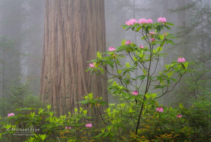
Redwood and rhododendron in the fog, northern California. 90mm, 1.5 seconds at f/16, ISO 400, polarizer.
When teaching composition I emphasize simplicity, because I think the single most common mistake people make is including too much in the frame. I tell students to ask themselves, before composing a photograph, what caught their eye in the first place, and then try to include only that, and nothing else. Pare the image down to its essentials.
The more specific you can get the better. In other words, if a tree caught your eye, what is it about that tree that you find interesting? It’s shape? It’s color? The juxtaposition between the tree and something else? Part of the tree rather than the whole thing? Does something about the tree convey a feeling to you? If you can identify exactly what drew you to a subject or scene you’ll know what you’re trying to say, which is the first, essential step toward effective communication.
What caught your eye could be one thing, two things, three things, or more. But if you try to emphasize three or more different elements then you’re probably headed for trouble. It’s like trying to make three different points in one sentence; in your zeal to communicate everything at once you’ll end up confusing your listener, and all your points will get lost. Better to keep it simple and make one point at a time. And when composing an image, it’s best to make one point, or tell one photographic story, at a time.
On the other hand, including only one element can make the photograph too simple. It’s like a sentence with a subject but no object, or a story with a beginning and no end. There usually needs to be some interplay between different elements to make the image interesting.
That’s why one of the most common compositional themes in photography is a juxtaposition between two things. A two-item juxtaposition can be simple enough to communicate its message clearly, but complex enough to be interesting. The two elements could complement each other (moon and Half Dome; mother and child), or contrast with each other (a chihuahua next to a Saint Bernard; a 19th-century cathedral surrounded by skyscrapers).
The photograph at the top of this post is a simple, classic juxtaposition between a redwood and rhododendron. The large, straight, brown redwood trunk contrasts with, yet also complements, the rhododendron, with its greens, pinks, and delicate shape. The fog helps make the image even simpler by obscuring the background. The photograph communicates it’s message clearly and directly.
Here’s a vertical version, from the same camera position. This is also a simple, direct juxtaposition between the redwood trunk and the rhododendron, but the vertical orientation allowed me to show more of the trunk, which helps convey more of the redwood’s height. (I might prefer the vertical, by a slight margin, because of that.)
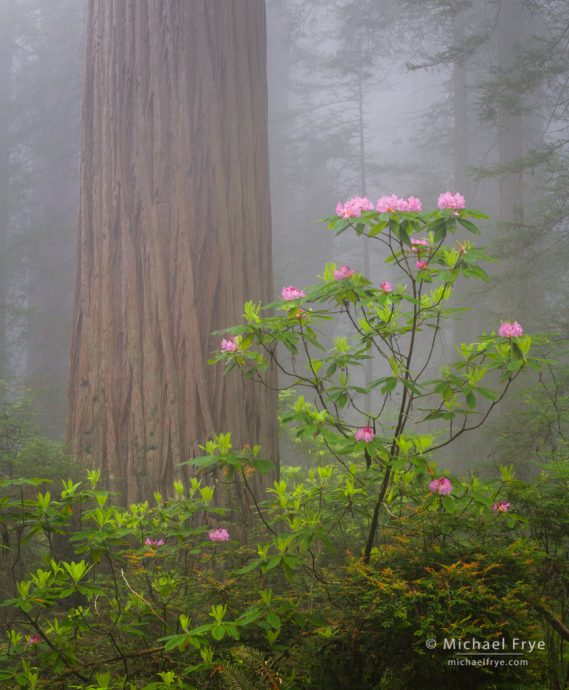
Redwood and rhododendron in the fog, northern California. 70mm, 1.5 seconds at f/16, ISO 400, polarizer.
As I said, I emphasize simplicity when I teach because for every image that’s too simple, I see a hundred that are too busy. And making simple compositions isn’t simple. It’s an art. (It also sometimes takes the right situation; anyone who’s tried to photograph redwoods and rhododendrons knows that it’s not easy to find the clean juxtapositions shown in these two images.)
But my favorite photographs (either mine or others) are rich and complex. They catch your attention, but then hold it because there’s so much to look at. They’re able to stay on the right side of that fine line between complex and interesting versus busy and confusing.
Some time ago I wrote about Sam Abell’s wonderfully rich and complex photograph of cowboys branding cattle in Montana. Abell said, “What we’re all trying to do is make a layered, deep, complex, complicated photograph that doesn’t look complex or complicated.”
Of course that’s not easy. I think you first have to learn how to make simple, direct compositions before you can try adding more complexity.
Here’s another composition of the same redwood trunk and rhododendron, from a different angle, with a wider lens. It’s more complex because it shows more trees, along with ferns and other vegetation. The image has a clear focal point – the rhododendron – and a focal point always helps clarify a complicated photograph. The vertical lines of the trunks create a repeating pattern that also helps unify the image:
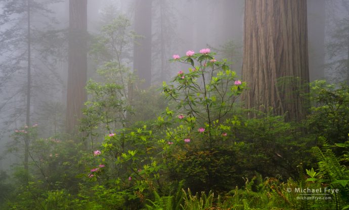
Redwoods, rhododendrons, and fog, northern California. 50mm, 1/2 second at f/16, ISO 320, polarizer.
This version has more sense of depth than the previous two, and also perhaps conveys the feeling of the environment better. But I think it also has less immediate impact. The previous two images would be more likely to catch your eye when flipping through the pages of a magazine, or scrolling through your Facebook feed. That’s sometimes the tradeoff you’re faced with. Ideally I’d like to make images that are immediately eye-catching, yet hold the viewer’s attention because of their richness and complexity, but that’s hard to pull off.
Here’s another comparison between a simpler composition and a more complicated one. During our workshop we had one wonderful morning when the sun broke through the fog and created some spectacular sunbeams. In the first photograph I took a simple, direct approach and used a telephoto lens (90mm) to fill the frame with the most interesting things at that moment – the sunbeams and the vivid double corona:
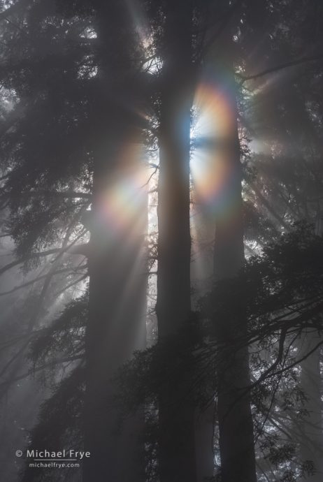
Redwoods with sunbeams and a corona, northern California. 90mm, f/11, ISO 400, five auto-bracketed exposures, two stops apart, blended with Lightroom’s HDR Merge.
In the second image I tried to add more complexity. I wanted to show some wider sunbeams, and a corona if possible, but also convey a sense of the environment. I found a single rhododendron tree that fit underneath the sunbeams and between redwood trunks, and positioned the rhododendron so that its curving trunk stood out as a clear silhouette against a lighter background:
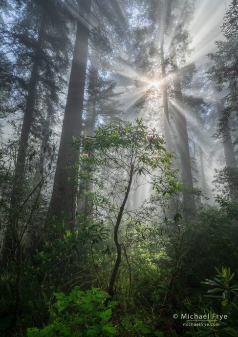
Redwoods, rhododendron, and sunbeams, northern California. 16mm, f/16, ISO 100, polarizer, five auto-bracketed exposures, two stops apart, blended with Lightroom’s HDR Merge.
This image is much more complex than the previous one, and some of its lower regions are a bit messy and indistinct. But the rhododendron provides an important foreground focal point that helps clarify the scene and keep it from crossing that line into becoming too complex and visually confusing. At least I hope so. It’s close.
I’ll have more to say about this subject soon, but in the meantime you can help develop your eye for simplicity versus complexity by looking at some of your favorite photographs – both your own and others. Are your favorites simple and direct, or more complex and layered? Do some border on being too busy and confusing? Looking at images this way can help you develop a better sense of where that line is.
— Michael Frye
Related Posts: Simplicity vs. Complexity in Photography; Dogwood Composition; Patterns, Focal Points, and Flowers
Michael Frye is a professional photographer specializing in landscapes and nature. He is the author or principal photographer of The Photographer’s Guide to Yosemite, Yosemite Meditations, Yosemite Meditations for Women, Yosemite Meditations for Adventurers, and Digital Landscape Photography: In the Footsteps of Ansel Adams and the Great Masters. He has also written three eBooks: Light & Land: Landscapes in the Digital Darkroom, Exposure for Outdoor Photography, and Landscapes in Lightroom: The Essential Step-by-Step Guide. Michael has written numerous magazine articles on the art and technique of photography, and his images have been published in over thirty countries around the world. Michael has lived either in or near Yosemite National Park since 1983, currently residing just outside the park in Mariposa, California.


Beautiful photos and some excellent points Michael. I learn a lot from you. Thank you.
Thanks John!
A really great discussion Michael. The examples of alternative framing/compositions really make the point. Lots for me to think about, learn, and remember.
Thank you.
Glad you like this post Mark – thanks! I’m looking forward to seeing more of your images from the workshop.
Amazing as always. Capturing the magnificence of the Redwoods is priceless…
Next we need your magic amongst the Sequoias…
Thanks Michael-Patrick! Photographically the sequoias are quite different. They don’t grow in pure stands, like redwoods, and fog is much less common. But I’ve made a few sequoia images I like – mostly in the fog, which should come as no surprise. 🙂 Here are a couple of links:
https://www.michaelfrye.com/2013/09/25/saving-the-sequoias-during-the-rim-fire/
https://www.michaelfrye.com/2018/11/04/dogwood-rebirth/
Thank you. Your images are *always* excellent and inspiring. In addition, you give thoughtful, helpful commentary about *how* you achieved the image.
You have a rare gift as an artist and a communicator. That’s extremely rare. Thank you for sharing with an audience, who in large numbers, you may never meet.
You’ve inspired me to stop off in the Redwoods as we make our way up the coast from San Francisco to Portland next May. I can only hope that I can capture a few images nearly as beautiful as these.
Thank you.
Thanks so much Rick! Very kind comments.
Even though your Yosemite and Sierra Images are always inspiring, I am truly in awe of your Redwoods images. I especially like/envy/appreciate your vertical take on the Redwood and rhododendron in the fog. This image is destined to be one of your best for 2019 – IMHO. Thank you for sharing your joy and skill with us.
Thanks very much Dave!
Very interesting article. Really well explained with use of supporting images. So good, that I have shared with my camera club members! Thank you.
Thank you Nick!
Many Thanks Michael For This Post Showing These Fantastic Images.
Also With All Of The Info/Tips On How You Are Taken These Images.
Thanks John!
Makes me so homesick. So beautiful. I miss the Redwoods, fog, smell, ferns, so, so much. Thank You for sharing. Don’t know that I’ll get it thru my thick skull when f/11 and f/16 are used!
Thanks Rosanna – I’m glad these bring back some good associations for you. You might find this post helpful:
https://www.michaelfrye.com/2017/11/05/image-sharpening/