Composition
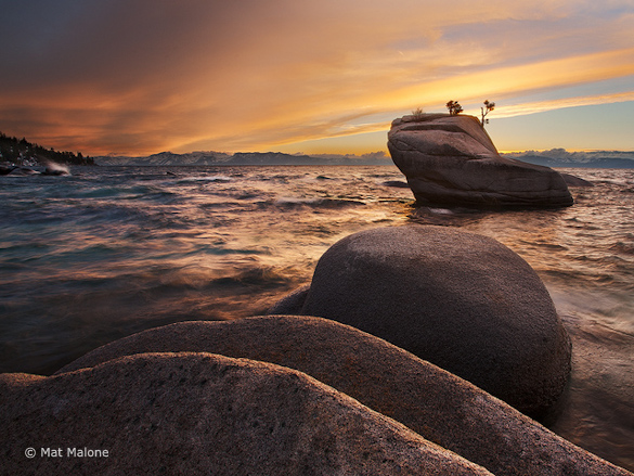
This week’s photograph was made by Mat Malone along the eastern shore of Lake Tahoe, Nevada. What first caught my eye about this image was the composition, with the layered, repeating shapes of the foreground rocks leading the eyes toward the more distant rock with the “bonsai” trees.
In some other critiques I’ve taken issue with foregrounds that didn’t seem to work, that really didn’t add to the photograph. This, on the other hand, is a strong foreground, something that contributes greatly to the overall effect of the image.
Mat told me, “When I was composing this I was really trying find an interesting set of lines that I could incorporate into the foreground. Along the shore I found a few large boulders next to each other that also lined up with the bonsai rock. Then it was just a matter of finding a perch for my tripod with a height that gave the rocks the separation I liked, and waiting for the light.”
Notice that the first thing Mat talked about was finding interesting lines. Lines and shapes are key components of any good composition. If a foreground is going to work, its lines and shapes have to tie in to the background—echo it somehow—or else lead your eyes into the distance. These rocks do both: their curving, layered lines echo the diagonal shape of the “bonsai” rock, and lead your eyes toward it as well.
Mat made some other good decisions in placing the camera and composing the image. He pointed the camera down, placing the horizon toward the top of the frame, and emphasizing the foreground rather than the sky. This made the image more about some unique and interesting rocks, and less about yet-another-pretty-sunset sky.
Another key decision was the height of the camera. Mat had to avoid making the small trees merge visually with the distant mountains, which meant either raising the camera high enough to position the trees against the water—probably not possible without a cherry picker, ladder, or levitation skills—or lowering it enough to silhouette those trees against the sky. Mat chose the low position, which was also the only option if he wanted to emphasize those foreground rocks. But even then he had to get it just right: too low and the third rock would merge visually with the “bonsai” rock; too high and we’d lose the sense of layering and repetition.
If there’s one thing I could nitpick about the composition it’s that the “bonsai” rock might be too close to the right edge. My eyes tend to move from the foreground boulders to the bonsai rock, then continue to the bright sky above and out of the frame. A little bit more space between that rock and the right edge—just a little—would help take the eyes back into the photograph rather than out of it.
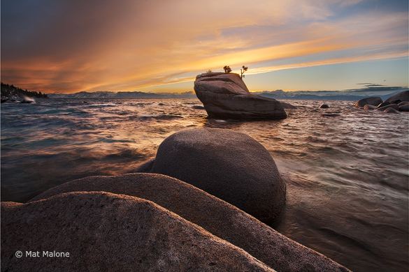
Since it looked like this image had been cropped—it’s more square than the standard 2:3 aspect ratio of this camera—I asked Mat about this, and it turns out there’s a good reason he cropped it this way: there’s a distracting rock just out of the frame to the right. Mat was kind enough to send me an uncropped version, which you can see below. The larger rocks on the right edge aren’t a problem, as they can easily be cropped out while still leaving plenty of space between the bonsai rock and the right edge. It’s that small rock sticking out of the water just to the right of the bonsai rock that forces the tight crop along the right edge.
Nature rarely provides perfect compositions, and sometimes we have to compromise. I agree with Mat’s choice here: I’d rather keep that distracting little rock out of the frame, even if that means a slightly-too-tight crop along the right edge (although I might darken that upper-right corner a bit to help hold the eyes in the frame). The other option, of course, would be to clone that rock out. That’s an ethical question that I won’t debate here, although personally I’d be very tempted.
Light
The light here is a great complement to the scene. The colorful clouds are nice, but what I really like is the way their colors reflect in the choppy water, creating beautiful textures. Calm, mirror-like water isn’t always necessary; sometimes ripples or waves are more interesting.
And then there’s that nice soft, backlit glow that highlights the layers in the foreground rocks. Overall the light and composition work together to create a great late-day mood. I can almost feel the cold wind and hear the waves splashing against the rocks.
Technical Considerations
This image was captured with a Canon 5D Mark II and 17-40 f/4L lens. The finished image is a blend of three exposures, all at 100 ISO and f/16, with shutter speeds of 1/30, 1/10, and 1/2 second.
I like the effect of the moderately-slow shutter speed (probably 1/10 sec.) on the waves. They’re not quite sharp, but not completely blurred either. This conveys a sense of motion, but also preserves some interesting textures.
The foreground rocks are probably no more than a few feet from the camera, and the small aperture (f/16) helped keep everything in focus—at least at screen-viewing resolutions.
Mat said, “I blended the exposures in Photoshop CS5: one for the sky, one for the foreground, and one for the middle tones. Getting the tree and the distant mountains to look natural was tricky.”
I’m sure this blending was challenging, but the result looks natural and well balanced, with just the right amount of contrast. In a larger view I can see some faint halos around the left edge of the bonsai rock, and above the trees near the left edge, but only a Photoshop nerd like me who’s actually looking for such things would notice them.
Conclusions
When picking images to critique I usually choose photographs that are good, but could be improved in some way. Sometimes, however, it’s nice to just select a really good photograph and talk about why it works. This is one of those times. Mat combined great light, an imaginative composition, and solid technique to create a beautiful image.
Your Comments
I’d love to hear your thoughts about this photograph. Do you like it as much as I do? Does the “bonsai” rock seem a little too close to the right edge, or is it fine the way it is? Does the photograph convey a mood to you?
Thanks Mat for sharing your photograph! You can see more of his work on Flickr.
If you like these critiques, share them with a friend! Email this article, or click on one of the buttons below to post it on Facebook or Twitter.
As part of being chosen for this critique Mat will receive a free 16×20 matted print courtesy of the folks at Aspen Creek Photo. If you’d like your images considered for future critiques, just upload them to the Flickr group I created for this purpose. If you’re not a Flickr member yet, joining is free and easy. You’ll have to read and accept the rules for the group before adding images, and please, no more than five photos per person per week. Thanks for participating!
—Michael Frye
Thanks to Aspen Creek Photo for sponsoring these critiques:


I agree with Michael. I like this image, especially the foreground. I like the way the lines of the rocks mirror the lines in the sky. I don’t like the uncropped version as I feel it places the rocks with trees too close to the center of the composition, which is not a major issue in and of itself, but the right side of the uncropped version also offers little of interest and detracts from the image because it keeps more dark areas in an already dark photograph. Having a lot of black areas in any given photograph is not necessarily detrimental. Some images are better with lots of black. The dark areas of this photograph are in some respects part of the mood and the time of day, but in my opinion they are a bit too heavy. I almost want to crop the left side too, for balancing purposes and to get rid of some black voids, but I feel the image would lose something that way and perhaps be less balanced in some aspects. The only reason I wouldn’t choose this photograph as a primary portfolio image is that it consists primarily of only two colors, mainly one shade of orange and black, with not too many gradations between, or other color variety. Otherwise, it is quite well put together and interesting for the reasons others have mentioned.
Very good critique & Very Good Picture.
I love the foreground patterns guiding the eyes to the Bonsai rock. The uncropped version is very good, but the cropped one is better.
Good job Mat.
Grettings from Barcelona.
Thanks everyone for your comments! I appreciate your input.
For the record, I don’t think anyone, least of all me, would prefer the uncropped version. The question is whether to include a little more space to the right of the bonsai rock, and, if so, what to do about that little rock in the water. Gordon says it doesn’t bother him, which is great – it is rather small, after all. I’d have to say it bothers me, but it’s all subjective.
David (Hyde), I see your point about only two colors, but to me the design and water texture make up for that. I thought about cropping the left side too, but it seemed to lose some balance that way. I think since the main centers of interest are on the right, there needs to be something to balance those on the left, and that little triangle of dark trees is the only thing available. Perfection is always elusive…
Michael,
Thanks for the critique. I have to admit that I’m flattered!
You’re welcome Mat – and you should be!
Love the photo, Matt. How about adding a little more to the right side of the frame and include the small rock, but “dodge” the rock so it is lighter in color and more similar to the water. Thus, being less obtrusive in the picture. Also, appreciate the critique Michael. You make some good points to consider and be aware of when framing my next shot.
Thanks for the idea Greg. Having tried things like this, I’m not sure you could lighten that rock enough to blend in and not have it look strange, but it’s worth a try.
Excellent critique, Michael, and excellent image, Matt. I agree that the crop is too tight, but the uncropped puts too many key objects in the middle. The little rock is a distraction for me also, so just loosen the crop and clone that dang thing out! After all, this is fine art, not photojournalism!
Thanks Doug for your unequivocal endorsement of cloning out the rock!
I like the original crop chosen by Mat. At first glance I thought to myself…..”what great movement in this photo”; I wasn’t thinking about the waves, rather the composition. I too love the foreground rocks. I think we’ve all seen a ton of photos from this location but the composition here makes it something special. Could it be composed/cropped a little differently? Sure–there’s a myriad of options but I honestly like this one just the way it is.
Thanks Charlene – I like it just the way it is too. I just thought a bit more space on the right would make it slightly better – just slightly.
The small rock on the right DOES NOT bother me; it is there! However, if it REALLY bothers him, how about “content aware” Fill for that small rock.
Great work and Great critique here. I agree that often nature does not provide the perfect composition and you have to work with what you have. The odd branch or some grass is easy enough to work around but moving boulders is a different story 🙂
When I encounter scenes like this one where nature hasn’t afforded the perfect composition, that often brings me back again and again, sometimes elusively searching for that perfect composition. I love that challenge.
Ahh…looks like the northern portion of the eastern shore, around the Zephyr Cove area. Last time I was there was a very early May morning, and it was absolutely freezing cold. Lovely photograph, Mat. And I can’t think of a thing to disagree with in Michael’s critique.
Nice image and good thoughtful critique. What I like most about this image is that it is a different perspective and not a copy of the typical iconic shot you see of this scene. Not that there is anything wrong with iconic shots. I would just clone the rock out to add the additional space to make this already strong image even better.
Thanks Greg – glad you like the photo and the critique, and that we seem to agree!