“Pacific Waves” by Jenna Beth Fender
This week’s photograph was made by Jenna Beth Fender at Manhattan Beach (or maybe Hermosa Beach) in southern California. By having her image chosen for this critique Jenna will receive a free 16×20 matted print from Aspen Creek Photo. To learn how you can submit photos for this series, and possibly win a free print, see the end of this post.
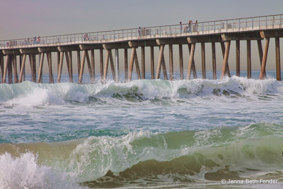
We’ve looked at several images where slow shutter speeds were used to blur the motion of water, but here a fast shutter speed of 1/400 sec. effectively froze the water’s motion, preserving the curling shape of the waves and texture of the water.
Those waves, along with the pier, provide the structure and design of this image, creating three long, slightly diagonal lines running across the frame. The overall composition is clean, simple, and strong, with some interesting details added by the spray, figures, and structural posts underneath the pier.
It was the waves, with their strong lines and almost palpable texture, that originally attracted me to this image. Jenna timed this well, catching both waves as they were curling over. Of course she may have simply held down the shutter button and picked the best one later, but that’s a perfectly valid technique—it’s what I would have done!
While the composition is strong overall, one thing that bothers me slightly is the bright spot in the lower-left corner. Since it’s on the edge it pulls my eye out of the frame. I’d rather see more room along the whole bottom edge of the photo, as that would give more breathing room to the foreground wave, which is such an important part of the composition. As it is, just darkening that lower-left corner would help.
Technically, the exposure looks good overall, although some areas of white water lack detail. The fast shutter speed worked well to freeze motion, but the trade-off was that the short exposure required a medium aperture, f/8, which didn’t provide enough depth of field to keep everything in focus (in a larger view you can see that the foreground wave is slightly soft). This image was captured at 100 ISO; by pushing the ISO up to 400 ISO Jenna could have used the same shutter speed, 1/400 sec., with an f-stop of f/16, getting both the motion-freezing short exposure time along with a small aperture to keep everything in focus. The tradeoff would have been more noise from the higher ISO, but I think the increased sharpness would have been worth the small increase in noise. Also, it would have helped to focus closer to the foreground rather than on the background. I don’t have space here to describe proper focusing technique in detail, but I do so in two of my books, The Photographer’s Guide to Yosemite and Digital Landscape Photography.
There are some hints of magenta/purple along the left edge of the image that seem unnatural and out of place. Jenna told me that she didn’t use any filters or do anything else to the photograph except use the Topaz Adjust filter with the “Photo Pop” option. I haven’t used that software, but I suspect that “Photo Pop” was the culprit in creating those strange colors. In general I’m not a big fan of automated options like this, whether from software plugins, commercially available Lightroom presets, or whatever. Every image is different, and it’s hard to create a standard set of development adjustments that will work on more than a few photographs. While pre-made settings can serve as a starting point, each image must be evaluated and adjusted based on its own unique characteristics.
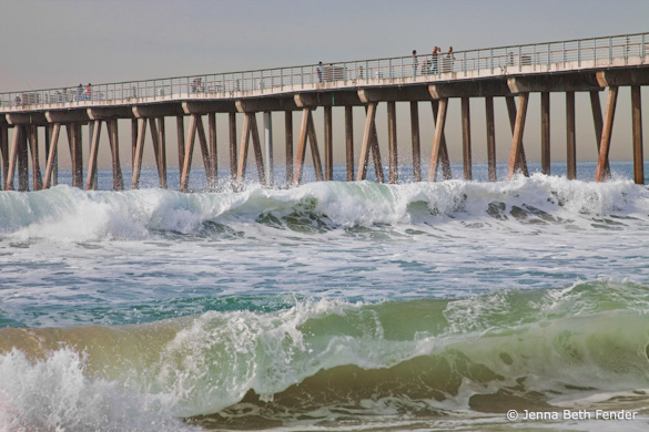
With that in mind, I took this image into Lightroom and removed some magenta and purple saturation to get rid of the unusual colors. Then I added a lightening S-curve to brighten the photograph and increase the contrast, and also darkened that lower-left corner. While the improvements weren’t dramatic, every bit helps. Here’s the result:

With the magenta cast removed, the lower-left corner darkened, and a bit more contrast added
The great thing about digital technology is that it’s given photographers tremendous control over the appearance of their images. The bad thing about digital technology is that it’s given photographers tremendous control over the appearance of their images. The tools can be used for good or evil—to enhance the expression and meaning of an image, or to ruin an otherwise perfectly good photograph. For better or worse, learning the software tools—and, more importantly, learning the judgement to use them wisely—has become an essential part of photography today.
Having said all that, the slight magenta/purple cast in this image is a minor problem, easily fixed, and overall I like this photograph very much—it has a clean, strong, graphic composition, great texture, and captures the feeling of a southern California beach quite well.
Thanks Jenna for sharing your image! You can see more of her work on Flickr.
As part of being chosen for this week’s critique Jenna will receive a free 16×20 matted print courtesy of the folks at Aspen Creek Photo. If you’d like your images considered for future critiques, just upload them to the Flickr group I created for this purpose. If you’re not a Flickr member yet, joining is free and easy. You’ll have to read and accept the rules for the group before adding images, and please, no more than five photos per person per week. I’ll be posting the next critique on May 18th or 19th. Thanks for participating!


Jenna’s photo is of the Hermosa Beach Pier. I grew up in the South Bay area, mostly living in Redondo Beach, but spent time in Hermosa and Manhattan Beach as well. I also lived in Ohio for several years. Funny how I found Jenna’s picture……I was searching the web, and knew Jenna when she was about 5 or 6 years old, because I was dating her mother.
I was actually looking for Jenna’s mother, Katie Fender, but happened across the photo. Funny how things tie together….. the Hermosa Pier begins near the Mermaid Restaurant, itself a local landmark. For about 45 years, The Mermaid was owned by my Aunt Johnnie and her husband “Boots” Thelan.
Nice story Kevin – thanks.