Here’s another long-awaited installment in my photo critique series. This time we’ll look at a photograph by Vaibhav Tripathi called “Winter Mist Rising Beneath Half Dome,” from my home territory, Yosemite National Park. It’s an interesting study in composition, and directing the viewer’s eye.
Light and Weather
The light is soft — no direct sunlight anywhere. Soft light is great for intimate scenes, but big, sweeping landscapes like this usually need sunlight to create contrast and keep the photograph from looking flat. Yet there’s actually a beautiful quality to the light here. This was made at dusk, and there’s a hint of alpenglow illuminating Half Dome, some blue in the sky, and of course the mist in the middle ground. The upper half of the photograph in particular has a luminous quality, and there’s a quiet, misty, mystical mood to the image. I also like the subtle hues and the warm-cool color contrast.
Composition
There are a lot of interesting things going on in the frame: Half Dome, the elm tree beneath it, the pines peaking through the mist, the grass hummocks in the foreground, and the reflection of Half Dome in the water.
With all those different items it would be easy for the photograph to become too busy and visually confusing, but it doesn’t: all the main elements stand out clearly, and the composition overall is fairly clean.
Yet to me it doesn’t all quite fit together. There are too many things vying for my attention, and they all have similar visual weight. Should I look at Half Dome, the elm, the pines on the right, or the foreground? I’m not sure. When composing a photograph you can’t be wishy-washy — you have to decide what’s most important to you, and make that choice obvious to the viewer.
Also, the eye doesn’t flow easily between all the different elements in the photograph. Half Dome, the elm, the reflection of Half Dome, and the most interesting grass hummocks are all on the left half of the frame. While I like the misty pines in the upper-right, the lower-right quadrant of the image isn’t as interesting, and it seems like my eye has to take a detour to get to those pines. Also, the (relatively) bright patch of water in the lower-right corner pulls my attention out of the frame.
Part of the reason things don’t flow here is the centered horizon. Centered horizons can work well with reflections, where the bottom half of the image mirrors the top, creating symmetry and repetition. But when the top and bottom are different — and they’re very different here — a centered horizon makes it look like you have two separate photographs randomly stuck together, and your eye doesn’t flow easily between the two halves. Again, it’s better to decide which is more important — the top or the bottom — and emphasize one or the other.
So how could this be composed differently? Vaibhav sent me several alternative views that he tried. There isn’t space to show those other compositions on this page, but you can see them here. Vaibhav said he liked the one at the top of this post best. I think a case can be made for the first image on the other page, where the lower-right corner of the frame seems more complete and more interesting. But the centered horizon in that version still interrupts the visual flow, and the small patches of snow near the bottom edge are a little distracting.
So, were there other possibilities? I think so. Working with the original image at the top of this page, I tried many different crops and found two that I think are more cohesive. The first has a slightly panoramic aspect ratio, and emphasizes the most eye-catching things in the top half of the photo — the trees, mist, and Half Dome:
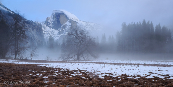
This slightly panoramic crop emphasizes the most interesting parts of the top half of the photo, and gets the horizon off-center.
The second is a squarish vertical that emphasizes Half Dome, the elm tree, the foreground grass hummocks, and the reflection. This still leaves the horizon centered, so ideally I’d like to include more of the area below the edge of the frame, and emphasize that foreground pattern more (if there was nothing too distracting below what’s visible here). This vertical composition eliminates some of the less-interesting space in the lower-right corner of the original, and the eye travels more smoothly around the frame on a roughly oval path:
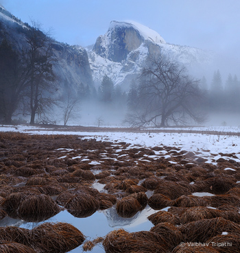
This squarish vertical crop highlights the most interesting elements of the left side of the frame. Ideally I’d include a little more along the bottom.
(As always these crops are meant to show how a photograph might be composed differently. Severe cropping throws away a lot of pixels, and limits how large a print you can make, so it’s always better to get the framing right in the camera.)
There are a couple of other minor issues with the original composition. The horizon is tilted. I know the ground slopes in this spot, but not that much. However that’s an easy fix (I corrected it in the cropped versions above). By moving the tripod just a few inches to the left the reflection of Half Dome would have been perfectly placed within the open patch of water, avoiding the slight merge of that reflection and the grass hummock below.
Technical Considerations
This image was captured with a Nikon D700 and Nikkor 16-35mm f/4 lens at 32mm. Vaibhav used the camera’s native ISO (200), with a shutter speed of 0.4 seconds at f/16. Vaibhav didn’t mention using a tripod, but he must have, as 0.4 seconds is a too slow a shutter speed to handhold the camera and get a photograph that looks this sharp.
It’s usually easy to find the right exposure for low-contrast scenes like this, and the exposure here looks perfect. There’s a lot of depth to the image, and Vaibhav did a good job of getting everything in focus by using a small aperture (f/16) to get sufficient depth of field (you can see a larger version here).
Vaibhav did minimal processing to this photograph. He used Nikon Capture NX2 initially, adjusting the white balance to 5850K to get a warm-cool color contrast, and making a few other small tweaks. Then he took the image into Photoshop and added a curve to “bring out the mist and the warmth/luminescence in the foreground.” The photograph hasn’t been cropped.
To me the processing looks about right. The white balance seems perfect; Vaibhav succeeded in getting that warm-cool color contrast, and the snow in the middle ground looks neutral. The overall contrast looks good too — enough to give the image some life, but not enough to make this soft, misty photograph look harsh. And I’m glad Vaibhav resisted the urge to pump up the saturation and spoil the subtle color palette.
Conclusions
This image is technically well-executed and processed, and Vaibhav succeeded in capturing the luminous, quiet, mystical mood of this scene. The composition is clean and simple, but I think a little more care in framing would have made the image more cohesive and improved the visual flow.
Your Comments
I’d love to hear your thoughts about this photograph. Do you like the mood? Do you think the composition works overall? What do you think of the alternate crops I presented?
Thank you Vaibhav for sharing your photograph! You can see more of his work on Flickr (check out his lunar eclipse sequences) and on his web site.
If you like these critiques, share them with a friend! Email this article, or click on one of the buttons below to post it on Facebook or Twitter.
As part of being chosen for this critique Vaibhav will receive a free 16×20 matted print courtesy of the folks at Aspen Creek Photo. If you’d like your images considered for future critiques, just upload them to the Flickr group I created for this purpose. If you’re not a Flickr member yet, joining is free and easy. You’ll have to read and accept the rules for the group before adding images. Please, no more than five photos per person per week, and make sure your Flickr profile has an email address where I can contact you. Thanks for participating!
Related Posts: Photo Critique Series: Space and Separation in a Mt. Shasta Photograph; Photo Critique Series: Re-Processing a Misty Forest Scene
Michael Frye is a professional photographer specializing in landscapes and nature. He is the author and photographer of The Photographer’s Guide to Yosemite, Yosemite Meditations, and Digital Landscape Photography: In the Footsteps of Ansel Adams and the Great Masters, plus the eBooks Light & Land: Landscapes in the Digital Darkroom, and Exposure for Outdoor Photography. He has written numerous magazine articles on the art and technique of photography, and his images have been published in over thirty countries around the world. Michael has lived either in or near Yosemite National Park since 1983, currently residing just outside the park in Mariposa, California.



I like parts of the picture, especially the misty mood, but agree that it doesn’t all quite fit together.
The grass hammocks aren’t the most interesting foreground and their color doesn’t quite work for me. It doesn’t seem the right counter-point to the misty background, but it’s hard to find an original and appealing counter-point to Half Dome.
The horizon appears tilted to the right, although this impression may be caused or reinforced by the tilt in the line of the foreground.
Thanks for your input foosion. I think the horizon is a little tilted, but it’s mostly optical illusion caused by the diagonal patch of bare ground on the right side.
this image seems that it was taken for the tree. I didn’t see the half dome until you pointed it out. it’s a very busy image. perhaps a small rotation counter-clockwise, the bare strip of ground is causing a tilting effect. I think it’s a great shot, but i would eliminate the foreground and show the tree in front of the mountain. that’s my opinion (as a non-pro.)
Thanks for your comments Doug. If you click the link to the other page you’ll see that Vaibhav did try a tighter composition, with just the tree and Half Dome, but personally I don’t like that one as much — something seems to be missing. That’s why I tried the two crops you see here, which are a little simpler, but show more than just Half Dome and the elm.
I am looking forward to acquiring and using the Nikkor 16-35 f/4. This photo riveted my attention on the way wide-angle lenses reduce the apparent size of subjects in the background. In this photo, Half Dome was greatly diminished in importance compared to the foreground, so I was confused about what the subject was. Both crops solved the problem and made Half Dome the subject. As Michael pointed out, the cropped photo lost a lot of pixels. This could have been avoided by using a longer lens.
The reflection of Half Dome in the foreground is seductive and I understand the desire to include it in the photo, however, I prefer the crop without the reflection because it better concentrates on the subject. I would prefer to crop out the vegetation in the foreground, and leave the pines on the right.
It would be interesting to see a photo at 16 mm with the lens held very low and very close to the vegetation. This would make the vegetation the subject with a great background. I believe that wide angle lenses usually perform best when they a pushed up close to the subject.
I am also looking forward to acquiring and using the Nikkor 70-200 f/4 which may be the right lens for this shot.
Thank you for this thought provoking photo.
Thanks for chiming in Eric. You make a good point about the reflection of Half Dome being “seductive.” I think that happens a lot, in many different photographic situations — we become enamored of something and try to make it fit into the rest of the scene, when we’d really be better off leaving it out. I think that reflection of Half Dome could work here with the right composition, but we always need to be careful wary of that thought, “Maybe I could include this other thing too…”
You’re right that wide-angle lenses often work best when you get close to something in the foreground — but that’s hardly a rule, as they can work in other situations as well.
I do like the original photograph, especially the mood of the upper half. Frankly, I didn’t even notice the reflection until it was mentioned in the critique. I agree with the comments about the lack of flow between the top and bottom and prefer the more square crop. I’m sure that if I was there I’d end up with wet feet and a wet seat trying to get low and get a clean reflection in more of the bottom half.
Waders, perhaps, Kyle? 🙂 Thanks for your input!
I am an absolute beginner to more serious (nature/landscape) photography and I am just reading your book “Digital Landscape Photography: In the Footsteps of Ansel Adams and the Great Masters” (German Version). It’s such a great book! For the first time it seems like I am getting a feeling for exposure and aperture setting and how to use it with my DSLR. Thanks for that!
I have found your blog and I like this Photo Critique. The mood in the picture is awesome! But yes, it is difficult to decide where to look at due to the centered horizon. I prefer the panoramic crop the most! The photographer’s essence is maintained while the picture was improved (although the originial photo is already great!).
Thanks Nordwolke — I’m glad you’re enjoying the Digital Landscape Photography book, and I appreciate hearing your thoughts about this photograph.
I feel it’s ok to have diverse visual elements in an image, if they link together in some way, but I agree that in this case little connection or flow exists between areas. This photograph is refreshing as images of Half Dome go, precisely because of the small reflection and unusual foreground, but as you say, this foreground also is too repetitive if allowed to reach across the whole photograph. Either crop improves the look of the foreground and how it compliments and allows more emphasis on the misty upper portion. However, I prefer the square or a vertical crop, which eliminates the right bottom corner issues and keeps the reflection of Half Dome that ties the top and bottom sections together.
Thanks for your (always) thoughtful comments David. It can work, as you say, to have diverse elements in a photograph, but not too many, and it usually helps to emphasize one of those elements more than the others.
Michael,
Nice job with the critique. I really like how you have taken the concept of visual flow and helped to show examples of how this image could be taken from a “snapshot” like composition to one that becomes more compelling and expressive of that moment in time that Vaibhav saw and felt when he stayed out late to enjoy Cook’s Meadow. For me, this is another example of the challenges around making a 2-D image from a 3-D world. I like how you think and teach.
Best regards, Peter
Thanks Peter — I’m glad you liked the critique, and I appreciate hearing your thoughts. I think Vaibhav put a lot of thought into his composition, but it is, as you say, a challenge to make a 2-D image from a 3-D world, and have it communicate what we hope it will communicate. It’s not always easy or obvious how to present your subject in the best way.
A great image and an insightful critique, Michael. Thank you.
I have occasionally had problems with the “pseudosloping horizon” effect (I made that term up – is there a proper one?) In this case it’s due to a very gentle slope, but it is often the result of a receding waterline or cliff edge which makes it look as though the camera was tilted when in fact it wasn’t. I am often uncertain whether it is best to correct the optical illusion by rotating the image, or to leave nature alone. On principle, I don’t like to correct a non-tilt, but often the image doesn’t look quite right unless this is done. What do you think?
Geoff, I don’t know of a “proper” term, and “Pseudosloping” works for me! Here the illusion is partly caused by that diagonal strip of bare ground near the right-middle, which makes it a particularly tough case.
Usually it’s best to not correct the optical illusion — in other words, to make the camera level in an absolute sense. When viewers look at a photograph they pick up many subtle visual clues that tell them what’s level. Pseudo-horizons are one clue, but others include trees and actual horizons. We’re usually savvy enough, even at a subconscious level, to not be fooled by the “pseudosloping,” so usually trying to correct for the illusion actually makes the image look tilted.
This image is a tough case in that regard, because no matter what you do it looks tilted. But I’ll call it a rare exception. Here’s a link to a better example, where the opposite bank of the river looks slanted, an illusion created by perspective — the bank on the right side of the frame is closer to the camera than the bank on the left side of the frame, and the camera is above ground level (actually about 8 feet above the water). But the real horizon is not the river bank, but the line just above it between snowy meadow and trees. That looks more-or-less straight, as do the trees:
https://www.michaelfrye.com/2011/01/19/moonrise-and-moonrise-again/
When in doubt, frame a little loosely, so you can correct any tilt later in software. (That requires some cropping, hence the need to keep a little extra in the frame. Just a little!)
Great point and name for what you call the “pseudosloping horizon” problem. I recently experienced this numerous times during Michael Frye’s “Hidden Yosemite” this past July workshop– especially when creating compositions around alpine lakes and rugged, steep and expansive terrains. I am generally more satisfied with compositions if I first level the camera and tripod to a zero bubble, then work with whatever lens and focal length offers the right balance and interest to express the moment of the scene. By incorporating this zero bubble technique into the image capture process, I find that I have many more “keepers” when I get home and review them on a large computer monitor. Before I adopted this zero bubble technique out in the field, I used to have many more images that were too tilted to use and and/or optimize to what I thought I was doing in the field. It is always challenging in the field to successfully simplify a composition and not get overwhelmed with trying to include too much and get the natural horizontal and vertical lines of a scene to come thru in the final image. This is a tricky thing for the photographer to do for viewers because the photographer will always have the 3 dimensional memory of what is and what is not included in the final composition. Viewers who only have the knowledge of the 2 dimensional image that is in front of them may have an entirely different sense of what the most realistic or accepting balance of the horizontal and vertical lines will be no matter what reality is! Let me know what you think about the zero bubble technique as a possible solution to address the “pseudosloping horizon”. Best regards.
Peter, I agree with you that it’s usually better to get the image truly level — see my reply to Geoff above. A bubble level is one way to do this. Many newer cameras also have a “virtual horizon” in live-view mode that’s a big help. Another tip: get the tripod up to your eye level. If you’re bending down to look through the viewfinder you’ll probably tilt your head, and it’s difficult to get the photograph straight when your head isn’t. One more tip: step back from the tripod and look at the camera itself from about four or five feet away. The bottom of the camera should be level (or vertical if you’re in “portrait” mode).
Fantastic photo Vaibhav!
This was a really great critique Michael.
I feel that the vertical crop suggestion works best, as it contains all of the key elements, without causing the eye to wander.
This might be just an illusion on my part, but I think that reflections in, as well as the color of the water, stand out best in the vertical crop.
Looks like Yosemite is going to get a ton of new snow this week. 🙂
Take care!
Paolo – Jacksonville, FL
Thanks Paolo — glad you like the photo and the critique.
The weather forecast calls for showers and not a big dump, but there should be some snow!
Your 2nd crop definately helped, the original had balance problems. Still the crop leaves the snow line off where the first crop put it in the corner (giving up the reflection). I believe your original comment was dead on, look for the more emotional-initmate shot. The tree in the fog itself, the moss bog itself, etc. Half Dome with a blue sky isn’t attractive most of my photography friends, but seems to be a big hit in the Village store. He is working on off a composition type shot which is the key in Yosemite if one wants original work.
Vibro1 – Burbank
Thanks for chiming in Bruce!