Spacing and separation are always important elements of composition, but during my recent workshops in and around Redwood National Park we encountered many situations where spacing and separation were particularly vital.
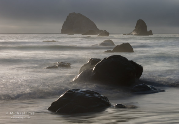
The photograph above is a good example. I positioned the camera carefully to avoid, as much as possible, visual mergers between the foreground rocks. I wanted the shape of each rock to stand out clearly, as those shapes are the point of this composition: they set up a repeating pattern, and lead your eye from foreground to background.
But some mergers were unavoidable. The two rocks in the middle distance, just right of center, “touch” each other, though just barely. Unfortunately I couldn’t get the tripod any higher, and moving to the left would have disrupted the overall balance. There’s no such thing as a perfect composition.
Some photography books recommend choosing a low camera angle to create an unusual viewpoint. This is not bad advice – sometimes the low camera position works well. But in many situations you want to get the camera as high as possible to see over foreground objects and avoid visual mergers. In this photograph, a lower angle would have made the foreground rocks blend together and look like one big, indistinct blob. In fact, I wish I could have gotten higher. Maybe next time I’ll take an eight-foot tripod and a step stool!
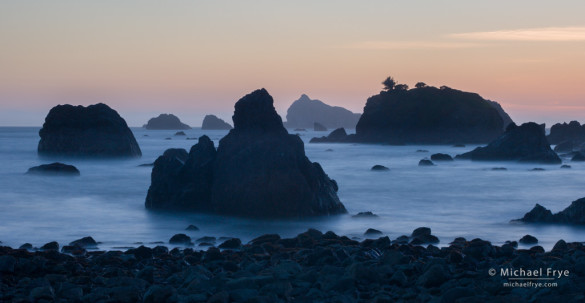
In this next photograph, the pyramid-shaped rock just left of center is the visual focal point of the image. I couldn’t quite separate it from the other rocks in the background, but by trying to get as much visual separation as possible I was able to make its shape stand out clearly enough to set up a repeating pattern, and keep all the elements in balance.
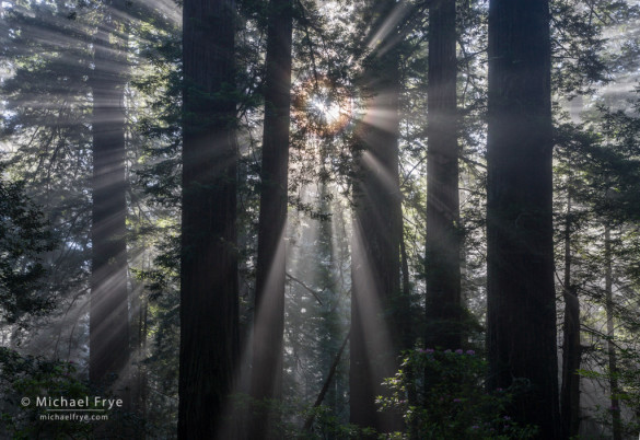
Spacing and separation are just as vital in forest scenes. In this next photograph, my camera position was limited to a few spots where I could see the corona around the sun, and also avoid lens flare by keeping the sun behind branches. Luckily one of these spots had almost perfect spacing and balance between the six main trunks.
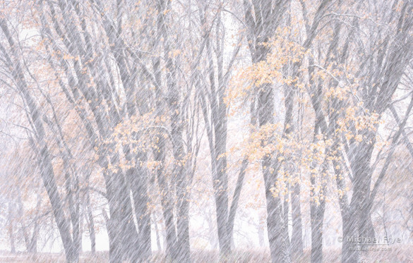
Here’s one more example from Yosemite. Again, there are some mergers, but most of the trunks stand out clearly. The most important element is the tree in the middle, which is separated from, and balanced between, the trunks on either side.
Having space and separation around important elements creates repetition and order. Many images just don’t make sense, visually, if those objects merge together. It’s the difference between a confusing sentence and a clear one.
I’ve seen many otherwise beautiful photographs ruined by mergers that could easily have been avoided – if the photographer had been paying attention. The first step is to be aware of the problem. Your compositions will improve dramatically when you become conscious of mergers and start looking for them.
— Michael Frye
Related Posts: Creating Depth: Beyond the Wide-Angle Formula; Simplicity vs. Complexity in Photography
Michael Frye is a professional photographer specializing in landscapes and nature. He is the author and photographer of The Photographer’s Guide to Yosemite, Yosemite Meditations, and Digital Landscape Photography: In the Footsteps of Ansel Adams and the Great Masters, plus the eBooks Light & Land: Landscapes in the Digital Darkroom, and Exposure for Outdoor Photography. He has written numerous magazine articles on the art and technique of photography, and his images have been published in over thirty countries around the world. Michael has lived either in or near Yosemite National Park since 1983, currently residing just outside the park in Mariposa, California.



Nice lesson. Always need to keep all these tips in mind. I think for some it comes more naturally than for others. Probably someone trained in the arts, like painting, would shift around a lot to see those mergers that they would never put in their painting. I need to remember to do this more consciously than through sheer instinct. Thanks for the reminder and the nice pictures to look at.
Thanks Aram! Yes, I’m sure it comes more naturally to some than others, but this is definitely one of those things that can be learned. In my early years in photography I never thought about spacing and separation, once someone pointed it out to me it became a conscious effort to think about it.
The first photo is very nice and subtle, but the last one is really cool. Snow gives it a great semi-abstract feel. I agree, I’m always extending my tripod and wishing I could float 20 feet higher. Then there are the times you CAN get really low. As always it depends on the situation. I don’t find many “rules” and reminders useful because I just go with what’s in front of me. But I can see this one key reminder being useful for learning composition. Good post.
Thanks Michael! Glad you like that last photo – me too. You’re right, rules are of limited use in the infinitely varied situations we encounter as photographers. This one, though, about keeping separation and spacing between important elements, is something that applies in a lot of situations, and can definitely be consciously learned.
Great comments. You are a great photographer and teacher. I enjoy your posts!
Thank you Hank!
Thank you Mike for this great blog. I can’t wait to start thinking and incorporating this approach.
Enjoy the weekend!
Steve
Thanks Steve, and I hope you are able to incorporate some of the ideas here.
Michael:
Thanks for the great tip. Something to slow down and think about. I like the idea of using a higher camera angle. I belivee you also had a blog post awhile back about how a higher camera angle can sometimes add a sense of depth.
Thanks for sharing,
Kevin
Thanks Kevin. I linked to that earlier post you mentioned above (under “Related Posts” at the end of the article). In that case I was talking about finding an elevated perch — a hill, or even an embankment, that gives you a little higher viewpoint. Here I’m talking about simply getting the tripod up as high as possible to get separation between foreground elements. But the two issues are definitely related. I think the top photograph here has some depth, and that’s helped by the slightly elevated camera position — even if the camera is only at eye level on a sloping beach. If the camera were lower, the rocks would merge visually, and would destroy the sense of depth. So raising the camera can give you better separation between foreground and middle-ground elements, and that separation can help create a better sense of depth. On the other hand, an elevated perch can help create a sense of depth even without the kind of mergers that I talk about here.
Michael,
I find myself doing this quite often but it has really been guesswork. Thanks for the pointers.
Thanks,
Charles
You’re welcome Charles! Glad this is helpful.
Great tips Michael, I find myself arriving to a pre-scouted location looking for options constantly parosing the scene and even in the middle of the shoot finding that magic “point of view”. Ansel Adams really did emphasis the “what if” moment with his previsualizing exercises. I try to exhaust all the options and only realize their limits after the fact in post. I suppose that is why the scene keeps bringing be back for another look. My “cornfield collection” on my website is that best effort. Thanks Michael – great advise.