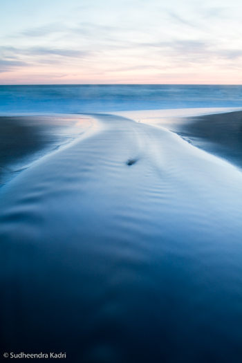
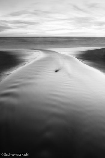
“Outward Momentum, Panther Beach, Davenport, California” by Sudheendra Kadri
This week’s image, by Sudheendra Kadri, was made at Panther Beach in Davenport, California (just north of Santa Cruz).
What initially caught my eye was this photograph’s zen-like simplicity. The entire image consists of only a few lines and shapes. The dominant visual element is the curving X of the stream, resembling a whale’s tail, which in turn is flanked by two triangles of darker sand, then topped by a band of water and lighter expanse of sky. The small dark rock in the center of the frame could be a distraction under different circumstances, but here I think it’s a nice touch, adding a subtle focal point.
In photography, less is usually more, and this image provides a great example of that. The simple, graphic design grabs our attention in a way that more cluttered compositions don’t. But simplicity isn’t simple—in fact it’s quite difficult. The universe wasn’t constructed with photographers in mind; much of the time the world seems to consist of random clutter, with bits of junk and debris thrown in for good measure. The photographer’s job is to find order within that chaos (to paraphrase Robert Glenn Ketchum), to see designs and patterns in the random configurations of the universe.
I talked about seeing abstractly—focusing on lines, shapes, and patterns, rather than thinking about the subject—in my critique from March 24th. I also discuss this in my Digital Landscape Photographybook, and in every workshop I teach. I must think it’s important! Sudheendra said on Flickr, “The way this stream turned sharply before meeting the oncoming waves caught my eyes and I thought this would bring some nice curves and lines into this frame.” So clearly he was thinking abstractly, and that mindset allowed him to see the potential of this scene.
This image’s simple design could only have been created from a particular point of view, which looks like it was the middle of the creek! I asked Sudheendra about that and he confirmed that, yes, he was standing in the water. I guess photographers sometimes have to sacrifice for their art.
The dusk light allowed a 30-second exposure that smoothed the foreground water, giving it that porcelain glow and increasing the level of abstraction by lessening the water’s texture. That soft, glowing, dusky light can be effective for many subjects; the great John Sexton seems to use it almost exclusively.
 Sudheendra wrote on Flickr, “Shot after sundown, initially I liked the blue-hour colors, but once I saw how it looked in black and white, I wanted to stick with it.” I think that was a key decision, and a good one. Here you can see the color version that Sudheendra sent me for comparison (I added a little contrast to the file to make it closer to the black-and-white version). While the blues and pinks have some appeal, to me the black-and-white image is stronger. By taking away the color the image becomes that much more abstract, focusing our attention on just the lines and shapes, and emphasizing the strong design. We also notice the glassy texture of the foreground water more.
Even if you intend to make the final image black and white it’s usually better to capture the image in full color, as this gives you more options for making that conversion and translating the colors into shades of gray. (With Raw files that’s the only choice—they’re always in color—but some cameras can process JPEGs into black and white.)
Starting with that color image you can use the “Grayscale Mix” in Lightroom or Adobe Camera Raw, or a black-and-white adjustment layer in Photoshop, to alter the tonal relationships between different colors. A classic example is a red apple next to a green apple. A straight black-and-white conversion would make both apples appear medium gray. By adjusting the Grayscale Mix you can make the red apple lighter and the green apple darker, or vice versa. In this “Outward Momentum” photograph, lightening blues would make the foreground water a lighter shade of gray, while darkening magentas would lower the tones of the sky near the horizon. (I discuss these concepts in more detail in my Digital Landscape Photography book.)
But before making these adjustments you have to decide when to convert an image to black and white, and when to leave it in color. Any photograph that lacks color to begin with—a snow scene, or gray tree trunks against gray rocks—is a good candidate for black and white. But other situations are less obvious. To me the question to ask is whether color is adding to photograph’s message and mood, or distracting from it.
In Sudheendra’s photograph, although the original colors are interesting, it turns out that they actually take attention away from the strong, abstract design, which is really the point of the image. As a contrary example, my photograph from Tunnel View that I posted on this blog on February 9th, isn’t particularly colorful, so I tried it in black and white, but decided that the subtle colors, particularly the gold hues in the clouds, actually enhanced the mood, so I kept it in color.
Overall Sudheendra’s photograph is very well done. The only improvement I can think of is to darken the sky a bit, especially near the top, as it’s a bit bright and tends to pull the viewer’s eye out of the frame. But that’s a small thing.
Thanks Sudheendra for sharing your image! You can see more of his work on Flickr.


Trackbacks/Pingbacks