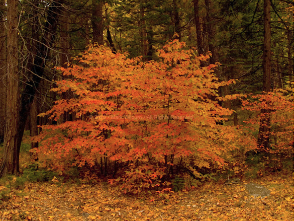
“Dogwood” by Mark Wilburn
This week’s photograph was made by Mark Wilburn in Yosemite Valley. By having his image chosen for this critique Mark will receive a free 16×20 matted print from Aspen Creek Photo. If you’d like your images considered for future critiques you can upload them to the Flickr group I created for this purpose.
Overview, Composition, and Light
This image was made just a few days ago, on November 6th, near the peak of fall color in Yosemite Valley this year. In fact I was nearby, teaching a private workshop, when Mark made this photograph. I exchanged some pleasantries with a man who said he read my blog, but I didn’t get his name. Then when I contacted Mark about using this image for a critique he told me that was him!
Anyway, I know exactly where these dogwoods are: near Gates of the Valley, also known as Valley View. The dogwoods in this area are striking right now, but not necessarily easy to photograph. It’s one thing to find a colorful subject; it’s another to build a strong composition around that color.
I think Mark did a good job of finding a coherent, simple composition amid the forest clutter. The two central dogwoods provide a strong focal point, and we can also see subtle echoes between the vertical lines of the thin dogwood trunks and similar, thicker lines in the surrounding conifers, plus more echoes in the spreading branches throughout the scene.
The soft light is ideal for this subject. Forest scenes are usually complicated, and patches of sun and shade just add to the confusion. The low-contrast illumination also helps bring out colors and color contrasts.
White Balance
Mark told me that he “wanted to show enough of the surrounding darker trees to accentuate the brilliant color of the leaves.” This seems like a sound compositional idea, and we do get some sense of that here. But I think a cooler white balance setting would have emphasized this concept more. Everything in the image has a yellow tinge, including the gray rock in the lower-right corner and the dark-green conifers. Consequently all the colors look warm, so the red and yellow dogwood leaves don’t stand out as clearly as they could, and the photograph looks a bit muddy.
It can be tempting to warm up the color temperature in scenes like this, hoping to enhance the reds and yellows, but by doing so everything in the photograph becomes warm, obscuring the natural color contrast. Warm colors like red, orange, and yellow are actually enhanced and emphasized when contrasted with cooler blues and greens. A photograph that’s all red or all yellow is essentially monochromatic.
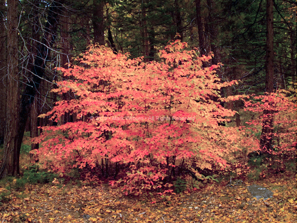
To show what I mean, I took this image into Lightroom and lowered the color temperature. The photograph also seemed a bit dark, so I added a lightening S-curve (I discuss curves, including lightening S-curves, in my tutorial The Power of Curves). And to emphasize that contrast between the lighter dogwoods and the darker surroundings I used Lightroom’s Adjustment Brush to darken everything in the frame except the dogwoods.
After lightening, lowering the color temperature, and darkening the edges
I’m not completely happy with the color in this revised version—it would be easier to work with the original Raw file—but nevertheless I think the changes bring more life to the image.
Otherwise this photograph is technically sound. The overall exposure looks good, and everything appears to be in focus.
Alternatives
When critiquing photographs I always ask myself if there were other options. How else could the image have been composed? What most catches my eye, and how could that be emphasized?
What grabs my attention here is the colors and patterns of the dogwood leaves. Looking at those leaves it occurred to me that I might have photographed these very same trees recently. So I browsed through some of the images I’ve made in the last week and sure enough, there was a photograph of that right-hand dogwood where I zoomed in on that pattern of leaves:
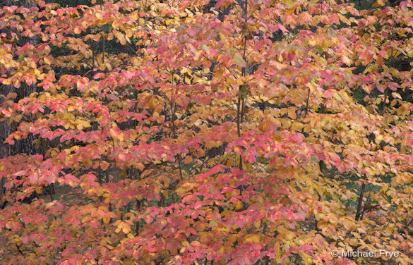
I recently made a more abstract photograph of the same trees
I don’t think my version is better or worse than Mark’s. They’re just different ideas, and I like Mark’s idea of showing the dogwoods set among darker conifers just as much as my more abstract concept. But it’s interesting to see how two photographers faced with the same subject can see different things. Of course Mark may have tried other compositions that I haven’t seen—maybe even something similar to mine!
Looking at these different versions also reminds of the value of “working” a good subject. There’s a saying in chess: “When you find a good move, look for a better one.” We can easily modify this for photography: “When you find a good composition, look for a better one.” A photogenic subject always holds the potential for many different compositions, and the first one you find may not be the best one. And unlike chess, where you only get one move, in photography you can make as many moves, or compositions, as you like.
Join the Conversation
I really value your input—it’s an essential part of this blog. Do you like the revised version, with the cooler white balance, or do you prefer the original? Do you see other possible compositions that Mark and I both overlooked?
Thanks Mark for sharing your image! You can see more of his work on Flickr.
If you like these critiques, share them with a friend! Email this article, or click on one of the buttons below to post it on Facebook or Twitter.
As part of being chosen for this week’s critique Mark will receive a free 16×20 matted print courtesy of the folks at Aspen Creek Photo. If you’d like your images considered for future critiques, just upload them to the Flickr group I created for this purpose. If you’re not a Flickr member yet, joining is free and easy. You’ll have to read and accept the rules for the group before adding images, and please, no more than five photos per person per week. I’ll be posting the next critique in two weeks. Thanks for participating!



Trackbacks/Pingbacks