“The term visualization refers to the entire emotional-mental process of creating a photograph, and as such, it is one of the most important concepts in photography.”
— Ansel Adams
I’ve become increasingly aware of the power of visualization over the years. Looking back through my own work, it’s clear that my best photographs were created when I had a strong response to a subject or scene, knew the feeling I wanted to convey, and was able to visualize in advance how I wanted the finished image to look.
But what does visualization mean, and how does it apply to digital photography today? Although Adams mostly talked about visualization in relation to technique, he also made it clear that visualization was part of the creative process. He wrote: “Visualization is a conscious process of projecting the final photographic image in the mind before taking the first steps in actually photographing the subject. Not only do we relate to the subject itself, but we become aware of the its potential as an expressive image.”
In other words, when you have an idea for a photograph, that idea can and should include a visualization of what the final photograph will look like, and how that finished image will express the feeling you want to convey. Do you visualize a photograph with dramatic contrast, or one that’s soft and impressionistic? Would the colors in the scene help to convey your idea, or would the concept be expressed better in shades of gray? Does the feeling you’re after require sharpness and clarity, or would some blurring suggest that mood more strongly?
My latest article for Outdoor Photographer magazine explores the topic of visualization in depth. It includes several examples that take you through the entire process, starting with the initial visualization, then capturing the necessary information in the field, and finally processing the image to make that original visualization come to life. You can read the article on the Outdoor Photographer website, or pick up a copy of the March issue on your local newsstand.
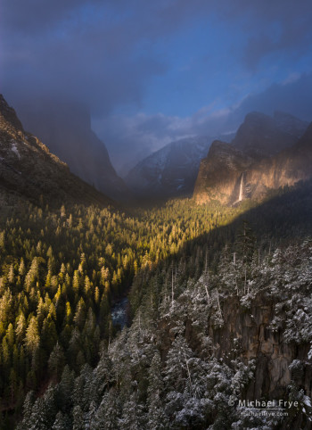
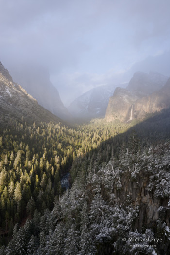
The photograph above is on the cover of the March issue, and I had a strong visualization of the final image before I pressed the shutter. To my eyes, the diagonal beam of light slicing across Yosemite Valley and illuminating Bridalveil Fall created a highly dramatic scene. This was in March of 2007, and at that time this was the most striking lighting event I had witnessed from Tunnel View. Yet here’s what the unprocessed Raw file looks like at Adobe’s default settings in Lightroom:
Not very dramatic at all, is it? In fact it looks rather washed out. It’s common for Raw files to look flat straight out of the camera, and, as readers of my Lightroom ebook know, the default Exposure setting in Lightroom often makes images look washed out even when they’re properly exposed.
But the histogram showed detail in both highlights and shadows, so I knew there was plenty of information to work with. Remembering my initial, dramatic visualization of the scene, I cropped the image slightly, warmed up the white balance, reduced that Exposure setting to -1.00 (my default starting point), and made a strong s-curve to increase the contrast. I then used the Adjustment Brush to darken the sky. The final image (at the top of this post) represents my initial visualization very well – dark, moody, and dramatic.
The ability to visualize how you want the final photograph to look is one of the most essential and powerful tools a photographer needs to make strong, expressive images. I hope you’ll hop over to the Outdoor Photographer website to read the article, or pick up a copy of the magazine – and I hope you enjoy the article!
— Michael Frye
Related Posts: Telling a Visual Story; Capturing a Mood
Did you like this article? Click here to subscribe to this blog and get every new post delivered right to your inbox!
Michael Frye is a professional photographer specializing in landscapes and nature. He is the author or principal photographer of The Photographer’s Guide to Yosemite, Yosemite Meditations, Yosemite Meditations for Women, Yosemite Meditations for Adventurers, and Digital Landscape Photography: In the Footsteps of Ansel Adams and the Great Masters. He has also written three eBooks: Light & Land: Landscapes in the Digital Darkroom, Exposure for Outdoor Photography, and Landscapes in Lightroom: The Essential Step-by-Step Guide. Michael has written numerous magazine articles on the art and technique of photography, and his images have been published in over thirty countries around the world. Michael has lived either in or near Yosemite National Park since 1983, currently residing just outside the park in Mariposa, California.




Hi Michael,
I did read the article and it’s very informative. A great example of what you speak is brought to light in the ‘lightening photograph’ taken during a storm in the Central Valley. Without imagining the final product before you began, nothing close would have been possible. The end result is quite dramatic.
Cheers,
Alyn
Thanks Alyn, and I’m glad you found the article interesting.
Hi Michael,
My copy came in the mail and I recognized your excellent cover shot right away. Great article and of course beautiful images. Maybe see you up in the valley sometime soon before the light is over on HorseTail.Are the Redbuds close to turning yet up there? They are already turning down here in Bay area, seems early this year.
Take Care,
Wayne
Thanks Wayne. There are some poppies blooming in the Merced River Canyon, but no redbuds. They typically don’t bloom until at least late March.
Thanks for guiding us through this process and showing the finished and raw images. Looking forward to seeing the Outdoor Photographer article. Visualization has been harder for me than I expected, so I am always appreciative of seeing/reading about this process by others.
You’re welcome Iren, and thanks. You don’t have to have a complete visualization of how the photograph will look; that’s hard to do at first. If you just have a sense of the feeling that you’d like the photograph to convey, that will help a great deal.
That was a wonderful teaching experience. This foresight of yours is what truly makes you an artist. Visualization is hard. Thank you.
Thanks Janet! I don’t think visualization is THAT hard. As I told Iren here, just having a sense of the feeling you’d like the photograph to convey will help.
Super article. I find my best photographs are always those were I knew why I was taking them – what I was trying to say about the scene in front of me. If I go looking for a photograph, the results are almost always inferior.
Like the two previous comments, I too find visualisation hard. I have two problems with visualisation. Firstly, in thinking about the location before I go, my visual memory is not that good, and I find what I imagined is just not there. Secondly, having captured the image, and with the end result in mind, I find processing the colours in the image to get the desired result extremely difficult. For instance, there may be grass in the image that I want to subdue in order to bring out some other aspect. I can see in my mind the colour I want to get to, but can’t find a way using the Red, Blue and Green curves. There seems to be oceans written about white balance and colour management, but almost nothing about manipulating colour, in the way that B&W photographers manipulated tone. And it is that which I feel I need to create truly expressive images.
Thanks Peter – I’m glad you liked the article. I think you’re laboring under a common misconception about visualization – that visualization is the same thing as preconception. Visualization actually doesn’t have anything to do with how the idea for the photograph arises. That idea can be conceived months in advance, or it can be a spontaneous reaction to a scene, subject, pose, or a fleeting and unpredictable arrangement of clouds. Regardless of whether the idea is spontaneous or pre-conceived, you can visualize how you want the final photograph to look, or at least the feeling you’d like the image to convey, and then take the steps necessary to make that visualization come to life. You’ll note that all of the examples I wrote about in the article were instances where the idea was spontaneous, not conceived in advance. In nature photography, where it’s hard to control anything, I think you’re usually better off reacting to the changing environment rather than planning a photograph and then sticking to the plan no matter what. It’s not that you can’t plan – you have to choose a direction to go in, at least – but that you have to be willing to change plans when your original idea doesn’t pan out – which is often.
As for your question about color, in my own work I rarely try to manipulate it in the sense that you seem to be asking about. I’m mostly just trying to get the photograph to match the hues that I remember seeing. Having said that, I will try to emphasize certain colors through choice of white balance or selectively increasing saturation for certain colors. Sometimes I’ll change the hue of a particular color (usually with the HSL panel in Lightroom), but that’s most often in an attempt to make the color more accurate.
Good read. Thanks for sharing Michael
You’re welcome – thanks Victoria!