Composition
by Michael Frye | Jun 20, 2014 | Advanced Techniques, Composition

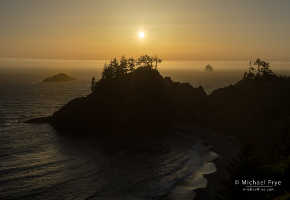
Sun setting over the Pacific Ocean, southern Oregon
After our redwoods workshop, Claudia and I drove north and spent a couple of days along the Oregon coast. I’d never been to this area before, so on our first afternoon we scouted a number of locations north of the town of Brookings. We made several short hikes down steep trails to the coast, with correspondingly steep climbs back out. Though we found some nice spots, none made me jump up and down. Sunset was approaching, and I had to decide where to go. I could see some interesting sea stacks to the north, and decided to drive in that direction.
But we never made it to those sea stacks, because before we could get there we checked one more viewpoint, and immediately realized we didn’t need to go any further. We’d found a scene that practically composed itself, with all the elements nicely balanced and arranged: two stands of silhouetted trees on a ridgeline, with an offshore rock placed perfectly in the gap between the trees, and another rock spaced neatly out to the left. There was even a scalloped line of waves in the foreground to lead the eye toward that gap and the distant rock.
(more…)
by Michael Frye | Nov 26, 2013 | Composition, Photography Tips, Vision and Creativity

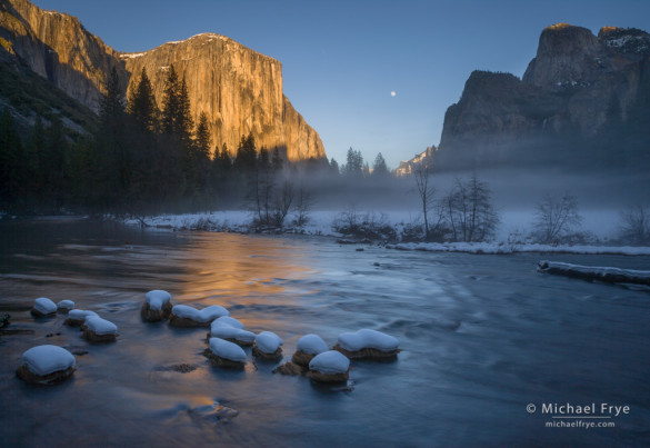
Moon rising between El Capitan and Cathedral Rocks from Valley View. What’s the least interesting part of this image?
The best compositions are simple; they present only the essentials, and leave out extraneous clutter. The most common mistake in photography – by far – is including too much in the frame. Anything that’s not adding to the photograph’s message is detracting from it.
To help simplify your compositions, ask yourself, before you press the shutter, “What’s the least interesting part of this photograph?” Try to identify the weakest area of your composition, and find a way to get rid of it. Then, once you’ve done that, ask the same question again: “Now, what’s the least interesting part of this image?” And get rid of that. And keep doing that until there’s nothing left that you could possibly cut out without losing something vital.
To give you some practice, look at the photograph above. What’s the least interesting part of that image? And if you got rid of that, what would be next – what’s the next least interesting part of the photograph?
I’ll give you a minute to think about it. When you’re ready, take a look at this next photograph, and answer the same question: what’s the least interesting part of this image?
(more…)
by Michael Frye | Nov 19, 2013 | Composition, Photography Tips, Vision and Creativity

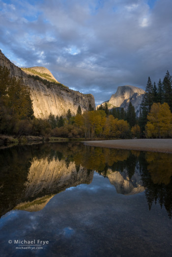
Half Dome and the Merced River, 4:28 p.m.
Is it better to be active or static? To change your location and composition to suit the light, or hope that the light changes to suit your composition?
There’s this persistent myth that Ansel Adams would camp for days at one spot, waiting for the right light. Ironically, this myth is often repeated in relation to Clearing Winter Storm, which was made at Tunnel View, only a few miles from his warm home and comfortable bed in Yosemite Valley. In fact Ansel wrote, “I have always been mindful of Edward Weston’s remark, ‘If I wait for something here I may lose something better over there.’ I have found that keeping on the move is generally more rewarding.”
I have also found that keeping on the move is more rewarding. I’ve sometimes regretted moving, but more often regretted staying when I ignored the inner voice that told me the light would be better elsewhere. And when I do find myself in the right place at the right time, I’ve found that it pays to stay active with my camera and my compositions, and not get lazy about changing lenses or camera positions. If I decide in advance what my composition should be, and stick with that no matter what, I’ll probably miss some great opportunities.
(more…)
by Michael Frye | Jul 10, 2013 | Composition, Photography Tips, Vision and Creativity

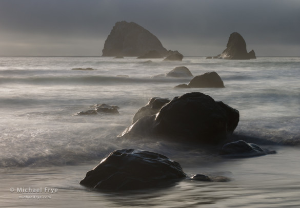
Rocks and sea stacks, late afternoon, Redwood NP, CA, USA
Spacing and separation are always important elements of composition, but during my recent workshops in and around Redwood National Park we encountered many situations where spacing and separation were particularly vital.
The photograph above is a good example. I positioned the camera carefully to avoid, as much as possible, visual mergers between the foreground rocks. I wanted the shape of each rock to stand out clearly, as those shapes are the point of this composition: they set up a repeating pattern, and lead your eye from foreground to background.
(more…)
by Michael Frye | Jan 23, 2013 | Composition, Vision and Creativity

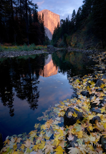
El Capitan and the Merced River, autumn, Yosemite NP, CA, USA
Depth can be a powerful tool in photography. Our medium is two-dimensional, but a sense of depth, an illusion of space and distance, can make the viewer feel like part of the scene, and literally and figuratively add another dimension to a photograph.
A Common Formula
This image of El Capitan follows a common formula for creating a three-dimensional effect in landscape photographs: find an interesting foreground (preferably with some leading lines), get the camera low and close to that foreground, and use a wide-angle lens.
A wide-angle lens by itself can’t create a sense of depth. Wide-angle lenses make things look smaller, and therefore more distant, but if everything looks small and distant there’s no sense of depth. The 3-D effect only happens when you put the wide-angle lens close to something in the foreground. That proximity makes the foreground look big, but things in the background still look small. The optics create an exaggerated size difference between near and far objects, and our brains interpret that as depth and distance.
This wide-angle, near-far look is common today, but it wasn’t always so. Though he wasn’t the first to use this perspective, master landscape photographer David Muench popularized this technique through his many beautiful books, and a lot of people have followed his lead.
But this look has become so popular that I think landscape photographers have stopped looking for other ways to create a sense of depth, and by doing that we’ve limited our options. We owe it to ourselves and our viewers to explore other paths, and create images with depth and meaning that go beyond this one formula.
(more…)
by Michael Frye | Dec 13, 2012 | Composition, Critiques

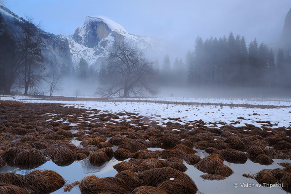
“Winter Mist Rising Beneath Half Dome,” by Vaibhav Tripathi
Here’s another long-awaited installment in my photo critique series. This time we’ll look at a photograph by Vaibhav Tripathi called “Winter Mist Rising Beneath Half Dome,” from my home territory, Yosemite National Park. It’s an interesting study in composition, and directing the viewer’s eye.
Light and Weather
The light is soft — no direct sunlight anywhere. Soft light is great for intimate scenes, but big, sweeping landscapes like this usually need sunlight to create contrast and keep the photograph from looking flat. Yet there’s actually a beautiful quality to the light here. This was made at dusk, and there’s a hint of alpenglow illuminating Half Dome, some blue in the sky, and of course the mist in the middle ground. The upper half of the photograph in particular has a luminous quality, and there’s a quiet, misty, mystical mood to the image. I also like the subtle hues and the warm-cool color contrast.
(more…)

