Composition
by Michael Frye | Sep 4, 2012 | Composition, Photography Tips

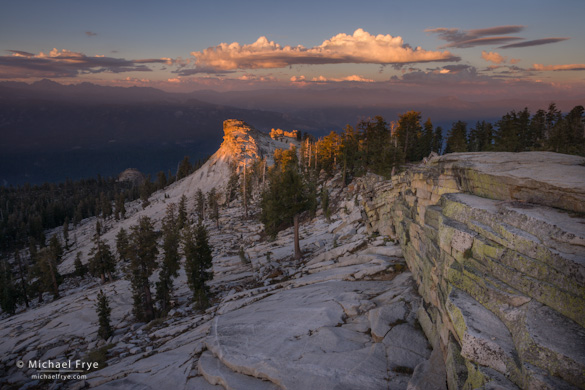
Last light on a granite thumb below Shuteye Peak
The Journey to Shuteye Peak
Last Thursday my wife Claudia and I—and our dog Rider—went to Shuteye Peak to photograph the moonrise. (Well Claudia and I went for the moonrise—Rider went to look for squirrels.)
Shuteye Peak is in the Sierra National Forest south of Yosemite, and from the fire lookout on top (8,351 feet) you can see a spectacular 360-degree view that includes the Clark Range, Mt. Lyell (both in Yosemite), Mount Ritter, the Minarets, Mammoth Mountain, Bear Creek Spire, the Kaiser Wilderness, and the deep gorge of the San Joaquin River 5000 feet below.
I had been to Shuteye Peak many years ago on a scouting trip. I didn’t take any photos, but remembered the amazing view and wanted to go back. Claudia and her friend Anne had tried hiking there last year, but hadn’t managed to navigate the maze of Forest Service roads approaching the mountain.
There’s a road to the summit of Shuteye Peak, and supposedly in the past you could drive a station wagon up it. Not any more. The road has deteriorated, to say the least, and now the last two-and-a-half miles from Little Shuteye Pass are a very difficult and rocky four-wheel-drive trail, suitable only for expert drivers in appropriate vehicles. We found the route to Little Shuteye Pass (even that road requires a high-clearance vehicle), but hiked that last stretch.
(more…)
by Michael Frye | Aug 29, 2012 | Composition, Photography Tips, Vision and Creativity

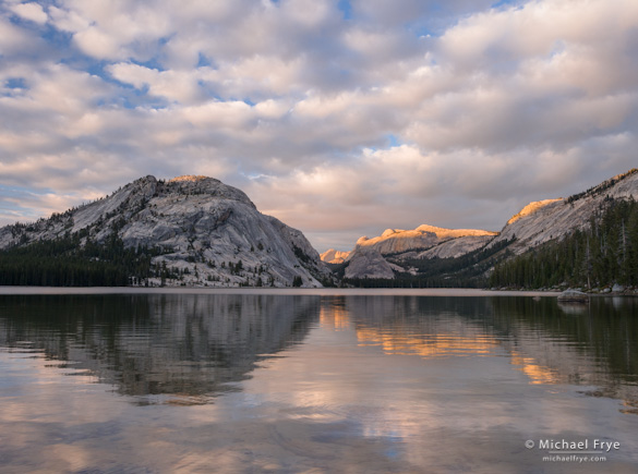
(A) Clouds and reflections, Tenaya Lake, Yosemite
At Tenaya Lake last week my workshop student and I watched and photographed a spectacular, constantly-changing cloud display for over two hours. I made many images, including the one at the top of this post (you can see two more here and here). With the lake in the foreground every composition included a prominent horizon line, so I was often thinking about where to place the horizon in the frame.
It’s not always an easy decision. If you’ve ever read any books on composition you probably learned about the rule of thirds. And when applied to horizons this means you should place the horizon a third of the way from the top or bottom of the photograph. And you probably also read that you should, at all costs, avoid putting the horizon in the center of the frame.
As many of you already know, I’m not a big fan of the rule of thirds. It’s too restrictive, too limiting when applied to the infinite number of possible subjects and situations a photographer can encounter. It’s useful sometimes, but shouldn’t be taken as dogma.
I think this applies to horizons as well. Sometimes putting the horizon a third of the way from the top or bottom works. Sometimes it’s better to ignore the rule and put the horizon right in the middle, or near the top or bottom of the frame.
(more…)
by Michael Frye | Sep 7, 2011 | Composition, Digital Darkroom, Photography Tips

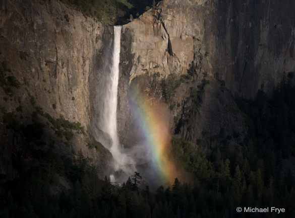
My preferred crop for this image of Bridalveil Fall doesn't fit any of the common print sizes.
In the comments for my last critique, Michael Glover asked a question about cropping and aspect ratios. I get this question a lot, as many people feel that they must crop their images to a certain size—4×6, 8×10—for printing. So I thought I would expand on my answer to Michael and address this issue in more depth here.
The problem with cropping to fit a particular aspect ratio for printing is that you can compromise the photograph’s esthetics. The accompanying images of Bridalveil Fall show what I mean. Below you’ll find the uncropped version, with its original 2:3 (or 4×6 or 8×12) aspect ratio, and a version cropped to a 4:5 (or 8×10) ratio.
To me, the uncropped version leaves too much empty space on the right and left sides, while the 4:5 ratio is too square, and a bit static. I prefer the crop at the top of this post, which lies somewhere in between.
(more…)
by Michael Frye | Jul 12, 2011 | Composition, Photography Tips, Vision and Creativity

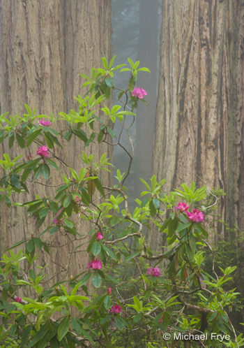
Redwoods and rhododendrons—telephoto view
A Tale of Two Photographs
Reading David duChemin’s eBook A Deeper Frame got me thinking about how we perceive depth and space in photographs, and how lens choice affects that perception.
David says that because photography turns “a world of three dimensions into two,” that “if we aim to create photographs that create within the reader a deeper, fuller, longer experience, it falls to us to recreate that depth.”
There’s no question that wide-angle lenses are better tools for creating a sense of depth in a photograph than telephoto lenses. Telephotos make objects appear closer together than they really are, compressing space and flattening the perspective. Wide-angle lenses make objects appear farther apart than they really are, expanding the sense of space, and, if used correctly, creating an illusion of depth.
These two photographs from my recent trip to the redwoods illustrate the difference. Both images include the same rhododendrons and redwoods.
In the top image I stepped back with a telephoto lens (130mm) and isolated part of the bush against two redwood trunks. It looks like the rhododendrons are only a few feet in front of the trees, but they’re not. They’re at least 20 feet away—illustrating the compression effect of the telephoto lens. The sense of depth is minimal.
(more…)

