Critiques
by Michael Frye | Apr 1, 2010 | Critiques

Sorry I’m late posting this—I’ve been chasing flowers. Hope this is worth the wait!
Before I start I’d like to once again thank all of you who have submitted photographs for this critique series. You’ve added many outstanding images in the collection—I wish I had time to write about all of them.
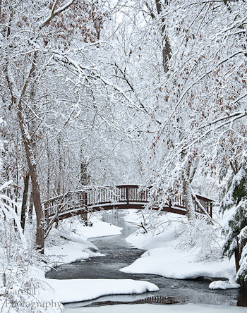
This week’s image, by Garen Johnson, was made near his home in Kildeer, Illinois, a Chicago suburb, after a late-February snow-and-ice storm. The snowy trees, bridge, and winding creek made great subjects for a photograph, and I can certainly see why Garen wanted to capture this image.
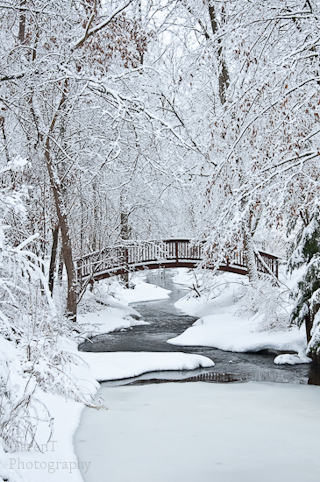
The composition is nicely arranged. The meandering creek, bridge, and overarching trees all seem well balanced within the frame. Garen sent me the original, uncropped version, which I’ve displayed below. You can see that he trimmed a little off the top and left sides, eliminating some slightly messy and distracting branches. He also cropped the bottom to reduce the big expanse of blank ice. That was a good idea, but I think he might have gone a bit too far; I’d prefer to see just a bit more space below a key feature like the reflection of the bridge. I’d also crop the right side a little as well; the tree trunk along the bottom half of the right edge is darker than anything else in the photo, so it’s a bit distracting. I show my preferred crop below as well.
While all that cropping is relatively minor, it’s always better to frame as precisely as possible in the camera so that you’re not throwing away too many pixels and reducing resolution.
Garen wrote on Flickr that he wished the reflection of the bridge were bigger, but it was blocked by the ice at the bottom of the frame. I actually love that little hint of a reflection—it’s a nice, subtle detail that doesn’t leap out at you right away, yet adds a lot to the image once you see it. A full reflection of the bridge might have seemed a bit too cliché.
Garen told me that “the light was terrible that day, it was completely overcast with complete cloud cover.” He was hoping for some sun to bring out “shimmering reflections” from the icy trees. I’m not so sure sunshine would have improved this image. Sunlight filtering through the trees would have created random splotches of sun and shade, adding complexity and confusion. If the spots of light struck just the right places that might have worked, but the odds were against that. This soft, even lighting helped to simplify the composition, and contributed to the quiet, peaceful, wintry mood.
I talked about mood in my critique ofSteve Deligan’s dramatic image from March 17th. This week’s photograph effectively conveys a completely different feeling. Drama isn’t essential for conveying mood—sometimes a solo flute can be as powerful as a whole orchestra.
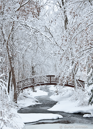
It’s worth taking a moment to look at the elements that contribute to the mood of this photo. Weather is certainly one of them—the snow and ice speak clearly of winter. The laden trees, the lack of footprints or other signs of people, the squiggly line of the creek, the calm reflections, and the muted color palette all convey quiet and serenity. We see vertical, horizontal, curved, and diagonal lines in the frame. Vertical and horizontal lines suggest stateliness and calm, while diagonals are energetic, and curved lines add rhythm and flow. All those fit with the mood here except the diagonals, but luckily they’re not too overwhelming, and most of them are at least slightly bent.
The exposure looks perfect—the snow appears white, but not washed out. The overall contrast seems just right. The color balance is just a tad blue, which helps convey the cold, but I’d prefer to have the snow neutral in this case, which would make the whole image a little warmer. This could also look great in black and white.
Garen said that he couldn’t use a tripod because he had little time and the “snowplows were on my heels.” Since he needed to keep the shutter speed fairly quick to avoid camera movement, he used a medium aperture—f/8—and consequently didn’t get as much depth of field as he would have liked. To me things look pretty sharp overall, even when viewing a larger version. Although some of the branches in the lower-left corner, the ones closest to the camera, are a bit soft, that minor problem doesn’t detract from the message of the photograph.
Garen told me that, “What I learned most is to shoot it anyway; had I not shot that day because of the ‘bad’ light, or snow plows or lack of tripod, I would never have taken this one…” And that’s a great lesson. I’m glad he captured this, despite the problems he encountered.
Thanks Garen for sharing your image! You can see more of his work on Flickr.
If you’d like your images considered for future critiques, just upload them to the Flickr group I created for this purpose. If you’re not a Flickr member yet, joining is free and easy. You’ll have to read and accept the rules for the group before adding images, and please, no more than five photos per person per week. I’ll be posting the next critique on April 6th or 7th. Thanks for participating!
by Michael Frye | Mar 24, 2010 | Critiques

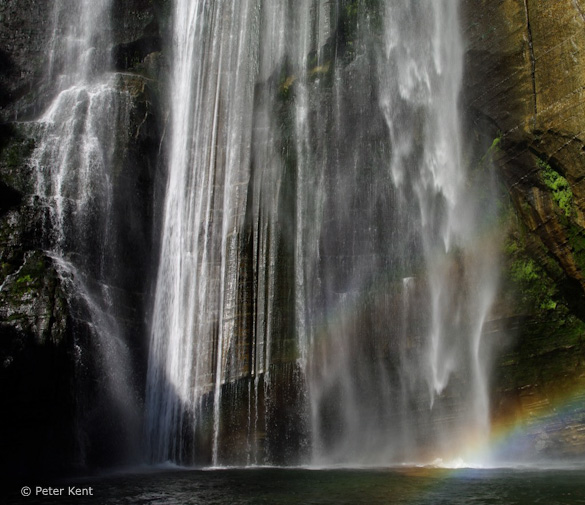
Shine Falls Base—Hawkes Bay, by Peter Kent
This week’s image, by Peter Kent of Canberra, Australia, was made in the Boundary Creek Reserve in the Hawkes Bay region of New Zealand. It’s nice to add a photograph from down under to this series!
There’s something about falling water that holds an irresistible attraction; photographers have a hard time passing by a waterfall without breaking out their cameras. Having lived in or near Yosemite for over 25 years I get to photograph some of the world’s most spectacular waterfalls on a regular basis, yet it never gets old—I still find them fascinating. But Yosemite doesn’t have a monopoly—there are thousands of waterfalls in the world, each with its own unique character and photographic potential.
I’d never heard of Shine Falls before I saw this image, but it certainly looks like a beautiful cascade, and a rich subject for photographs. On Peter’s Flickr photostream you can see a couple of other variations, including an overall view.
That wider view is a pretty good composition as well, but when I look at it my eyes are drawn to the bottom of the waterfall, with its interesting patterns and textures, and of course the rainbow. So I think Peter did a good job of identifying the most appealing part of the scene, the area that captured his attention the most, and filling the frame with just that.
This is the essence of composition: identifying what catches your eye, and eliminating all but the most essential elements. The best images are simple. The photographer’s point stands out clearly without distractions or clutter.
Good compositions almost always have something else in common: a strong, abstract design. Too often photographers become trapped into thinking in terms of subjects rather than designs. When photographing a tree, for example, many people approach the scene with a pre-formed mental image of what a tree is supposed to look like, instead of seeing the unique qualities of the particular tree they’re photographing. To avoid this trap, try studying the tree’s lines and shapes. Think of the abstract designs created by the trunk and branches, then find the composition that presents these patterns in the strongest way. And don’t be afraid to cut off the top or bottom of the tree. The desire to include the whole subject is grounded in that mental image of what a tree is supposed to look like, not in the desire to present the most interesting, essential elements of a particular tree in the strongest manner.
Here Peter wasn’t afraid to cut off the top of the waterfall and focus attention on what he thought was the most interesting part. In doing so he also emphasized the lines and shapes of the subject—the repeating vertical lines in the cascading water, and the small diagonal lines and triangles in the corners.
I think there’s potential for other compositions of this scene as well, especially more abstract images that include just small sections of the fall. In fact Peter said he did just that while he waited for the sun to be in the right position for wider views, but he didn’t post them to his Flickr page.
The light was coming from behind, above, and to the left of the camera. Frontlight like this often leads to flat, dull photographs, but there’s enough contrast here between the white water and the dark surrounding rocks to avoid that, plus of course the rainbow adds a splash of color.
If there’s a problem with this image, it’s the position of that rainbow. Since it’s the only really colorful thing in the photograph, it pulls your eye into the corner. It would be great if the rainbow arced through the middle of the frame. Of course we don’t have control over those things, except to try to be in the right place at the right time.
Here’s where some planning can be beneficial, because rainbows on waterfalls are actually predictable. Rainbows form a circle around a point opposite the sun. Because the sun is always above us, the point opposite it is always located below us, so we usually only see the top half of the circle, which looks like an arch (the bottom half is interrupted by the earth). To find a rainbow in any waterfall, position yourself so that the sun is at your back as you look toward an area with abundant spray. Rainbows are most vivid when they arc through the base of the fall, where copious amounts of mist are generated.
This image was made at around 10:00 a.m. Remember, a rainbow forms a circle around a point opposite the sun, so as the sun rises in the morning, the rainbow moves down, from the top of a waterfall to the bottom. In the northern hemisphere it moves from top-left to lower-right, but in the southern hemisphere it travels from top-right to lower-left. So it probably just slid through the lower-right corner of this image, and was never in an ideal position from this camera position on the morning Peter made this photograph. If he had been able to move further to his left the rainbow would have “followed” him and arced through the lower-middle of the waterfall. I don’t know if that was possible; Peter actually included a photo of his camera and tripod on Flickr, which show their position, but it’s hard to tell if there was any more room to the left. Most likely stepping to the left would have put him in the river!
Time of year also matters. My brain has a hard time wrapping itself around the movement of the sun in the southern hemisphere, but I think that the rainbow would be visible further left, toward the middle of the fall, on shorter days, when the sun would rise further north. The EXIF data says this was made on March 14th, a little over a week ago. Maybe in another month or two it would be in the right place, or again in the southern spring, around August.
Of course we don’t always have the opportunity to plan things that precisely. Peter made this photograph while on a business trip, and tried to take advantage of whatever conditions he found. That kind of flexibility is vital in landscape photography, but so is the ability to plan and try to figure out when the light will be best for a certain image. Often on your first visit to a location you find subjects that would work better at a different time, conjuring thoughts of a return trip.
One more thing about rainbows: they’re actually enhanced slightly by polarizing filters. Rotated to maximum strength, where it darkens a blue sky and cuts reflections, a polarizer will make the rainbow disappear, but turned 90 degrees from that it will make the rainbow a bit more vibrant.
The exposure looks great overall: the water is as light as it can be without being washed out. I might try darkening the brightest strand of water, about a third of the way from the left edge, to keep it in balance with the rest. I like the choice of a fast shutter speed for this image. While slow shutter speeds usually work well with small cascades, as in the photograph by Charlene Burge that I critiqued on February 24th, fast shutter speeds are often a better choice for big waterfalls, as frozen motion preserves the form and texture of the spray.
Thanks Peter for sharing your photograph! You can see more of his work on Flickr.
If you’d like your images considered for future critiques, just upload them to the Flickr group I created for this purpose. If you’re not a Flickr member yet, joining is free and easy. You’ll have to read and accept the rules for the group before adding images, and please, no more than five photos per person per week. I’ll be posting the next critique on March 30th or 31st. Thanks for participating!
by Michael Frye | Mar 17, 2010 | Critiques
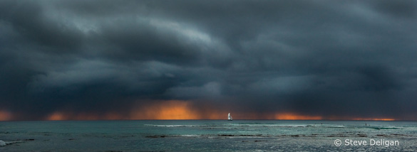
“Oahu Sunset” by Steve Deligan
This week’s image, by Steve Deligan, was photographed from near the base of Diamond Head on Oahu, Hawaii. (Click here to see a bigger version.)
It’s no secret that weather plays a big role in landscape photography, and this image provides a great example. Turbulent clouds dominate the frame, and the sunset color peeking underneath those clouds creates a striking color palette of orange and gray-blue. These elements help convey a dramatic, stormy mood.
The panoramic crop fits the subject well, concentrating attention on the most interesting parts of the scene. The sailboat adds a great touch—it’s perfectly placed within the frame, and provides a focal point, something for the eye to latch onto before roaming around the water and sky. The sailboat is almost centered from left to right, but that doesn’t bother me, as this seems like a natural, balanced placement. (I discuss centered subjects and the rule of thirds in more depth in my critique from February 10th.) In this instance the framing of the sky is the first consideration, and if the sailboat happens to move into a good spot within that composition, great. A large view shows other interesting details, especially the surfers near the right edge of the frame.
Technically this image was well-executed; everything looks sharp, and the exposure is perfect. The large view shows some minor JPEG artifacts, but those are probably the result of compressing the file for uploading, and hopefully not part of the original file. The clouds have an HDR look, but when I asked Steve about this he said that no HDR was involved—that’s just the way they looked. Sometimes nature is just spectacular.
Usually I pick images for these critiques that have more flaws, as those flaws give me more to talk about. There’s not much to criticize in this photograph. There’s a small light area in the lower-left corner—a wave, I think—that’s a bit distracting, but it could easily be cropped out. The panoramic format works esthetically, but making such a big crop throws away a lot of pixels and resolution, so technically it would have been better to stitch together two or more images. Those are about the only things I can think of that might have improved this photograph.
The main reason I chose this image is because it has a such a great mood. Ultimately, the best photographs are not just interesting, or even beautiful—they capture a mood or feeling, or evoke some reaction in the viewer. Ansel Adams felt that the photographer had to respond to a subject before the viewer could: “I have made thousands of photographs of the natural scene, but only those visualizations that were most intensely felt at the moment of exposure have survived the inevitable winnowing of time.”
To infuse your own photographs with mood, you must pay attention to light and weather, and use every possible visual tool—line, shape, pattern, tone, color, movement, exposure, depth of field—to emphasize the feeling you’re trying to convey.
Weather, in the form of roiling clouds and visible sheets of rain, contributes greatly to this photograph’s mood. The color palette also helps; the blue-gray color of the clouds—just the color—adds a stormy feeling, further enhanced by the orange glow. Although color grabs our attention here, tonality is also important—there’s actually a lot of contrast, and that helps convey drama. Long, horizontal lines, like the ones that dominate this photograph, usually evoke calm and serenity, but here they form an interesting counterpoint, something to contrast with, and balance, the turbulence in the sky. The sailboat conveys a sense of scale and space; it seems so small and fragile underneath those clouds. The boat and surfers also add a human element; looking at this image we can put ourselves in the scene and imagine what those people were thinking, like, “Hmm… I wonder if we should get out of here?”
Now I’m sure Steve wasn’t considering all this when he composed this image. He probably did what most of us would when faced with a scene like this: concentrate on framing and getting the exposure right. But the more you become aware of how all the elements of a photograph—lines, shapes, colors, tones, weather, sharpness (or the lack of it)—interact with the subject to create a feeling, the more often you’ll be able to create wonderful, moody photographs.
Landscapes can have an infinite variety of moods—dramatic, delicate, cheerful, peaceful, quiet, somber, or mysterious. One of the keys to conveying mood is to not fight what’s in front of you. If it’s a sunny, cloudless day, then go with it—try to capture that bright, cheerful feeling in your photograph. If it’s raining, use that to your advantage—make the viewer feel how damp it is.
Thanks Steve for sharing your photograph! You can see more of his work on Flickr.
If you’d like your images considered for future critiques, just upload them to the Flickr group I created for this purpose. If you’re not a Flickr member yet, joining is free and easy. You’ll have to read and accept the rules for the group before adding images, and please, no more than five photos per person per week. I’ll be posting the next critique on March 23rd or 24th. Thanks for participating!
by Michael Frye | Mar 3, 2010 | Critiques
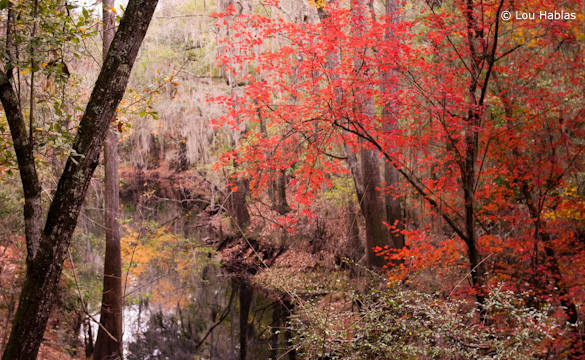
“Ogden Lake II” by Joe Hablas
This week’s photograph, by Lou Hablas, is from O’Leno State Park in Florida. Did you know they had fall color like that in Florida? I sure didn’t.
Lou said that he made this photograph on an overcast and sometimes rainy day while on a hike with his family. That weather provided perfect conditions for this subject. I mentioned last week how soft light enhances colors and color contrasts, but it has another benefit: simplification. Forests have random, chaotic configurations of branches, trunks, and leaves. Sunlight filtering through the trees creates splotchy patterns of light and dark, further adding to the visual confusion. Soft, even light helps simplify such scenes.
But forests are still difficult to photograph, even on an overcast day, because it’s hard to create visual order out of so much chaos. I think Joe did a pretty good job of finding a coherent design; we grasp the main ideas easily, and it doesn’t seem too confusing. The main focal point is the red maple on the right side, and its Y shape echoes the lines of the trunks on the left edge of the frame, giving this image structure and repetition.
(more…)
by Michael Frye | Feb 24, 2010 | Critiques

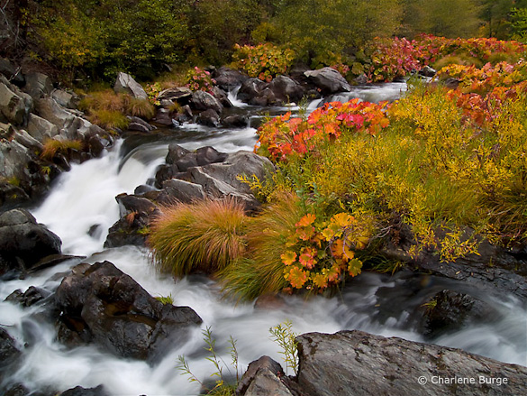
“A Walk Along the Cascades” by Charlene Burge
This week’s photograph, by Charlene Burge, is from the Plumas National Forest near the northern end of my home mountain range, the Sierra Nevada. The colorful plants along the creek are called wild rhubarb or Indian rhubarb. They’re found in a few places in and around Yosemite, but I was pleasantly surprised to discover this photo and see that they grow further north as well. It’s hard to tell from this image, but their leaves are quite large, sometimes more than a foot in diameter. Since they’re colorful in the fall, and grow along creeks, these plants make great photo subjects.
Color is one of the most appealing things about this image. The reds and oranges of the rhubarb draw the eye and contrast with the greens of the grasses and trees. The soft light of an overcast day worked perfectly for this subject. Sunlight would have been too harsh, creating bright highlights and dark shadows that would have overwhelmed the colors.
This seems counterintuitive to many beginning photographers—they assume that sunlight is a requirement for good photos, and that overcast is inherently dull. And that’s true for many subjects—the gray granite of El Capitan, for instance, seems lifeless on a cloudy day. But colorful subjects often look best with soft light. The even illumination gives prominence to color contrast rather than light-and-dark contrast.
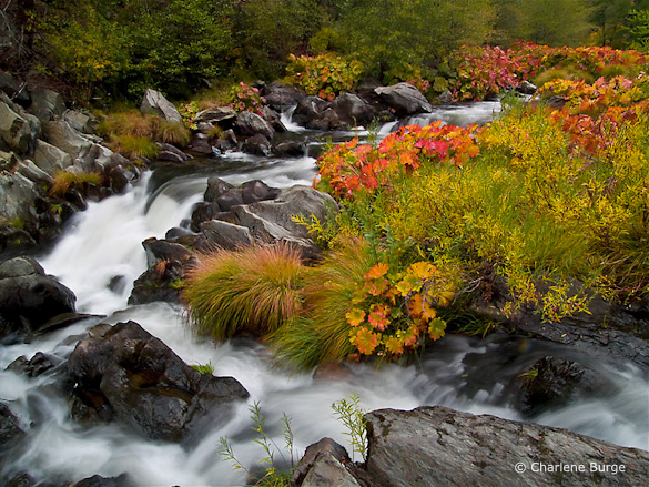
While we’re on the subject of color, the white balance looks good here—the rocks and white water appear neutral, and everything else is the appropriate hue, except perhaps the greens, which look a bit too red to me. Usually I see the opposite problem—greens that look blue-green. Here the greens are too warm, so they blend with the surrounding golds and oranges, and some of the natural warm-cool color contrast has been lost. I used Lightroom to remove some of that reddish tint in this next version. The difference is subtle, and takes a good monitor to see, but to me it’s significant.

With the greens adjusted to remove the reddish tint
This image was captured at f/22 with a 1/2 second shutter speed. These were appropriate choices for showing the movement of the water and getting enough depth of field to keep everything in focus. The blurred, silky look of the water creates a nice textural contrast with the rocks and vegetation. The largest cascade, however, near the middle of the frame along the left side, lacks definition—it’s mostly the same shade of white. I might have tried a slightly faster shutter speed, like 1/4 sec. or 1/8 sec., to try to keep more texture in that area without losing the flowing appearance of the water. Of course that would have required opening the aperture to f/16 or f/11, creating possible depth of field problems, or using a higher ISO, which would have added noise. In photography, everything is a compromise.
The two branches of the creek form a nice semi-circular shape and give the image structure. The top and right edges of the frame seem well placed. The lower-left corner, however, is troublesome. Bright areas along the edge of a photograph are often distracting, and here the white water in the lower-left corner pulls my eye out of the frame and away from the main centers of interest.
But having identified this problem, there may not have been a solution. Charlene told me that she couldn’t include anything to the left because she couldn’t hang out further over the water. I’m guessing that intervening vegetation blocked the view. Even if she could have pointed the camera down and to the left more, the creek obviously continues in that direction, and white water would have touched the edge of the frame somewhere. In those situations I try to put dark rocks along as much of the edge as possible, but sometimes there’s no perfect solution.
These dilemmas are common in landscape photography. A subject catches your eye, yet somehow it defies your attempts to make a clean composition. Some annoying, distracting element can’t be eliminated without losing an essential component of the scene.
Most of my best photographs have practically composed themselves; the right framing was immediately obvious. When I struggle with the composition I rarely like the end result. But there are exceptions, situations where I’ve worked with a subject for half an hour and finally found a good solution. And even if it doesn’t work I often learn something in the process. So it’s worth the effort, even if resulting image isn’t successful.
In researching my most recent book I found this quote from Ansel Adams: “I have found that when I have to labor over a composition I seldom achieve anything worthwhile.” So even the great Adams faced the same problem!
With the composition we see here, the only thing that might help prevent the eye from leaking out of that lower-left corner is to darken the water a bit, and I’ve done that in this next version. For good measure I also darkened and added contrast to that cascade near the middle-left edge to try to bring out more texture. I can’t say these changes made a big difference, but every little bit helps.

Water along the left side darkened, plus more contrast added to the large cascade
Despite my nitpicks this is a pleasing photograph of an intimate landscape. It makes me wish I had been there.
Thank you Charlene for sharing your image! You can see more of her work on Flickr.
If you’d like your images considered for future critiques, just upload them to the Flickr group I created for this purpose. If you’re not a Flickr member yet, joining is free and easy. You’ll have to read and accept the rules for the group before adding images, and please, no more than five photos per person per week. I’ll post the next critique on March 2nd or 3rd. Thanks for participating!
by Michael Frye | Feb 17, 2010 | Critiques

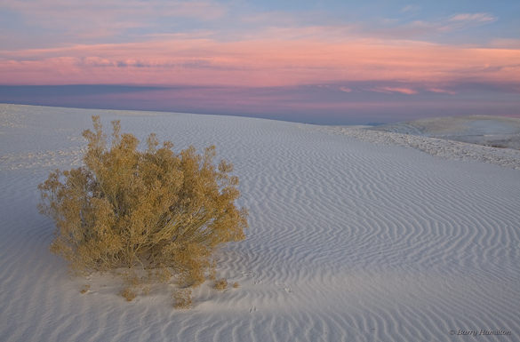
“Scrub, Before the Dawn” by Barry Hamilton
This week’s photo, by Barry Hamilton, is from White Sands National Monument, New Mexico. It features a simple, strong composition, with a clear focal point—the bush. That bush is too near the left edge of the photograph to qualify for the rule of thirds, but I think it works because it’s balanced by the ripples in the dune and the pink clouds. Yet another successful violation of the rule of thirds!
The pre-dawn glow is beautiful. Even though the sun wasn’t up yet, the light has a strong direction from the right, bringing out the texture of the dune. (Soft light with direction is one the subtleties I talk about in this article from Outdoor Photographer.) The pinks, golds, and blues form a pleasing color palette. Viewed larger you can see some nice details, like the animal tracks in the sand.
Barry says he found this shrub while scouting the day before. In my critique from two weeks ago I talked about the importance of flexibility, of adapting to conditions when the light and weather don’t meet your expectations. But that doesn’t mean you shouldn’t plan; planning and scouting are still vital components of landscape photography. The more intimately you know a location, the better your photographs will be. When traveling I’d rather spend two weeks in one area, getting to know the best viewpoints and understanding how the light changes, than spend two days apiece in seven different spots.
Technically this photograph is well executed. The contrast in this scene was low, so that made the exposure easy. There’s a lot of depth—the bush was only a few feet away from the camera—but everything appears to be in focus. That seems surprising, since the aperture was only f/9, but Barry told me that he took three frames, each focused at different distances, and blended them together in Photoshop to get the necessary depth of field.
This is a technique I use fairly often when I can’t get everything in focus with my smallest aperture. But with a wide-angle lens like this (28mm), properly focused, it should have been relatively easy to get enough depth of field at a small aperture like f/22. I can only guess that Barry was concerned that his lens wouldn’t be sharp at its smallest opening. Small apertures can cause diffraction, and a theoretical softening of the image. But I don’t believe theories unless I’ve tested them myself. I haven’t used Barry’s lens, a Canon 24-105mm f/4L, but with my 17-40 f/4L and 70-200 f/4L lenses I’ve found that while the center is sharper at middle apertures like f/8 and f/11—which fits with the theory—the corners are much crisper at f/22. So I’d rather sacrifice a little bit of sharpness in the center to gain a lot at the edges. Portrait photographers may not care about corner detail, but landscape photographers should. It’s important to test your equipment under conditions that are typical for you and the type of images you make.
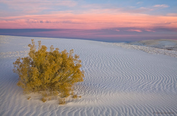
One thing that struck me immediately about this photograph is that it looks flat—that is, lacking in contrast, especially in the foreground. Raw files often seem rather dull at first. (This is an issue I address in my Zone System article for Outdoor Photographer.) Here’s another version where I increased the contrast and lightened the foreground. The added contrast incidentally boosted the saturation as well.

Modified version with the contrast increased and foreground lightened
I also warmed up the color balance slightly, but not enough to eliminate the blue tint in the shadowed sides of the ripples. Part of what makes this image effective is the color contrast between the warm yellowish tint of the bush and the cooler blues in the dune, and I didn’t want to lose that by completely neutralizing the tones of the sand. A neutral color balance is not always as expressive as one with a subtle tint.
Digital imaging has given us tremendous power and flexibility in processing our images and changing their appearance. Most people, if they set their minds to it, can learn the tools of Photoshop, Lightroom, Nikon Capture, or whatever software they prefer. I think it’s more difficult to know what to do with those tools—to find the right color balance, or know when you’ve added enough contrast, but not too much. Of course these things are subjective; there are no right or wrong answers. But I think it helps to gain a frame of reference by spending time in galleries and museums. Look at the contrast in prints by Edward Weston and Ansel Adams, or the treatment of color balance and saturation by a modern color darkroom master like Christopher Burkett.
Thanks Barry for sharing your photograph! You can view more of Barry’s work on Flickr.
If you’d like your images considered for future critiques, just upload them to the Flickr group I created for this purpose. If you’re not a Flickr member yet, joining is free and easy. You’ll have to read and accept the rules for the group before adding images, and please, no more than five photos per person per week. I’ll post the next critique on February 23rd or 24th. Thanks for participating!
 While all that cropping is relatively minor, it’s always better to frame as precisely as possible in the camera so that you’re not throwing away too many pixels and reducing resolution.
 It’s worth taking a moment to look at the elements that contribute to the mood of this photo. Weather is certainly one of them—the snow and ice speak clearly of winter. The laden trees, the lack of footprints or other signs of people, the squiggly line of the creek, the calm reflections, and the muted color palette all convey quiet and serenity. We see vertical, horizontal, curved, and diagonal lines in the frame. Vertical and horizontal lines suggest stateliness and calm, while diagonals are energetic, and curved lines add rhythm and flow. All those fit with the mood here except the diagonals, but luckily they’re not too overwhelming, and most of them are at least slightly bent.

