by Michael Frye | Feb 10, 2010 | Critiques
The image I chose for the first critique in this series was made with a 4 x 5 view camera; this one was captured with a Canon Powershot SD1000—a point-and-shoot. But great photos can be made with any equipment, whether a 4 x 5, digital SLR, point-and-shoot, or pinhole camera. Vision is always more important than equipment.
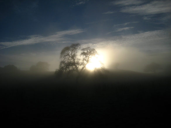
Joe Navratil captured a great moment here, with the sun breaking through fog and silhouetting stately oaks. There’s a wonderful, optimistic mood to the photograph. The composition is pretty simple, and simplicity is always a good thing. One problem is that the main focal points—the sun and the largest tree—are centered. Now I’m not a stickler for the rule of thirds, or any rule for that matter. As Edward Weston said, “To consult the rules of composition before making a picture is a little like consulting the law of gravitation before going for a walk.” But the rule of thirds reminds us that photographs are usually more interesting if you place the main subject off-center—like a third of the way from the left or right edge of the frame. And I think that applies here: this image would be more dynamic if the main tree wasn’t centered.
Of course centered subjects are a common problem with point-and-shoot cameras, as putting the main subject off-center might cause the autofocus to latch onto the wrong thing. But you can always press the shutter button halfway to lock the focus (and usually the exposure too) on your subject, then, while holding the button down, recompose the picture and press the button all the way.
A more fundamental principle than the rule of thirds is simplicity. The best compositions contain only the essentials of the scene or subject, and nothing extra. Or, to quote Weston again, “To compose a subject well means no more than to see and present it in the strongest manner possible.” To me there’s too much empty space in this photograph—too much sky at the top, and too much dark foreground at the bottom. The image would have more impact if the most interesting areas, like the sun and that central tree, filled up more of the frame.
To illustrate what I’m talking about, I’ve cropped this photo two different ways. In the first version (Crop A) I’ve trimmed the image into a long, somewhat panoramic shape. This gets the main subject out of the center, and emphasizes the two longest lines—the horizon and the clouds. This framing also adds rhythm and repetition by giving more visual weight to the flanking trees, which echo the shape of the largest oak. The second version (Crop B) is tighter, more square, and fills the frame with the sun and that central tree. (more…)
by Michael Frye | Feb 3, 2010 | Critiques
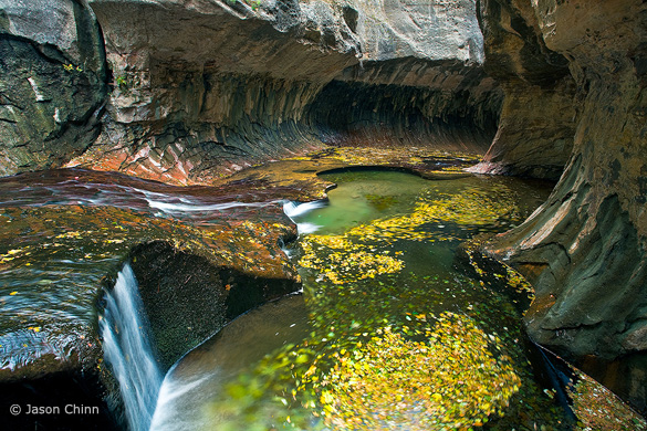
“Subway 1” by Jason Chinn, original version
Thanks to all of you who continue to submit photographs for this critique. The Flickr pool keeps growing, and many more outstanding images have been added to the collection.
This week’s photo is by Jason Chinn from the Subway in Zion National Park. I chose it because it’s a beautiful photograph, with many lessons to impart, and also because the Subway is a special place to me. My wife Claudia and I hiked to the Subway back in 1988 when hardly anyone knew about it. Four miles of thrashing through brush and sloshing up the stream led us to this unique and beautiful place—a slot canyon that widens at the bottom into a tube (hence the name). I still have a couple of 35 mm slides from that day.
I like many things about this image, but let’s start with what’s not there. In his comments on Flickr Jason says that this was made on a cloudy day, and he was disappointed that he didn’t find the “Subway glow.” (Here’s one example of this, or go to Flickr and do a search with the words “Subway” and “Zion.”) Personally, I don’t miss that glow in this photograph. The swirling yellow leaves in the water make this image more interesting than most of the other Subway renditions I’ve seen, and the “glow” might have been just be a distraction here. (more…)
by Michael Frye | Feb 3, 2010 | Critiques
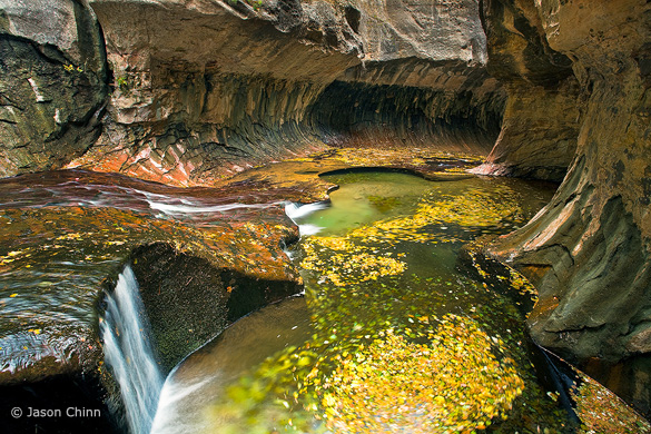
“Subway 1” by Jason Chinn, original version
Thanks to all of you who continue to submit photographs for this critique. The Flickr pool keeps growing, and many more outstanding images have been added to the collection.
This week’s photo is by Jason Chinn from the Subway in Zion National Park. I chose it because it’s a beautiful photograph, with many lessons to impart, and also because the Subway is a special place to me. My wife Claudia and I hiked to the Subway back in 1988 when hardly anyone knew about it. Four miles of thrashing through brush and sloshing up the stream led us to this unique and beautiful place—a slot canyon that widens at the bottom into a tube (hence the name). I still have a couple of 35 mm slides from that day.
I like many things about this image, but let’s start with what’s not there. In his comments on Flickr Jason says that this was made on a cloudy day, and he was disappointed that he didn’t find the “Subway glow.” (Here’s one example of this, or go to Flickr and do a search with the words “Subway” and “Zion.”) Personally, I don’t miss that glow in this photograph. The swirling yellow leaves in the water make this image more interesting than most of the other Subway renditions I’ve seen, and the “glow” might have been just be a distraction here.
Jason’s photograph has an appealing color palette, with yellows, rusty oranges, and greens. The composition also has a nice rhythm and flow; the stream coming in from the left leads your eye to the yellow leaves, and then to the tube of the Subway, plus there are many circles and curved lines that echo each other throughout the frame. The swirling leaves add a nice sense of movement.
I appreciate the fact that Jason didn’t try to pump up the color too much. I see many over-saturated, over-manipulated images on Flickr and elsewhere, but here I think the saturation seems just about right, and the photograph looks natural.
One thing I noticed is that the color balance, or white balance, seems a bit too blue. There’s a bluish tint to the water in the lower-left corner, as well as a hint of blue in the rocks near the top of the frame. Also, the bright rocks at the top-center of the photo pull my eye away from more interesting things in the middle of the picture. To a lesser extent this is also true of the bright rocks and water at the left edge. In this next version (Version B) I’ve warmed up the color balance and darkened the top and left sides of the image. (I did this in Lightroom, but you could easily do the same thing in Photoshop.) To me the result seems more coherent:
Version B, with warmer color balance and top and left edges darkened
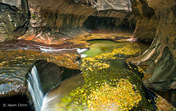
The top and bottom of the frame still bother me though. The bright rock above the Subway at the top-center still grabs attention, and the image needs more room at the bottom, as the base of the little waterfall in the lower-left corner is cut off, and I’d like to see more of that circle of swirling leaves along the bottom edge. A wider lens would’ve helped, but looking at the EXIF data tells me that this was made with a 17 mm lens, which was probably as wide as Jason could go. Still, just pointing the camera down slightly would have lessened the space devoted to the distracting rock at the top, and shown more of the waterfall and circle of leaves at the bottom. I wonder if it would also have been possible to take a step back. Given what we have to work with here, I’ve cropped this image to eliminate some of the rock at the top of the frame (Version C). I think this works a little better, but I’m not sure. What do you think? And while you’re at it, what do you think of the other changes I made?

Version C, with the top edge cropped
Jason says that he used a polarizing filter to cut some of the reflections on the rocks and slow down the shutter speed, allowing him to blur the motion of the leaves (the polarizer cuts two stops of light, so acts like a neutral-density filter). The shutter speed was 2 seconds at f/14 and 100 ISO. A slower shutter speed would have added more motion and accentuated the swirling effect in the leaves. This could have been done by stopping down the aperture to f/22 and lowering the ISO to 50, cutting 2 1/3 stops of light and allowing a shutter speed of 10 seconds.
Despite my nitpicks I think this is a very nice photograph. In landscape photography we often set out with an idea in mind, but frequently the light and weather don’t cooperate. Rather than bemoan what’s not there, look around and ask yourself what is there. What’s special, unique, and interesting about this particular place at this particular time? Jason did just that. He was hoping to see the Subway “glow,” but clouds prevented that, so he looked around, found these pools filled with yellow leaves, and made them the centerpiece of his composition. He may have been disappointed, but personally I like this result better.
We often edit our own images with these preconceived ideas in mind. After spending time and energy to bring a concept to life, it’s easy to believe that the result is better than it is. On the other hand, we’re likely to overlook a photograph that’s didn’t match our expectations. Time and distance help. Days, weeks, or months later we’re better at judging our images objectively.
Thank you Jason for sharing your photograph! You can see more of his work on Flickr.
If you’d like your photographs considered for future critiques, just upload them to the Flickr group I created for this purpose. If you’re not a Flickr member yet, joining is free and easy. You’ll have to read and accept the rules for the group before adding images, and please, no more than five photos per person per week. I’ll post the next critique on February 9th or 10th. Thanks for participating!
by Michael Frye | Jan 27, 2010 | Critiques

Thanks to everyone who submitted photographs for this critique. 26 people uploaded images to Flickr, and there are some outstanding images in the collection. I had to pass over a lot of interesting choices, but I’m keeping several in mind for future critiques.
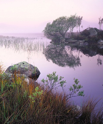
I chose this image mostly for aesthetic and instructive reasons, but also because the international flavor appealed to me. The photographer, Tim Parkin, lives in Leeds, UK, and the photograph was made at Lochan Na h’Achlaise (which Tim says roughly translates as ‘Loch of the armpit’) in Rannoch Moor, Scotland. Also, I like the title Tim used on Flickr—“That Damed Loch”—although his official title isPinks, Lochan Na h’Achlaise, Rannoch Moor.
I love the soft, subtle, color palette of this photograph, with pinks, golds, and hints of green. Many photographers would be tempted to pump up the saturation, but I think that would make this image look garish and fake, and lose some of its attractive, quiet feeling.
The composition is well seen and thought out. The main focal point is the shrub on the island just right of center, and my eye moves from that down to the smaller shrub, grasses, and rocks in the foreground. Tim was careful to keep separation between everything in the foreground and the reflections in the water, with the exception of the unavoidable merger between the three tall grasses just left of center and the reeds behind them.
The small foreground shrub echoes the shape of the larger one in the background, adding some repetition and tying the foreground and background together. I often see random foregrounds that seem stuck on, included only because the photographer felt that a foreground was obligatory. If you’re going to include a foreground it has add something to the image and tie in with the background somehow, either with similar lines and shapes, or by leading the viewer’s eye into the distance. Here the foreground definitely adds interest, and echoes shapes in the background. (more…)
by Michael Frye | Jan 15, 2010 | Critiques
I’m starting a new feature in this blog: a weekly photo critique. Every Tuesday or Wednesday I’ll pick a photograph submitted by one of my readers, write a detailed critique, and invite other readers to post their comments as well.
I’ve always felt that portfolio reviews are one of the most valuable parts of my workshops—perhaps the single best teaching tool. Everyone gains insights into their photography, regardless of who’s work is being reviewed. This new blog feature give you the chance to have one of your photos critiqued for free. But more importantly, I hope every reader will learn something.
I’ll post the first critique on January 26th or 27th. If you want your images considered for a critique, post it to the Flickr group I’ve created for this purpose. (You’ll have to join Flickr, but it’s free and easy). Photographs will be chosen for their instructive value, not necessarily their quality. Please, no more than five images per person per week!

