by Michael Frye | Apr 22, 2013 | Digital Darkroom
As many of you know, Adobe released Lightroom 5 Beta last week. Now that I’ve had a chance to give it a thorough test drive, here are my thoughts about the new features:
Advanced Healing Brush
The Spot Removal tool has received a major upgrade – finally! You can now brush over an area you want to retouch, instead of being confined to using only discrete spots.
I’ve tried this new feature on several images, and it works pretty well. It makes short work of relatively simple jobs, like getting rid of a jet trail in the sky, that used to require tediously placing a series of cloning or healing spots. Now it usually takes just one brush stroke to make a jet trail disappear.
Photoshop still has easier and more efficient options for difficult retouching jobs. But the new Advanced Healing Brush will make it possible to do more retouching in Lightroom, allowing you to keep a completely flexible, non-destructive workflow. I think that’s a big improvement; I’ll say more about that further down.
(more…)
by Michael Frye | Jun 15, 2012 | Digital Darkroom

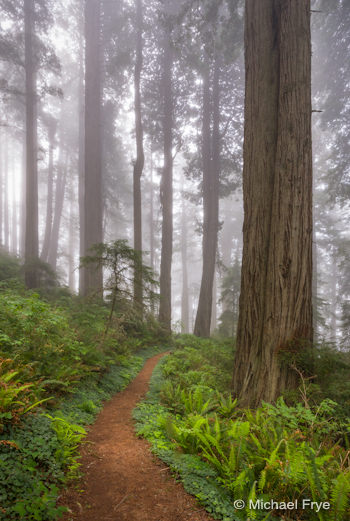
Path through foggy redwoods
I meant to post this earlier, but if you haven’t heard, Lightroom 4.1 was officially released about two weeks ago. So if you’ve been waiting to upgrade to Lightroom 4 until Adobe fixed the bugs, I think your wait is over, as the major problems should have been addressed. I know the point curve bug was fixed with the 4.1 RC (“release candidate”), so that shouldn’t be an issue any more.
Lightroom 4 is a big step forward in Raw image processing, but the advancements require a lot of horsepower to work properly. So check the system requirements before you take the plunge. Many people have had to upgrade their operating system to run Lightroom 4, and upgrading your OS can be a big undertaking, requiring that you update other applications as well.
Earlier I posted two videos about Lightroom 4, so if you haven’t watched those yet they can help you get up to speed in the new process. Here are links to Part 1 and Part 2.
The first image here, as well as all of the images from Monday’s post—including some pretty high-contrast scenes—were processed exclusively in Lightroom 4. In the comments for that last post JayM asked if I could make a tutorial on how I processed the first image. That’s a great suggestion, but for now you’ll find a screen shot below that shows the Basic Panel settings for that photograph. (I didn’t use the Tone Curve, which is not unusual for me these days with high-contrast images in Lightroom 4.)
(more…)
by Michael Frye | Apr 6, 2012 | Digital Darkroom

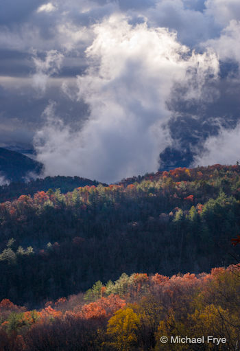
Clearing storm along the North Carolina-South Carolina border—processed with Lightroom 4
I’ve finally had a chance to really dive into Lightroom 4, and I’m very happy with the results I’ve been getting. While I haven’t found a big difference in processing low-contrast images, with high-contrast scenes the improvements are significant.
The accompanying image was made during my trip to South Carolina last November. It was a fast-changing situation—the sun suddenly broke through, and I missed the exposure slightly, so the brightest highlights at the top of the clouds were blown out. By the time I adjusted the exposure the scene had changed.
(more…)
by Michael Frye | Mar 7, 2012 | Announcements, Digital Darkroom

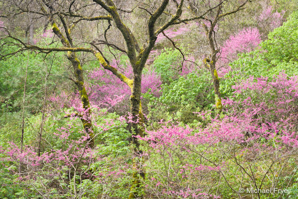
Redbud and oaks, Merced River Canyon, processed in Lightroom 3
If you’re a regular reader of this blog you know that I’m a big fan of Lightroom. It’s easy to use, yet powerful, which makes it a great tool for both beginning and advanced photographers. I teach workshops about Lightroom, and wrote an eBook about it, because I think it’s a tool that can help many photographers. Personally, as Lightroom’s processing tools have grown more sophisticated I’ve used Lightroom more and more and Photoshop less and less.
As many of you probably know, Lightroom 4 went on sale yesterday. In this new version Adobe has completely revamped the Basic panel, with significant improvements in highlight and shadow recovery. I’ve already used the beta version of Lightroom 4 to take advantage of those improvements. For example, I was able to get smoother transitions around the sun in one of the photographs from this post (“Ross’s geese taking flight at sunset”).
The Basic panel tools have completely changed in both operation and behavior, which may require some modifications in they way we work in Lightroom. I’m looking forward to exploring these new tools, and telling you about my discoveries, but unfortunately I’ve encountered a frustrating roadblock—a bug in Lightroom 4 that causes all of my Tone Curve settings for images previously processed in Lightroom 3 to disappear! All I see is the default Tone Curve for the camera, and, since I do most of the tonal adjustments for every image with curves, my images look rather flat (the accompanying images show one example of this). And I don’t want to re-create the curve for thousands of images!
(more…)
by Michael Frye | Jan 11, 2012 | Digital Darkroom
As many of you know, Adobe released a beta version of Lightroom 4 yesterday. There are some major changes to the Develop Module—the Brightness slider has disappeared, while the Recovery and Fill Light tools have been replaced by Highlights and Shadows. Adobe says these Highlight and Shadow tools were improved, and a quick test bears this out—I was able to recover detail in an overexposed moon with Lightroom 4 and not with Lightroom 3. There’s also a new Whites slider, the Blacks slider is quite different, you can adjust individual color channels with the Point Curve—and they’ve changed the default settings.
I’m looking forward to experimenting with the new tools, figuring out the new defaults, and sharing with you what I learn. In the mean time you can watch Julianne Kost give an overview of the new features, or describe the specific changes to the Develop Module. To download the beta, click here.
Remember that this his a beta, so it’s bound to have bugs, and the final shipping version will be different, so adjustments you make now might not translate to the finished version. If you want to import a few images into the beta version to try it out, great, but I don’t recommend that you start using Lightroom 4 beta as your primary tool until the final version ships.
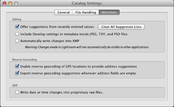
You can’t upgrade your current catalog to Lightroom 4, which is good—you don’t want to mess with your existing catalog. Adobe also recommends that you don’t save metadata to XMP, and I wholeheartedly agree. Don’t Save—don’t press Command-S on a Mac, or Control-S on Windows, and make sure the option to automatically write changes into XMP is turned off. It’s turned off by default in Lightroom 4, but to check go to your Catalog Settings (under the Lightroom menu on Macs, or under the Edit menu on Windows), click on the Metadata tab at the top, and make sure that “Automatically write changes into XMP ” is unchecked. And while you’re at it uncheck “Include Develop settings in metadata inside JPEG, TIFF, and PSD files” also.

Now in Lightroom 3 I do recommend—highly—that you check these boxes. To understand why, and what all XMP stuff means, we have to talk about some fundamental aspects of how Lightroom works, so if you want to delve into these details read on.
Lightroom is a non-destructive editor, which means that when you make changes to a photograph’s appearance, Lightroom does not modify the original Raw or JPEG file, but rather writes a set of instructions about how you want to the image to look. Those instructions don’t get applied until and unless you export the image out of Lightroom (like when you take it into Photoshop, or export a JPEG to put on a web site).
Those instructions are automatically written into the Lightroom database, and can also be written into the image file itself with JPEG, TIFF, PSD, and DNG files, or with other Raw files (NEF, CR2, etc.) into a sidecar file with a .xmp extension. So with Lightroom 4 you want avoid writing writing those instructions into the image file, or a sidecar file, because those instructions won’t be compatible with Lightroom 3, and may not be compatible with the final version of Lightroom 4. But with Lightroom 3 you want to write those instructions (the metadata) into the file or sidecar file so that if Lightroom catalog ever gets corrupted those instructions, your edits to all your images, won’t be lost, because the information will be stored with the image itself. Also, that information can be read by other programs, namely Adobe Camera Raw and other copies of Lightroom.
So with that said, have fun playing with Lightroom 4, and I’ll be back with more after I’ve given it a thorough test drive.
by Michael Frye | Sep 7, 2011 | Composition, Digital Darkroom, Photography Tips

My preferred crop for this image of Bridalveil Fall doesn't fit any of the common print sizes.
In the comments for my last critique, Michael Glover asked a question about cropping and aspect ratios. I get this question a lot, as many people feel that they must crop their images to a certain size—4×6, 8×10—for printing. So I thought I would expand on my answer to Michael and address this issue in more depth here.
The problem with cropping to fit a particular aspect ratio for printing is that you can compromise the photograph’s esthetics. The accompanying images of Bridalveil Fall show what I mean. Below you’ll find the uncropped version, with its original 2:3 (or 4×6 or 8×12) aspect ratio, and a version cropped to a 4:5 (or 8×10) ratio.
To me, the uncropped version leaves too much empty space on the right and left sides, while the 4:5 ratio is too square, and a bit static. I prefer the crop at the top of this post, which lies somewhere in between.
(more…)

