Digital Darkroom
by Michael Frye | Mar 3, 2011 | Digital Darkroom, Photography Tips
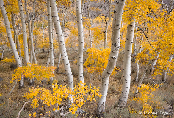
Lightroom has grown up. I’ve made 30×40 inch prints from this image using only Lightroom (except for the final print sharpening). Yet Photoshop can still do things that Lightroom can’t.
“Should I get Lightroom or Photoshop?” This is a question I get asked a lot, usually by people who own Photoshop Elements and are thinking of upgrading to either Lightroom or the full version of Photoshop.
Six years ago this was an easy decision, because Lightroom didn’t exist. If you wanted to upgrade from Elements, the full version of Photoshop was the only real choice. But then Apple launched Aperture, Adobe countered with Lightroom, Nikon and Canon upgraded their software, and a host of other companies added even more options.
For now I’m going to keep this simple and just talk about Lightroom and Photoshop—mainly because these are the two most popular choices, but also because they’re the two applications I’m most familiar with, and they’re natural choices for people wishing to graduate from Adobe’s other photo-editing program, Elements.
(more…)
by Michael Frye | Jan 6, 2011 | Advanced Techniques, Digital Darkroom, Photography Tips, Video Tutorials
White Balance for Landscape Photographs – Part 3: A Special Problem from Michael Frye on Vimeo.
Here’s the third part of my video series on white balance, where I present solutions to a common problem in landscape photographs—finding the right white balance when mixing low-angle sunlight with blue sky.
If you haven’t seen them already, here are links to Part 1 and Part 2.
To see this video clearly, be sure that “HD” is on (the letters “HD” should be white instead of gray; if not, click on them), and click the “expand” icon just to the right of “HD.”
Hope you find this helpful; I look forward to hearing your comments! And if you like the video, please share the link.
by Michael Frye | Dec 22, 2010 | Digital Darkroom, Photography Tips, Video Tutorials
White Balance for Landscape Photographs – Part 2: Shade from Michael Frye on Vimeo.
Here’s the second part of my video series on white balance. Today it’s all about shade—finding the perfect color temperature that brings out all the hues when there’s no sunlight in your photograph.
If you haven’t seen it already, here’s a link to Part 1. Still to come is Part 3, where I’ll present solutions to a common problem in landscape photographs—finding the right white balance when mixing low-angle sunlight with blue sky.
To see this video clearly, be sure that “HD” is on (the letters “HD” should be white instead of gray; if not, click on them), and click the “expand” icon just to the right of “HD.”
These videos are a great way to explain concepts like white balance, but if you want to put all the bits and pieces together and really master the digital darkroom, there’s still space available in my upcoming Photoshop and Digital Printing workshop, January 16-20.
Hope you find this video helpful, and I look forward to hearing your comments!
by Michael Frye | Dec 19, 2010 | Announcements, Digital Darkroom

Today is the last chance to get a discount on Craft & Vision eBooks, including my new one, Light & Land: Landscapes in the Digital Darkroom.
Use the code LAND4 at checkout to get my book for only $4, or buy any five Craft & Vision eBooks and get 20 percent off by using the code LAND20. The offer expires at midnight tonight Pacific time.
There are lots of great titles in the C&V collection, so even if you’ve already bought Light & Land you can still easily find five other titles to inspire you to greater creative heights. I haven’t read them all, but really like David duChemin’s two-part series The Inspired Eye, and Andrew Gibson’s three-part series on The Magic of Black and White.
Click here to see all the titles.
by Michael Frye | Dec 16, 2010 | Announcements, Digital Darkroom
 It’s easy to find information about Photoshop, Lightroom, or just about any other aspect of the digital darkroom. But too often this information consists of random tips and tricks.
So I asked myself how I could help people put it all together. How could I help photographers develop a simple, powerful workflow, learn to make good decisions about how their photographs should look, and convey their original inspiration?
And that’s when I had the idea for this book.
In Light & Land: Landscapes in the Digital Darkroom I’ll take you step-by-step through each decision as I process five different images in Adobe Lightroom. You’ll see my workflow in action, and I’ll explain why I use particular techniques in a particular order. But more importantly, you’ll come to understand the esthetic judgements behind each decision—how a certain amount of contrast conveyed my vision, or why too much saturation muddied the color rather than enhanced it. As you look over my shoulder you’ll gain insights about how to convey your own unique vision, and how to squeeze every ounce of beauty, emotion, and inspiration out of your photographs.
While I use Lightroom for these examples, the basic principles apply to any software. Learning how to make good decisions and find the right balance is more important than learning any particular tool or technique.
This eBook is published in conjunction with Craft & Vision, David duChemin’s great photography eBook site. Like all their eBooks, Light & Land is normally only five dollars. But for the next four days you can get it for only four dollars. Just use the code LAND4 at checkout. Or use the code LAND20 to get 20 percent off if you buy five or more Craft & Vision eBooks.
Click here to order your copy!
by Michael Frye | Dec 10, 2010 | Digital Darkroom, Photography Tips, Video Tutorials
White Balance for Landscape Photographs – Part 1: Sunlight from Michael Frye on Vimeo.
My recent critique of Mark Wilburn’s dogwood photograph prompted a lively discussion about white balance, so this seemed like a good topic for a more in-depth treatment. I’ve created three videos on white balance for landscape photographs, and here’s part one, which looks at images with sunlight, including sunrises and sunsets. Part two will discuss photographs captured in the shade, and part three will present solutions to a common problem in landscape photographs—finding the right white balance when mixing low-angle sunlight with blue sky.
In all of these videos I discuss what I think is the key to setting color temperature—finding a good balance between warm and cool colors, and preserving the vibrance of all the individual hues.
To see this video clearly, be sure that “HD” is on (the letters “HD” should be white instead of gray; if not, click on them), and click the “expand” icon just to the right of “HD.” Once you’ve expanded you might want to turn Scaling off if you have a big monitor.
As I mentioned yesterday, my new eBook will discuss my entire workflow in depth. I’ll post more details soon.

